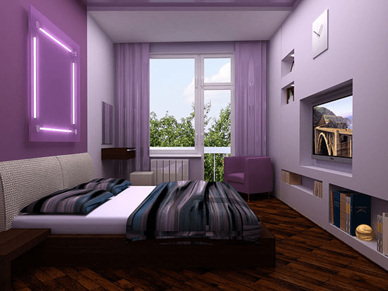
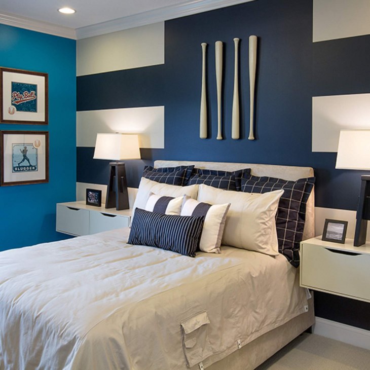
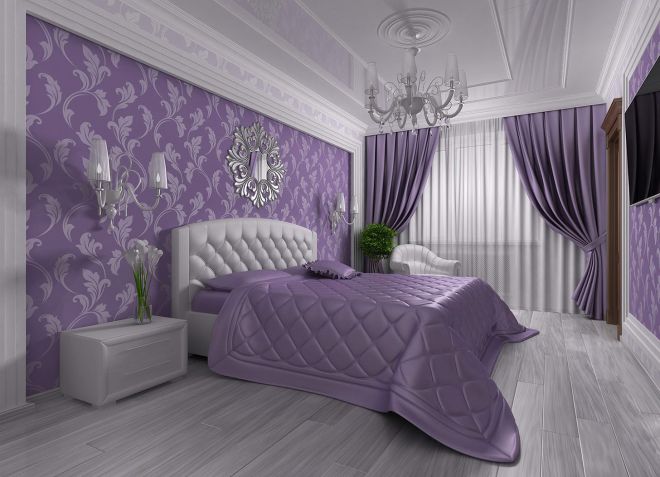
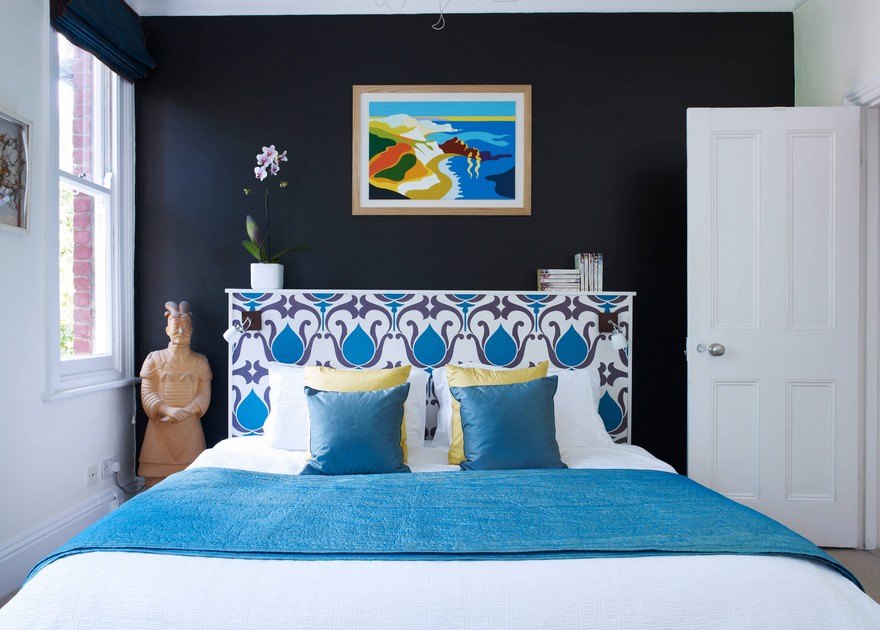
How to paint walls in a bedroom with dark furniture
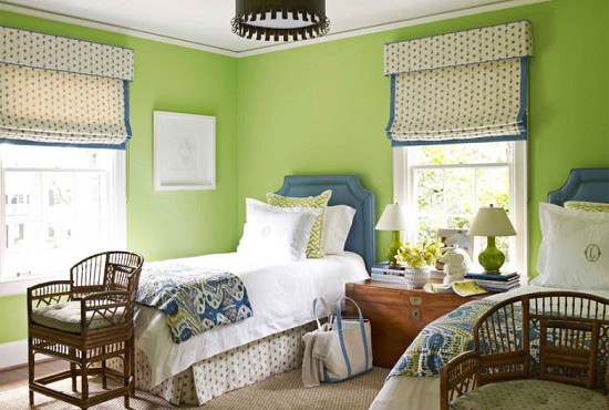
In the case when the furniture for the bedroom was bought before the creation of the interior project or came to the owner in another way that requires its mandatory use, it is necessary to adjust the rest of the design for it. Dark furniture obliges you to install it in a large room or combine it with light surfaces. Otherwise, the atmosphere will be oppressive.
Light walls, floor, ceiling will save the day. Designers recommend combining only cold or warm colors in one interior. According to this principle, starting from the dominant color of the furniture, you can choose the tone of the walls. The situation is simpler if dark furniture has an abundance of glossy surfaces. Even in dark shades, they will reflect and multiply the rays of light, giving the room a mystery.

To combine walls and furniture in one composition, you can add patterns to a light background in a color that repeats the shade of the furniture. A bedspread or upholstered furniture that repeats the pattern of the walls and the tone of the bed frames, the facades of cabinets, pedestals looks spectacular.

These simple tips will allow you to create a mysterious world in the bedroom, allowing you to give pleasant thoughts or go to the kingdom of Morpheus at the end of a difficult day. The furnishings of the room and the right shades will help you forget about the hustle and bustle at least for the duration of your stay in your boudoir.
Factors affecting the choice of color in the bedroom
When creating a certain interior composition in the bedroom, it is necessary to take into account not only personal taste preferences. The choice of color for this room should also be based on the technical characteristics of the room:
- room area;
- the amount of natural light;
- side of the world that the windows face.

Small dark rooms need an abundance of light, so white and light cold pastel colors are suitable for such rooms. For a bedroom located in the north and northwest part of the house, it is necessary to choose a different spectrum: warm shades and more saturated colors will neutralize the lack of light.
Spacious rooms in the southern and eastern parts of the building can be safely decorated in both muted dark shades and light cold colors. This color will have a soft and calming effect on the owner and harmonize with the general idea of decorating the bedroom.
What colors can be combined with
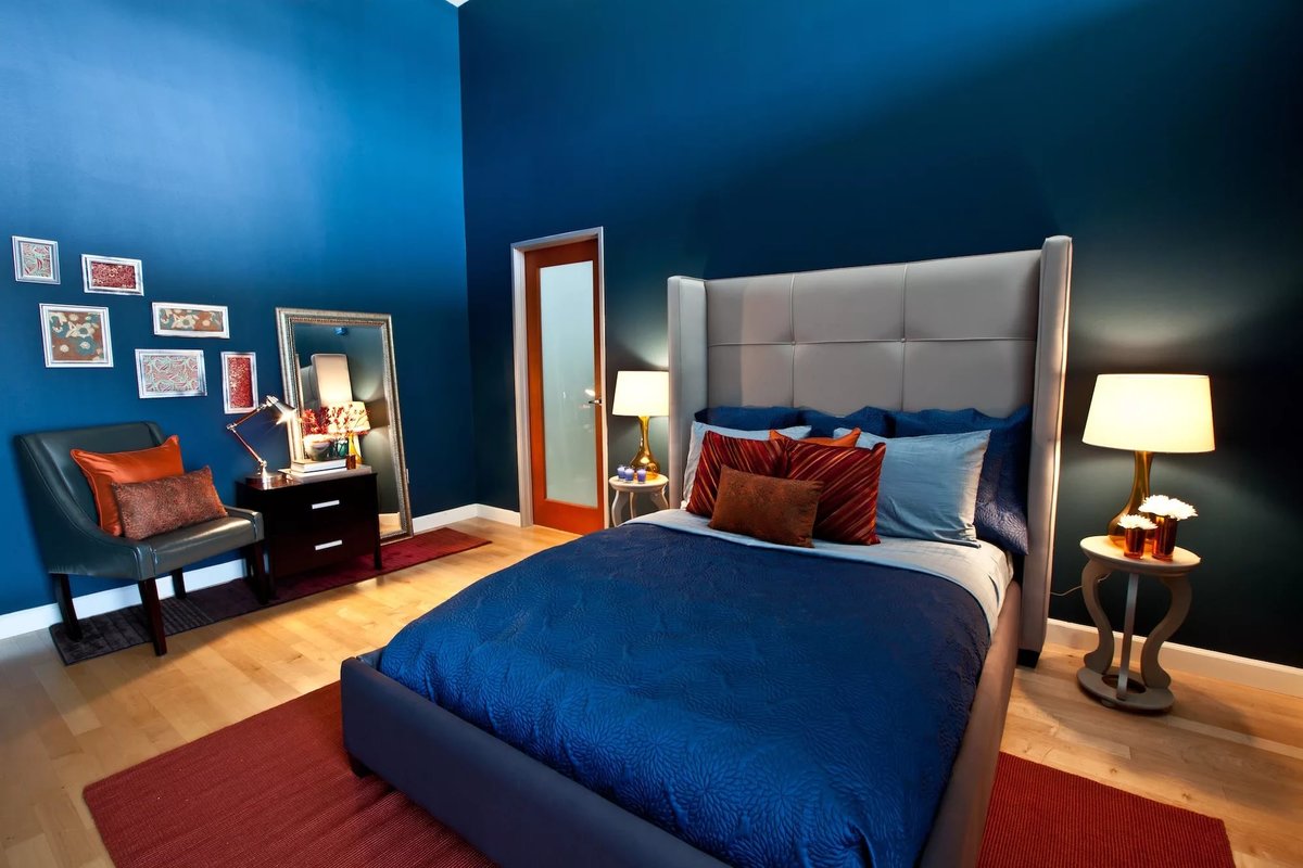
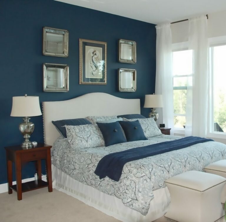
The advantage of the blue palette is its compatibility with other shades. They choose a composition depending on the location of the bedroom, the character and taste of the owners of the house.
Gray
Blue-gray shades are often used in the interior of the bedroom. The combination of a neutral tone with cold blue will allow you to relax and unwind. A feeling of security and serenity is created. The room where the man is resting should be decorated in such colors.
Beige
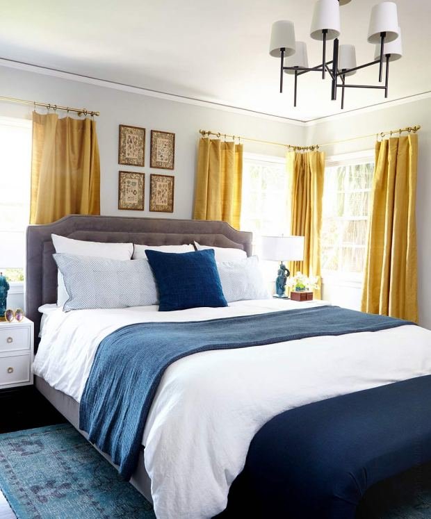
The warmth of beige is perfect for a blue indoor palette. Delicate peach colors of textiles, lampshades along with walls in dark blue wallpaper will create an atmosphere of romance, flirting, tenderness.

Golden
A truly royal bedroom will turn out if golden shades appear among the blue color. Lamps, curtains, textiles are decorated with gold. Patterns on pillows and carpets should contain elements of noble metal color.
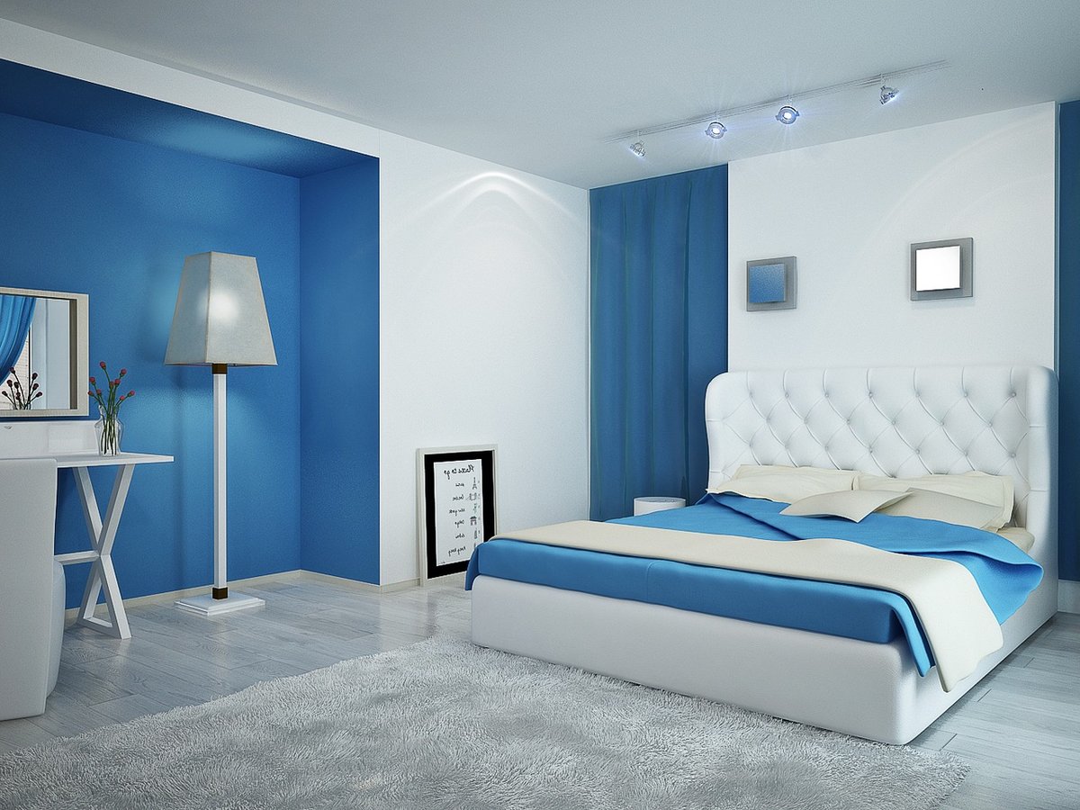
White
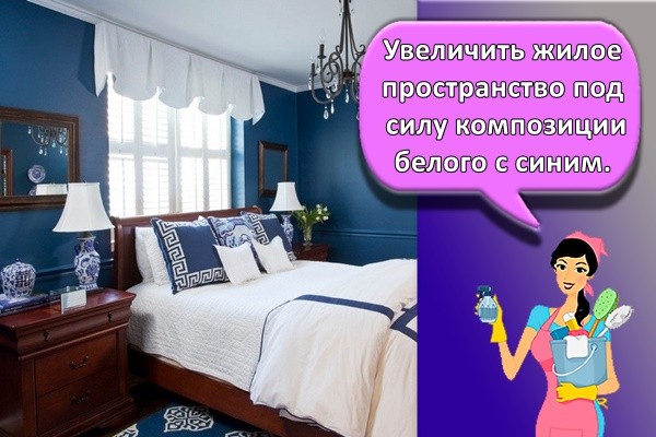
To increase the living space by virtue of the composition of white and blue. The interior is suitable for sophisticated romantic natures. The combination creates a joyful mood. It is advisable to add bright images to the colors of wallpaper, upholstered furniture, curtains.
Brown
The dark blue walls are enlivened by walnut furniture. The combination is more suitable for a vintage bedroom design.Furniture looks better in the style of the 80s of the last century. The floor is covered with brown laminate.
Blue
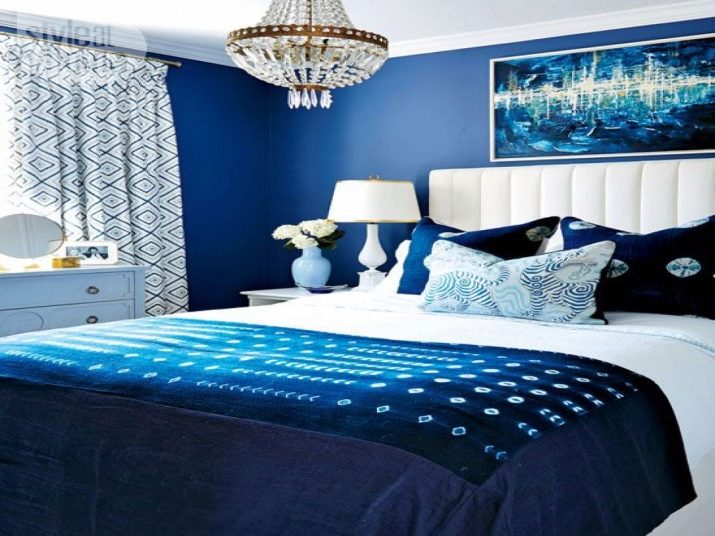
A brightly lit room is decorated with light and dark shades of blue. You just need to choose the right combination so that the walls are in harmony with the bed and furniture. You can make one wall blue and the others blue. It is worth adding white, which will fill the bedroom with light.
Red
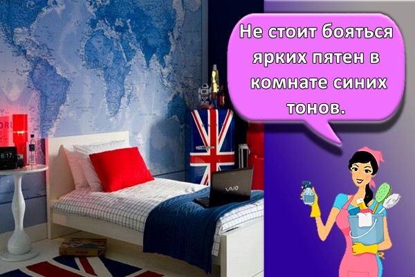
Do not be afraid of bright spots in the room of blue tones. But you need to use the red color in dosage. It is better to decorate the room with bright vases, pillows, poufs.
The combination of blue with other colors in the interior
In an interior in which blue shades are taken as a basis, other colors will certainly be present. To create a harmonious space, you need to know their correct combinations.
With white
The combination of stylish white with luxurious blue is considered a classic.
White tones help to create an atmosphere of lightness and ease. Cool shades of blue along with white refresh the room.
Bright blue textile accessories will add charm and extravagance.
A good solution is the use of white furniture in such rooms.
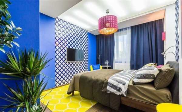
With yellow
Joyful yellow perfectly complements the deep blue.
This combination will appeal to extraordinary people who like to surround themselves with unusual things. A feeling of comfort and happiness will always appear in a person who crosses the threshold of a room in blue and yellow tones.
Delicate cornflower blue combined with lemon yellow will help create an interesting rustic setting.
With red
If we take blue shades as a basis, and add red to them pointwise, then such a combination will look very extravagant. The feeling of peace in such a room will not arise.
The combination of blue and red invigorates, promotes the emergence of new goals and the search for ways to achieve them.
With blue
Delicate blue shades and turquoise color are indispensable when creating the interior of a nursery and a bedroom.
These tones will help you relax and enjoy a good rest. Light blue reduces the rate of metabolic processes in the body and promotes restful sleep.
In an apartment, it is used to decorate those areas in which it is necessary to reduce energy activity.
With pink
The combination of blue and pink will be the right solution if you use only warm or cold shades of these colors.
The selected tones for interior decoration should match each other in brightness. Colors are used evenly, no tone should prevail.

With beige
Deep blue will be softer and warmer when you add a cozy beige tone to it.
This combination is often used to decorate living rooms and family rooms. The environment in the room, which uses the blue and beige combination, is very comfortable and relaxing.
With green
According to the designers, the combination of green and blue will be successful if shades that do not complement each other in tone are chosen.
If a rich blue is chosen for the interior, then it is diluted with light green shades.
If a bright emerald color prevails in the main tone, then soft blue is used to extinguish it.
With gray
The elegant combination of gray with different shades of blue is often used to create classic interiors.
The more saturated and brighter the blue tone is selected, the softer and lighter the gray should be.
The graphite color will be a good complement to the indigo color or the mysterious cobalt tone.
With purple
Correctly selected blue tones can set off the luxurious purple color in the interior.
Similar in tone, blue and violet balance each other well.
They create an atmosphere of tranquility and comfort. One of these colors is taken as a basis, and the second is used to add piquant notes.
With lilac
A romantic combination of blue with delicate lilac is used to decorate bedrooms and living rooms.
Beautiful shades of lilac color will add sophistication and elegance to the interior.
Deep blue tones will become even more noble and luxurious.
Features of choice
Thinking over the decoration of the bedroom, you need to remember that intense purple tones are tiring, quickly get bored, and can provoke depression. For large surfaces, they are not used; pale, delicate shades are chosen. Individual details of bright colors can make the interior more expressive.
Furniture
When choosing furniture, the style of the bedroom is taken into account. The rule is observed - if the decoration is made in purple tones, the furniture is selected in neutral shades (beige, white, gold, gray). Furniture looks great with gloss, mirrors, decorative glass.
Textile
Textiles are the main elements of bedroom decoration. Use soft fabrics to enhance or tone down the purple palette. Delicate lavender curtains are appropriate in classics and provence, plum bedspreads are suitable for modern styles, for the eastern direction a bright shade of fuchsia, cyclamen can be combined with green and yellow. The easiest way to add purple to your décor is to use linens or bedspreads.
Wall and ceiling decoration
A few tips for decorating your bedroom in purple tones:
- Only light colors are used to decorate a small room - this will visually increase the volume.
- It is necessary to decide on the predominant color in order to give the room warmth or coolness. Cold colors are chosen for sunny rooms.
- Do not paint all surfaces in shades of purple.
- Glossy surfaces and mirrors will help to extinguish the expressiveness of color.
- Wallpaper of neutral colors with a print of a bright or muted purple tone looks great in the bedroom. The pattern is chosen in accordance with the style.

If the decoration is made in dark colors, it is necessary to provide for many light sources, otherwise the bedroom will look intimidating at dusk and at night.
Wallpaper
Lilac, cyclamen, orchid, fuchsia are popular motives for photo wallpaper in the bedroom. Sleepers with flowers add a purple hint to the bedroom with a 3D drawing.

Basic principles of color selection
The choice of the main color for the bedroom should be done on the basis of harmony, temperature and chromatism.
Types of color harmony
Harmony is an important point in choosing a color scheme for a bedroom. It includes two concepts: contrast and nuance. Contrasting harmony is a combination of rich cold and warm tones
The result is catchy and eye-catching. For a bedroom, contrasting harmony is not very suitable - it will be difficult to relax
This way of combining colors is appropriate in a living room or hall.
Interesting color solutions for the bedroom, photo of interiors
Nuance harmony assumes a minimum amount of contrasts in the room; they are included in the interior exactly to the extent that it is required to balance the design. It looks like this: the color of the walls in the bedroom and most of the other surfaces is neutral, and little things are left to the share of contrasts - accessories and decor items. The result is a combination suitable for a bedroom, children's room or study.

White walls in the bedroom. Photo of design in nuanced harmony
Please note that examples of contrasting and nuanced color harmony can be distinguished among the design styles. Contrasting harmony is characteristic of pop art, kitsch, expressionism, partly for fusion and eclecticism
Nuance harmony - shabby chic, Provence, classicism, French and Scandinavian style, with reservations - Biedermeier, neoclassicism and colonial style.
A few more concepts in color
The division of tones into warm and cold is known to everyone. The former include blues, blues, greens and purples with a predominance of blue.The second - colors with a dominance of yellow and red. Cold ones are conventionally called distant, they visually expand the room, and warm ones are close - they are seen closer than they really are. Temperature characteristics are important when it comes to choosing a color for a small bedroom.


What colors are suitable for the bedroom: Warm tones make the room smaller
Another division of shades in the bedroom is achromatic and chromatic. The former include white, gray and black, the latter - all the others. Achromatic - neutral, combined with anything, including among themselves; can be used as a base or a linear outline for all other colors; white is distant, gray and black are close tones.
In what colors to make the bedroom: shades of white will allow you to use textiles of any color
How to match colors in the bedroom
The correct combination of colors in the bedroom obeys the same laws as the combination of shades in other rooms. The four design canons remain the most advantageous:
- Combine shades within the same color by adjusting the intensity of the color scheme. For example, you can use green, olive and mint, which will add freshness and liveliness to the bedroom. You can dilute the same type of shades with neutral white;
- Use classic combinations of contrasting shades such as black and white;
- Shape the interior in colors that are adjacent to each other in the color wheel. Such organic shades can be green, yellow-green and yellow;
- Combine harmonizing colors, one of which should be dominant and the other secondary. The main color scheme can be snow-white, green, beige, cream, milk, gray and pearl.

Benefits and features of using gray tones
The range of gray is used by interior designers because:
- creating compositions is not difficult;
- gives personality to the bedroom;
- there is a mood for relaxation;
- emphasizes the taste of the owner;
- you can choose different combinations with other tones.
> Gray tones in the bedroom interior leave a feeling of security. And the combination with contrasting colors will create the mood of the room. It is worth considering the selection of shades of gray depending on the size of the bedroom. If the room is large, then you need to opt for dark colors. You can visually increase the size of the room with light gray walls.
Do not consider the shade gloomy. He balances the objects in the bedroom by placing the accents correctly. Psychologically, the choice of design in gray tones is typical for self-sufficient, mature people. Romantics also do not shy away from colors. Everything is presented to them in a haze, a veil that they find mysterious.
Blue in the kitchen
There is a debate about the appropriateness of using blue in the kitchen. Psychologists say that the blue color helps to reduce food intake, and this is in the hands of those who monitor their diet or want to normalize their weight. But if the kitchen for you is a hotbed of warmth and comfort, and you need a warm, comfortable atmosphere, which also enhances your appetite, then you should use blue in the kitchen in a very metered manner, as bright accents.

Blue-gray kitchen photo

Blue color in the interior of the kitchen

The combination of blue and brown in the interior

Metallic + blue pastel

Dosed blue and colorful elements

Spectacular azure on a white background

Cyan in accents

Kitchen in blue and gray tones

Kitchen interior in blue colors, coupled with graphite and white
For lovers of blue in the interior of the kitchen, there is a wonderful selection here.
What factors should influence the choice
In order to feel as comfortable as possible in the room, many features should be taken into account when choosing a color scheme.
Side of the world
The perception of shades is directly dependent on sunlight. Rooms that are poorly lit are recommended to be decorated in a warm color palette.
Illumination
It is recommended to redo a poorly lit room, flood it with light. Otherwise, the space will be too heavy.
Quadrature
For small rooms, it is worth using light colors - they will help make the space lighter. In spacious rooms, bold experiments with rich and dark tones are permissible.
Number, size and arrangement of windows
Large windows allow you to use a variety of shades to decorate the room. With a sufficient amount of light, it is permissible to use dark tones - brown or gray. In some cases, it is allowed to choose even black.
Furniture
The classic version of the combination of shades of furniture and walls is the use of contrasts. This helps to highlight certain items. Light walls work well with dark furniture. A light set in a pastel palette will go well with rich colors.

Selected style
To choose a good palette for a room, you should take into account the stylistic direction of the interior:
- The classic style suggests a warm palette. For such a bedroom, combinations of red and brown are suitable. You can use milky or beige as a background. The role of accents is played by golden and burgundy tones.
- Art Nouveau style allows the use of brown, amber, gray. Green, dark red or blue tones are suitable as accents.
- Mediterranean style implies a combination of white, blue, blue. To create interesting accents, it is permissible to use orange or terracotta tones.
- Provence style can be decorated with lavender and green tones. The shade of ivory looks great. Accents should be done with blue, carmine.
Blue in the interior
Now let's take a closer look at how the blue color will look in the interior of a particular room.
Kitchen
Blue colors are rarely used for the kitchen. Designers recommend using a deep tone in moderation, since the kitchen should be cozy and evoke a feeling of warmth and security. A light blue shade, heavenly, blue-gray will do. It is best to combine with white.

Refreshing cuisine - promotes relaxation and relaxation
Living room
Blue in the living room interior is a controversial decision. Splashes of blue are best suited here, rather than the design of the entire room. Pillows for the sofa and paintings with a shade of azure or blue dust will give an excellent look.


Living room with blue, red and yellow. Who said this is an impossible combination?
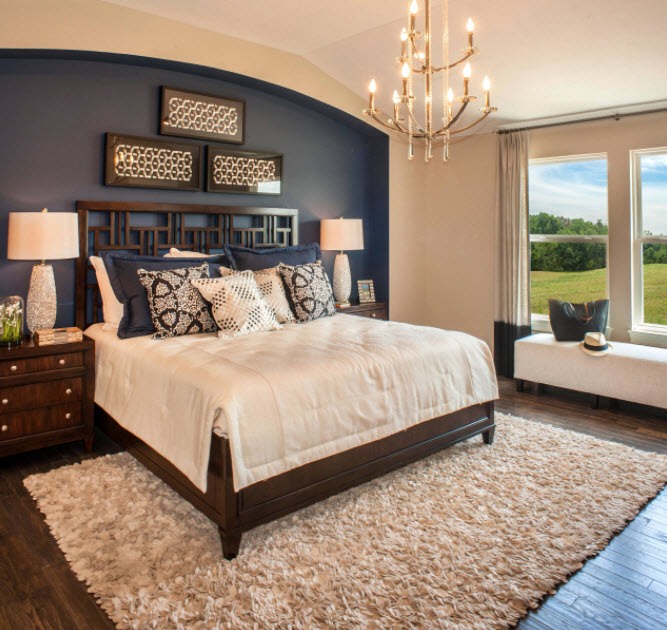
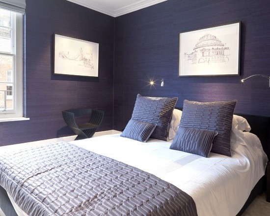
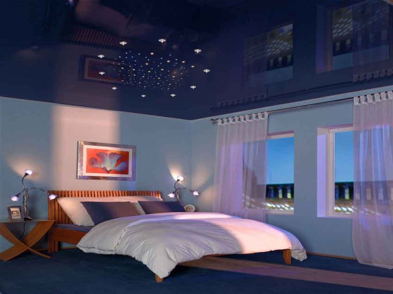
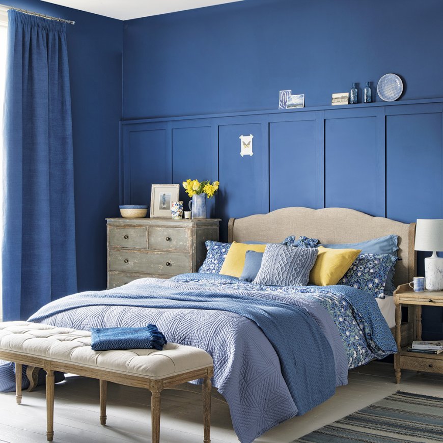
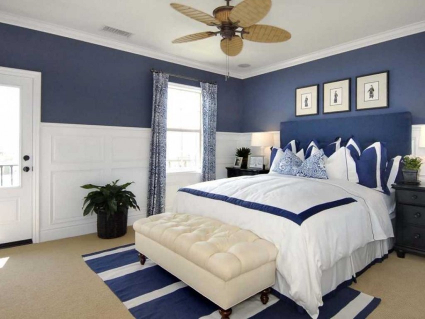
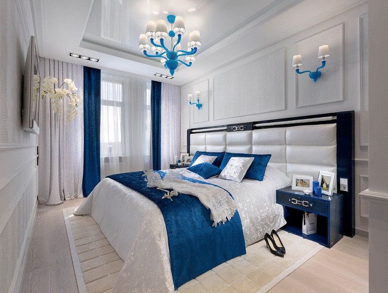
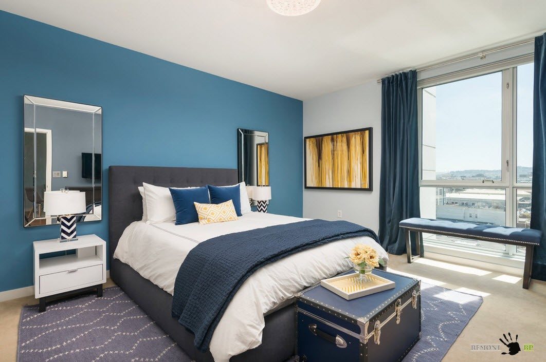
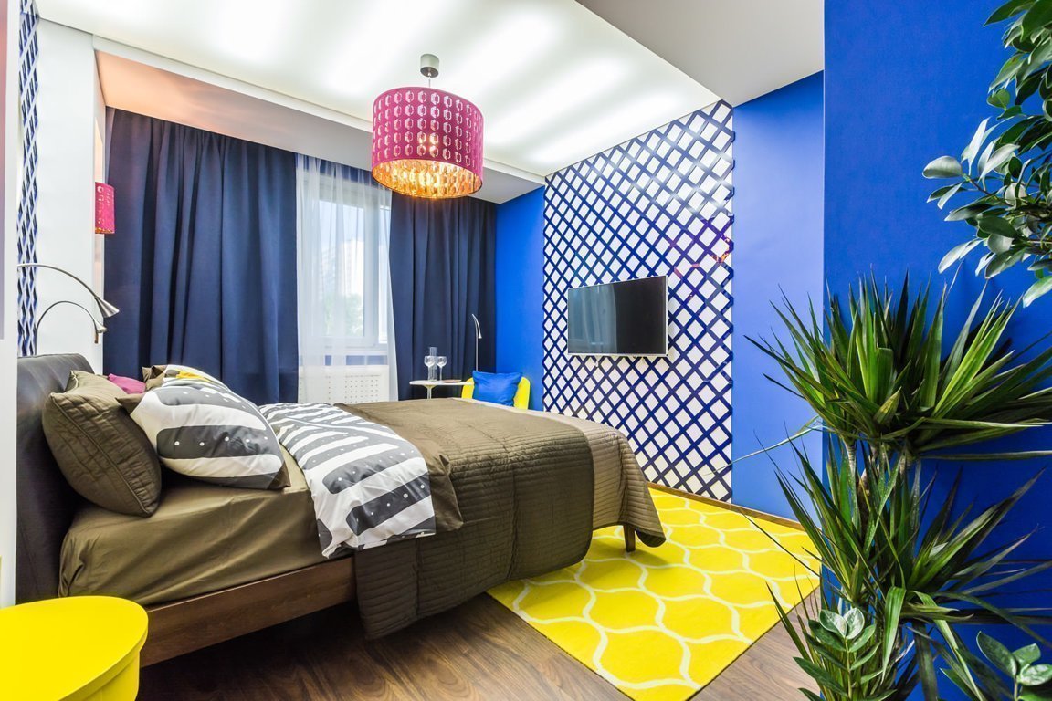
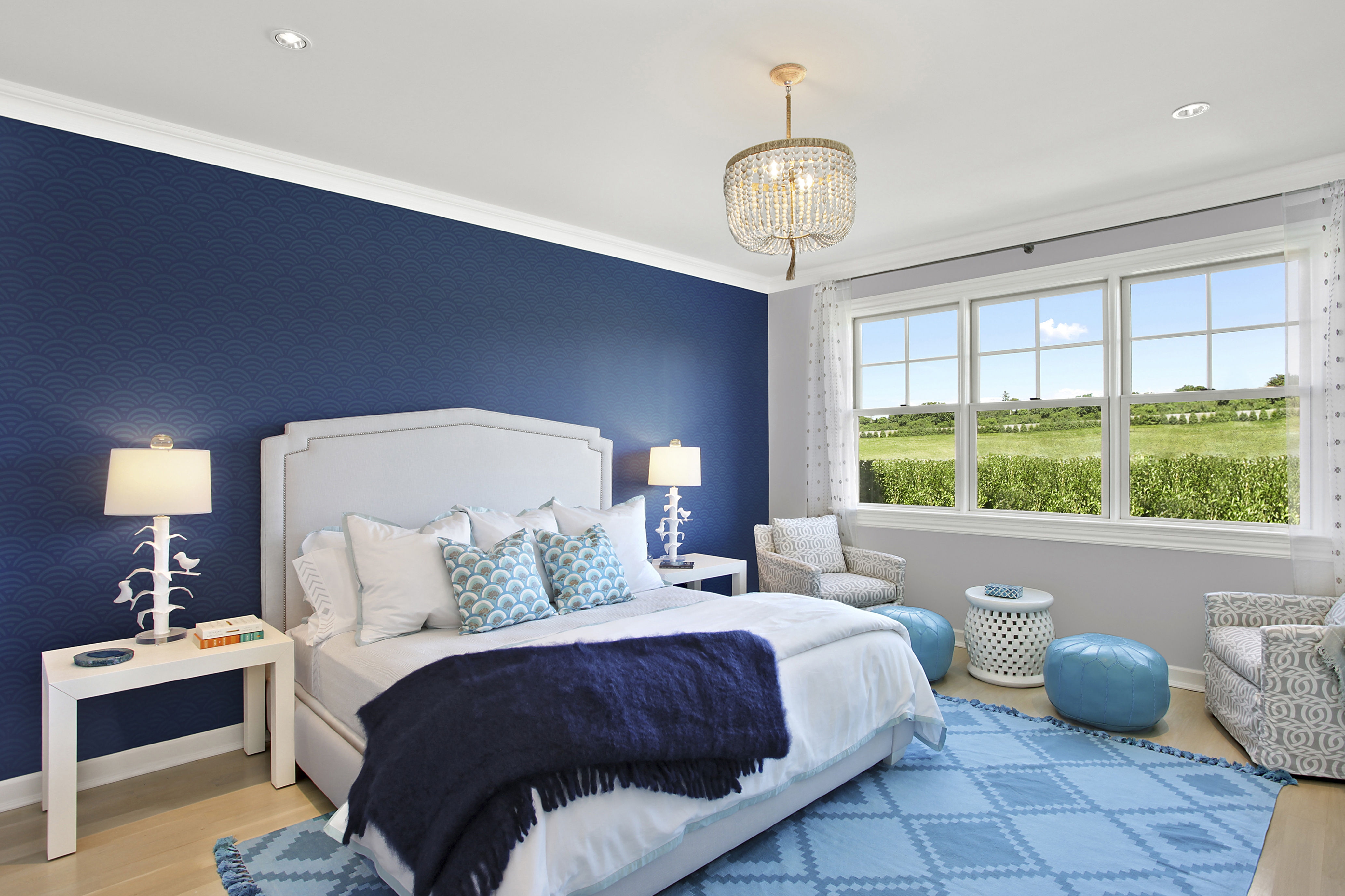
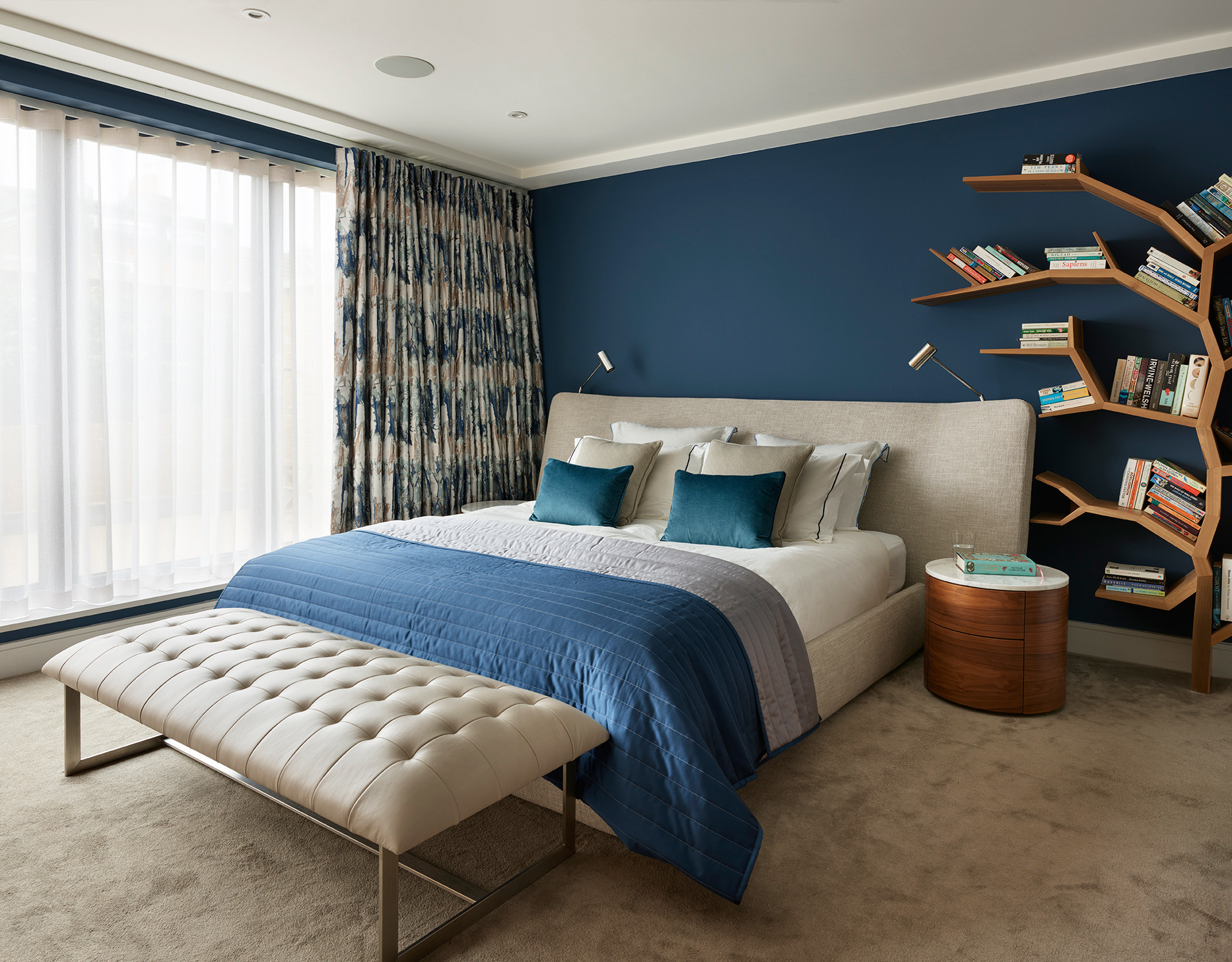
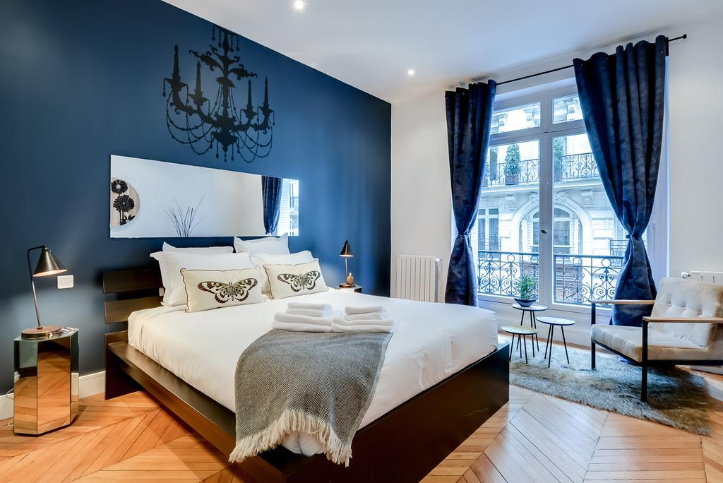
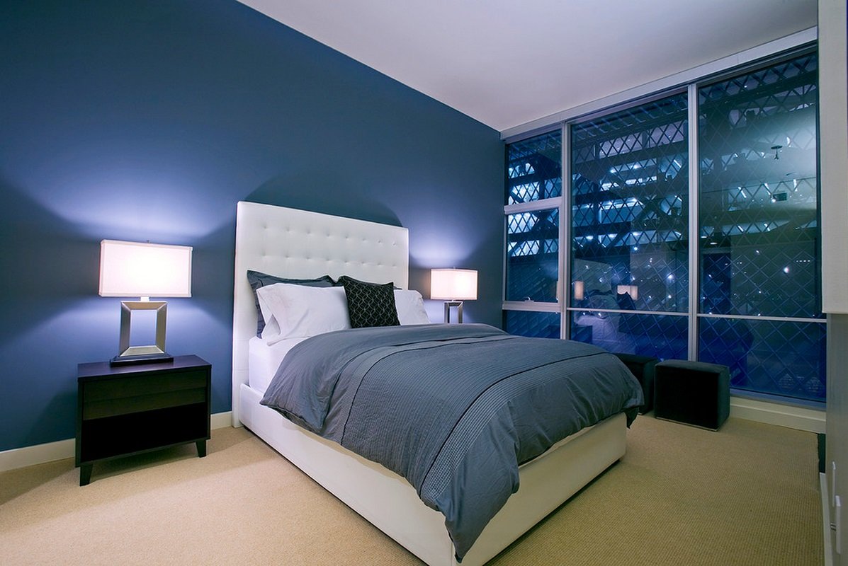
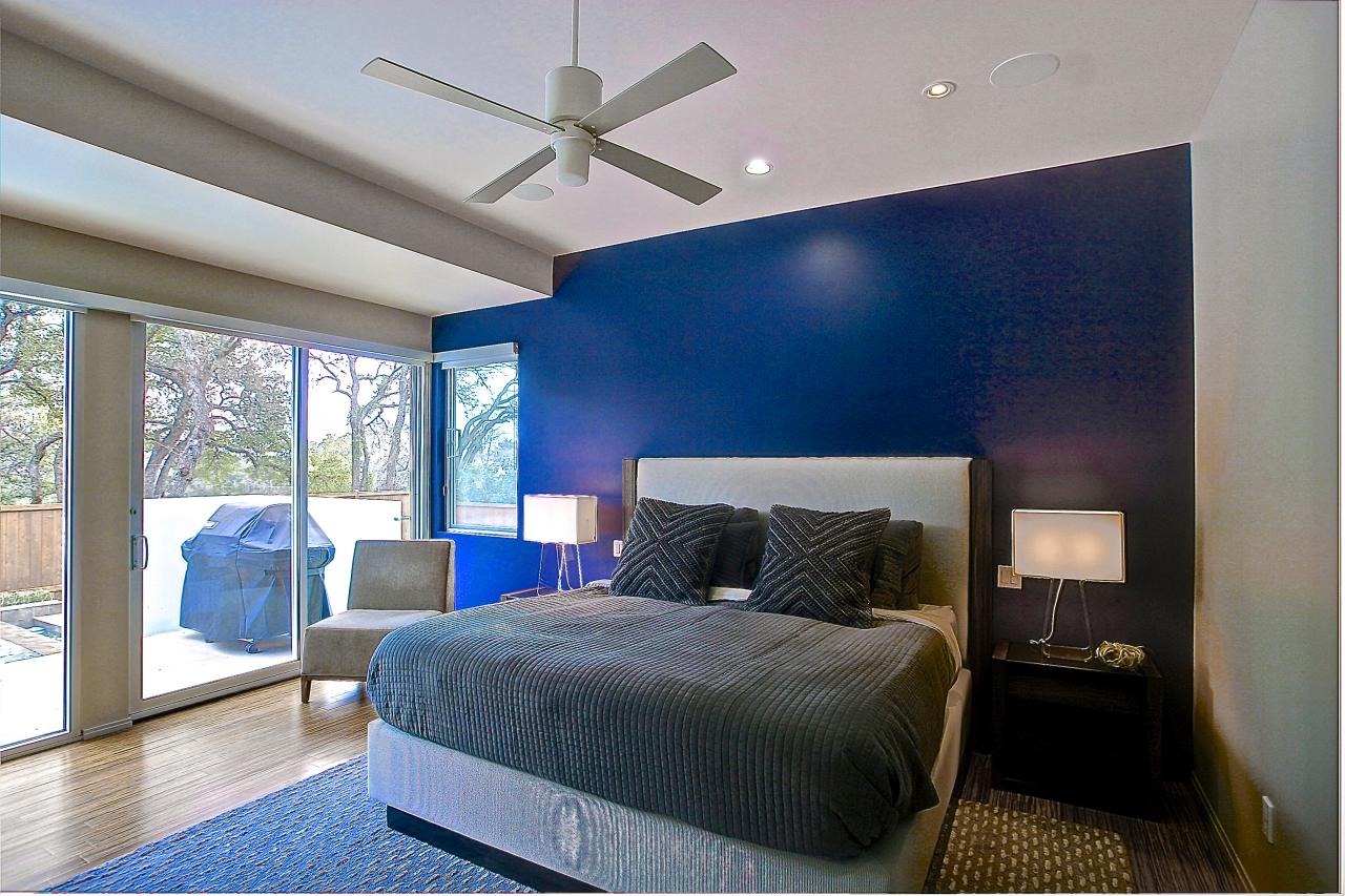
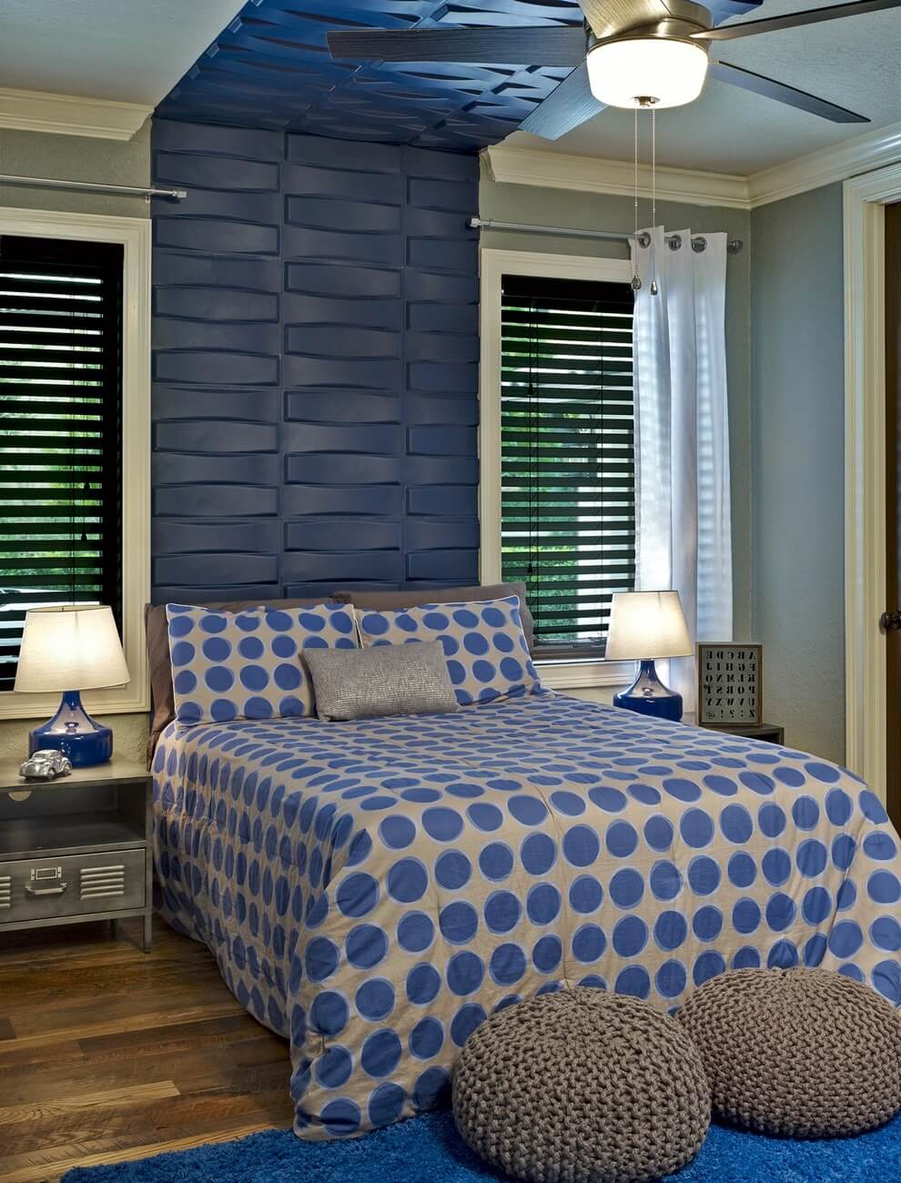
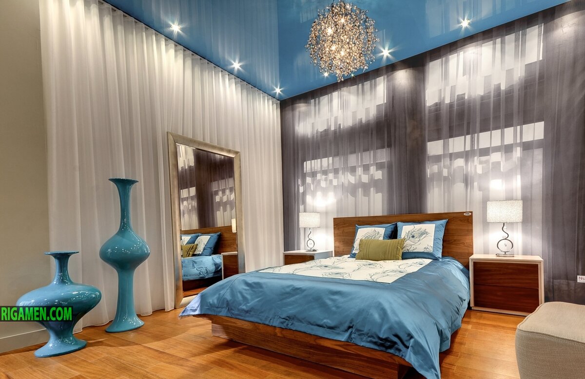
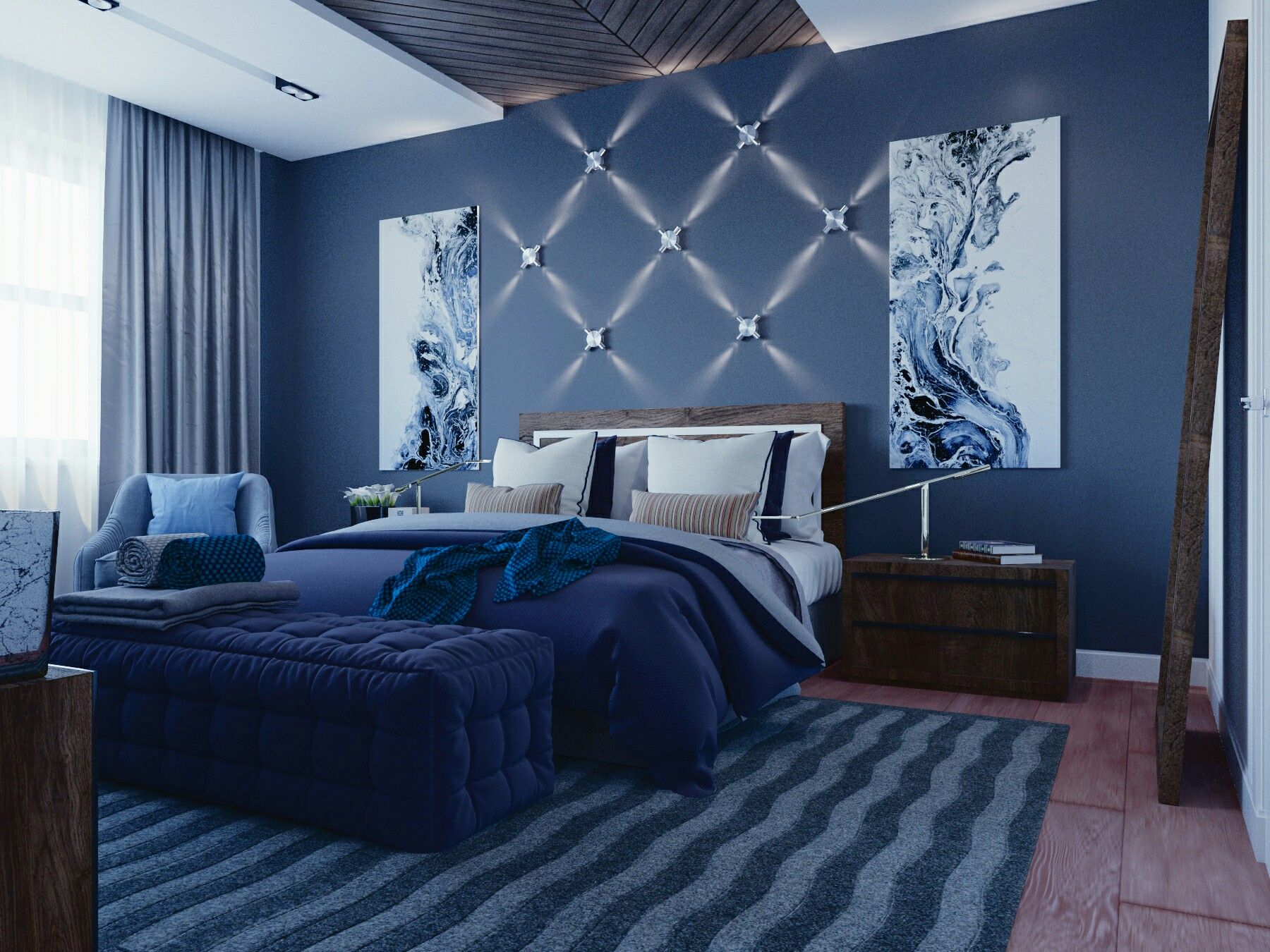
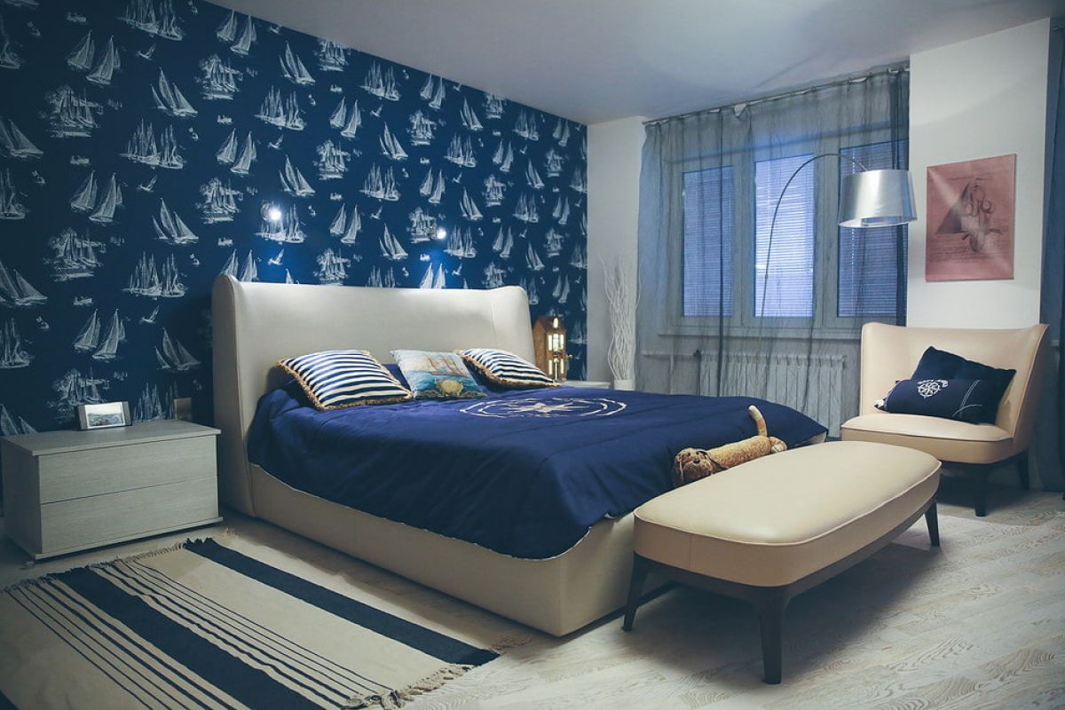
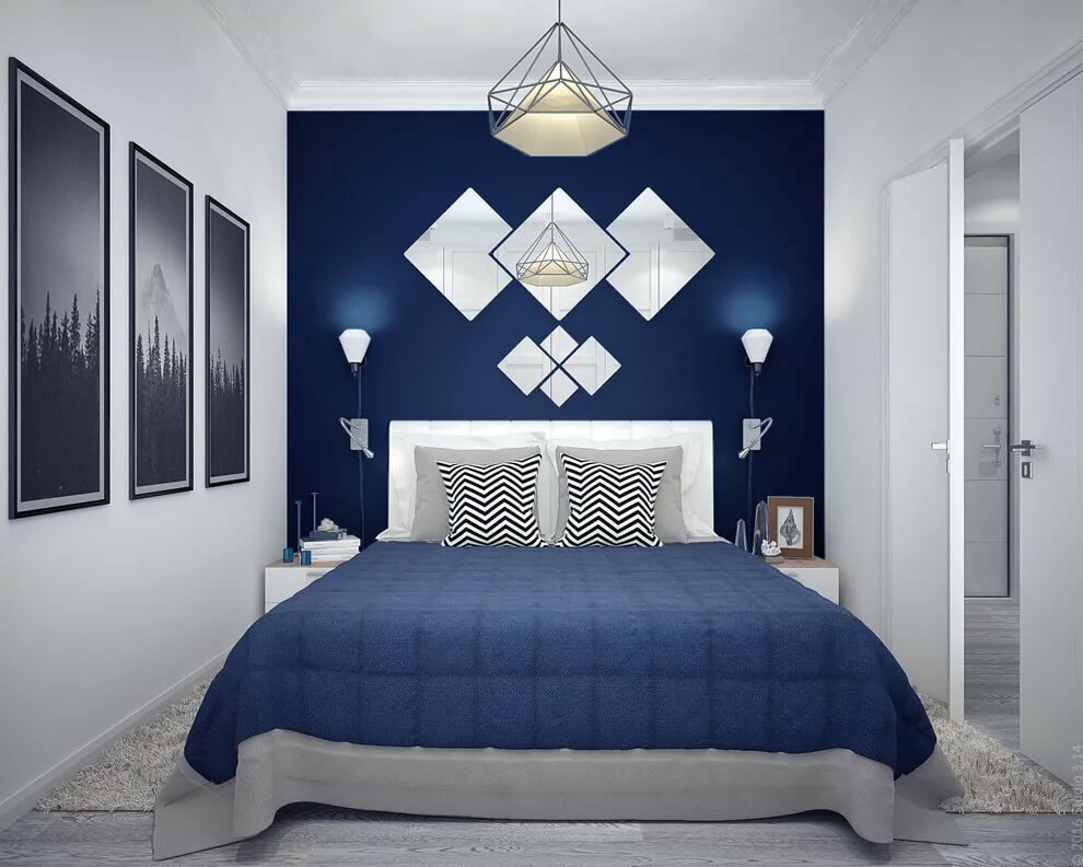
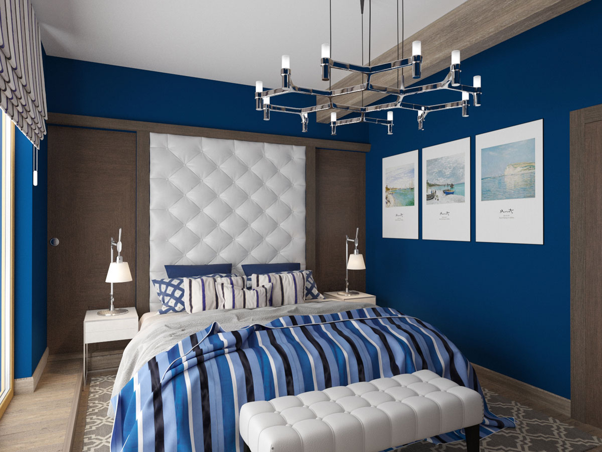
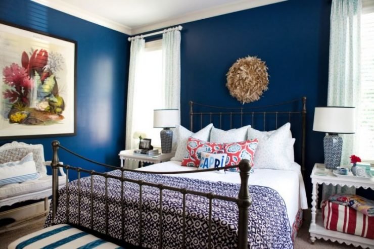
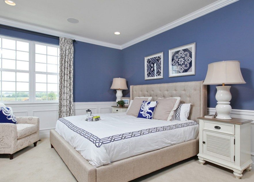
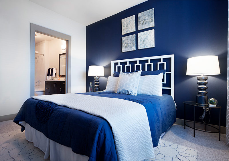
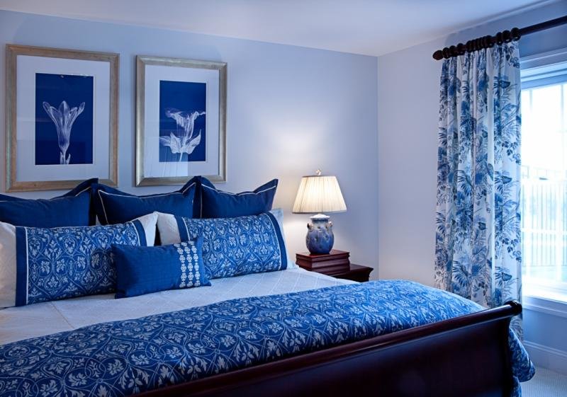
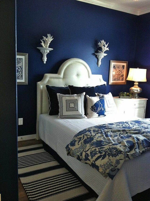
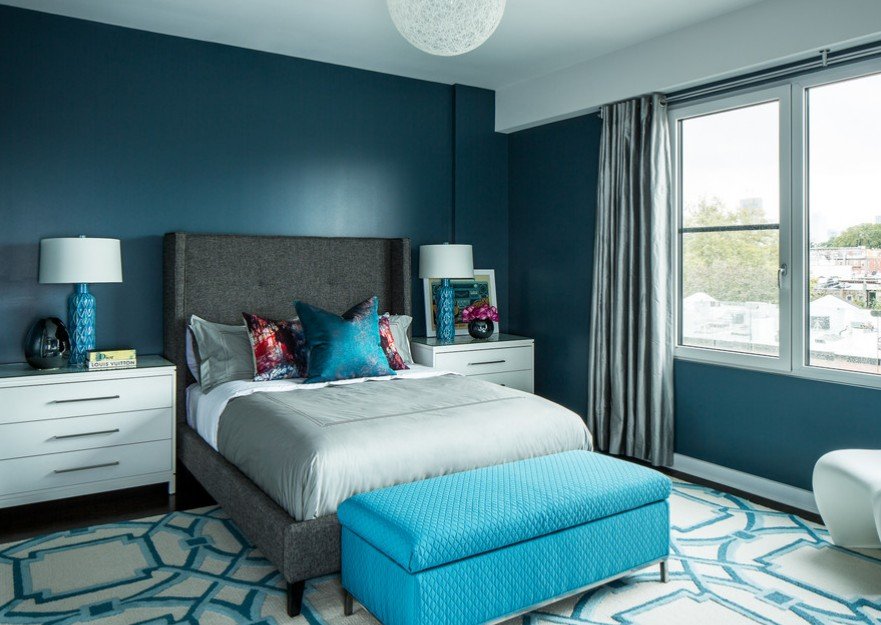
Bedroom
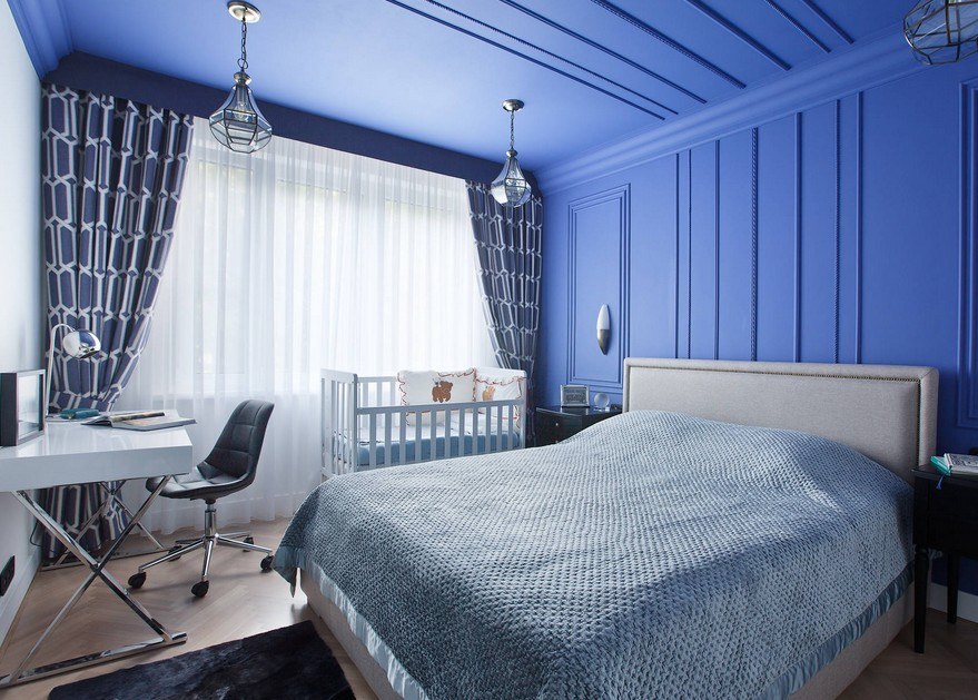
The blue bedroom is a pretty daring decision. Intense color will add style and luxury effect. It is best to use dark blue only for some part of the room. For example, a blue ceiling or wallpaper with a blue pattern. Pale blue can be given more space in the bedroom.
Bedroom with turquoise and coffee shade
Bathroom
The best use of blue is for an apartment or house. Combining it with the dazzling whiteness of the bathroom fixtures would be a win-win. Moreover, both deep tones and light blue ones can harmoniously fit here.
Advice! Dark blue will look rich, and light will give the atmosphere a lightness.
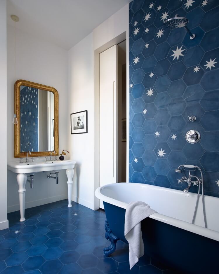
This refreshing bathroom look will look flawless.
Examples of ready-made design solutions
To get a beautiful and harmonious interior, you can use ready-made design solutions:
- Gray and white tones look good in the interior. To preserve the charm of such a room, do not use saturated elements. Abstract prints will help bring zest to the space. The smaller the room, the more white it is recommended to use. At the same time, gray should be very saturated.
- The combination of gray and yellow looks great.At the same time, very few bright details should be used. These include textile elements - curtains, bedspreads, pillows. The original solution would be to use gray-yellow patterns in the room.
- Fans of a noble color palette should give preference to a combination of beige and chocolate. Such an interior will look stylish and elegant. At the same time, it will provide warmth and comfort. This combination works well in well-lit spaces. Accents can be set with white, green, gold details. If you need to visually expand the room, you should make the beige shade dominant.
- If you want a natural interior that will have a calming effect, choose a green shade as a base. It can be complemented with yellow details and white furniture. Curtains and pillows are often decorated with floral designs. Images of leaves or grass are also suitable. One of the walls can be decorated with photo wallpapers with natural motives.
Choosing a color scheme for a bedroom is a difficult and responsible undertaking. The quality of rest and the mood of a person depends on the selected shade. To get an impeccable result, you should take into account the illumination of the interior, the size of the room, and the peculiarities of your character.
Share link:
Shades of turquoise for the bedroom, color combinations
Turquoise has many different shades - from heavenly to very dark turquoise. Almost all of them can be used for bedroom decoration and combined with warm or cold colors, depending on the selected shade of turquoise and the desired result. Intense shades of turquoise can be softened by adding soft, neutral colors. If you combine active colors with bright turquoise, the bedroom will turn out to be too colorful and you will get the opposite effect - excessive activity instead of relaxation. Therefore, you should carefully consider the choice of additional colors. In some cases, there may be several of them.
 All shades of turquoise
Turquoise can be attributed to a universal color - it is harmoniously combined with almost all colors. By the type of compatibility, several subgroups of colors can be distinguished:
- Similar - similar in spectrum. For turquoise, these are blue and green.
- Complementary - bright, active colors on the opposite side of the spectrum. Coral, peach and orange.
- Intermediate - closely spaced colors. Purple and yellow.
- Neutral or conditionally neutral are the main background for turquoise. White, brown, beige, gray, black.
When decorating a bedroom, it is important to maintain a color balance. Should not stick to a 50/50 ratio
In the event that this proportion has turned out, it makes sense to introduce an additional color or use different patterns: stripes, polka dots, floral prints, etc.
Bright shades of turquoise - electric blue, use cyan to decorate the bedroom in modern styles. Combine them with glossy materials: plastic, glass, metal parts used in art deco, modern, hi-tech styles.
 The combination of white and turquoise looks interesting due to the fact that different prints on textiles and different textures on the lampshade are used.
How do you get the color combination that suits your taste? You should focus on the end result that you want to get. The table below will help you decide on the selection of a partner color when decorating a bedroom.
Harmonious combination of purple with other colors
Violet is obtained by mixing in different proportions of red and blue. When choosing the desired shade, you should take into account its "temperature". It becomes warm if the red pigment predominates, cold - when more blue.

If you like this mysterious tone, do not rush to start repairs, it is better to first familiarize yourself with the perception properties of the purple palette.
Warm and cold shades of purple popular in bedroom interiors
Warm shades of purple:
- crimson;
- purple (red-violet);
- amethyst (with a reddish tint);
- primrose color (with a touch of indigo);
- beetroot (burgundy purple saturated);
- fuchsia (purple-red with pink tint);
- cyclamen (dark red with pink).

Studying its features, try to delve into and understand, so much it will be comfortable for you personally.
Cool shades of purple:
- eggplant (rich dark purple);
- plum (with a blue tint);
- lavender (cold saturated);
- mallow (cold light pink with blue);
- iris (dark blue with purple);
- lilac (saturated with red);
- violet (pale purple with blue);
- orchid color (pale purple with pink);
- lilac (with a blue tint);
- heliotrope (dark purple).
Floral hues soften the obvious coldness and detachment of the deep tone of the cosmic and ocean depths.
Important! When choosing the color of the building material, it is necessary to check the marking indicated on the packaging (article, series, batch, etc.). Especially carefully choose wallpaper, enamels, paints, plaster
This is due to the fact that manufacturers mix paints using different technologies and in different proportions. So, for example, wallpapers of the same company in purple, say a lilac shade, but released in different batches may differ. The problem is that this difference is often very small. You can only notice it with good lighting and a comparison of two canvases of wallpaper. That is why it is so important to check the lot and batch numbers for match.
Main color and combination options
Scientists have conducted studies that have proven the direct effect of different shades of the spectrum on our condition. In short, some of them act excitingly, others, on the contrary, calming or depressing.
Favorable colors for the bedroom
White is a pure color that speaks of safety. Symbolizes serenity, peace, freedom and concentration. Perfect as a dominant in the design of the bedroom. To avoid a feeling of emptiness or loneliness, white should be supplemented with colored spots, to create a nuanced contrast. White alone should be used only in shades and with undertones.
A room in shades of white
blue is also considered the recommended color for the bedroom. It relaxes, causes peace, extinguishes fears and self-doubt; helps to reduce pressure, muscle tone. If a person has increased excitability, this color will suit his bedroom very well. Blue is natural, which means it is suitable as the main color in a feng shui bedroom.
It will be comfortable in the green bedroom, mainly because of the natural color. Pale, bed tones will contribute to relaxation, while bright ones, on the contrary, tone up and fill with energy. Dark green gives bedroom dwellers a sense of consistency and confidence, but it should be used sparingly.
What color should the bedroom be: green is easy to perceive
A few words about other colors for the bedroom:
- Yellow - stimulating, positive, promotes concentration. As the main one, it is preferable in muted shades.
- Blue - silence, peace, tranquility. Develops intuition, clarifies thoughts. Best used as a companion.
- Gray and black - calmness, confidence and at the same time - depression, emptiness. They need one or two sufficiently bright companions to compensate for negative qualities.
- Beige is natural. Serenity, confidence, tenderness, relaxation and comfort. An excellent basic tone for the bedroom.
Best bedroom colors: Grayscale is versatile and can be combined with anything
Color combinations in the bedroom interior
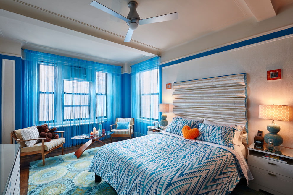
The most versatile in terms of tone compatibility are achromatic. Any option will be a win-win. Next is turquoise.Will accept even the most difficult green, red, pink, and orange combinations. Very beautiful - turquoise-chocolate, -beige, -lemon, and turquoise-burgundy room. The latter option is quite active, so it is better to add white color to the interior of the bedroom.

Room in shades of turquoise and red
Beige is almost as versatile as white, black and gray. It gives beautiful combinations with shades of brown, purple, green, pink, light blue, blue and turquoise. Green "accepts" fewer companions. Blue, yellow, light brown looks good with him; orange, ocher and violet - when the temperature of the tones coincides.

The combination of colors in the bedroom: a photo of a beige room with brown accents
Please note: bleached, pastel shades combine well with each other, even if they are difficult to combine in their pure form. An example of this is country-style interiors - in them you can find the neighborhood of red with green, pink or orange.
Bedroom in blue: the concept and choice of interior design
It has long been believed that this particular color will perfectly emphasize the strength of character and will of a person.
IMPORTANT! If the owners of the room have chosen this tone as the main one, it is recommended to use it in furniture, and leave the walls, ceiling and floor neutral, but with harmonious blue elements.
In psychology, love for blue is an indicator of dedication, self-confidence, and the presence of leadership qualities.
Today, there are many styles that use blue as the main, or complementary
Designers recommend paying attention to marine, Provence, minimalism, modern and other similar in spirit concepts. Blue walls in the bedroom or just furniture - these parameters depend on the preferences of the property owners, the parameters of the apartment (plan)
A bedroom in this color is the perfect solution for people who value relaxation and home comfort.
Shades of green for every style
Credit: @
The interior of the bedroom in green tones and the shades of the main color will be influenced by the style of room decoration you have chosen:
-
classic style prefers depth of color; -
the east loves all shades of natural stones (malachite, emerald, jade) or a protective shade; -
romantic style is the tenderness of colors; -
country style is the brightness of the color palette; -
modern style - a bedroom with a predominant gray-green tone; -
minimalism - swamp color prevails and the color of forest foliage.
Decide on the shades of the main color, based on the style of the interior. Then all the furniture and related accessories are selected.
Correctly selected textiles are just as important when decorating a restroom. Natural light plays an important role. For a room on the south side, it is recommended to use a fabric with a rich tone, dense in texture. For northern fabrics, light, delicate tones are better suited.
Pay attention to the olive color in the interior, which will give an atmosphere of tranquility - read more.
A room in a gentle olive shade. The atmosphere is conducive to relaxation
Interior in green. The combination of white with delicate green is a bedroom for newlyweds
The interior of the bedroom in green tones is an unusual solution for decorating your resting place. But by choosing the right combination of colors, you will get an original and fresh solution for the interior design of the rest room.
What rooms are they used for?
Designers use shades of blue to decorate different rooms in an apartment.
Kitchen
The façade of the kitchen unit in an unusual blue color will be a bright decoration for any kitchen.
In order for the rich blue shades not to visually reduce the room, it is important to harmoniously dilute them with light gray or beige tones.
Beautiful dark wood furniture will add extra charm to the kitchen in blue tones.
An effective solution would be to use the technique in this color.
Living room
The deep blue color in the living room interior will have a positive effect on the psyche of people who spend time in it.
Such premises will become a favorite in the apartment. A spectacular combination of blue with beige and white is used to decorate living rooms in both classic and modern styles.
Luxurious blue will help emphasize the delicate refined taste of the owners of the room.
Interior items made of wood will look spectacular in the blue living room.
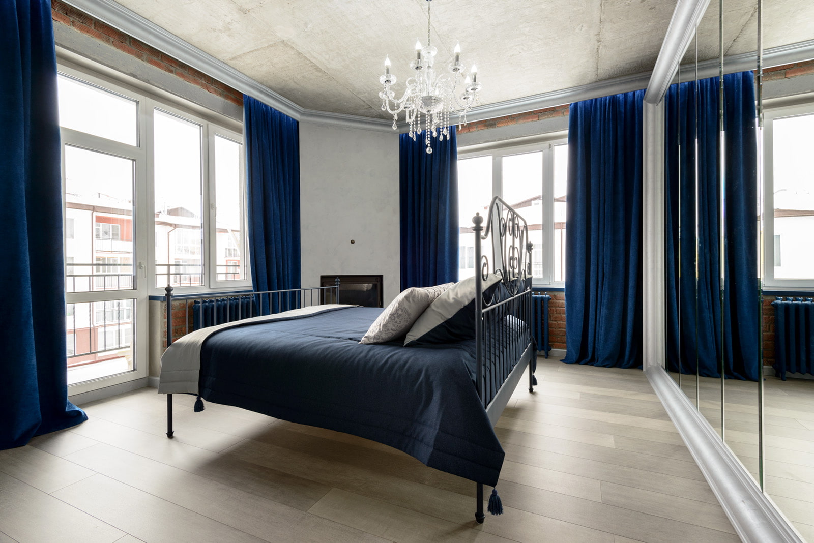
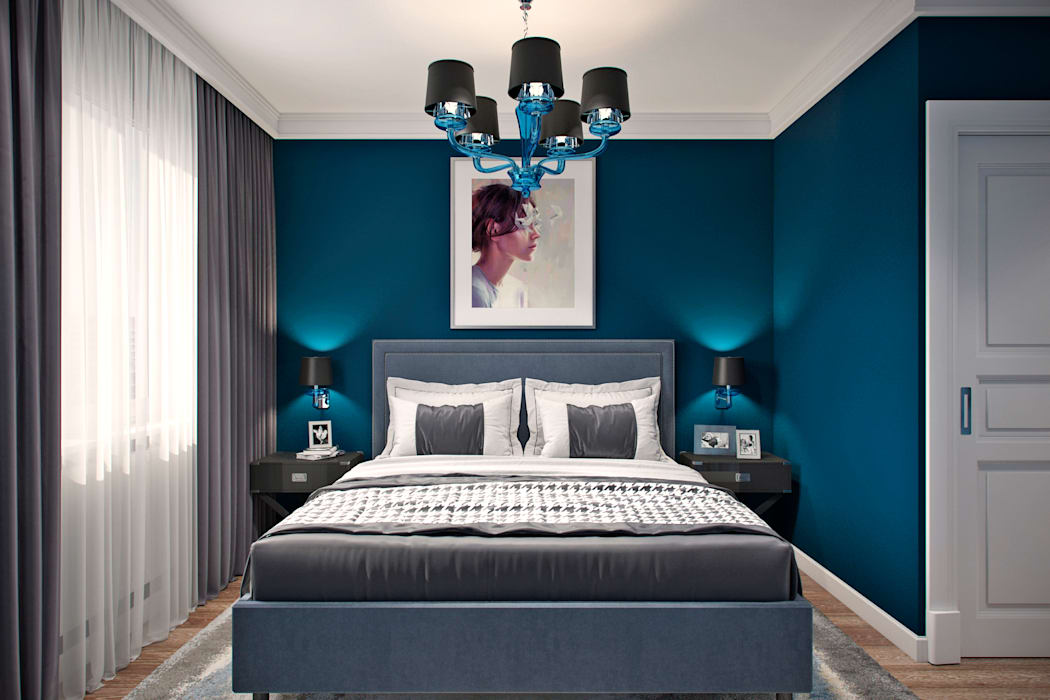
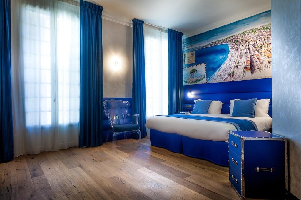
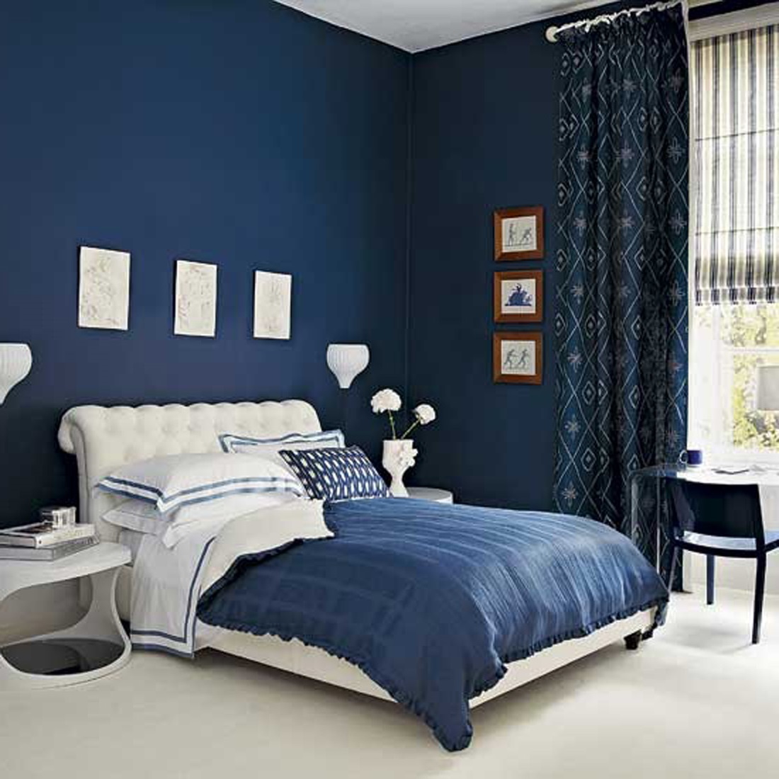
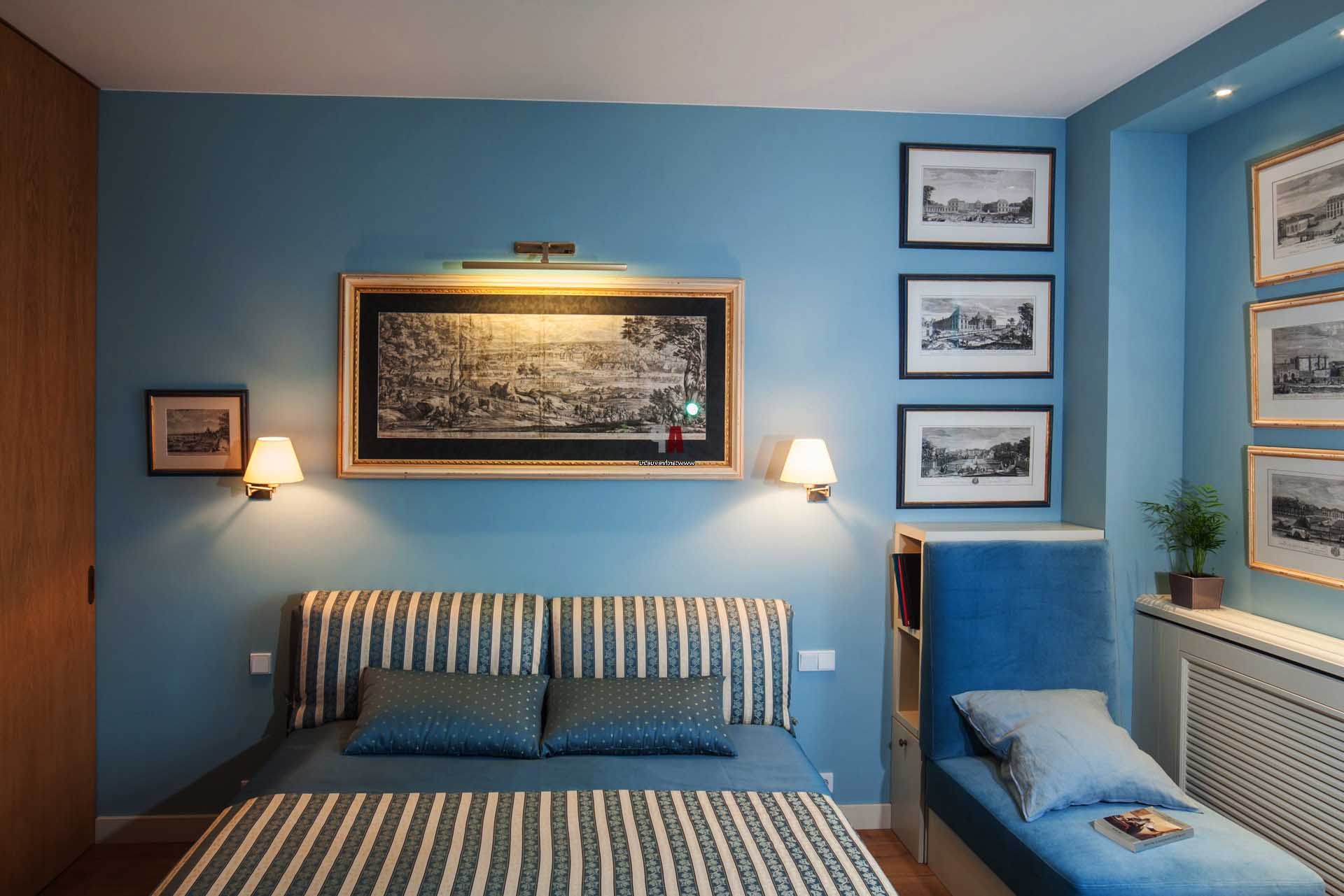
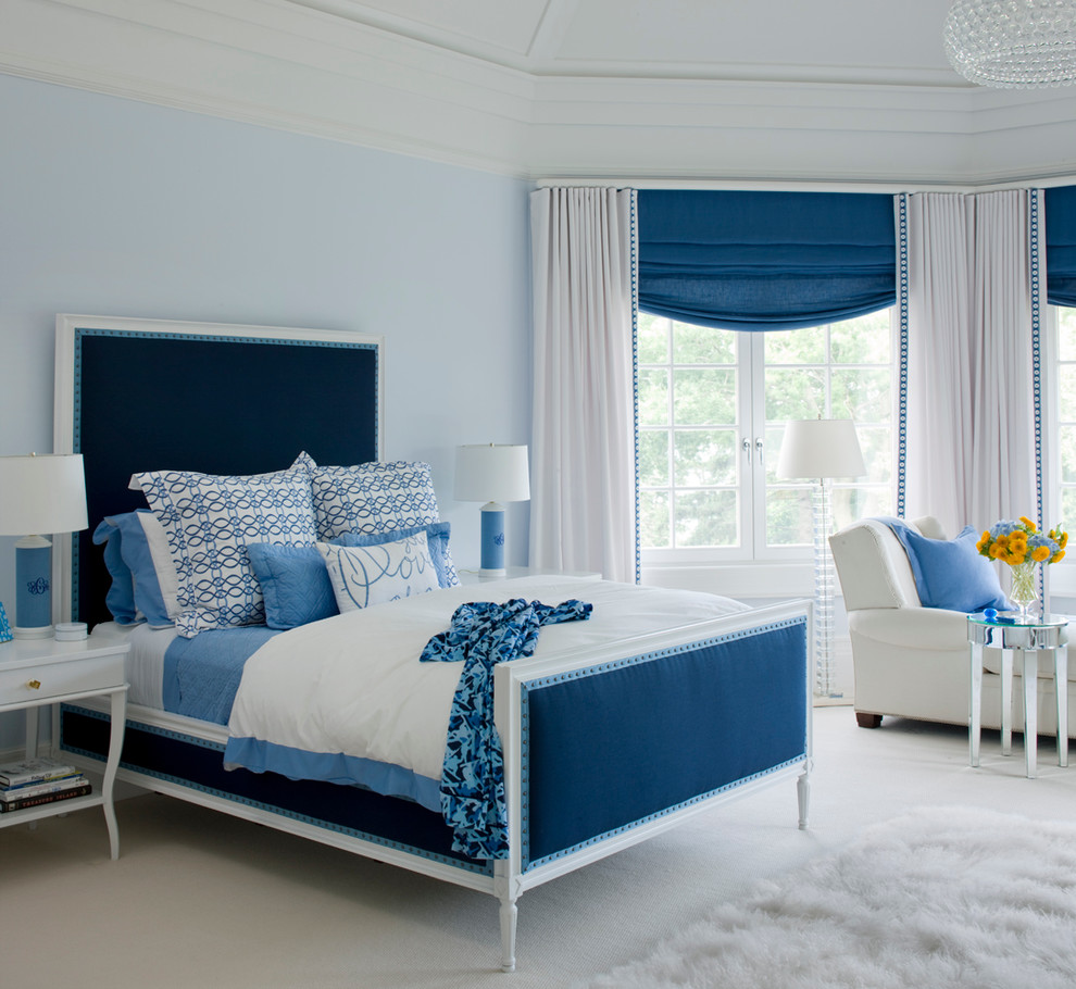
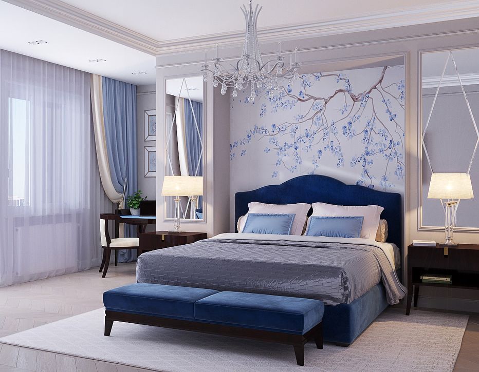
Bedroom
Warm blue shades promote good rest and healthy sleep.
If blue tones are chosen for decorating the walls in the bedroom, then it is important to remember that the color should not be too saturated.
Solid white furniture looks harmonious against the background of blue walls.
Delicate shades of blue will go well with a dark wood bed.
Beautiful picture frames matched to the tone will become a spectacular decoration of the bedroom walls.
Bathroom
When decorating a small bathroom, a rich blue tone should be used sparingly. One of the walls of the room can be laid with tiles of this color.
An unusual blue ornament on light tiles will help to visually enlarge the room.
If you need to decorate a spacious bathroom, then blue can be taken as the main tone.
Beautiful blue shades will fit well into the interior of the room, which will be regularly used for rest and relaxation.
Distinctive design features
The action of the blue color, its shades has a beneficial effect on human psychology. In a room where blue tones are used, one can feel:
- friendly atmosphere;
- how easy it is to assimilate the information received during the day;
- relieving stress, fatigue;
- that the heart is working normally without a rhythm disruption;
- lowering blood pressure.
Shades of blue create harmony in the interior and within a person. A correctly selected palette, a combination of shades is of great importance for complete relaxation, relaxation in the bedroom. Do not be afraid of the cold tone in the design of the rest room. When choosing furniture, textiles, room decor, you should boldly combine colors, emphasizing the individuality, uniqueness of the house.
Choosing a color for the bedroom according to Feng Shui
Eastern philosophy suggests choosing a color palette for the bedroom based on the location of the room.
For bedrooms in the east and southeast part of the house, all shades of green will be optimal for design, which symbolizes the connection with the energy of the tree.

Natural shades of brown and ocher tones are associated with the energy of the Earth. These colors must be implemented in the decoration of bedrooms in the southwest, northeast and rooms located in the very center of the dwelling.
The South and its symbol Fire gravitate towards all shades of red. Since scarlet and purple can be overly stimulating on a person, it is better to use these shades in dosage or opt for muted pastel shades of red.

For the northern part of the house, subordinated to the energy of Water, palettes in blue and light blue are suitable, contributing to tranquility and self-contemplation.
The bedroom in the northwest area of the apartment is influenced by Metal. Gray and white are appropriate here, harmoniously combined with the flows of strong and powerful energy.

Combinations of different colors play a huge role in the interior, because not only the general ambience of the room depends on the competent combination of shades, but also the well-being of the owners of the house and their guests. Choose a color palette for the bedroom based on your own perception, the stylistic direction of the room and its technical characteristics. So you will be able to create a cozy and comfortable room, where rest will bring maximum benefit and pleasure.