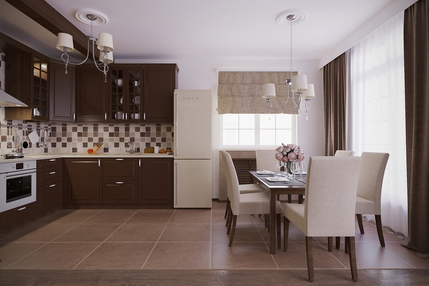
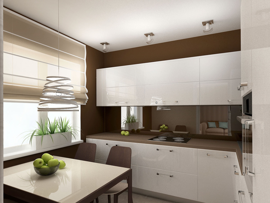
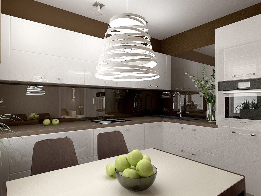
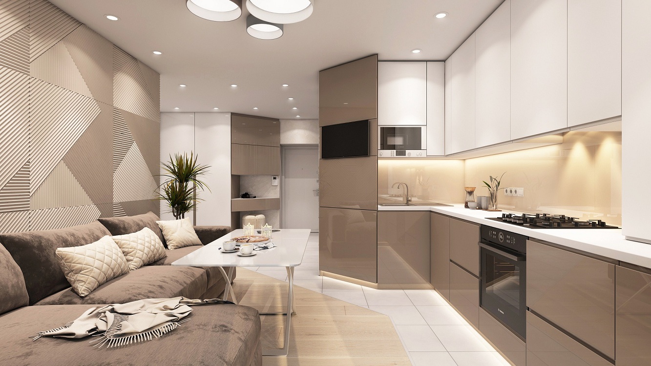
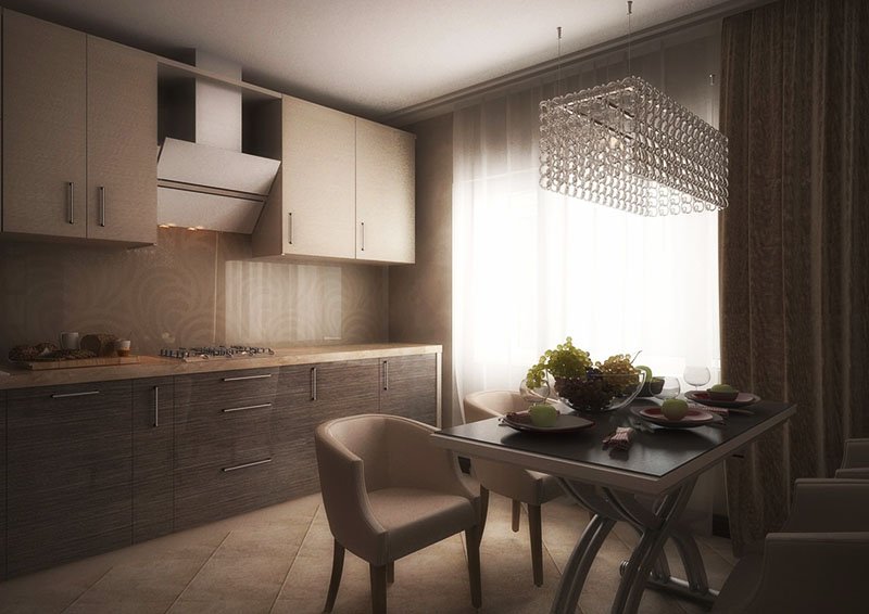
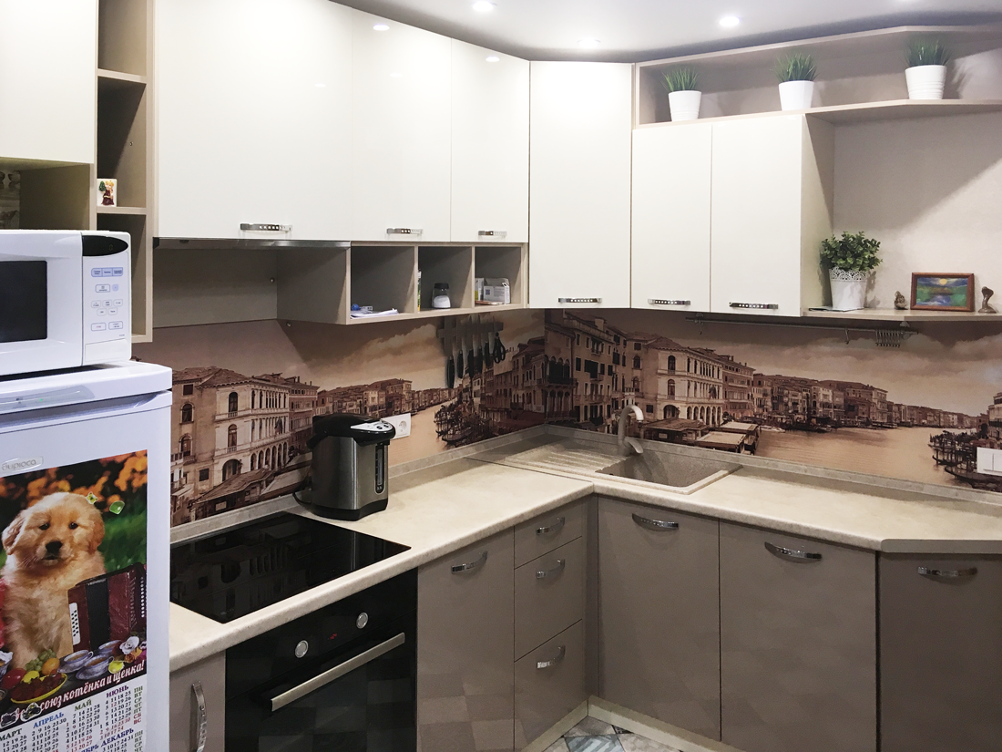
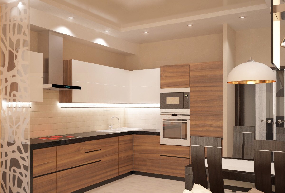
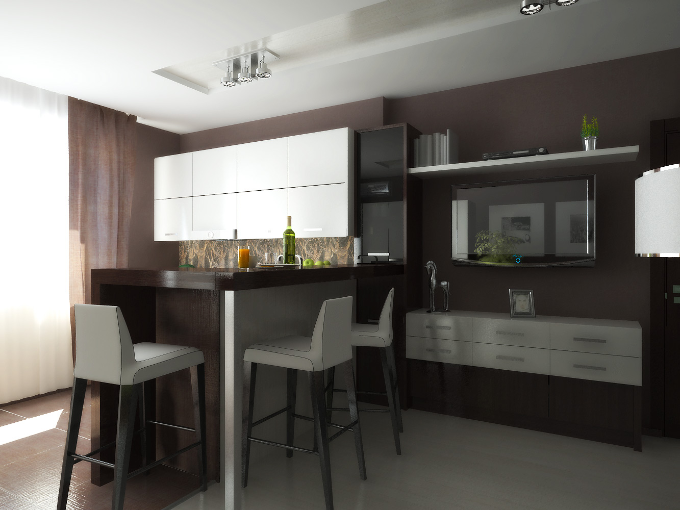
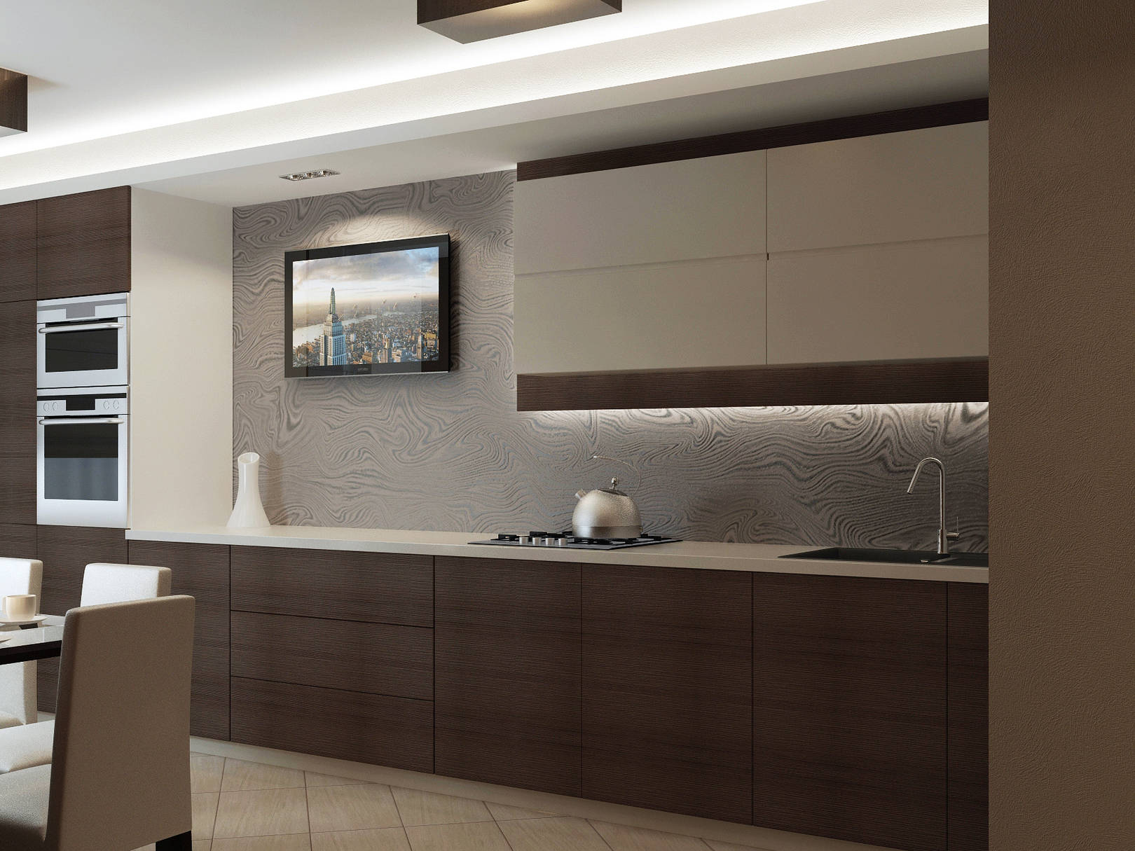
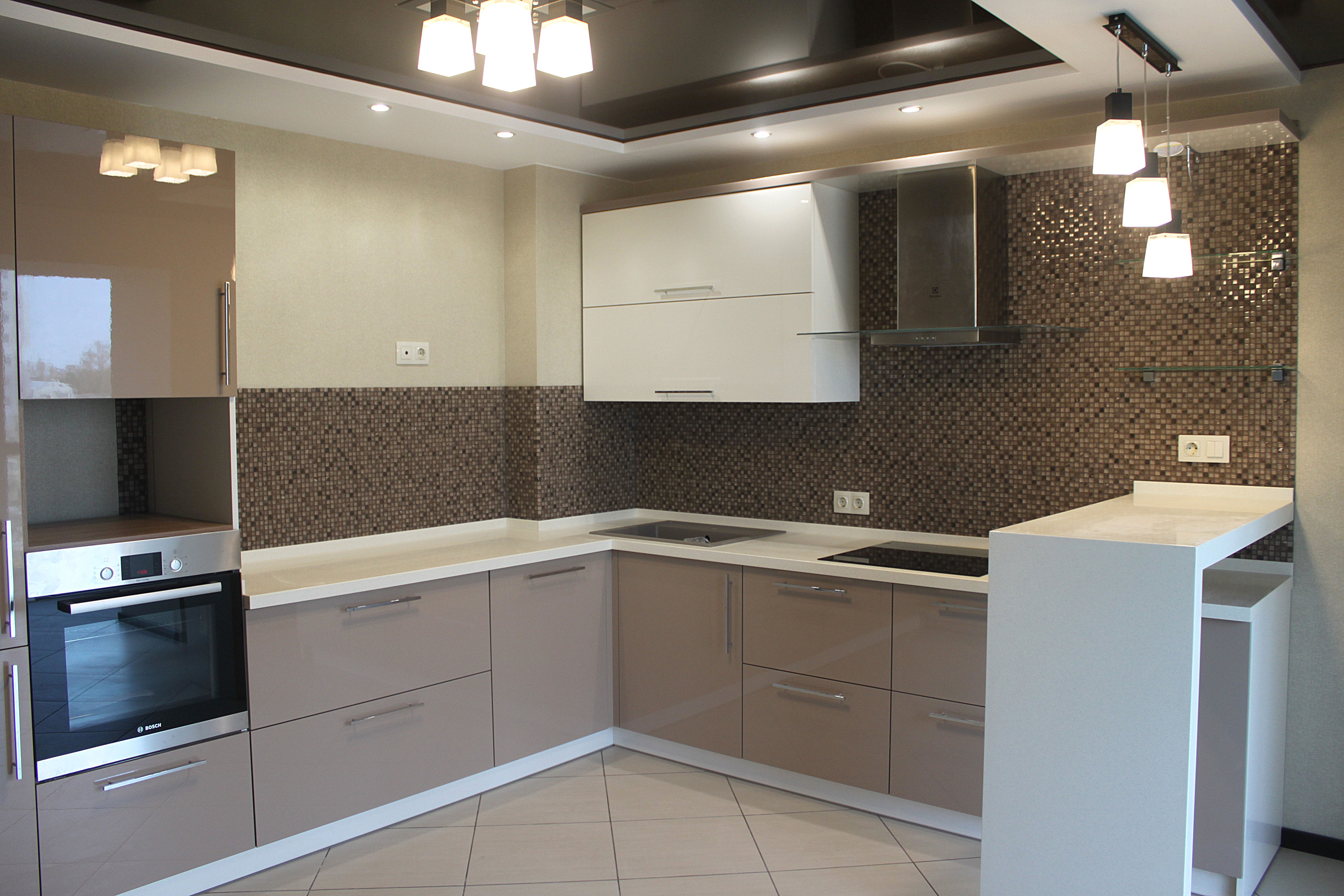
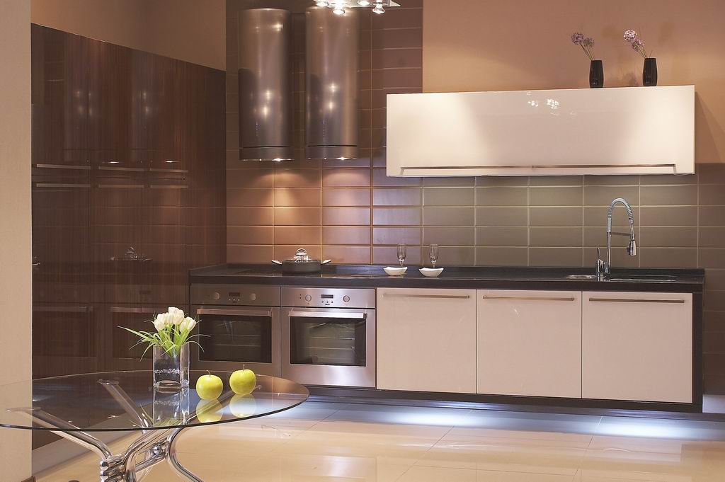
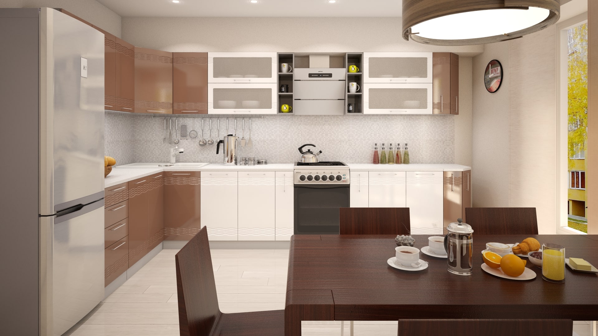
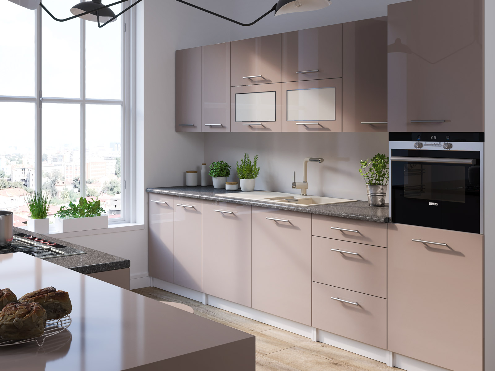
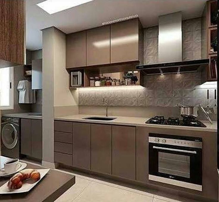
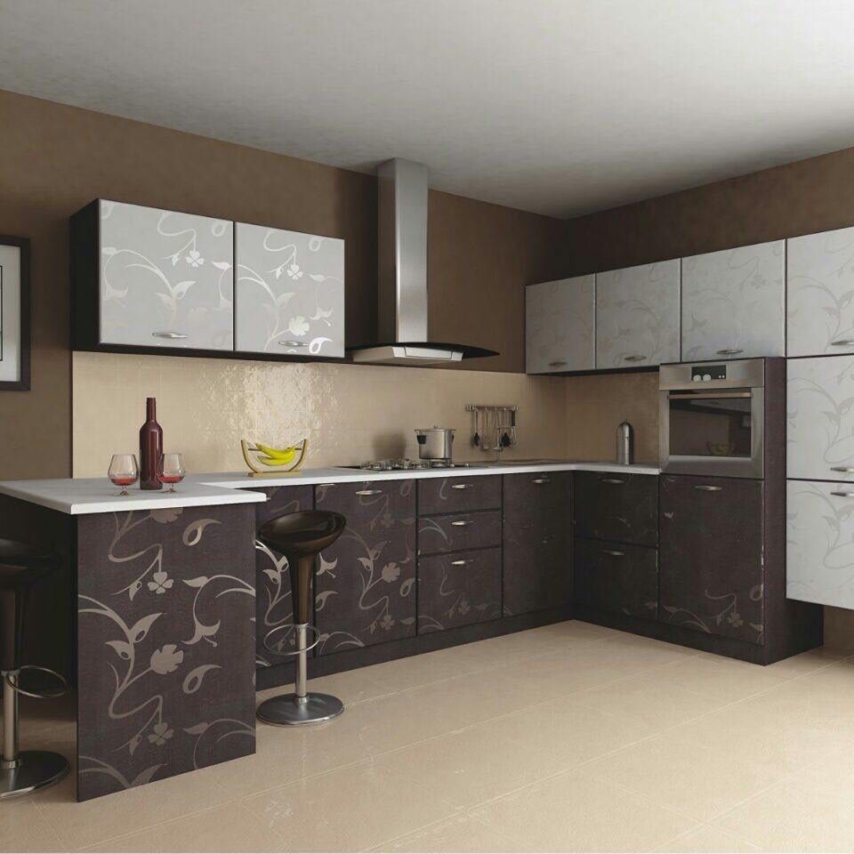
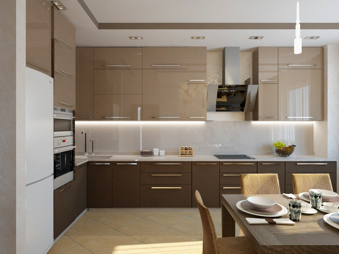
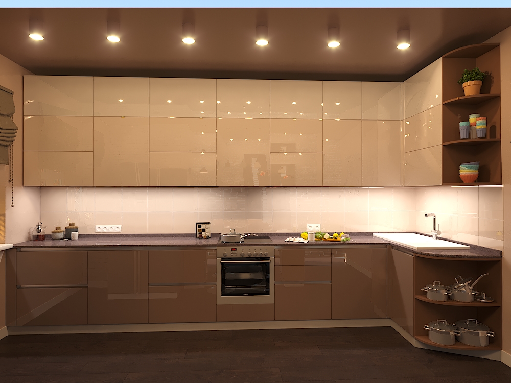
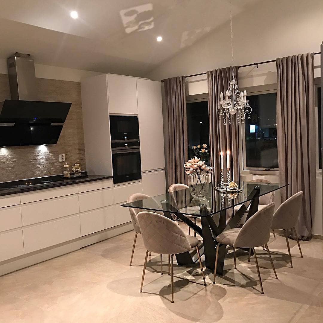
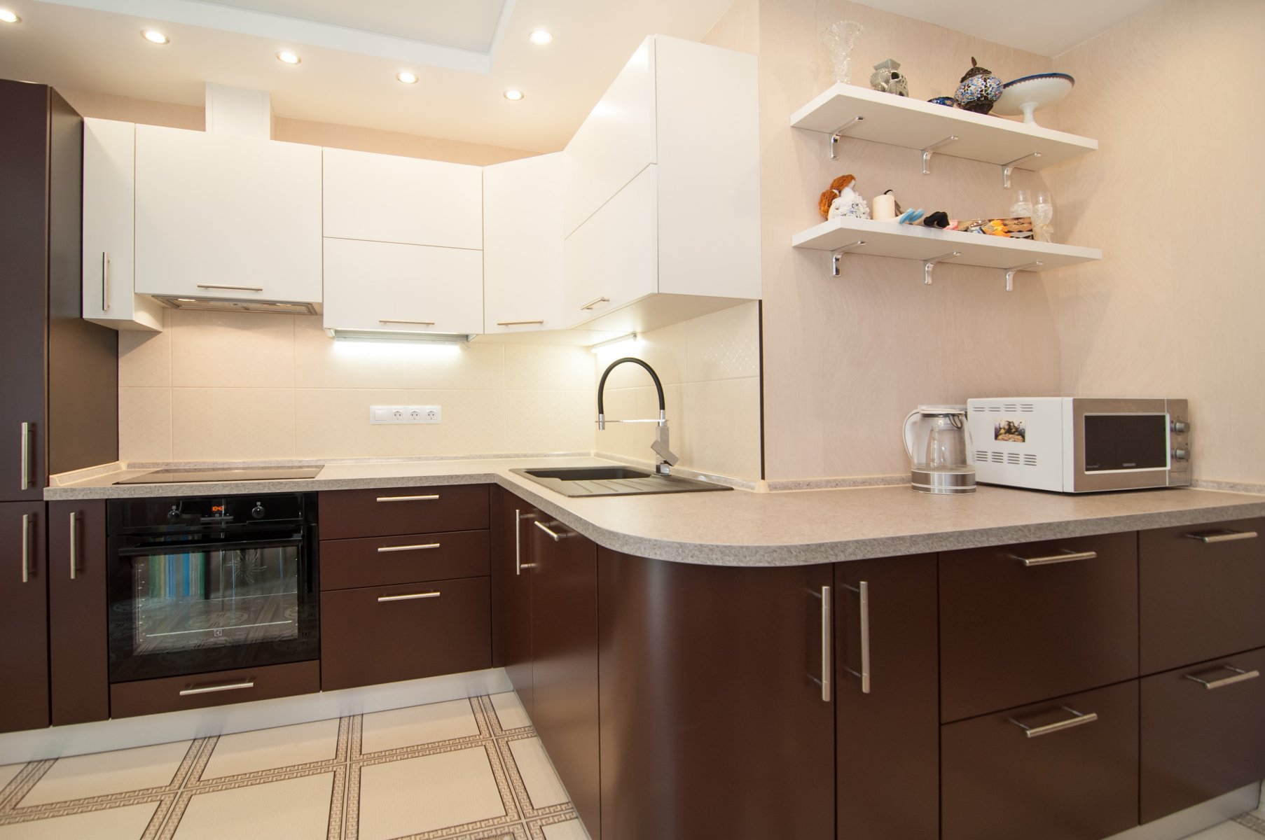
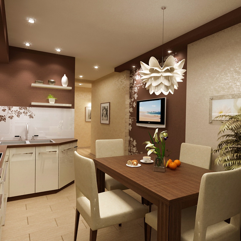
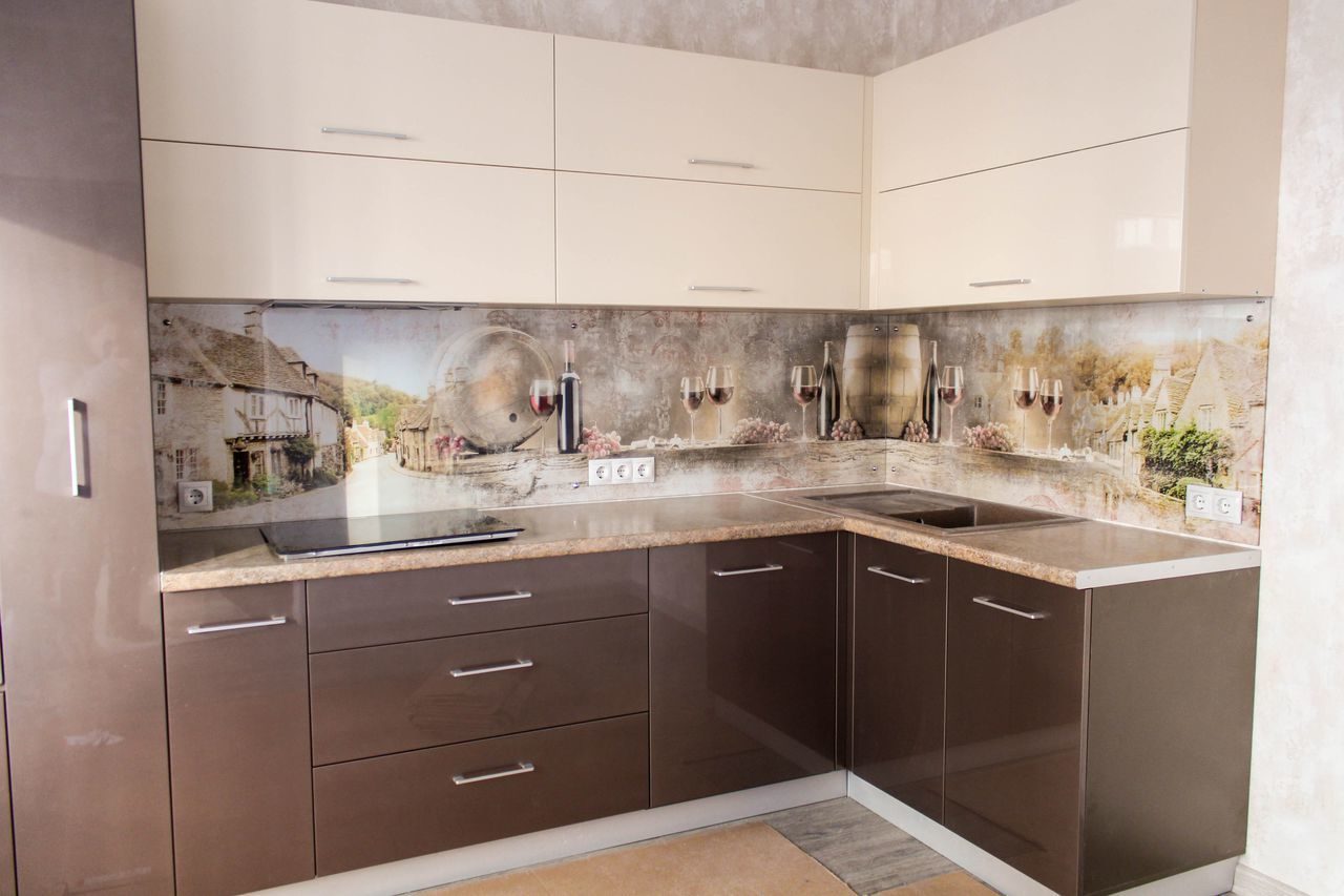
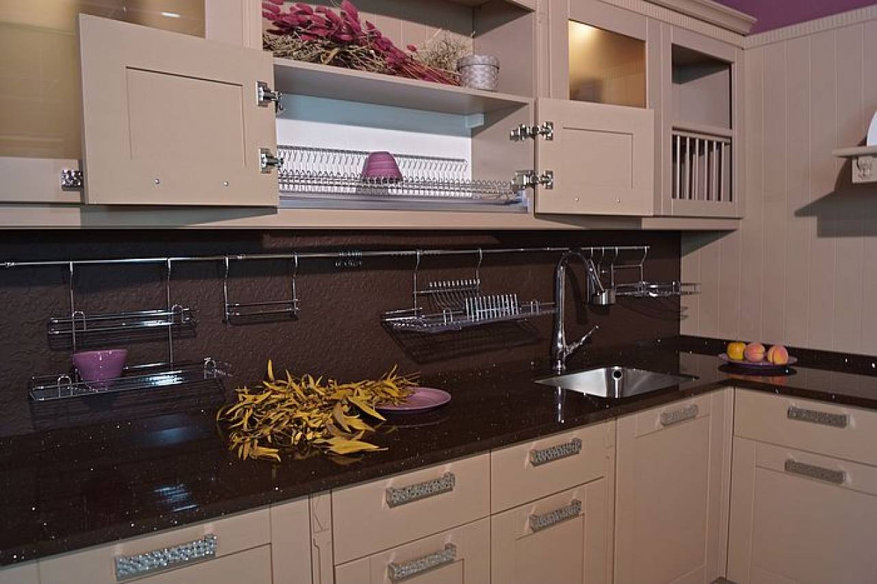
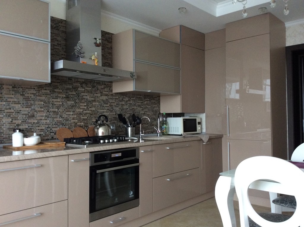
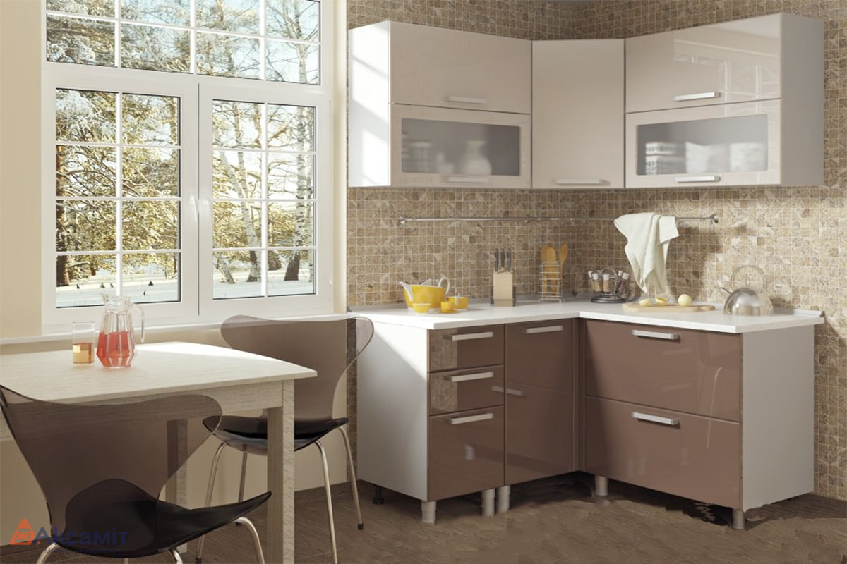
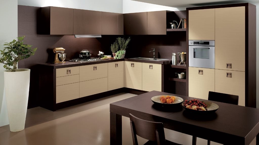
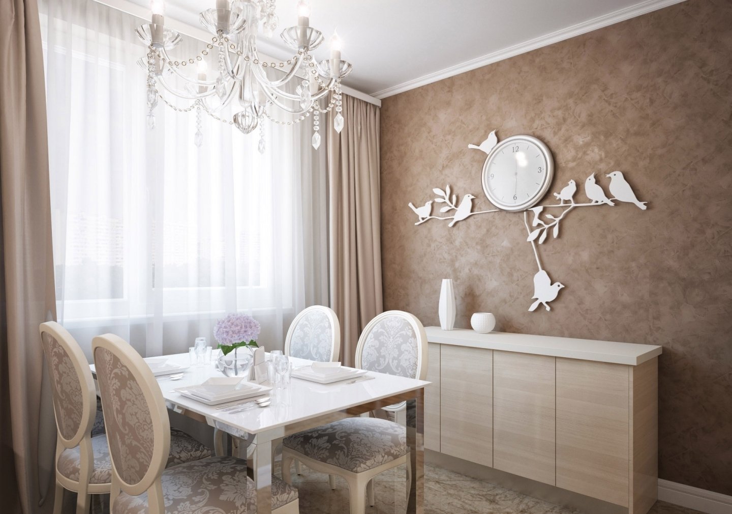
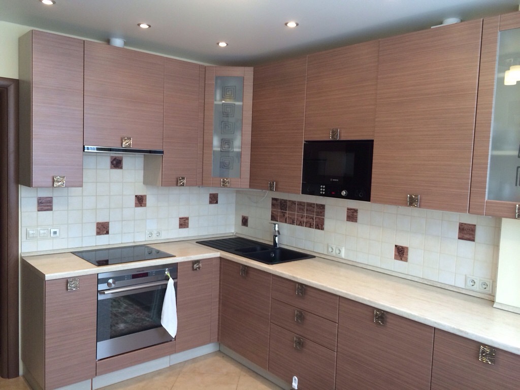
The combination of cappuccino color in the interior of the kitchen
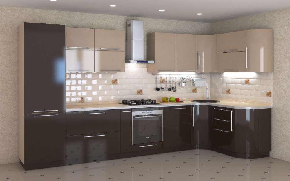
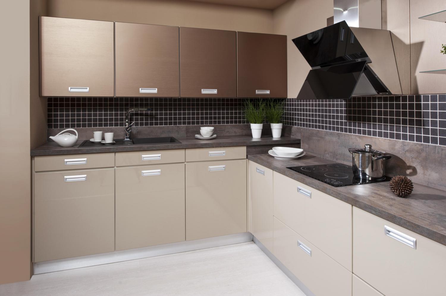
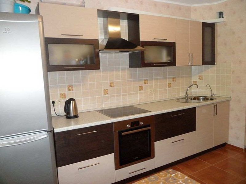
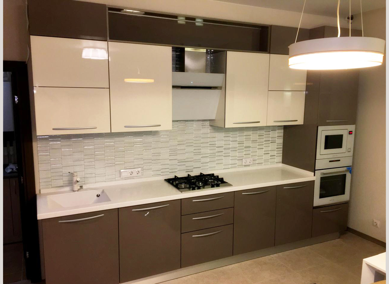
Shades of cappuccino look better in combination with other colors. The most successful of them are white, vanilla and wenge, which subtly emphasize the softness and warmth of coffee shades.
White
In combination with cappuccino, it fills the interior with freshness and light and visually expands the space. However, this color is considered quite easily soiled and designers recommend using it sparingly.


Wenge
The dark brown shade of wenge successfully complements the light coffee gamut of the interior and helps to correctly place contrasting accents without creating unnecessary variegation.

Vanilla
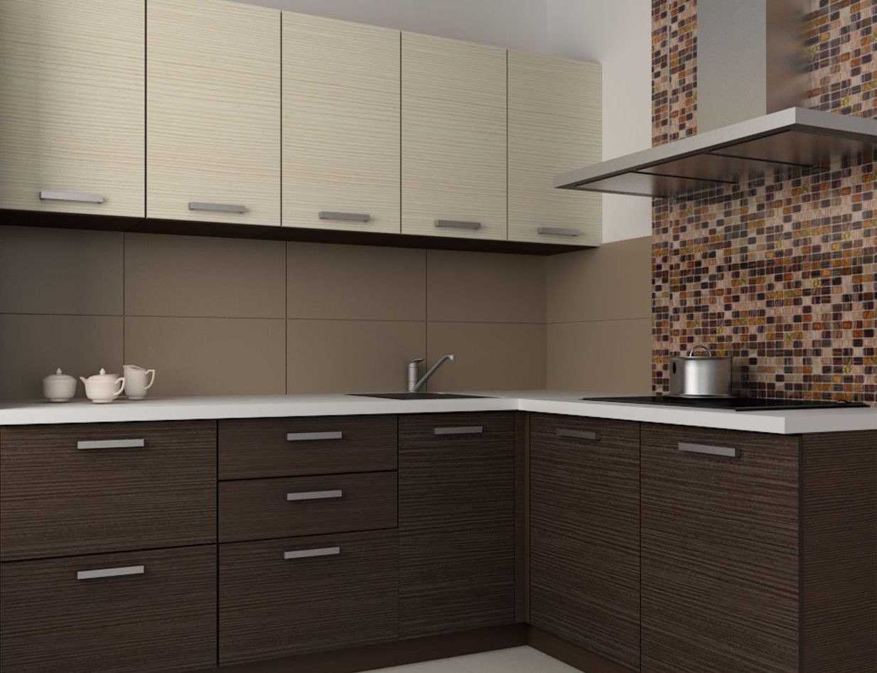
The shade of vanilla looks harmonious in combination with the color of cappuccino. It adds freshness to the interior, makes it more stylish and uplifting.
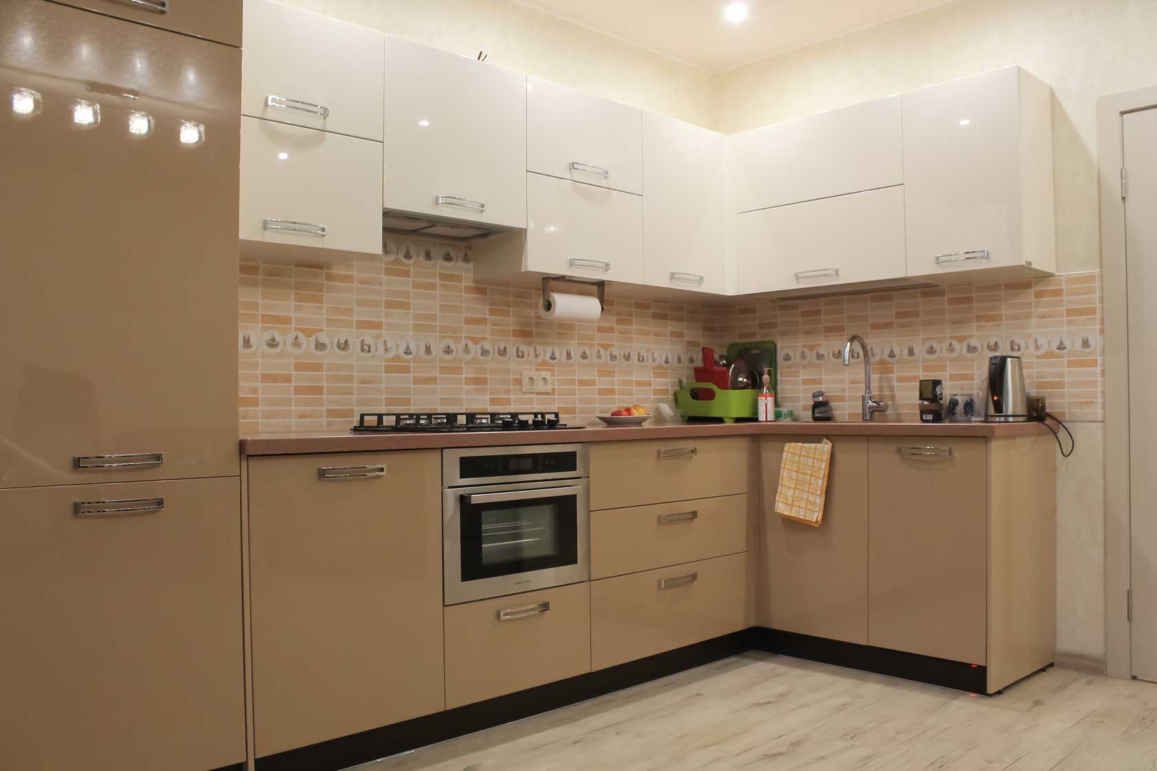
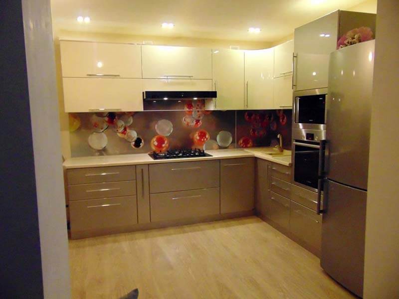


This combination is ideal for people for whom an atmosphere of harmony, calmness and pleasant relaxation is important, but who do not want their kitchen to look too monotonous or boring.
Light shades of coffee with milk are great for decorating the smallest rooms. It is recommended to complement the cappuccino color with a white or lighter shade of yellowish-brown tones, as well as use glossy surfaces when decorating the kitchen.
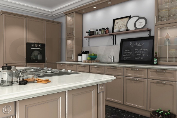
If a cappuccino-colored kitchen is designed in one of the classic directions, then for it you need to choose a set of laconic forms without an abundance of decor or too catchy fittings.
A cappuccino color that is considered neutral can vary in color temperature. Its warm shades are well suited for spacious north-facing kitchens, while cold and light shades are well suited for small, south-facing rooms.
Almost all people like coffee shades, they calm, relax and bring notes of freshness and at the same time warmth to the interior. However, in order for a cappuccino-colored kitchen to look really advantageous, designers recommend diluting this shade with other colors, for example, such as wenge, white or vanilla.
Features of the choice of interior details
In order for a headset in a shade of cocoa or coffee to become a real decoration of the interior, rich details are required. These include edging of facades, interesting prints, unusual textures
It is also worth paying attention to the details that surround the kitchen.
At the same time, it is recommended to choose the decoration for the walls very carefully, taking into account the general style of the room. For a Provence style kitchen, you should use wooden slats. Plastic analogs are also perfect. If you want to get a modern kitchen, you should decorate the wall with artificial stone or glass.
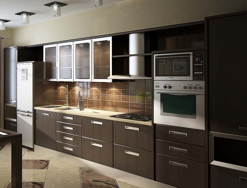
Wallpaper is considered the standard option for wall decoration. For the kitchen, you should choose practical options. It is best to use a washable cover. Do not use liquid wallpaper that swells when exposed to moisture. It is best to choose glass or paper finishes. It is also permissible to use interlining. The cladding can be plain or textured. A patterned coating will look no less successful. Don't use large prints.
A fragment of the wall is covered with a kitchen apron. Depending on the designer's idea, it can go up to the ceiling. A beautiful option in such a palette would be brickwork or a concrete ledge. A backlit glass niche looks no less good. The apron can be made of ceramic or tile. It can also be glass, metal and even mirrored. For accents, mosaics on the grid are often used.
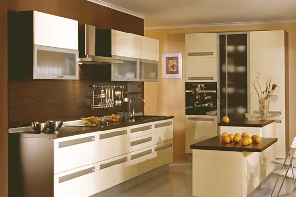
Besides, for wall decoration it is permissible to use plastic wall panels or wooden slats. They are often combined with wallpaper. In this case, the cladding is performed according to the locking technology. Such materials are chosen taking into account a specific style. This finish is considered very specific. At the same time, it visually increases the height of the walls, and therefore is very popular with manufacturers. Panels are used to highlight one wall or accentuate the entire dining area.
The choice of flooring should be treated very carefully. It must be durable and resistant to moisture
It is important that the material is durable and attractive. Depending on the style of the room, it is permissible to use stone, linoleum, laminate
Self-leveling floor or porcelain stoneware are considered no less successful options.
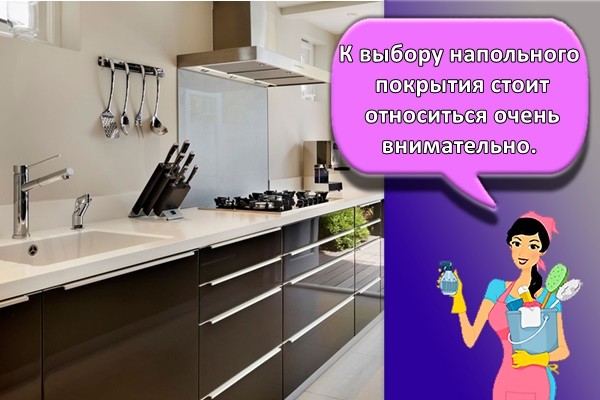
The choice of material for flooring is carried out taking into account the textures that are used for wall decoration
It is important that they look harmoniously against the general background. For zoning space, it is permissible to use 2 materials
So, the area for cooking is laid out with tiles, and the dining area is covered with linoleum. Kitchen doors vary in shape and width. They are made from different materials. Doors are made of wood or veneer. They are also made from wood-shaving raw materials. Options with glass elements look attractive. They help to visually enlarge the room.
At the same time, the inserts differ in different textures - matte, glossy, embossed. Doors can have 1-2 wings. In this case, the color of the opening should slightly differ from the shade of the floor covering. Thanks to this, the interior will not look monotonous. To make the kitchen space more interesting, it is worth using original details. These include paintings, lamps, curtains. To make the room cozy, they use all kinds of flowerpots and pots, textile napkins, tablecloths.

All these elements help to quickly transform the space. Combined with a cappuccino-colored headset, these details help to create a homely atmosphere. To create a harmonious interior, it is recommended to choose accessories in tones similar to the headset. At the same time, you should not use only the shade of cappuccino indoors - a small accent in the color of the accessory is enough. The choice of decorative elements depends on the style of the room. So, textiles and floral prints are suitable for Provence. In such an interior, chairs that are decorated with textile elements look good. Curtains with eyelets will also work.
Chrome details fit well into a modern interior. It can be the same finish of the furniture handles and the ceiling light. It is also worth using a refrigerator with a chrome surface and built-in appliances. For a loft-style kitchen, a metal apron is suitable. In such an interior, a chrome hood and exposed communications will look great.
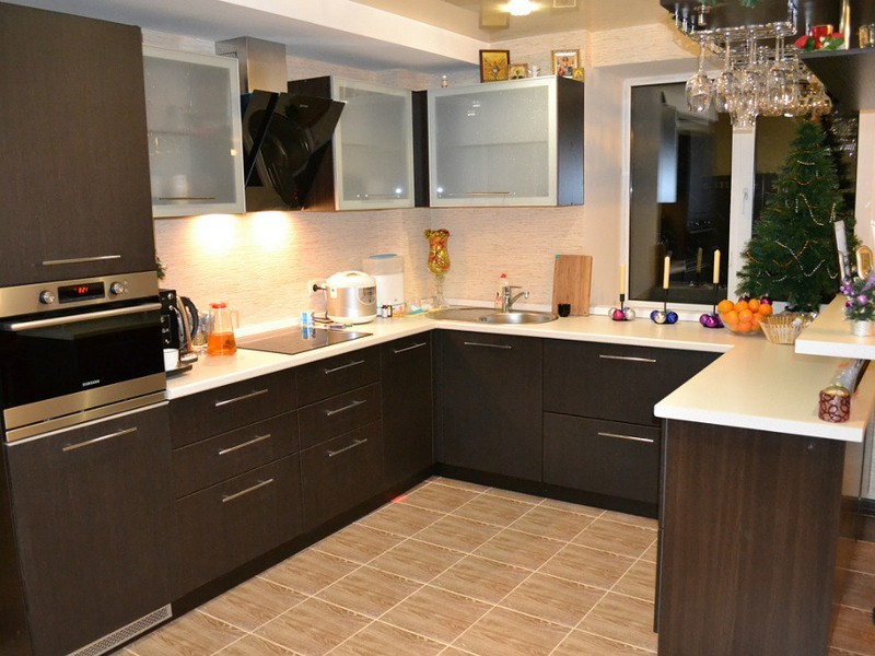
Kitchen decoration with coffee with milk: furniture and not only
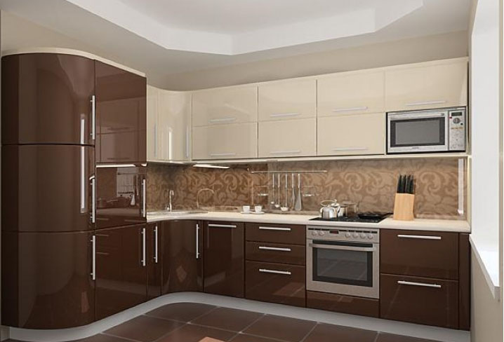
The kitchen set does not have to be completely coffee.
Furniture
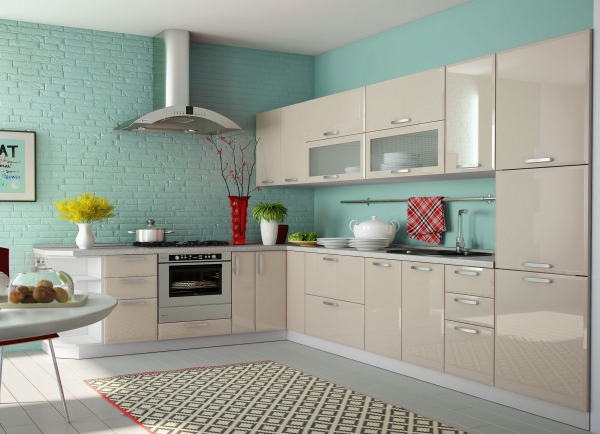
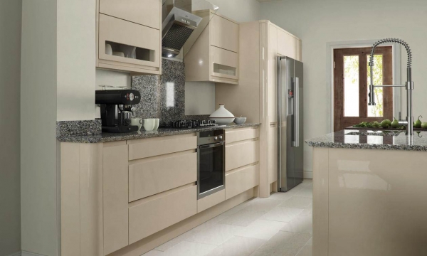
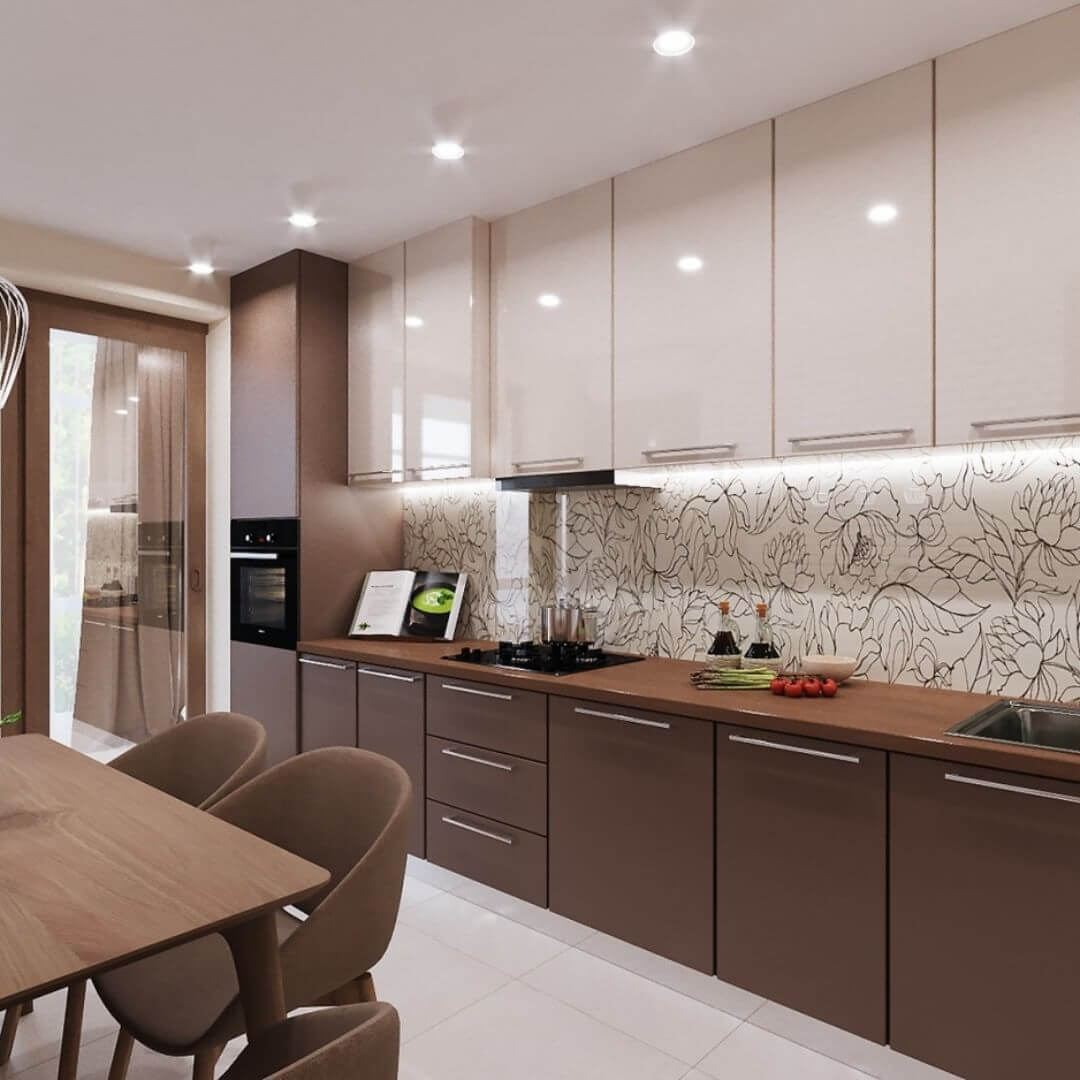
When choosing a color, a kitchen in coffee tones will be an example of the manifestation of your imagination. For example, the upper and lower tiers will look both monochromatic and have a fairly strong contrast. Hanging cabinets are usually made lighter than the pedestals. For example, the bottom will be the color of coffee, and the top will be creamy or vanilla. The coffee range embellished with gloss will look especially impressive. Thanks to the shiny surface, the interior will not only be more spacious and lighter, but also have a modern style.
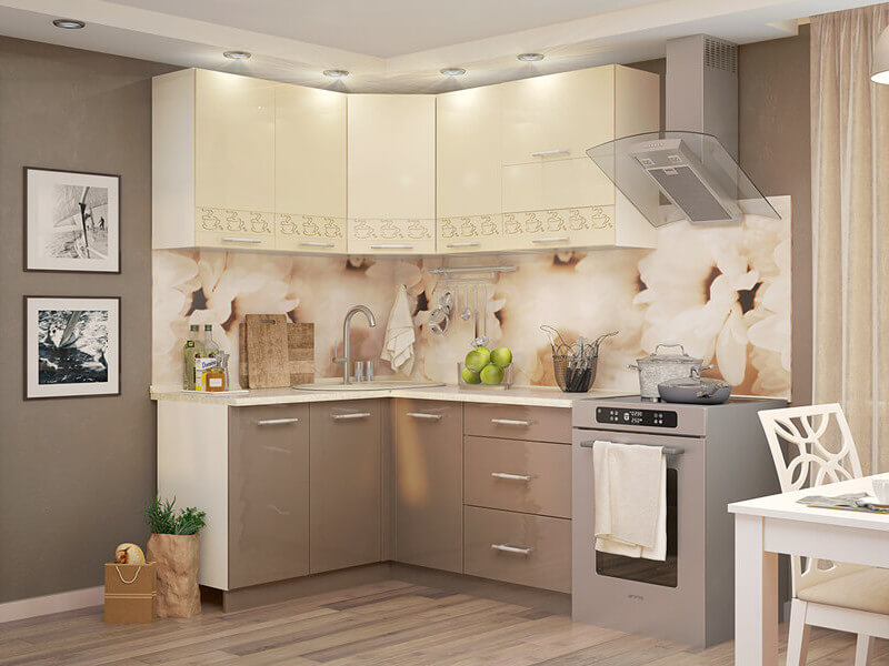
The headset can be monochromatic or contrasting
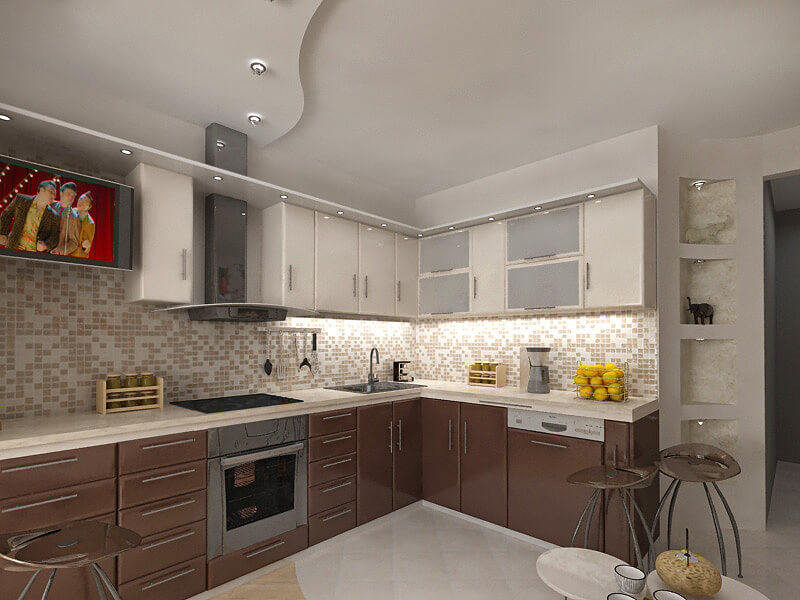
A contrasting combination of light cappuccino with darker tones of a brown palette always looks impressive
Decor
Real coffee is quite suitable for decorating the kitchen.With the help of whole grains, you can make panels, add them to ceramic dishes, or simply pour in a transparent vessel.

Coffee beans can be used to create an original composition on burlap canvas
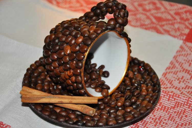
Or make a unique decor from an ordinary porcelain mug
The coffee design can be diluted with brighter and lighter details. The following elements can be used as an example:
- furniture upholstery;
- curtains;
- tablecloths;
- napkins.
- chair covers;
- live plants.
If the shades of coffee are dark, it is necessary to dilute such an interior with lighter tones, apply gloss in the decoration, and take care of beautiful lighting. Use color charts to select complementary colors.
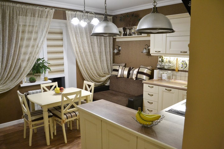
You can diversify the interior of the kitchen with the help of interesting shades of pendant lamps
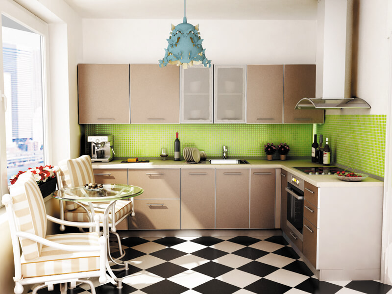
A bright light green apron will add a touch of spring freshness to the kitchen
When using a milky coffee shade in combination with gloss, do not overdo it. Over-saturation of shiny surfaces will create extra shine, but their complete absence will give the kitchen a strict look. Choosing coffee with milk will always delight you with coziness, tranquility and warmth. You will always want to be here as long as possible, thinking about pressing matters and drinking coffee with milk. Coffee with milk - this shade will always be popular. Facades decorated in this color shade will never go out of fashion, in contrast to the bright color scheme.
Cappuccino-colored cuisine: 10 interesting facts and photos
1. Cappuccino is a drink originally from Italy, consisting of espresso, milk and whipped milk foam. If before that it was difficult for you to imagine the color of cappuccino in the interior of the kitchen, now just mentally pour some milk into the coffee and sprinkle the froth with cinnamon or vanilla. Yes, it is a light brown shade with a slight yellowness or a hint of gray.
2. In fact, the cappuccino-colored kitchen, the photo of which you see below, refers to beige interiors, which automatically translates it into the category of neutral shades. They are often used in kitchen and dining room interiors. And beige and wood shades are especially famous for their ability to create coziness, comfort and that very warmth of the hearth. But with our color in the interior of the kitchen it looks even more interesting and brighter than the more phlegmatic beige.
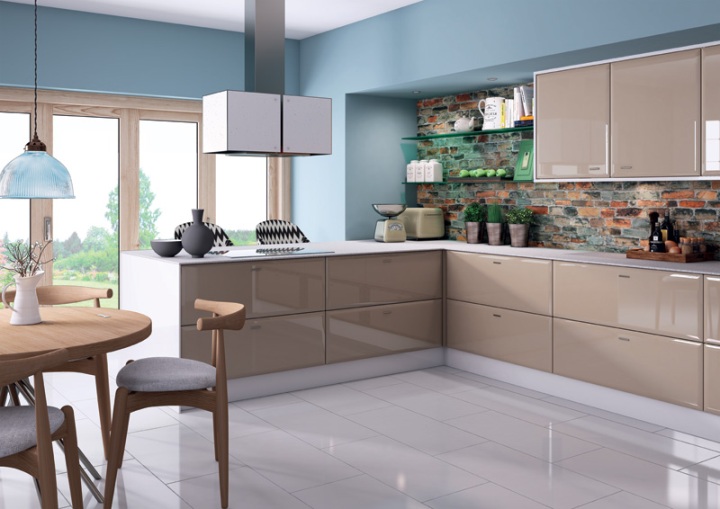
3. Capuccino cuisine is also excellent in that it is combined with various neutral and pastel shades. In this case, the interior of the room can be at least exclusively monochromatic, even with the addition of white, gray, black and dark brown. Most often, you can find a white-brown range with small splashes of silver and black. To prevent the interior from looking faded, you can add bright accents, for example, a bright red or lemon-green wall panel, a dining group or a work apron.
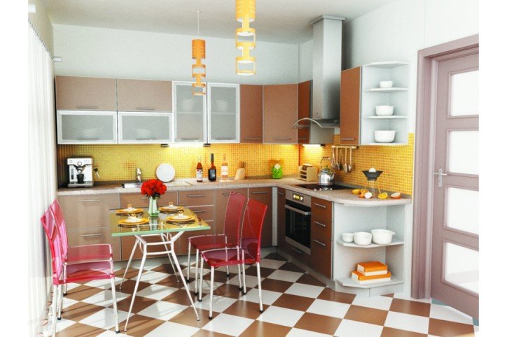
Although the color of cappuccino in the interior of the kitchen can muffle the most annoying and bright colors, it is not recommended to use it together with acid green and dark blue because of the too strong color contrast.
4. A cappuccino kitchen, glossy or matte, can be made of any materials: plastic, film MDF, painted wood, acrylic countertops and an apron. This shade will look great both against light walls and dark ones.
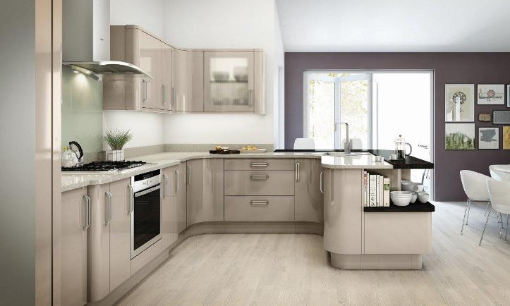
5. To make a large kitchen cozier and more elegant, you should combine the color of cappuccino in the interior of the kitchen with dark shades. But the owners of small apartments should choose a "companion" of lighter colors. At your service milk, white, creamy, golden, creamy and sandy. Using the right color scheme will result in a visually spacious and lighter kitchen.
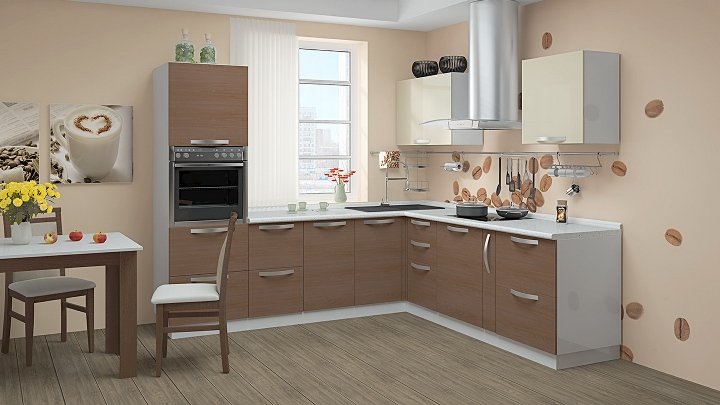
6. The color of cappuccino in the interior of the kitchen can be used anywhere: on walls, textiles, furniture upholstery, facades of kitchen sets, accessories.Any furniture in this color looks simply chic and sophisticated, be it Japanese-style rattan seats or carved baroque chairs. This color can manifest itself in zebrano stripes, geometric or floral designs. Cappuccino-colored kitchens with glossy facades, which reflect light, look especially beautiful. They can easily brighten a small kitchen.
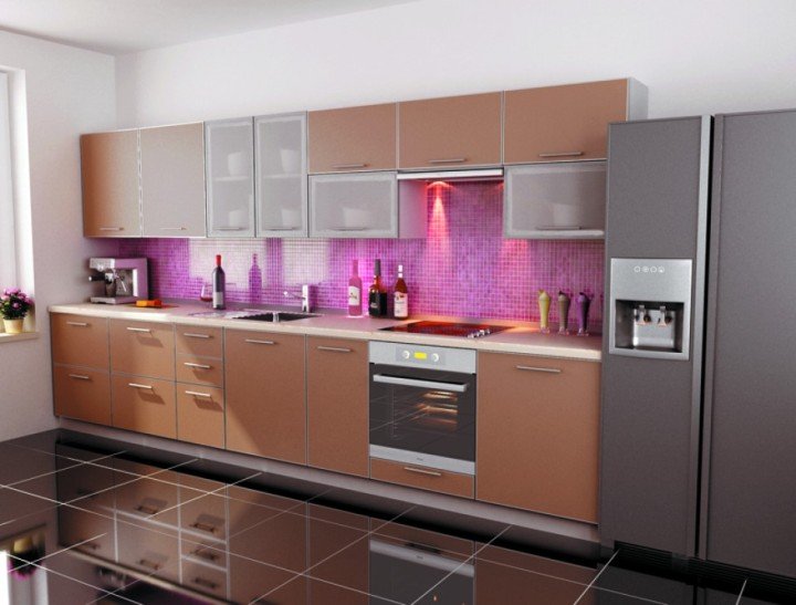
7. A cappuccino-colored kitchen suits any interior style, from classic to ethnic. You just need to choose the right material (for example, classics - wood, hi-tech - film MDF) and accessories.

8. The color of cappuccino in the interior of the kitchen allows the hostess to worry less about drops of water on the facades or a work apron, because against this background they are not very clearly visible.
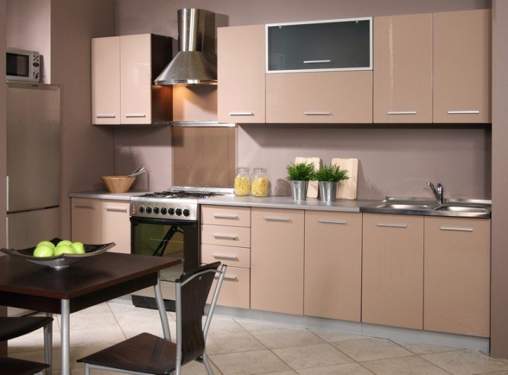
9. Coffee kitchen will cost you inexpensively. It is easy to pick up not only the style, but also the finishing materials for it, without resorting to the help of a professional designer. For example, the same milky paint for the walls, which will set off this kitchen in the shade of coffee with milk (photo below), will cost much less than a darker color scheme.
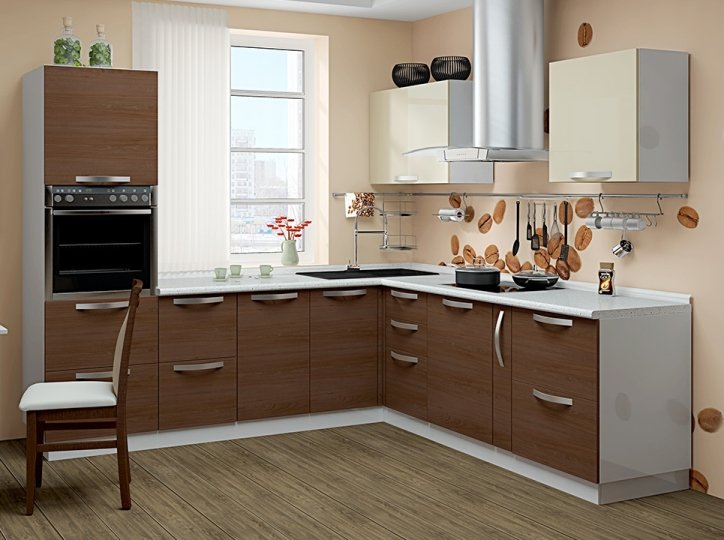
10. A cappuccino-colored kitchen is always in trend, which means that the interior of the room will remain stylish and fashionable for a long time.
It follows from this that if you are planning to make an inexpensive but high-quality renovation, then pay attention to matte or glossy cappuccino-colored kitchens. So you can create your unique, cozy, stylish, sophisticated interior of a room of eternal relaxation and good mood!
Decorating walls, floors and ceilings in chocolate colors
Not everyone can do a competent design of the entire apartment in extraordinary colors without a hint from the designer. If you follow the listed principles and examples in the photo, everything will work out. For example, if you do not make completely brown walls, but insert a panel of painted wallpaper and shade with furniture. The option with chocolate walls in the interior is suitable only for the south room, it will be dark on the north side.
Advice. Use expensive chocolate-colored wallpaper with a golden background in the interior when zoning a large room. As an option - a dark base for decorating a niche for a cabinet such as a showcase with lighting or a background for a noble tone of leather furniture.

Chocolate color in the interior

Kitchen design in chocolate color
The floors in the hall, living room with laminate or wenge-colored parquet boards look gorgeous. But do not overload the entire design with these shades. Better to shade furniture and accessories in the form of interesting contrasts with bright accents.
Multilevel ceiling will not be "overhanging" if supplemented with diode illumination. The stretched fabric should be glossy, almost mirror-like, then the "thickness of chocolate" can dilute the light reflected from the surface.
Golden Rule. The more dark in the design of the floor, walls and ceiling, the greater the need to balance the overall color of the room with light shades.
Low ceilings should not be made dark, no design techniques will "raise" them. But if you use wenge-colored decor in a classic setting, and make the ceiling light blue, you will have a visual feeling of "open sky".
The modern interior with linear contrast looks noble (skirting boards and ceiling cornices, paneling on the door, laminated PVC windows with a "dark wood" look).

Chocolate color in the interior of the room
Bedroom interior in chocolate color

Room design in chocolate color
- In the bathroom, shades of the elements of the Earth are rarely used, but in combination with gold and white, such an interior looks very elegant. Brown plumbing and expensive patterned tiles with gold on the floor or walls will add nobility.
- A dark hallway with a natural wood look is a classic, especially if you choose the right shade of the cabinet furniture facade, curtain fabrics and accessories.
- The dining room and the kitchen, decorated with tasty shades, also look very harmonious.Give preference to beautiful gilded dishes and furniture with curved graceful legs - this will add aristocracy to a balanced interior.
- A classic bedroom can have a lot of brown - walls, furniture, bedspreads and curtains. But at the same time, choose a light pink or lemon background, a white ceiling and decor with pink and lilac tones. Shiny and shimmering additions with original lighting add beauty and nobility to a modern style.
- If you decorate a room according to all the Feng Shui rules, then earth shades are practiced mainly in the eastern zone. It is believed that this will give health and solidity to the family.
Look at our photo gallery for a lot of interesting examples on the theme of home decoration with this palette.
Furniture selection rules
A very popular furniture color for today is espresso colors. There is some confusion over and over with another color called coffee, which tends to be slightly lighter and ranges from the light to dark chocolate brown family of colors.
The kitchen in this photo is decorated in espresso color.
There is no standardization of shade names in the furniture industry. Most companies create and mix their own colors, not to mention they call them themselves.
Furniture manufacturers often do this to get you to buy a matching Espresso piece of furniture. This makes competing furniture items less attractive to the consumer because they will not be the same color or in the same color family.
All furniture manufacturers try to add flavor to their models. Therefore, purchasing furniture for the kitchen for yourself, you can be sure that your interior will be original and unique.
Choose furniture that is a few shades lighter or darker than the background color, but which will still be in the milky brown palette.
A great option for the interior - furniture is a little lighter than the main tone of the walls.
Combining chocolate cuisine with other colors
Classic combinations of chocolate color suggest warm colors. Milky white, vanilla, golden tones look very harmonious with each other.

High-tech style, which involves a large number of chrome details, glass accessories and broken lines, can also be successfully combined with the color of coffee, vanilla or cocoa.

Photo by
on
Bright, rich shades are effective in interiors where dark brown is the leading one. Red, blue or mint green accessories look great against such a background and effectively complement the interior.

A chocolate-colored kitchen with elements of red blotches looks unusual and stylish. Warm shades complement each other, and the design of the kitchen becomes harmonious and effective.

Gold, silver, white and black create an atmosphere of luxury. In the design of a chocolate kitchen, they can be used both for fittings and for textiles and household items.
Find out what examples and combinations are suitable for a black and white kitchen.
Finishing options
In the interior of the kitchen in the color of coffee with milk, contrasting solutions are popular, when the furniture stands out against the background of the walls, or the upper tiers of the headset are lighter than the lower cabinets. This combination is reminiscent of coffee with a high crema. Using different combinations of finishing materials and textures, you can create an exquisite interior. How different finishes look in the design of a kitchen decorated in the color of coffee with milk can be seen in the photo below.
Walls
Since the coffee range is universal, most tones are suitable for it. Any texture can be on the surface of the walls, and the choice of patterns is almost limitless. If cappuccino is used as a background, then the furniture should be selected lighter - milk, vanilla, ivory or light beige. This combination looks light and elegant, eye-catching.
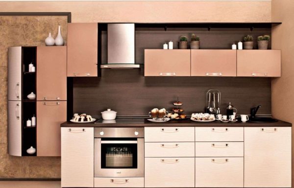 The most natural combination is the whole range of coffee and beige shades.
In small kitchens, you can choose walls of a lighter shade, in which case the furniture should be slightly darker, for example, chocolate. This setting is reminiscent of a French cafe, where you can sit comfortably with friends over a cup of coffee.

Floor
As a floor covering in the kitchen, you can use a moisture-resistant laminate in the color of coffee with milk, linoleum or tiles in the same range. Various woody shades, both lighter and darker, also work well. But you should not choose parquet, it is better to leave it for the living room.
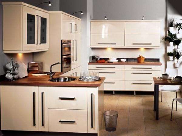
Ceiling
For finishing the ceiling in the kitchen, it is better to use the lightest shades of cappuccino, or even milk or white. Dark gamut can visually make the room lower and smaller. In small kitchens, gloss will help expand the space, stretch canvases of a milky or light coffee color will perfectly fit into the design. But in a large kitchen, experiments can be allowed, for example, coffee-colored beams on a milky ceiling.
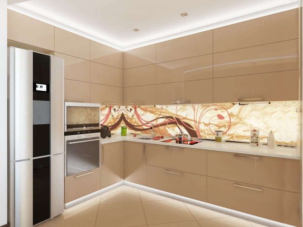
Doors
In the kitchen interior, cappuccino is used not only for finishing surfaces and furniture facades with gloss, doorways are made in the same range. The color of the opening and the flooring can completely match, which is the most common option - this creates a single design. Also, the door frame and the door itself can overlap with walls, decorative elements or furniture.
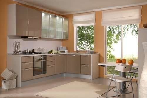
To make the doors visually look easier, it is worth choosing models with glass inserts. In this case, the texture can be any - gloss, frosted glass, ornament, etc. Doors will not merge with the interior of the kitchen, if you choose a color for them that is different from the headset.
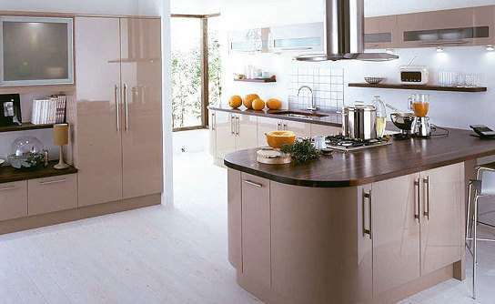
Selection Tips
When choosing a kitchen set in the color of coffee with milk, you need to take into account several factors. One of them is the matching of the kitchen and the size of a particular room.
Furniture should not look bulky, it is important that the space does not seem overloaded. If there is not enough space in the room, buy a headset with wall cabinets
At the same time, they look at the width of the room: if the room is narrow, it is advisable to buy a linear set of small width.
If the room is wide, it is better to purchase a corner kitchen. In this case, the model can have a peninsula (a table fixed to the headset) or an island (a separate table for a meal). A headset with a bar counter looks harmoniously in a modern design. It can be located in the center of the room, thereby creating the boundaries of different functional areas. The peninsula can be transformable: this modular design option is especially convenient in small kitchens with a lack of footage.
At the same time, the headset can have a different shade of the upper and lower cabinets. Furniture with transparent glass covering the stone countertops will look beautiful in the kitchen. In addition to bringing lightness to the interior, glass will protect the working base in the cooking area.
When choosing the temperature of the shade, it is necessary to take into account which side the windows face. For example, when facing north, the room will appear cold. If the shade of the headset is cold, it is likely that the room will lose its visual comfort. If the windows are facing south, the warm cappuccino will give off orange, the room will seem stuffy.
When choosing a design, it is important to pay attention to the material of the ceiling cladding. For example, glossy furniture goes well with stretch fabric and plasterboard ceilings. You need to look at the shape, as well as the lines of furniture, which should be repeated in the interior of the entire room.
You need to look at the shape, as well as the lines of furniture, which should be repeated in the interior of the entire room.
As for the material of the headset, we will have to proceed from practicality considerations, given the style.For example, the classic branches of design are quite categorical: furniture of the classic, neoclassical, classicism styles must necessarily be wooden and massive, decorated with gilding and ornate carvings.
For modernity, the synthetic component and the abundance of gloss are important. Here, in addition to glass, plastic is used. The headset itself should be laconic and monochromatic, possibly with glass facades of several wall cabinets.
An equally important criterion for choosing a kitchen unit is its status. A set of expensive furniture will not look appropriate when surrounded by cheap furnishings: it will be striking. It is necessary to choose a modular or built-in ensemble correctly.
Useful Tips
In order for the kitchen design in the coffee range to look impressive and harmonious, several nuances should be taken into account:
- Some shades of coffee are quite dark, so such an interior must be diluted with light tones, use gloss in the decoration, and also take care of high-quality lighting.
- In order not to be mistaken with the selection of complementary colors, it is useful to consult the color charts or a circle.
If you are using gloss in combination with cappuccino, do so in moderation. Too many shiny surfaces create an extra shine, while their complete absence will make the kitchen design overly strict. The design of the cappuccino-colored kitchen is incredibly diverse; the options for such a design can be seen further on the selection of photos.
The coffee range is universal, it suits any design, combining with almost all colors. The choice of cappuccino for the interior of the kitchen is due to the peculiarities of this shade, its coziness, warmth and tranquility. In such an environment, you want to stay for a long time, thinking about something over a cup of coffee with milk.
Ideas for decorating a cappuccino kitchen
Contrary to what many people think, the main shade of cappuccino - brown, has the widest range of palette variations. Because it is made by mixing two opposite colors, it can look different, ranging from cool with a lot of blue-purple hue, to something deeply warm if it contains red blotches. This gives it a huge potential for decoration.
 The color of the cappuccino has a wide range of shades.
Try a deep chocolate brown paired with a delicate milky-creamy brown. A deep dark color creates drama and can be beautifully combined with a deep curtain of wine as opposed to milky brown.
 Combination of deep chocolate with creamy color. Looks gorgeous!
This combination works well with cobalt or sapphire. You can create a luxurious, relaxing brown atmosphere by using some bold colors like blue, black or white.
 See how chocolate and turquoise works well.
Ceiling
Low ceilings in kitchens are usually plastered or painted. For a coffee design, light shades should prevail here. The dark brown color of the ceilings is great for a small space. The white ceiling, along with the white trim, keeps the milky coffee interior fresh and vibrant.
 A dark ceiling is great for a small space.
The ceiling can also be successful in a coffee hue if there is a contrast between brown ceilings and white walls.
 The light ceiling in the kitchen in coffee colors will add space and light.
Walls
Wall surfaces in such an interior can be decorated with wallpaper (with a special coating), plastered, covered with plasterboard, tiles or plastic. The apron can be finished with tiles, the color of which has such accents: cherry, gray, lilac or green.
Dark cladding is only permitted in spacious coffee-colored kitchens. For simple and strict versions, the walls are simply plastered, and a relief is created in the accent zone, similar to scraps of milk foam.
Floor
The floor in such an interior is usually tiled. In expensive versions, a self-leveling floor is used, which is not only durable, but also creates an elegant "lacquered" shine.
For a cappuccino-style design, a coffee-themed tile can be chosen. In budget versions, linoleum is used as a floor covering. In such an interior, it is ideal to use parquet or stone floors in combination with marble countertops.
 Floors can be decorated with tiles, parquet or linoleum. The self-leveling floor will look especially good.
Doors
Most of the doors are made of brown wood. Therefore, these wooden doors are easy to adapt to the coffee design. The ideal choice for contrast would be wenge doors against a background of milky brown walls. A softer option would be to paint the bamboo doors white.
Most often, wooden doors in a brown shade are installed in such an interior.
Many people know for a reason that the invigorating design of a cappuccino will act accordingly. In addition, it is beneficial, since kitchen dirt and grease are not particularly noticeable against a light and soft background of such a milky brown color.
Coffee palette in the interior: walls, floor and ceiling
The brown palette has a huge number of shades. From the color of milk chocolate to the darkest - rich chocolate. All of these shades are warm and cozy. Their distinctive feature is their amazing softness of perception. They breathe with reliability and age-old regularity.
This design will make you smile and not fall into a blues.
Dark brown is associated with aromatic coffee or dark chocolate. This is the color of the classic style with its nobility and aristocracy.
Red-brown is a luxurious representative of the Victorian style with its firmness and conservatism. The color of red furniture made from expensive solid wood will suit brilliant art deco.
Yellow-brown will be appropriate in ethnic styles: wooden Russian, sultry African or luxurious Egyptian. This is an optimistic color of cheerful comfort and good mood.
Taupe or taupe is a discreet background of solid Scandinavian style. Excessive grayness in decorative details will make this brown shade uncomfortable and dull.
Light brown hides comfort and tranquility. This shade disposes to quiet family evenings over a cup of coffee and sincere conversations in a close circle.
Ideal partners for brown shades in interior design:
- Relaxed beige and soft milky will lead to a self-sufficient union. Combining colors with a milky color comes the extra warmth of this shade.
- An optimistic orange will give positive energy and add joy. White shades will fit into this duet and will add lightness and airiness to the interior.
- Blurry yellow will add a bit of dimension and detachment. Best used as a background.
- Fresh greens add coolness. Light shades are restrained, while dark ones are elegant.
- Rich gold will accentuate the sophistication of brown designs. This color is best used for decorative items only.
- Reliable blue will bring practicality to the interior of a brown kitchen.
Such a kitchen adds an exquisite picture of the interior.
Conclusion
The use of cappuccino color is relevant not only in kitchens, but also in living rooms, dining rooms, bedrooms. Any room can be transformed with this shade. For many, cappuccino is associated with the morning rite of waking up. Invigorating, sweet drink helps to wake up and get a boost of good mood with a margin for the day. Memorize these sensations so that, focusing on them, create a mosaic of the kitchen atmosphere by fragments. The finished interior should attract household members to the room, like the unique aroma of roasted coffee beans.
