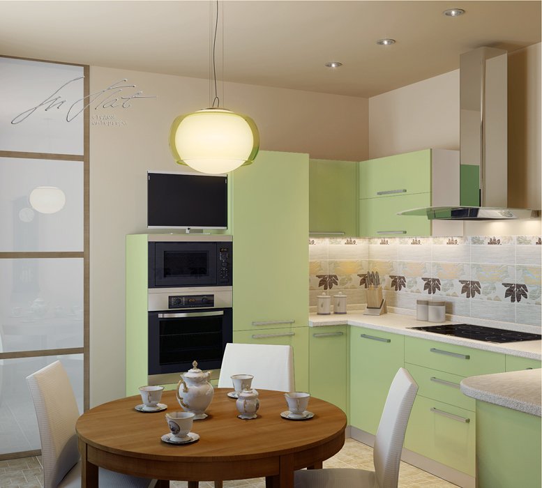
Interiors in pistachio colors - photo
The pistachio color is versatile: it is equally appropriate in the bedroom, in the kitchen or in the office. Paint all walls in it, leave a big stain, or limit yourself to accessories - all of these options are equally good. Moderation is the main characteristic of the pistachio color: it is not too catchy, not aggressive, not bland or faded.
Pistachio color in the living room
The pistachio living room is conducive to pleasant communication, calm relaxation or lively friendly evenings with board games. Colder shades tune in to the working mood and stimulate the imagination, so they are suitable for decorating the work area. The soft corner looks bright and unusual in this color - it is definitely worth spending time looking for suitable upholstery! If you want to paint all the walls in pistachio, we recommend that you do with a smooth surface. He still "eats" and mutes all the unusual textures, patterns and blotches. In this case, you will also have to experiment with wall decor, but on the floor and for furniture, feel free to choose any tree - from bleached birch to dark walnut.
Pistachio color in the kitchen
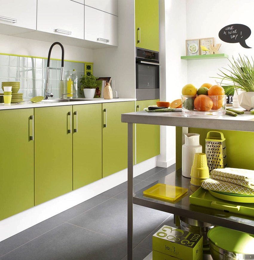
Pistachio walls go well with classic wooden kitchen units. And bright accents with expressive white verticals can visually raise ceilings, expand the space and add light to a small room. Combination with cream, peach, sand or beige - and now you have the coziest kitchen in the world. By the way, it is believed that pistachio helps with weight loss: it adjusts to healthy food and even slightly reduces the amount eaten.
At the same time, it is much less easily soiled and capricious than white, which is also important in the kitchen. Here it is - a fine line between functionality, aesthetics and content.
Pistachio color in the bedroom
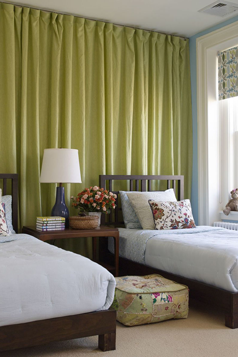
In the bedroom, a whitewashed dusty green immediately creates a cozy and almost intimate atmosphere.
The very feeling of harmony, balance and tranquility is especially important here. And the versatility of the shade makes it possible to equally effectively use it in lush classic interiors and in a fashionable loft. In such a bedroom it is easy to abstract from external worries and finally relax after a hard and eventful day.
It is not for nothing that even experienced psychotherapists use some methods of color therapy to stabilize the nervous system and healthy sleep. And pistachio textiles also look original, although you will have to look for it.
Pistachio color in the bathroom
Pistachio in the bathroom is a great alternative to boring white and beige tones! If gray is too cold and austere for you, blue in the bathrooms has bored you since childhood, and yellow annoys and changes the perception of lighting - feel free to take pistachio! All variations of the Mediterranean style and the addition of coral, orange and peach details to the white-pistachio bathroom interior look good ... At the same time, in order to radically change the atmosphere in the room, it will be enough to replace accessories and textiles.
Pistachio color in the hallway
Often, the main task in typical hallways is to make the room visually more spacious. But white, beige and even light gray are not the most practical colors for a room where they constantly wear shoes, outerwear and bags. But pistachio is not so capricious at the same time and fully copes with the main problem.In a narrow hallway, it is better to avoid complex color combinations: limit yourself to white or light wood. This way you can place a wardrobe, a coat rack, a pouf and all the essentials, without overloading an already small space.
Pistachio color in the children's room
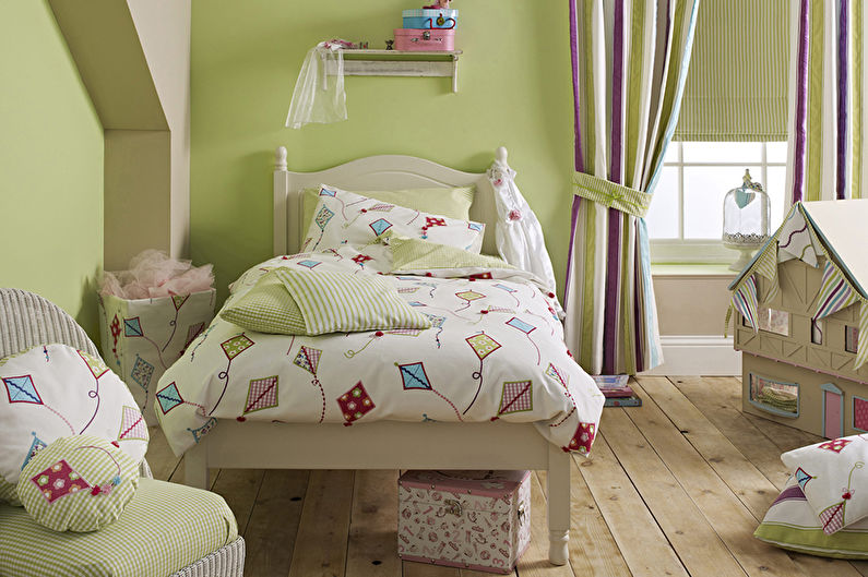
Pistachio nursery is quite bright and unusual, but at the same time quite calm
It is especially important to catch this fine line here, because children are much more susceptible to external factors and influences. A too calm child in such a room will cheer up and start to be active, and hyperactive and agitated children, on the contrary, calm down and relax.
If you use it as the main background color, as the child grows, it will be possible to change the interior with just the help of details and accessories. After all, among other things, the same pistachio tone is combined with both bright and juicy, as well as with classic shades.
- Interiors
- Decor
- Handmade
- Summer cottage and garden
- Advice
Color combinations
As already mentioned, pistachio can peacefully coexist with many shades, and with some of them it forms a very stylish pair. Let's take a look at some successful combinations.
Pistachio with white
An interior dominated by these two colors has a calm, natural ambiance, as versatile white is able to softly set off even a rich pistachio variation, letting in even more light into the room.
You can often find two options for using this combination. In the first case, one or more walls reflect the shade of walnut, and the furniture is painted white. In the second, it is the other way around, and this solution is more preferable for small sizes, since it allows you to visually expand the space, while creating a variety of colors.


Pistachio with blue
This pair usually does not act as the main color scheme due to the richness of the final design, but is harmonized with neutral blotches. In the interior, it is often embodied in elements adjacent to each other, creating a lively, natural atmosphere.
It can be a marine or pastel shade - with any of them, pistachio will form a successful combination. The success of the "union" lies in the belonging of one color to cold tones, and the other to warm ones.


Pistachio with yellow
Yellow will only emphasize the presence of this shade in the pistachio composition. As a result, even a few details with this color scheme will make the room sunny and very warm - ideal for houses with north-facing windows, allowing little natural light to pass through during the day. Bright wall cladding will help enhance the effect, but this is a very bold design option.

Pistachio with brown
Brown can be presented as an independent color or as a finishing material - wood. The second option demonstrates a wide palette of not only textures, but also tones, among which warm ones should be preferred. They combine better with pistachio, emphasizing its natural origin.
In the interior, it can be used for wall decoration - then the wooden set will stand out well against its background. The color can be used as a textile, for example, for upholstery. This is a great combination to suit the classic style.


Pistachio with pink
A catchy pair forms a natural pistachio color with a less natural pink. You can achieve an interesting effect by playing with their saturation. For example, pastel varieties can coexist in any incarnation: partitions, furniture, decor. And saturated ones must be added carefully, balancing with white.
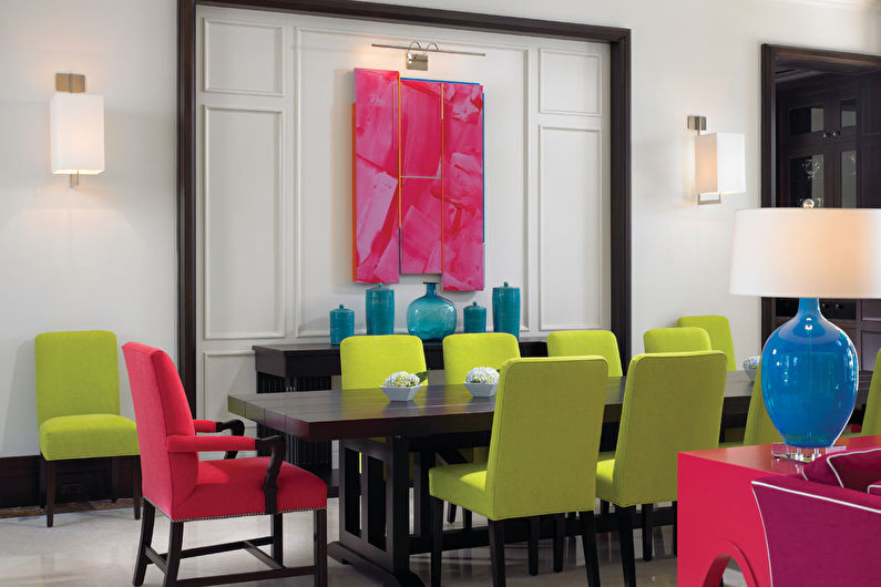
Orange kitchen - ideal color combinations
Psychologists call this color a real cure for depression. It charges with vital energy, gives warmth and evokes the most joyful emotions. Another property of orange is the ability to induce appetite, so it is ideal for decorating the interior of the kitchen.
Staying in a room filled with such bright and rich colors will appeal to cheerful, cheerful and confident people who look at everything with optimism. However, orange tones should not be overused, as their overabundance in the interior can cause irritation.
All shades of orange, from light to rich, go well with ivory and milky shades (great for wall decoration).
When creating modern interiors, it is worth using muted tones of orange, combining them with brown, terracotta, gray, dark olive and burgundy.
In modern interiors, you can choose gray, light brown, white or blue as the main color, combining them with glossy orange surfaces.
The combination of orange shades with all gray variants can be called universal - such combinations are allowed to be used when creating any interiors.
The use of pistachio shades in various interior styles
This color is quite often found in the design of modern interior styles: high-tech, minimalism, contemporary. This is due to its successful combination with chrome elements, plastic and gloss.
Large accessories or single pieces of furniture in pistachio color always look great
The naturalness of green flowers fits perfectly into the eco-style popular today. If you put an accent on the pistachio shade, it will be a good option for pop art or eclecticism.
The Tuscan interior style has Italian roots. Here, natural wood, all kinds of forged products and green shades are used in large quantities.
Pistachio upholstery on wicker cushions - perfect for relaxing on a sun-drenched patio
Pistachio plush pouf in a colonial-style interior
The French direction of the Provence style is distinguished by romanticism and lightness. The abundance of textiles and all kinds of wicker baskets, vases, even pieces of furniture will be an excellent complement to the pistachio color.
The combination of pistachio with floral prints, paintings from wildlife, and so on, gives the interior a spring freshness
Popular color combinations
To make the kitchen look harmoniously decorated, you need to adhere to several recommendations:
If the kitchen set is made in pistachio color, then the tone of the finishing materials must be matched to the furnishings. That is, it is the latter that forms the atmosphere in the room, and the walls, floor and ceiling complement the overall picture.
Therefore, in the decoration of the room, it is recommended to use light shades without original drawings that attract attention.
For wall decoration with materials painted in pistachio color, matte or plain wallpaper should be used. And in the area of the working area, you need to lay mosaic or glossy tiles, which will emphasize the depth of the shade.
If the kitchen is executed in a style without pronounced accents, then pistachio curtains, vases and other similar items help to "dilute" the interior design.
These recommendations are general in nature. If you wish, you can ignore these tips.
With snow-white
Pistachio is best combined with snow-white. These shades are called "companions", as both colors are often used in interior decoration. This combination allows you to create a wide variety of compositions. In addition, white, like pistachio, visually expands the size of the room. And the first shade fully reveals the depth of the second. This combination is also interesting because both colors can be used in any proportion.
With cream
The combination of pistachio with cream is another good solution that is often used in kitchen design. The latter color creates a "soft", "warm" atmosphere
At the same time, the cream one focuses on precisely those details of the kitchen (cabinets, walls, and others) that are painted in olive color
With green
This combination is rarely used. However, it is this color palette that can give the kitchen a respectable appearance. To create this effect, it is recommended to take finishing materials painted in light green.
And if the kitchen is large in size, then in the interior design you can combine light green and pistachio
This combination is recommended to be diluted with bed tones, which will focus on individual details of the room.
With natural woody tones
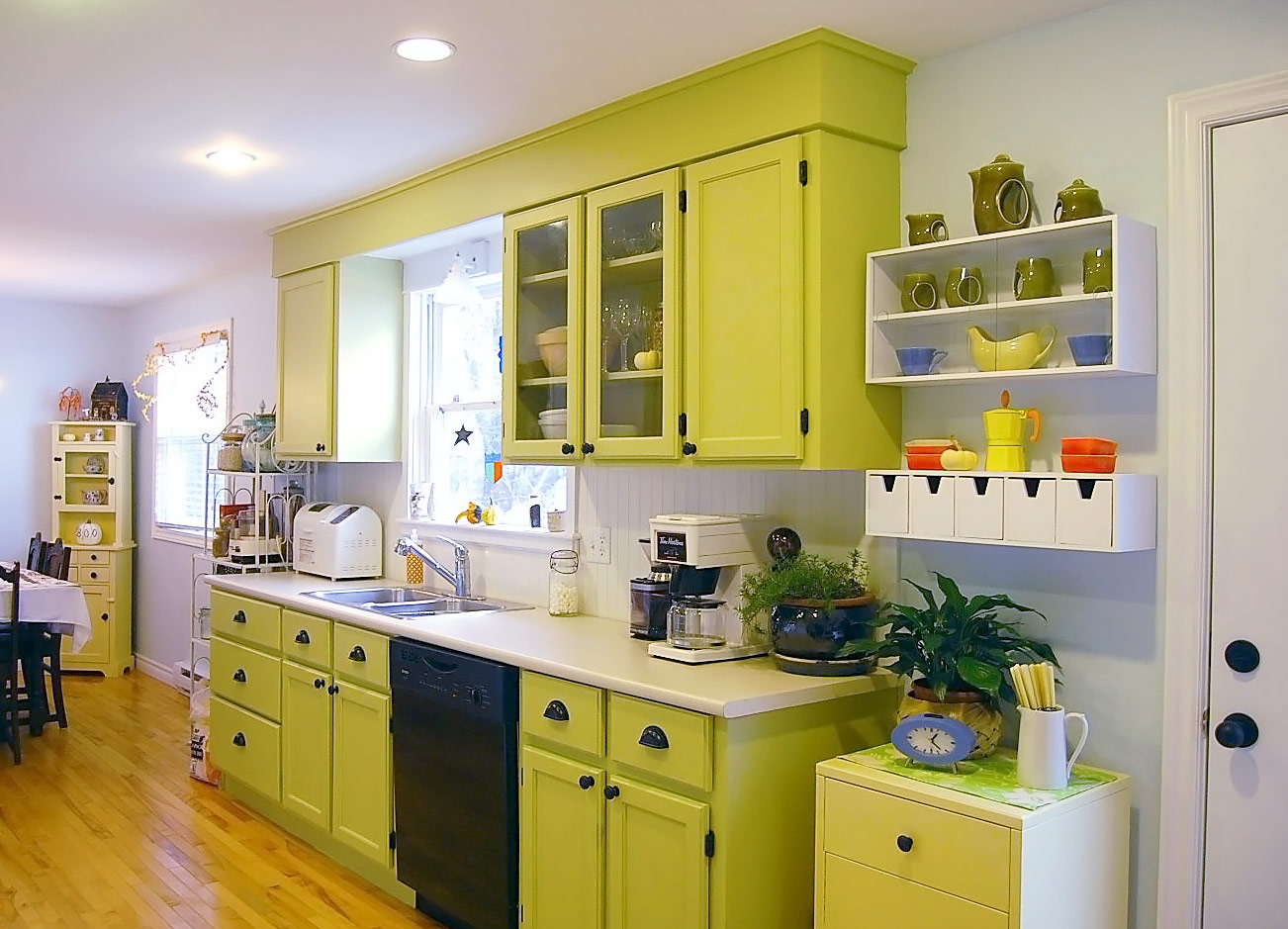
Light green tones harmonize well with other colors. In particular, when decorating a kitchen in a rustic style (country, Provence, etc.), you can decorate the kitchen with wooden elements. So, light green walls and furniture are successfully combined with panels made of this material. You can vary the shades in another way. The kitchen looks good, where pistachio cabinets sit side by side with a wooden countertop.
Complement with gray, brown or black
As already noted, the light green shade is in good harmony with other colors. This is explained by the fact that this color is considered natural. Therefore, pistachio is perceived by a person as something natural, calming and pacifying.
With red
The use of red (especially saturated) is recommended to create accents of attention. More frequent use of this shade will lead to a feeling of fatigue with prolonged stay in the kitchen.
With blue
Blue is the color of the sea or sky. Therefore, this shade is in harmony with pistachio cabinets or walls. This combination is often used when creating Provence style interiors.
With sand
Unlike cream, sand has a richer color. Pistachio with this combination will stand out noticeably. Designers recommend limiting the use of the color palette in this "duet". That is, the combination of pistachio cabinets with sand walls or vice versa will be advantageous.
With yellow
With this combination of color palette, the interior of the kitchen will be cheerful and light. But, as in the previous case, shades should be dosed. In this interior, it is not recommended to oversaturate the room with bright colors.
With beige
Beige, sand and peach are the three colors that harmonize well with pistachio. Therefore, each of these shades can be used in the decoration of various details of the kitchen interior.
Features of the use of pistachio color in interiors
Interior decoration using this shade is not uncommon. The natural beauty of light green has always attracted designers and stylists. This color is a great option for rooms with insufficient natural light.


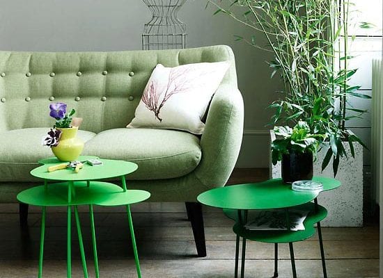


But even with artificial light, pistachio does not lose its brightness and natural charm.


Green is good for the eyes, so it never tires. It is appropriate in any room, be it a kitchen, a nursery or a living room. It goes well with both light and dark furniture.


The pistachio shade may not always be dominant. It looks amazing and fresh as accent notes in the form of light green curtains and other elements in the form of decorative pillows, rugs.


Pistachio even tone does not need any additions (stencils, stickers, drawings). An exception may be greenish curtains with a pattern as an additional decorative element.

Pistachio color in interior design - photo
The areas of application of the pistachio shade depend not only on the preferences of the owners, but also on the room and its conditions. Somewhere you need to create a calming atmosphere, and somewhere you need to add certain materials.
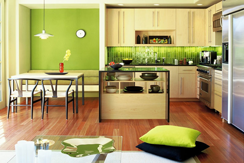
Pistachio color in the interior of the kitchen
In such an environment, the cooking process will turn into an exciting experience, since pistachio helps to increase the activity and mood of visitors.
In this space, it is often found in the form of wall tiles - the most versatile material for a work area that is constantly exposed to high temperatures, humidity and various types of pollution.
In the dining area, remote from the work area, you can pick up pistachio paint or wallpaper, since the conditions here are more stable. Washable wallpapers and other moisture-resistant varieties will do their job perfectly.
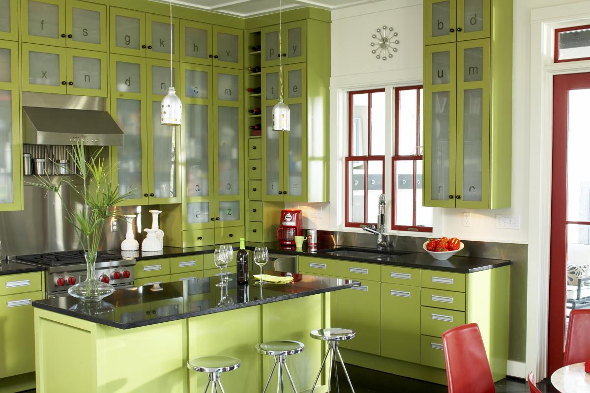
The shade is also used for furniture sets, with white, black or wooden countertops. This solution is well suited for Provence, classics, as well as modern style.


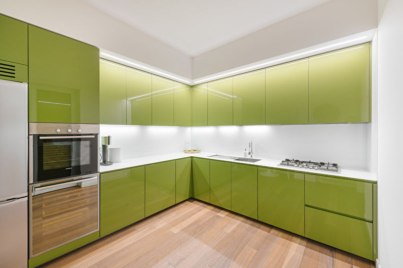




Pistachio color in the interior of the living room
In a place intended for relaxation with loved ones or a good movie, color plays an important role in creating a suitable atmosphere. Pistachio is a very friendly summer shade, so its presence in the living room is not only permissible, but also highly desirable.
In spacious rooms, you can paint all the walls without worrying that the solution will overload the composition. Pastel colors are especially suitable for such purposes. In small sizes, you can decorate only one part of the living room, for example, the central part - the one on which the TV screen is located.
If you need to focus on a more laconic design, then the pistachio color can be embodied in one or more objects: a sofa, carpet, curtains or wall paintings. This is an option for modern styles.


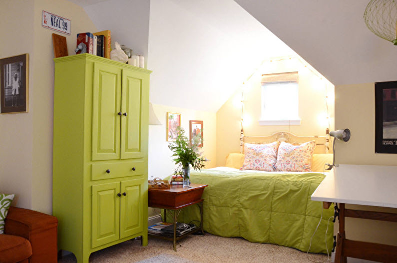
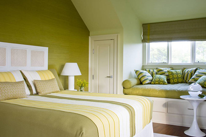
Pistachio color in the interior of the bedroom
Since the bedroom should promote relaxation and prepare for the upcoming sleep, it is recommended to limit yourself only to pistachio-colored textiles. Bed linen will do a great job with this, highlighting the bed as the main center of the room.
On the other hand, the pistachio design can be a real lifesaver for those who have a hard time waking up in the morning. Walls in this range will quickly tune in to an active mood and cheer you up. White, blue or beige details can be woven to balance the effect.






Pistachio color in the interior of the bathroom
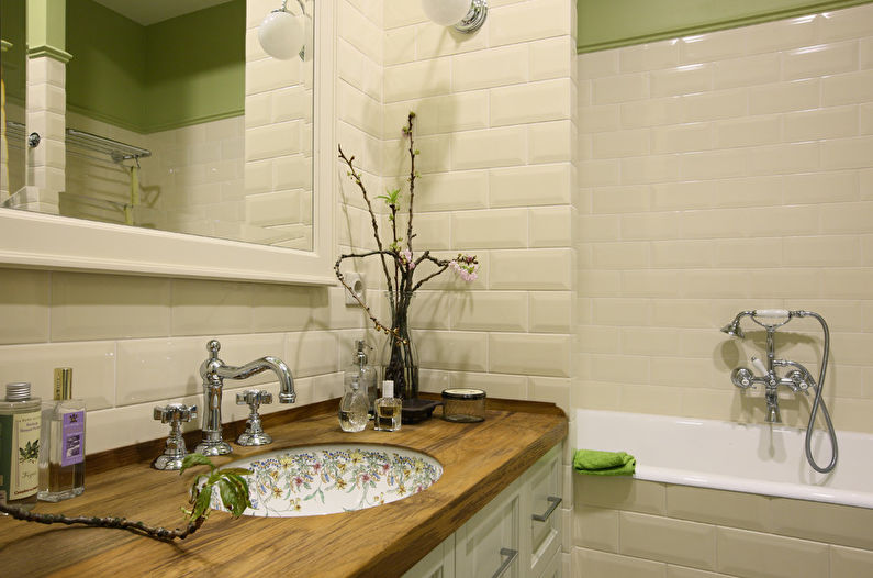
In the bathroom, this shade is used for decoration or furniture, since plumbing - the main element of space - is often presented in a white, glossy version.
Special washable paints can survive in a room with high humidity, but it is better to give preference to traditional tiles, which will not only withstand any stress, but will also help to diversify the monochromatic coating.
These can be large fragments or small mosaics that alternate with other colors, glossy or matte surfaces. The interior will look harmonious, making a reference to natural landscapes.




Pistachio color in the interior of the hallway
The entrance hall forms the first impression on the visitors, so the choice of pistachio color as the main component of the palette is a good solution for a cozy, welcoming space.
Warm colors visually seem closer to the audience, and therefore it is recommended to focus on pastel shades in small areas. On such a surface, traces of dirt are more quickly noticeable, which inevitably fall into the hallway from the street. To solve this problem, give preference to vinyl or non-woven wallpaper - they will last a long time.


Pistachio color in the interior of the children's room
There are several nuances in the choice of colors for the nursery. Firstly, through her, the child first begins to learn about the world, so natural combinations are preferable here to screaming and unnatural ones, which were previously considered "childish".
Secondly, the palette of the interior affects the well-being of the little inhabitant, increasing or vice versa - controlling his activity.For overly active children, you can choose a muted, calm pistachio tone. But for a child, closed in himself, a combination with pink or blue will help to open up.
The advantage of the pistachio color is that it is suitable for children of any gender and age. For example, using it as a background, you can eventually change toys into posters or books - and you get a room for a teenager.




Shades
Brilliant, intense scarlet tones, despite their brightness, belong to the light palette. They add extra space to the kitchen. You can add elegance to the atmosphere due to the royal and chic shade of burgundy.
The most neutral red color scheme is cherry color, which gives the interior a special comfort.

The photo shows a glossy headset in dark red tones.


Like any other shade, scarlet has a warm and cold spectrum. The color temperature depends on the addition of yellow or blue undertones.

The photo shows the interior of the kitchen with an island, made in pomegranate color.


Warm colors are carrot, coral, tomato and titian tones, while cold colors are carmine, raspberry, alizarin or cardinal.

In the photo there is a burgundy kitchen set in a neoclassical interior.
Choose the optimal color for furniture
The following tips will help you choose the right color for a headset for an already finished kitchen:
- Draw a plan. Use modern technologies - today on the Internet you can find dozens of available programs that will allow you to create a project for your kitchen. Visualization of furniture against the background of walls in color will give a complete picture and help you more accurately determine the decision.
- Use ready-made solutions. There are many resources on the Internet with ready-made designs. When choosing the right solution, you need to take into account the real dimensions of your room and the option you like. Evaluate how the tone of the furniture, the color of the walls and accessories are combined, and, if you have a studio apartment, how harmoniously the color transition from the hallway to the kitchen is carried out. It is advisable to take into account the location of the windows and the level of illumination, since in different natural lighting the same shades will look different.
- Check the correct combination of shades. To do this, it is recommended to apply the rules of the ratio of tones along the color wheel or use ready-made design correspondence tables.
Harmonious combinations
When choosing a scale for decorating a kitchen, it is important to determine the main shades, of which there should be no more than two, and one accent color. The combination of light green with other colors has a different character:
- A harmonious duet will be a combination of pistachio and white. This is the most common solution and can be used in literally any style. The proportions of both shades can be very different, as they are light and fairly neutral.
- An organic solution would be a combination with cream, beige, coffee with milk. The neutrality and balance of this palette will add sophistication to your kitchen design. This is an organic option if the kitchen is corner or rather small.
- A richer range of beige and yellow - sand, peach, apricot are also in harmony with pastel green. Pistachio cuisine in such a duet will be sunny and cheerful. It is appropriate to use such a combination as follows: it is better to choose green wallpaper, and yellow or combined furniture.
 In the photo - harmonious apricot-colored wallpaper and pistachio furniture.
- The combination of light green with shades of lilac looks original and summer-like. A purple kitchen set against a background of pistachio walls, like lavender walls in combination with pastel furniture, will be organic in styles such as Provence and country. Although no one will forbid the use of such an original duet in modern technological design directions.
- A natural combination is the combination of pistachio with natural wood surfaces.Such an interior is as harmonious as the white-green duet. Similar colors are suitable for eco and ethno design, country and Provence. The combination is applicable both in solemn retro directions, and in modern interpretations of those.
 In the photo - a combination of pistachio shade with light wood.
The light shade of pistachio looks beautiful in addition to chocolate, dark gray and black. The first option will be warmer and more sophisticated. Gray is applicable in a modern style, while black is an option for an extravagant spacious kitchen. Brown can also be glossy and technological, and black can be warmer due to its dullness and texture. Corner furniture in these combinations can be too bulky.
Color wheel concept
The color wheel helps to navigate in the correct combination of shades. There are various interpretations of this extremely handy tool, which has been used by professional artists and designers for a long time.

Development essence:
- In the center are the three basic colors - yellow, red and blue. This is a kind of whale on which all coloristic decisions are held.
- The following triangles are formed from a combination of base colors. Orange is nothing more than a mixture of red and yellow. Purple - red with blue, the result of the combination of yellow and blue will be green, respectively.
- The tertiary circle consists of 12 segments, each of which is a combination of neighboring shades.
All the presented tones are combined with each other, the result depends on their location in the circle, whether the neighborhood was close or the colors were on opposite sides.

There is another circle developed by Itten. It is even easier to study a harmonious combination on it. When decorating the interior of the kitchen, use one of the five rules for combining color:
Monochrome harmony. The bottom line is to apply shades located within one color segment. It is difficult to create a stylish design within the same shade, you must try to avoid dullness. To make the interior look original, a skillful combination of textures will help.
Harmony of opposites. In this case, shades are used to decorate the kitchen, which are located in a circle opposite each other. The main design task with this approach is to observe moderation, the correct dosage. The saturation of the tone is of great importance. The use of bright shades of color obliges you to choose the main one, the second serves as a small addition
Attention! The use of two bright colors in equal proportions in the interior is unacceptable. This rule does not apply to muted shades.
Kindred harmony
For the interior of the kitchen, you can choose an interesting combination of shades that are located in neighboring rays, for example, 84-92 or 34-46. It is not at all necessary that adjacent colors are on the same level.
The triangle rule is used much less often in the design of the kitchen interior. An isosceles figure is drawn inside the circle and colors are chosen for the design. A balanced approach should also be followed here.
Another interesting technique for combining color in kitchen design is after 2 by 3. This means that two steps are taken from the main ray to the side and the next shade is selected. For example 27-51 or 70-94.
If there are two colors in the interior, depending on their saturation, the following proportions are chosen for a harmonious combination:
- 60/40;
- 70/30;
- 80/20;
- 90/10.
The presence of the third color in the design is quite acceptable if the following parts are observed: 70/20/10 or 65/25/10. Of course, it is difficult to determine exactly the volume of a particular shade in the general interior of the kitchen, therefore, they are guided by their own perception.
The bold interior design of the red kitchen in the photo below:


