Individual color features
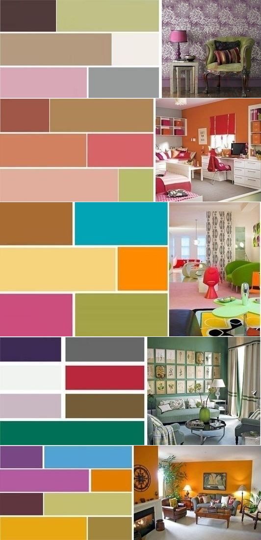
Designers recommend using a palette of no more than 3 colors for painting walls in a ratio of 60:30:10. The background is made of the main tone, the rest are used for accents. Choosing the necessary paint from a huge range of colors, you should be aware of its effect on the human psyche and the rules of combination. Each of the primary colors has the following features:
White. It is considered basic. Often used in large blocks to expand space. In large halls, it makes the background solid and harmonious
In small rooms, the white palette should be used sparingly. The abundance of such shades can intensify depression, create a feeling of isolation.
Red
For the background and painting of large areas of surfaces, a diluted color is used, brought to a calm tone. The presence of red in the interior increases activity, excites, helps to concentrate. Therefore, it is often used to paint one of the walls of the office.
Brown. The natural shade creates an atmosphere of magic. At different times of the day and under different lighting it will take on dissimilar forms. Looks good in a palette with pink, beige.
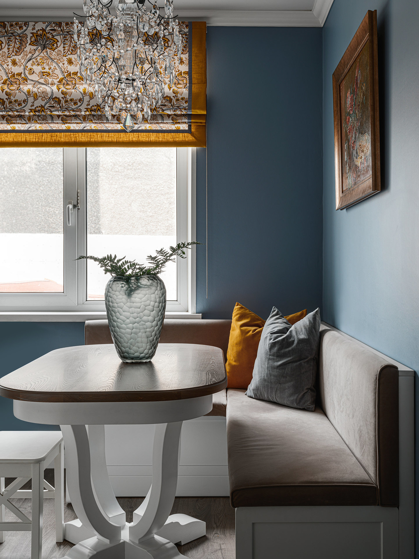
Blue. Any shade has a positive effect on the psyche, creates an impression of calmness and serenity. Surfaces next to large windows are decorated in fresh, cool colors. It goes well with achromatic colors.
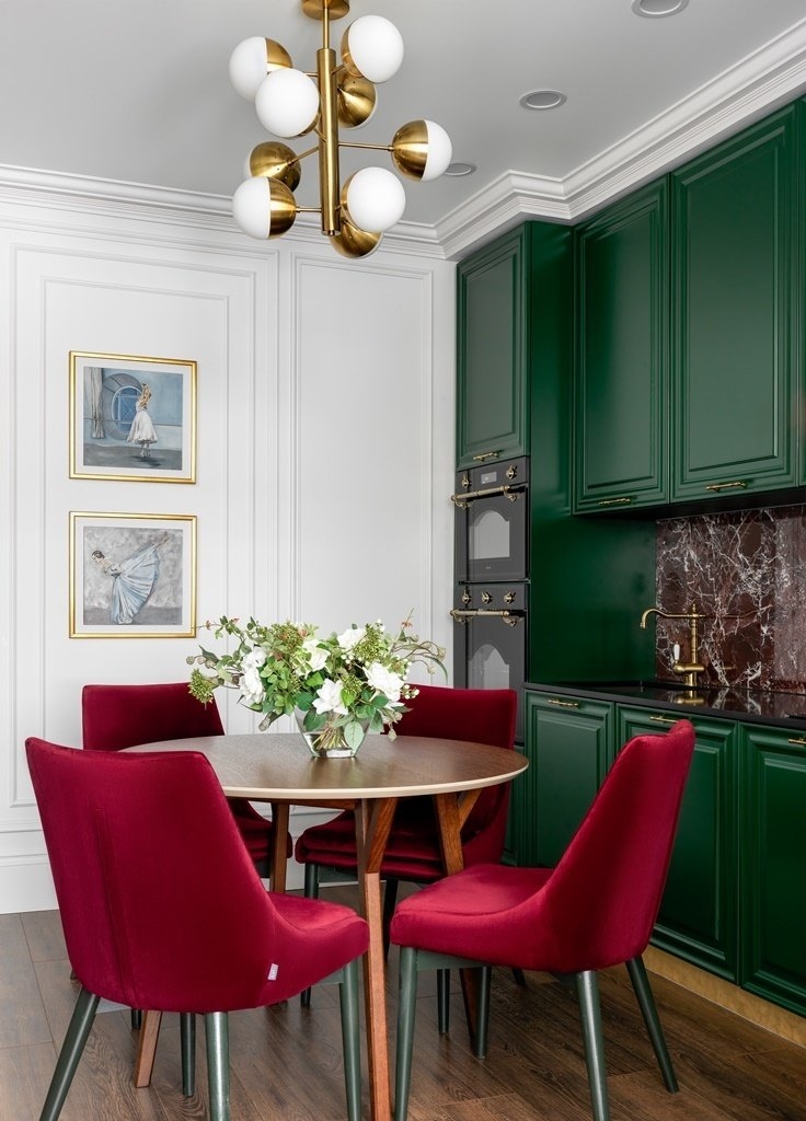
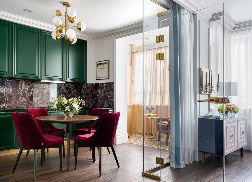
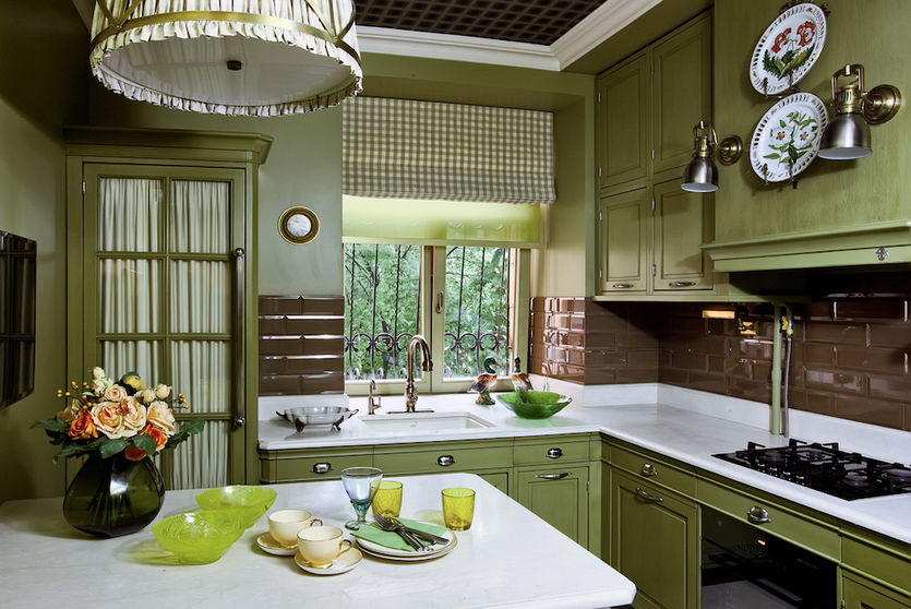
Green. Any natural shade is pleasing to the eye, a combination of one part of the palette, for example, coniferous, lime, mint, is especially successful. The color is suitable for painting walls in any room.
Yellow. Like a bright flower, a sunflower fills the room with light and is associated with happiness. It will look good in the form of small blotches. Solid lemon, amber surfaces will irritate and cause anger.
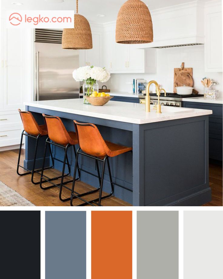
Orange. The only color that does not have cold shades perfectly relieves the blues, lifts the mood. It can be both primary and secondary. It goes well with any other tone.
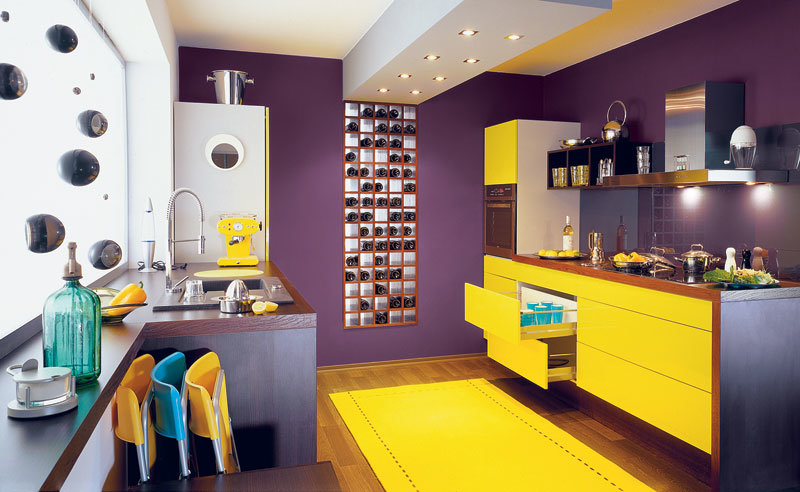
Purple. Depending on the concentration of red and blue, it can evoke certain emotions. The brightest representatives are fuchsia, lavender, eggplant, violet. The combination of these shades looks rich and sophisticated.

Kitchen colors
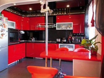
Choosing the right color scheme for the kitchen is not an easy task, because different colors affect our mood and our appetite in different ways. So, for example, it is not recommended to use such a color as red as the dominant color for kitchen interior design, since this color contributes to the emergence of aggression - not the best feeling for eating.
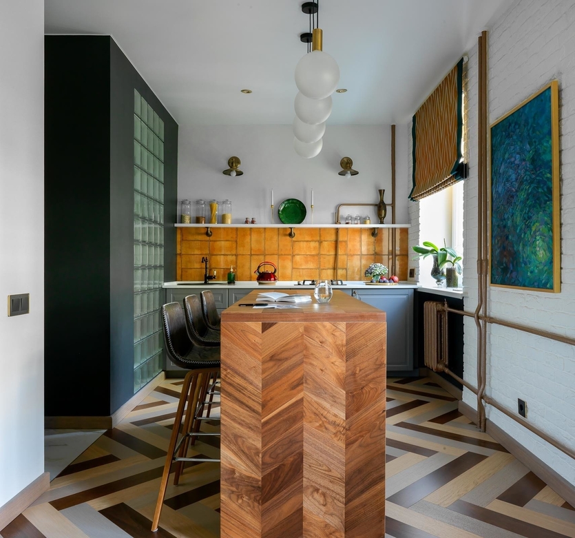
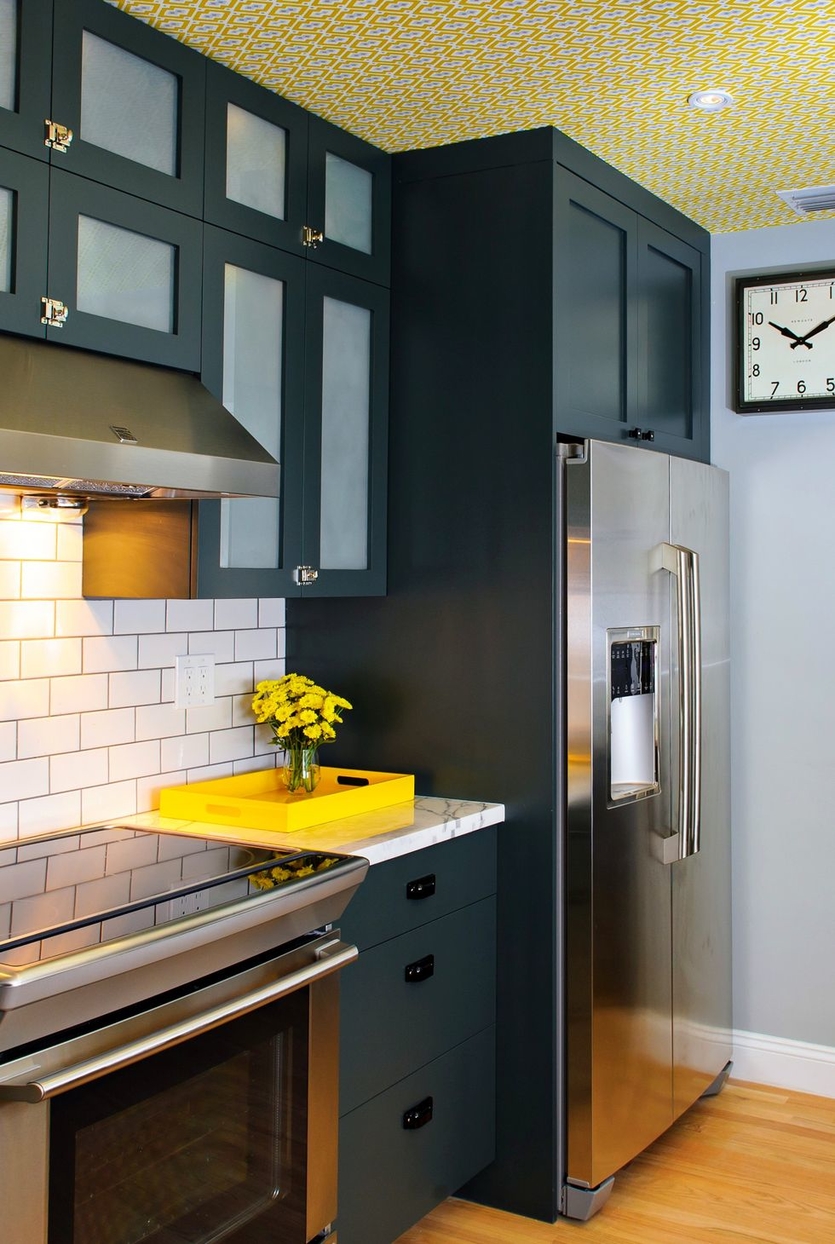
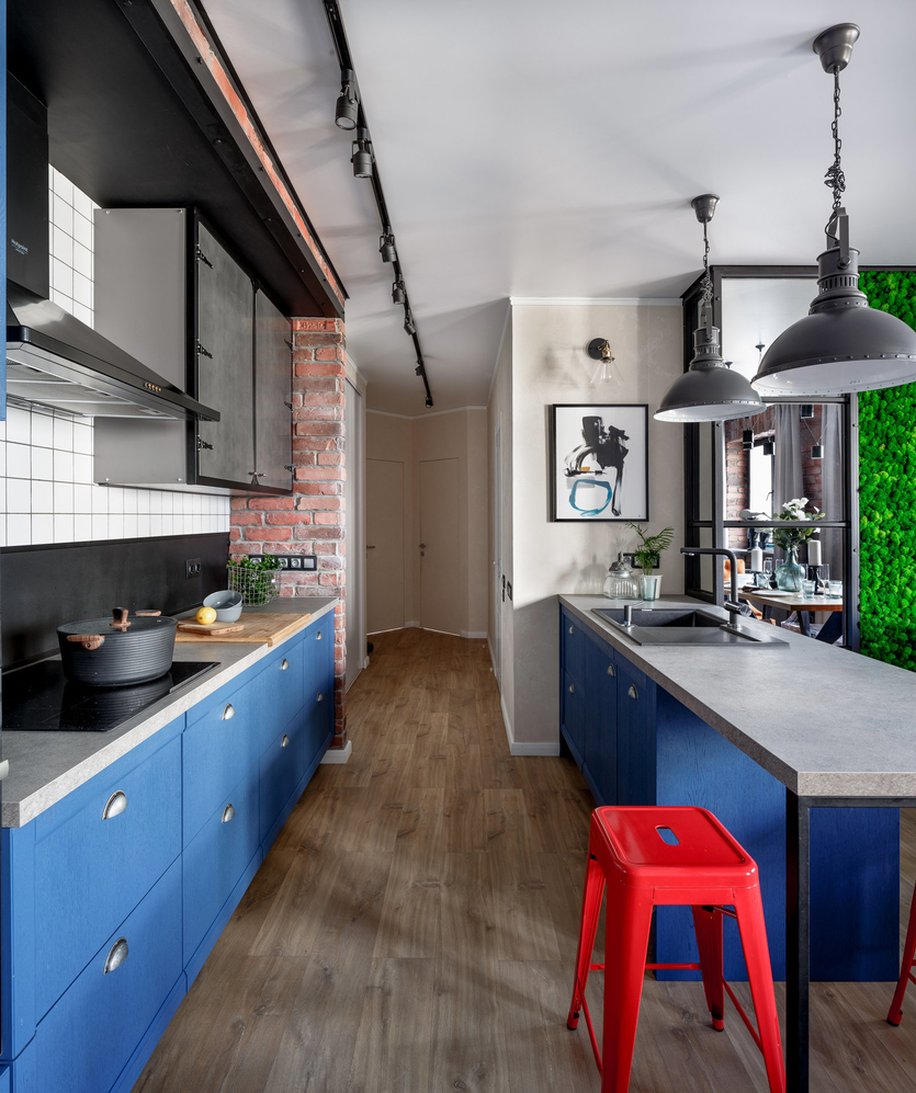
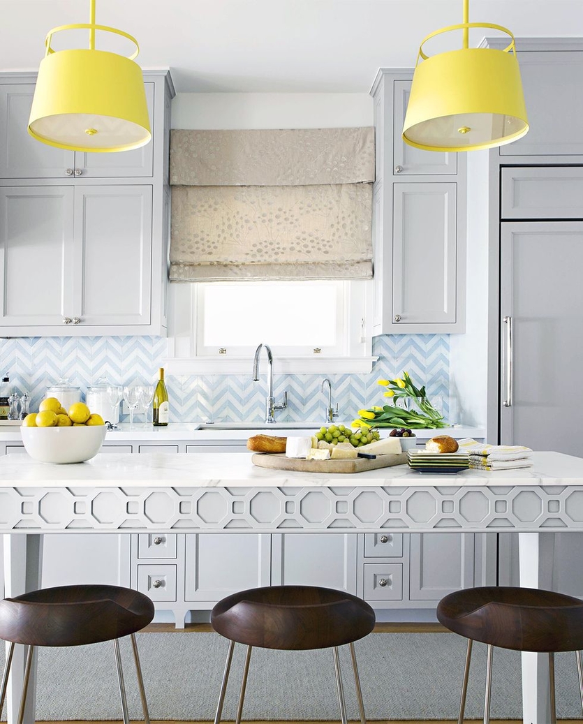
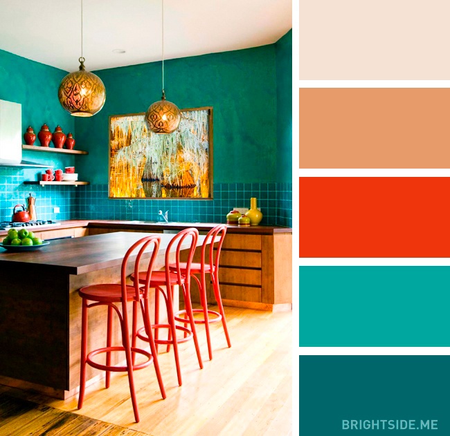
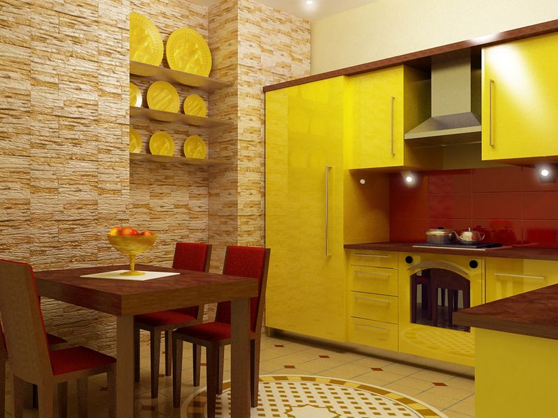 Yellow-red-brown kitchen.
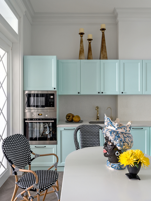
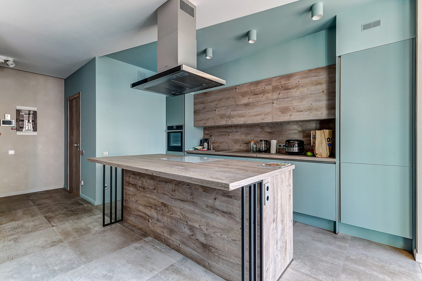
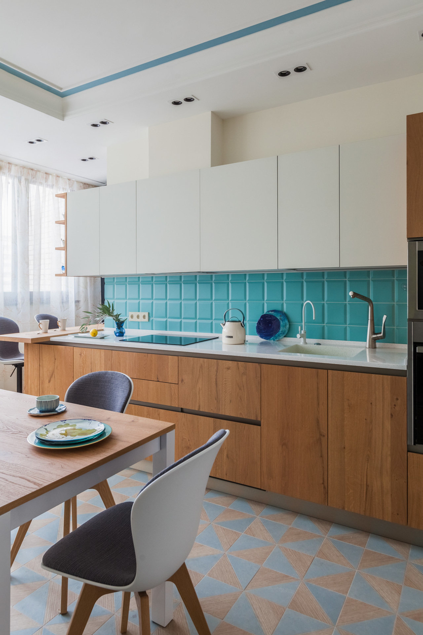
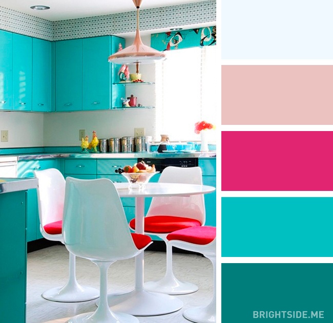
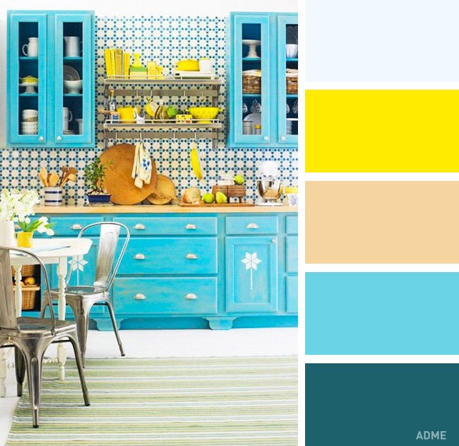
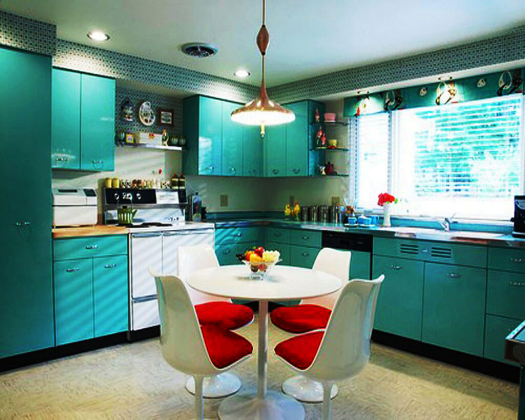
But orange is the color of optimists, it has a very good effect on appetite, because it is so sunny and warm. However, for those who follow their figure, orange in the kitchen can be dangerous: in a kitchen of this color, you just want to chew something. The same problem applies to turquoise. This color is natural, it soothes, and in a relaxed state we always eat more than we would like.
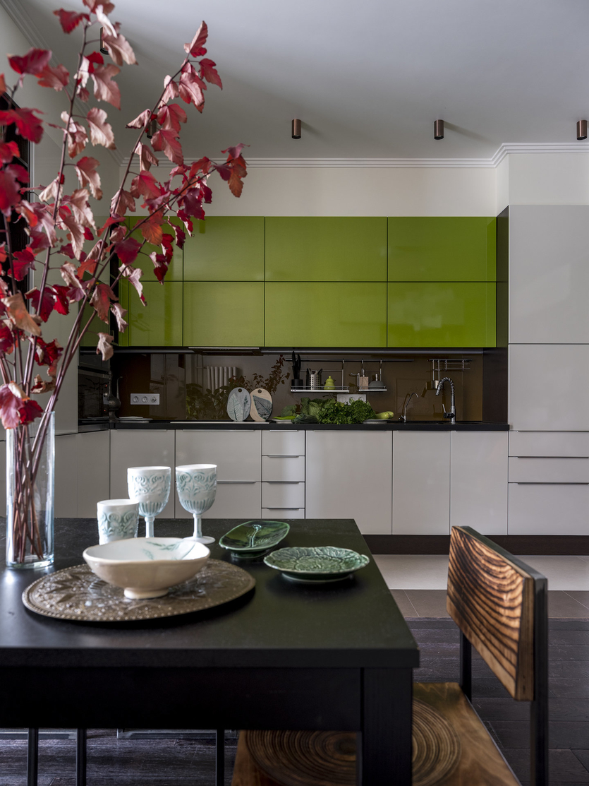
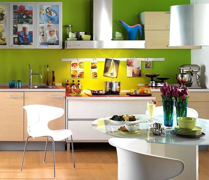
By the way, colors such as gray, pink and blue in the kitchen do not particularly promote appetite, and if you need to limit yourself in nutrition, then these colors are just what you need. But in a kitchen decorated mainly in green, hands literally reach for fresh salads, herbs, vegetables and fruits - this color for their kitchen should be chosen by those who lead a healthy lifestyle.
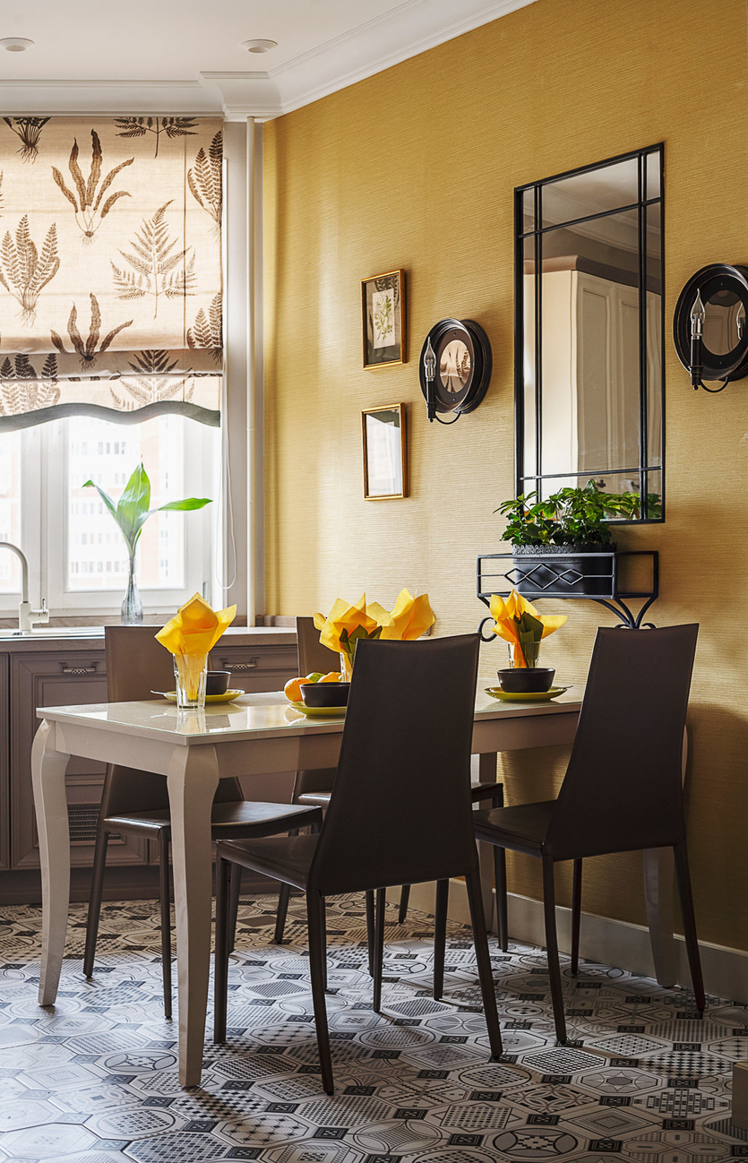
If there is no reason to worry about the figure, then you can choose shades from the yellow color scheme for the kitchen interior.Moreover, each shade of yellow will look completely different in the kitchen. For example, a warm sandy shade will give a cozy feeling, while a slightly cold lemon shade will create a fresh feeling.
Despite the peculiarities of our perception of a particular color in the interior of the kitchen, the general rules for choosing a color scheme for rooms in an apartment or house and for the kitchen remain quite fair. So, it is undesirable to decorate a small kitchen in dark colors - they will visually make the kitchen even smaller. In addition, a contrasting color scheme is contraindicated for a small kitchen - it also makes the kitchen visually smaller.
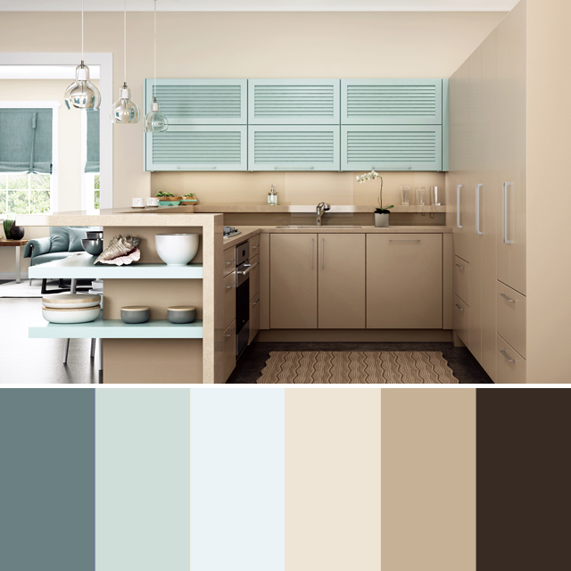
The best choice for a small kitchen -light colors... consisting of pastel shades. It is permissible to leave several bright color accents in the interior of such a kitchen. For example, it can be a set of bright dishes or bright accessories: a towel, a napkin holder, a pepper shaker or a salt shaker, etc.
The most suitable advisor in choosingcolors for the kitchen - own common sense. However, if there are fears that an independent choice will not give a positive result, then you should not risk it - it would be more correct to contact a specialist. A professional interior designer will not only help you choose the right color scheme for the kitchen, but will also advise how best to “beat” one or another selected color so that the effect is as interesting and attractive as possible.
About choosing a floor color
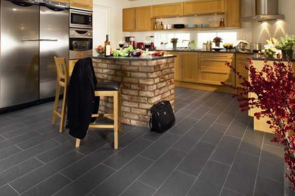
When choosing a floor shade, it is worth starting from the general color performance of the interior.
Light
Such tones visually expand the space. They look quite fresh and go well with any other shade. In addition, scuffs or scratches are practically not visible on such floors.

This shade is able to visually reduce the space. It looks organic with green, beige tones.

Black
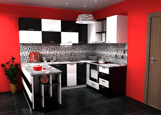
This floor color goes well with white or beige walls. It also harmonizes well with gray tones. To prevent the room from looking empty, it is recommended to use furniture in intermediate colors between the black floor and light walls.
Gray
This shade looks quite elegant. At the same time, it is distinguished by its amazing versatility. Such a floor can be combined with light and dark colors. The combination with beige will help create a cozy interior. Combining with blue will provide a cool atmosphere.
Color palette and style
Each nation has its own preferences in the color of finishing the interior surfaces of the home. Many factors influence an unambiguous choice. These are established traditions, climatic conditions, development of the region and other moments. Residents of the northern regions love the colorful bright interior, trying to make it the opposite of the daily monochrome street. For decoration, choose a color palette in ethnic style.
The owners of apartments and houses in large cities are increasingly equipping rooms in a country style. A simple and bright antipode to a dusty city implies the presence of the most natural shades. The walls are painted in trendy brown, orange with hints of green and blue.

Warm and tranquil Provence gives the feeling of being on the seashore among paradise gardens and fragrant vineyards. The walls are painted in warm, calm colors, with a minimum of combinations. In such a room, the eyes should rest from the riot of colors outside the window.
Variety of palette
You can choose the right color for a room for any purpose. Special color palettes from manufacturers will help with this. Modern painting technology allows you to create a unique design using bold colors.
Any kind of wall paint can be tinted, dimmed or brighter. Each company store has tinting machines. You can achieve the desired color yourself by adding special pigments before work.For mixing, it is better to use the main composition and powder from the same manufacturer. Subject to the proportions, the mixture is guaranteed to match the expected shade.

In order not to be mistaken in choosing wall paint, you need to experiment with samples. In the created sketch, you need to add the desired colors and evaluate their combination. If they fit harmoniously, you can start painting. First, a small area is trimmed, controlling the saturation of the hue.

Cool colors
The color palette is divided into several main types. Cool tones form one of the categories, the main of which are: blue, green. Shades from such a selection are often used to paint the walls of spacious southern rooms. Staying in such a room in hot summer will be the most comfortable.
When using cold tones, the main thing is not to overdo it and not create a feeling of sterility. It is better not to paint the walls in one color. Due to the different intensities of indoor lighting, it will look different in each individual area. Wall color - background for furniture, accessories, decor. The properties and perception of any of the shades of the cold palette are influenced by the area of the room, adjacent rooms in the house. The smaller the space, the lighter the tone should be.

Warm colors
Warm tones include beige, yellow, red, pink, lilac and other colors that create coziness and uplifting.
To paint the walls of small rooms, they must be used with care, as they visually reduce the space. Warm colors will be a great solution for rooms with poor lighting, windows which face north
The color scheme of the walls is selected based on the purpose of the room. Any warm color other than orange can have a cool hue, depending on the saturation. This feature must be taken into account when drawing up wall paint. Some shades will change temperature or become neutral.

Calm color palette
In such combinations, cold tones are more perceived. They don't always have to be pale and dull. A great combination for walls would be purple - green - blue. Any color from a calm palette can be safely combined with gray.
Blue is often used as the main color in calm palettes. It can be any shade of it - steel, silver. Intense colors emphasize the strength and leadership qualities of the owner of the premises, while light colors soothe and pacify.
A warmer, calm palette includes beige, light brown, and white. The darkest of the colors can be used to paint an accent wall or a specific area, the rest can be used for contrast. In a small amount, minor bronze, gold details will look great.

Bright color palette
Too bright colors are not suitable for large areas. With the help of such a palette, individual elements are usually selected. You can diversify the calm interior with beautiful patterns. To give the room originality, contrast coloring of adjacent surfaces is used. This technique will look great in spacious rooms.
When choosing a bright color palette for walls, furniture, floor, ceiling should only remain an addition. Do not oversaturate the room with color, otherwise it will seem variegated and tasteless. Orange, yellow, red will help to narrow the huge space.

How not to be mistaken with the choice of furniture colors
Most modern kitchen furniture manufacturers perform it in the entire color palette. Experts recommend purchasing furniture that will be two or three tones darker than the walls, but slightly lighter than the floor. The classic version is a wooden set, made in the colors of stained or bleached oak, ash or wenge, pine or cherry.Two-tone combinations are also popular, but the upper wall cabinets are made lighter than the lower ones - so that the furnishings gain visual stability.
Kitchen appliances are most often white, although, if necessary, they are selected in color - black, brown, silver, light green or any other. If it was not possible to match it to the background color, it is permissible to build most of the items behind the "blind" doors of the headset's facades.
In order not to be mistaken in choosing the color of furniture, do the following:
make up a project - this is done for money, when contacting a specialist, or for free through online designers, found on almost every website related to design;
any photo you like will become the basis, but to apply it “on the ground”, you will have to work hard;
it is important to pre-analyze the proposed color scheme - "like it or not like it" - while being guided by both personal feelings and the recommendations of professionals.

How to choose the color of wallpaper on the walls
In this case, it is worth focusing on the color scheme of the headset. They are solid or colored.
Plain
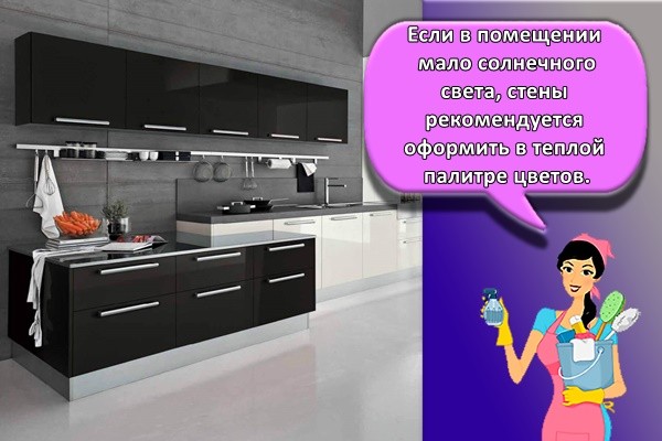
If there is little sunlight in the room, it is recommended to decorate the walls in a warm color palette. For this, yellow, beige tones are suitable. Orange colors are a good solution. With an excess of sunlight, it is recommended to abandon overly bright shades. It is best to give preference to soft and unobtrusive tones. Apricot, coral, saffron look great.
With drawing
When choosing a picture, it is worth considering the following features:
- Large prints visually reduce the area of the room. At the same time, small colors, on the contrary, make the kitchen more spacious.
- Geometric prints in the form of lines that intersect with each other help create a continuous space.
- The vertical print makes the room look taller.
- Horizontal patterns visually expand the kitchen. At the same time, its height visually decreases.
- Diagonal lines help to make the interior more dynamic and create the illusion of movement.
Textured wallpapers are considered an original solution. They give the walls a new dimension and give them an extra dimension. Due to the play of shadows, it will be possible to create many interesting effects.

What is background, accent and contrast
In beautiful photos with a professional design, you can always notice some basic, main color, and all the others act only as its “singing along” and additionally emphasize it. For example, if you take a photo from a furniture catalog, the main thing will be the shade of the facades made of MDF or other material, but the wallpaper will remain neutral, background and unobtrusive. This division also works in real interiors.
Background is a base color, usually light, which is used in two roles: as a kind of "canvas" to further highlight bright tonal accents, or as an element to soften an overly saturated gamut. In both cases, it helps to make the design not too tedious and annoying.
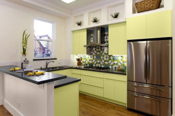 The main or accent color is the one that immediately catches the eye. It is usually the same as the background, or slightly less. It can be a shade of MDF, and one painted wall, or even a ceiling.
The choice of a complementary or contrasting tone should be especially thoughtful. The wrong combination will ruin the whole design. Another shade in the design of the kitchen is not always necessary, but if you want to add it, you should think about increasing the percentage of the background color to compensate for the excessive saturation.
It is better if some neutral, not too bright option is additional. For example, a very fashionable combination today is a basic beige, the main grassy green and an additional dark brown.
Universal tones
White
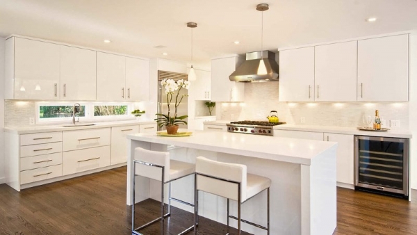
Popular at all times and surprisingly many-sided.Its shades can be cold (giving off in a blue or gray undertone) and warm - with a barely noticeable pink or yellow tint. But white does not have its own "character", so it just needs companion paints: without them it will look boring and inexpressive. The beauty is that it can be absolutely any shade - depending on the chosen interior style. But even if it is an aggressive red or gloomy colors (violet-black, gray-brown), achromatic white will smooth out the harsh impression from them.
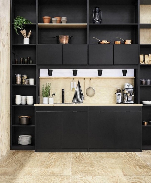
Black
Today, black is also in vogue, but in large quantities it is used only for decorating spacious kitchens. But in various combinations, this color scheme looks impressive, giving the interior individuality.
Like white, it can be diluted in almost any shade, but care should be taken with purple and green so that color schemes are beneficial for the kitchen.
Gray
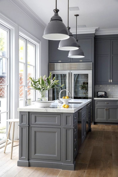
A universal and much more varied tone than the black and white colors that form it. Gray is now especially relevant: it attracts with its elegance, easily coexists with other shades in the interior, emphasizing their strong features and at the same time softening the harshness. You can choose a gray paint of any saturation:
- Cramped and overly bright colored kitchens are best decorated in trendy light gray tones.
- On a large area or in the company of pastel shades, a deep dark color scheme looks better.
Brown
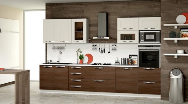
This color can be called conditionally universal, since there are practically no "contraindications" for it in terms of compatibility with other paints. The only exceptions are saturated shades of purple and gray. But since most of the kitchen sets are produced in the brown color of natural wood, it is rarely used for decoration by itself. You will not refuse it in a variety of tones, and in terms of practicality, this is the best color for the kitchen. Brown surfaces are the least visible for splashes, fingerprints and other contamination.
Rule 60/30/10
A table compiled specifically for such purposes will help to choose the shades correctly. It is called "60 / 30-10". The purpose of this cheat sheet was to help budding designers choose color combinations when creating an interior. After all, color balance is very important for an attractive design. The numbers 60,30 and 10 just indicate the percentage of dominant, second and accent colors.
It is not at all necessary to calculate everything down to the millimeter, the main thing is to follow the main idea of this rule:
- decorate most of the kitchen in one color - it can be walls, floor, set; most often the dominant gamut is neutral, the shades of which are close to each other, all white tones are ideal;
- about ¾ of the room is decorated with additional shades, there should be no more than three of them, as a rule, they are darker and richer than the dominant;
- the rest is made out in bright and as dark shades as possible, which should look like accents and details.
We offer you several ready-made combinations based on this rule. In the ratio 60/30/10 the following scales are perfectly combined:
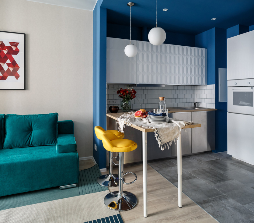
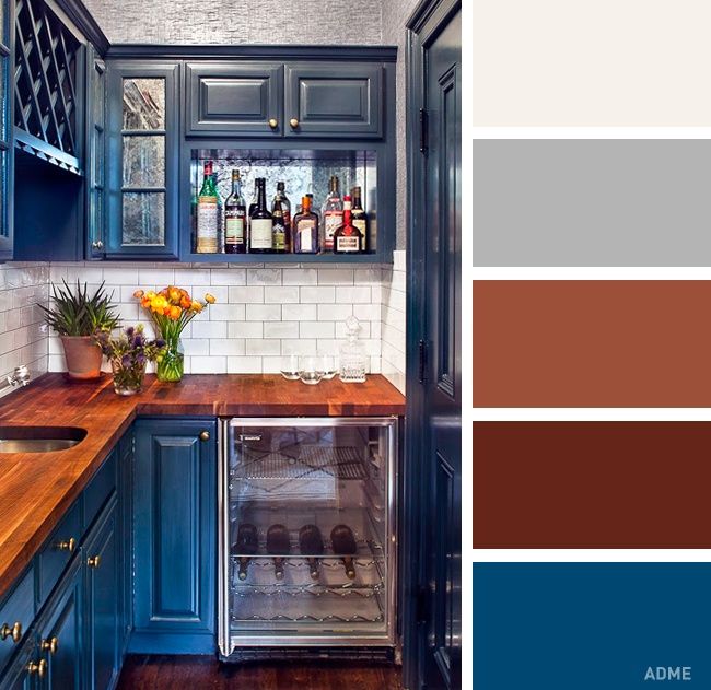
- deep blue, brown, cream (beige, white);
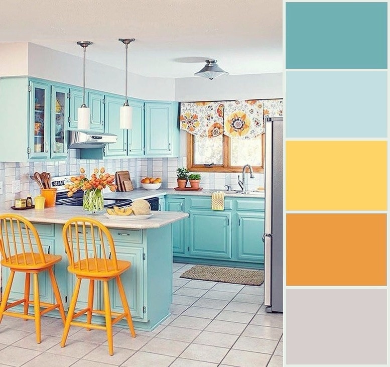
- greens, blue, yellow;
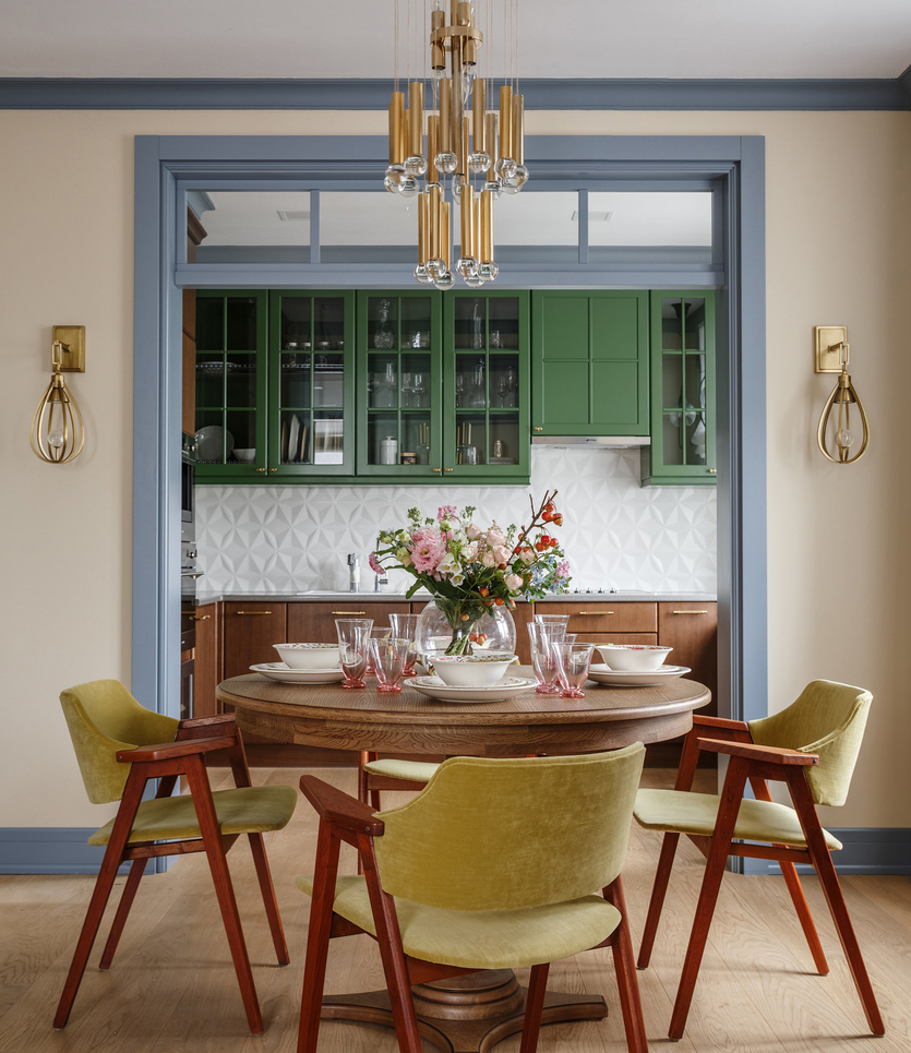
- brown with a golden sheen, green, white;
- lavender, whiteness, black;
- gray, white, yellow;
- peach, yellow, brown.
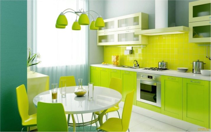
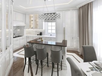
If you take a white palette as a basis, then you can pick up additional and accent colors from almost any gamut to it. White walls and headsets are the most versatile background for color and style solutions. If you choose, for example, red as a basis, it will be very easy to overload the room, but it is unlikely to create a comfortable design.
The psychological impact of color on a person
Each color scheme in its own way affects a person, his mood, well-being.For the past few centuries, various colors have been considered symbols of all kinds of things and phenomena. Orange is associated with fire, red with the sun, passion, yellow with grain, gold and wealth, white with cold, purity, green with nature, blue with the sea, black with earth, other worlds, etc.

How do some interior colors affect people:
red - the most "strong" color, has the ability to excite, tire, disturb. It speeds up breathing, blood pressure, heart rate, and also increases sexual activity
It should be used very carefully in the interior;
orange - associated with celebrations, holidays, stimulates the psyche, activates blood circulation, the work of the organs of the gastrointestinal tract, helps to digest food;
yellow - creates a feeling of "childish" carelessness, stimulates mental activity, increases efficiency, reminds of sunny days, even in cloudy weather;
green is the "color of life" and is very beneficial for the eyes. It soothes, refreshes, reduces appetite
Bright shades give the interior nobility, luxury;
blue - reduces blood pressure, improves overall well-being. A room decorated in such tones seems cool, but when there is a lot of blue, it evokes melancholy, apathy;
blue - soothes, but for some it causes anxiety. Kohler is considered austere, cold, attuning to the working mood, but it is better to avoid excessively dark shades so as not to darken the space;
purple is solemn and luxurious, it stimulates the respiratory organs, normalizes heart activity, and promotes recovery from colds. But for persons with an unstable psyche, color is contraindicated, as it causes fatigue, nervousness, and can frighten;
white - calms, clarifies thoughts, creates positive emotions, he is noble and wise, unable to carry any negative;
black - noble and gloomy, luxurious and frightening. It is not used in rooms where there are often small children, unbalanced, visually impaired, elderly people, since the color causes them negative emotions.

Types of color combinations
Choosing shades in the interior of the kitchen is a fascinating activity that becomes quite simple if you understand the basic principles of color combination. There are not very many combination rules. Here are the main ones.
- Start from the number of shades. There shouldn't be too many of them. The maximum allowable number of contrasting colors in a design is up to 3, within the same range - up to 5. Background palettes (headsets, floor, walls) are fundamental, they should not contradict each other, for example, consist of different shades of white.
- Use a color wheel. The shades on the chromatic circle will give you a complete picture of how a particular color is in harmony with another. This rainbow scheme will come to your rescue more than once when choosing a color palette.
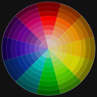
There are three main combination schemes.
- Monochrome, when shades are selected within the same palette. Suitable for creating elegant sophisticated interiors, but it can seem boring, therefore it requires a variety of textures, especially if the main background is in white tones.
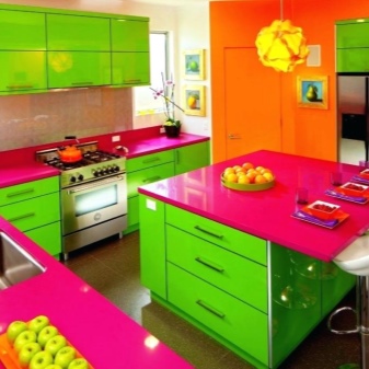
- Contrasting, when the opposite colors on the scheme are combined. Such a design is always very effective and expressive, but there is a danger that it will be too intrusive, therefore it requires dilution with neutral scales. It is better not to take pure colors as a basis.
- Harmonious. It uses combinations of nearby shades in the scheme. This is the most practical system, requiring catchy accents and interspersed with neutral scales.
Other combination rules include the following.
- Don't overdo it with darker shades.Despite all the aesthetic effect of dark materials and objects in the interior, especially in combination with white furniture, a work surface and floor in black or dark brown will bring you a lot of trouble. Practicality is a prerequisite for the formation of a kitchen project, so if you are not ready to get rid of traces, stains, drops, fingerprints, crumbs and dust several times a day, try not to use wenge, wet asphalt, anthracite when choosing a floor, facades and work surface etc. White kitchen is much more practical in this sense.
- Consider lighting. Color in different light "plays" in a completely special way. If the kitchen is not on the sunny side, you should be careful when choosing pastel and muted shades, they will give a dirty impression. The color should help to improve the quality of the interior, therefore, in a non-sunny room, it is advisable to use warm colors of rich, deep shades of red, pink, citrus, as well as classic white. It is better to abandon the blue palette, gray and purple. If the window faces south, pastels, blue, lavender, mint will play in a completely different way, gently and elegantly. Catchy shades can crush and make the room visually stuffy, heavy.
- Apply a color pattern. If you are unsure of your design skills, paint a piece of paper in the color you want to use and hang it on the wall of your future kitchen. It is enough to see how the color changes in the morning, afternoon and evening to understand whether it will look as good as in a building supermarket.
- Consider the size. Small rooms are best decorated in light colors. All shades of white will help to visually expand the space, add air, light, and push the boundaries. The white palette, contrary to popular belief, is quite rich: boiling white, snow, ivory, eggshells and others. All of them are superbly combined with each other and with other palettes. So that the white kitchen does not seem dull, it is enough to add beautiful bright accents, diversify the textures used. In addition to white, light gray, light blue, beige, cream colors are very good for small rooms.
- Remember the properties of color. The cooler the range, the less it affects the increase in appetite, and vice versa, warm shades contribute to its excitement. Here you need to consider the lifestyle and goals that you want to achieve.
- Choose a starting point. This can be a kitchen set, wall floor or decor. The main thing is that you have something to push off from and plan further finishing.
- Don't rely on memory. Prepare templates and diagrams that you use in hardware stores and supermarkets, because it is impossible to remember all the successful combinations. You can also use special color matching programs.
Factors affecting the choice of colors
When choosing a suitable color for the kitchen, it is important to have a competent color combination of all objects and surfaces, the area of the kitchen, the location of the compositional center of the room, lighting sources, and the choice of a suitable background.
Professional designers advise:
regardless of the chosen color scheme, make the ceiling the lightest, and the floor the darkest. The walls are made of an average shade or coincide with the tone of the floor covering;
with a few exceptions, it is advisable to use no more than three colors: the main one, which occupies 60-65% of the space, the additional one, which will take 30-35%, and the accent one is 5-10% of the area being designed. Excessive multicolor sometimes turns into an unsystematic mess;
the background color in small rooms is usually matte - light or medium saturation
For more spacious rooms, bright and shiny options are acceptable;
it is important to take into account the illumination of the space and the side of the light - for the north, north-west side, the warmest, lightest tones are used. The same goes for narrow, cramped rooms with low ceilings.
For spacious southern, southeastern premises with a high ceiling, cold tones of varying degrees of saturation are used;
a kind of "starting point" of the kitchen interior is usually a set, since this is the most expensive part of the kitchen interior. In other versions, the main one is the wall decoration, the textile decoration of upholstered furniture (if any).

For the work area, namely the countertop, kitchen apron, it is recommended to choose practical materials, non-marking colors, so that you do not have to spend an excessive amount of time and effort on cleaning them from dirt. The living or dining area is easiest to highlight with color, but the smaller area is decorated with a lighter tone.
Stylish design features
Despite the fact that the color of the pistachio is in good harmony with various shades, this color can only be used with certain styles. Basically, this color scheme is used in modern interiors or rooms with a design in which natural motives are present.
Classical
In a classic interior, it is recommended to paint the walls in pistachio color, and the rest of the design elements in pastel colors. This shade is combined with beige or cream. In this style, the color of pistachios and pearls are in good harmony.

Japanese
Japanese style is a minimalist direction in the design of premises. Therefore, the color of pistachio is actively used in this design. This shade is recommended to be combined with wood or milk-white colors. You should also use relief surfaces in the room, which will perform a decorative function.

Provence
The pistachio color in the Provence style kitchen plays a major role that sets the atmosphere for the entire room. This shade in this design is combined with wood and "warm" colors.
Minimalism
As with Japanese design, minimalist kitchens offer subtle accents. Premises with such a design are not recommended to be overloaded with decorative elements. Therefore, in kitchens in the style of minimalism, pistachio color occupies a dominant position, combined with white, beige, sand and other similar colors.
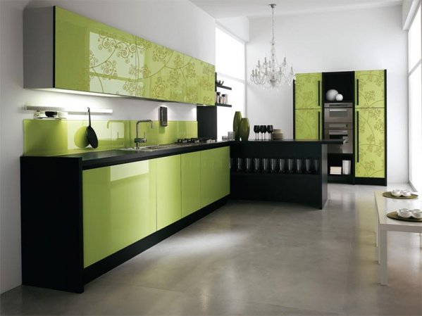
Country
Country is the American version of the country style. In kitchens with this design, the pistachio color is often combined with wood or dark brown shades, in which both pieces of furniture and walls with floors and ceilings are painted.
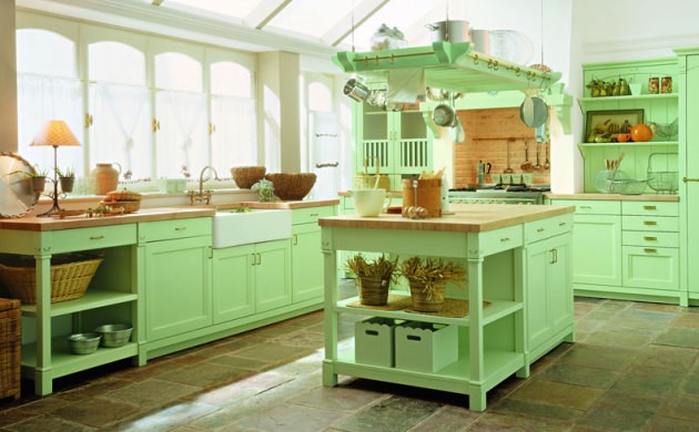
High tech
The color of pistachio in high-tech kitchens is used to soften the strict outlines of the interior. This shade is used to create an accent. Therefore, the facades of the kitchen set are often decorated in light green colors.
Why is it important to observe the combination of colors in the interior
Different color combinations can evoke both positive and negative emotions. Therefore, in order to create an interior that will be not only stylish or fashionable, but also cozy, you need to take into account the individual characteristics of each family member. So, the most sensitive in the perception of color are women and children
Accordingly, special attention should be paid to the design of the children's room, bedroom, living room and kitchen. To learn how to correctly combine colors in the interior, you need to decide on the goal that you want to achieve when developing a new design for your home.
As you know, each color has a different effect on a person. The presence of a certain color in the interior can have a beneficial or negative effect. Therefore, when choosing a color for the interior, it is necessary to get acquainted with the meaning of the main color scheme, this will create the harmony of the space. So, the right combination of color in the interior of the bedroom will help you to relax.Competent color combination in the interior of the living room will inspire for sincere communication, and the interior of the study will set you up for productive work and increase efficiency.
Green color
An unexpected burst of color can be truly charming. To prevent a bright, fresh color from becoming overwhelming, the rest of the elements should be neutral. For example, milky white walls, light wood facades and light green flooring.

 Bold classic palette
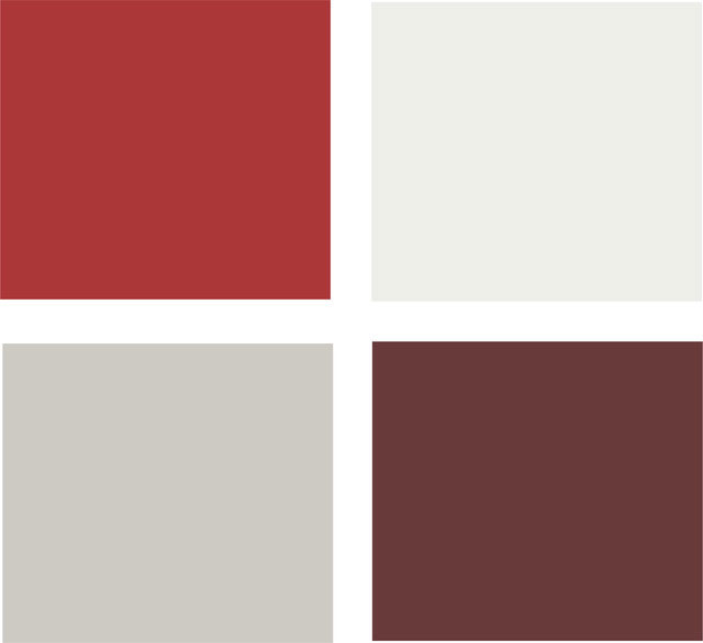
Stunning, eye-catching colors aren't just for modern kitchens. Massive kitchen sets, designed in a classic style, can have a rich chocolate color. Backsplash tiles can be decorated with intricate patterns, but in neutral colors. Thanks to this, the apron does not compete with the furniture, but complements its color. The stove, oven and dishes are of a deep red color, it also complements the chocolate one, making it deeper and richer.
Advantages and disadvantages of decorating a kitchen in blue colors
The perception of blue gamut is influenced by lighting. The kitchen windows facing north, northwest let in a little sunshine. A room dominated by dark blue shades will be depressing. Well-planned artificial lighting makes it cozy. The lack of yellow sunlight is compensated by lamps of the original form. They are placed in the dining and work area.
Psychologists find blue to be difficult. It suits confident, determined individuals. It is quite natural that blue kitchens can be found in the apartments of people engaged in business and creativity. A melancholic, indecisive, not self-confident is not comfortable in such an interior. The blue color makes such people discouraged, causes depression.
It is difficult to make a large kitchen cozy if it is dominated by blue colors. Only professionals can do it. In small rooms, blue visually enhances. Designers take this into account, use cornflower blue, azure, turquoise shades to decorate the ceiling, walls, and other surfaces.
Eating is the main purpose of the kitchen. Blue is one of 10 colors that affect appetite. This must be taken into account when choosing an interior. Shades of blue are relaxing, a person does not think about food, but about how to rest, sleep. That is why the blue kitchen is ideal for weight-control people who are on a diet.
Finishing features
Despite the fact that pistachio color creates a cozy atmosphere in the room, both the combination with other shades and the location of the lighting fixtures play an important role in this. The latter are able to neutralize the above effect.

When decorating a kitchen in this color, it is recommended to select peach, emerald or cream wallpaper or other materials.
Those who prefer rich colors are advised to pay attention to the non-standard combination of pistachio with red, orange and purple flowers. Decorative elements such as vases, baskets or cans, made in light colors, will complete the kitchen design in this style.
Walls
Walls are recommended to be finished with materials that differ in color from pistachio furniture. Moreover, in this case, you can use other tones of green (olive). However, the best solution would be to decorate the walls with light and “warm” materials that do not sharply contrast with the pieces of furniture. These include various shades of brown (dark, beige, and so on), white, yellow, and others.

Floor
The floor should be covered with laminate or tiles of "warm" colors
At the same time, the coverage should not focus on itself.
Ceiling
When decorating the ceiling in the kitchen, it is also recommended to use neutral shades that do not create pronounced accents. In particular, for this, tension structures in white, beige or other light colors can be used.

