Hello! With this article, we begin a series of publications about mistakes in interior renovation and design. So, if you want to stay informed, do not forget to subscribe to our Zen channel or choose any other method that suits you. For example, at the end of the article, you can leave your mail, and once a week we will send the most interesting of our publications to it!
But, to the point: in the interiors that we will consider, typical mistakes are brought to the point of absurdity. But, I will tell you for sure, people did not make them so that you and I would laugh at them. That is why we will use these examples to discuss with you what is wrong with all these rooms and why the “would-be designers” who designed it did this.
In variegation, but not offended
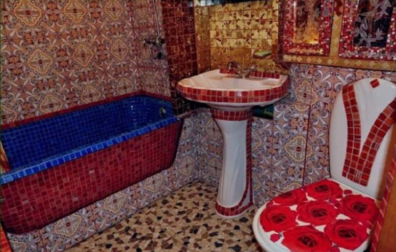
The authors of this bathroom clearly wanted to repeat the style of Arab saunas. However, the inability to combine bright colors played a cruel joke with the "designers". The fact is that even a bright blue bath or red flowers can sometimes be spectacular and beautiful, but they should be the center of attention, and the whole environment should only be emphasized and contrasted, and not trying to take this attention away from yourself. In design, this is commonly referred to as accents.
In the bathroom, classic objects of attention, with neutral colors (white, pale pink, gray and others), are usually a rug, a curtain and, for example, a toothbrush cup. In addition, these elements can always be easily replaced, depending on the taste and mood at a particular moment. But even so, a blue bathtub could be very beautiful if the entire bathroom was in a pale beige, almost white, color (noble marble).
Brightness is the sister of talent
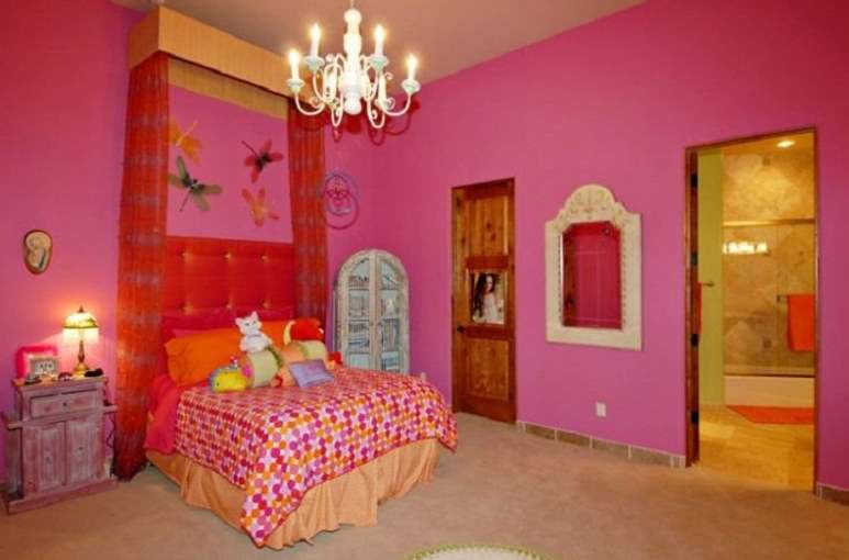
Children's rooms are very often made in rich bright colors (by the way, modern psychologists are increasingly agreeing that with the modern abundance of information in which young children live, it is better for their room to be without bright annoying colors). But let's think about the main problem with this room. After all, it is not in itself pink, no, but in the fact that there is too much of it. Brightness isn't necessarily a bad thing, but it should be used moderately and carefully. So, for example, if in this case three walls in the room were white and only one, for example, the one against which the bed is leaning against, pink, it would not have looked so heavy even then.
If the parents and the child want all the walls to be pink, you can choose a pale shade of it, perhaps even with some kind of texture.
Borokkukareku
Many people want to touch wealth and luxury, and some even succeed. But everything has its place and time. And, of course, everything has its own space. In the first case (Donald Trump's apartment), it is clear that everything is furnished very expensively, the rules for combining colors are followed, but even here the abundance of meaningless luxury looks inappropriate, because this is not the Versailles hall. In the second case, the cheapness of materials and an unsuccessful combination of styles (stucco and flowers on the ceiling) are also striking. If it's the painting, then at least like in the Sistine Chapel, although in this apartment even such a move would look bad, worse than in Trump's apartment.
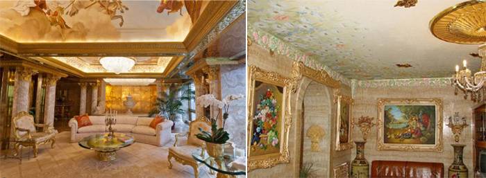
What can be done? Everything is very simple. Look at European styles such as Viennese, Biedermeier, Art Deco, Provence for small apartments. For large ones, antique is also suitable.

The charm of the Thai bourgeoisie
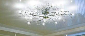
Have you ever been to Thailand or India? Due to the high humidity and hot weather, local walls are almost always covered with mold in the corners. Even in a five star hotel, this is completely normal and if you complain, you will not be understood. But why did you make such incomprehensible greenish spots in a rather stylish living room? Of course, this is a rhetorical question. We do not know what the author of this interior wanted to portray.But let's think about what can be done if our goal is to decorate with something an empty corner and ceiling of the room.
At one time, futuristic decor elements were very popular: curved smooth lines on the ceilings and unearthly lighting (green, blue, pink tones), personally I am not a fan of this style, but I admit that in this interior, such a solution would not look bad. But I personally would prefer to put hanging bookshelves or an interesting unusual painting in this corner.







Lol. The bathroom is a masterpiece. You don't understand anything hahaha. Lebedev will confirm)))