Square meters are never superfluous - this is how a person is made. But what if you actually have a very modest footage at your disposal? It is important to use it wisely. Even the smallest room can be visually made more. In today's article, we will look at the basic design techniques for decorating a small apartment, which will perfectly cope with this task.
Letting in more light
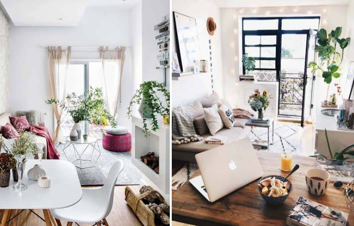
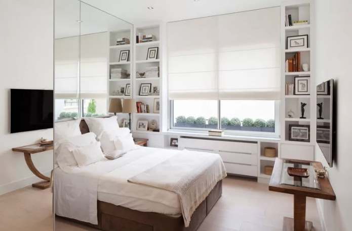
And the more, the better. No need to hide windows behind heavy curtains and clutter up window sills. It is better to choose light tulle and small curtains - they will visually lengthen the space. Light colors, as well as mirror and shiny surfaces, spread sunlight well in the apartment.
Place the mirrors so that they reflect a lot of light, and also near doorways - this will visually increase the footage.
Artificial lighting should also be abundant. Add spotlights, LED lights, floor lamps or wall sconces to your interior. It is better to refuse massive long chandeliers - they are superfluous in a small apartment.
By the way, we wrote an article about why small spaces are actually the best "in crowded but not mad". We recommend that you read it, there are many interesting things.
Getting rid of the doors
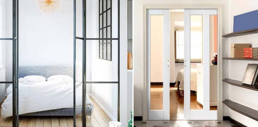
Leave only those that you really can't do without, for example, in the bathroom, and it is better to clean the interroom. But if it's still not comfortable without them, install sliding ones - they will not take up much space. When choosing a door material, give preference to glass - it will not interfere with the spread of light throughout the apartment.
Hiding furniture
We refuse from bulky cabinets and impressive storage systems. We choose mirrored wardrobes or decorate them in the colors of the walls. An excellent option would be hanging shelves and racks, as well as transparent glass or acrylic furniture.

We enrich the interior
A small area does not need to be overloaded with furniture and decor items, but you do not need to strive for strict minimalism. Leaving the walls bare and light, instead of visually expanding the footage, we risk getting the opposite effect. A combination of various finishing materials and textures will help to avoid this. Such an interior will look brighter and richer. But graphics and large drawings take up space. It is not necessary to completely abandon bright accents - but if it is just an accent. That is, an element of decor may be bright, but not all walls. You can emphasize only one of them with color - the distant one, such a technique will visually push the side walls apart.

Expanding and lengthening
You can increase the height of the room with the help of vertical stripes - mirrors, floor lamps, high shelves, as well as the corresponding pattern on the wallpaper. If the room needs to be made wider, horizontal stripes and decorative elements are a good solution. To expand the space in a room with a very high ceiling, you need to make it darker than the walls.

