Stylish features of the interior
Stylish features of the interior impose certain restrictions on color combinations. This circumstance must be taken into account when choosing finishing materials and furniture.

Minimalism
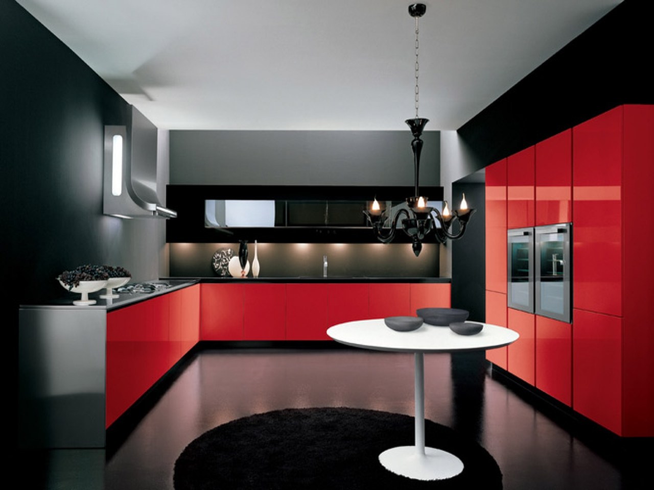
The minimalism style provides for a combination of white, gray, beige and black shades. Other tones are usually not used in this case. However, the red kitchen, decorated in a minimalist style, allows you to create a memorable and bright room. But, as in other cases, this color is used in dosage.

High tech
High-tech style involves the use of neutral "cold" shades. Kitchens with this design are dominated by white, dark, gray and black tones. Red is used in high-tech style to create accents.
Loft
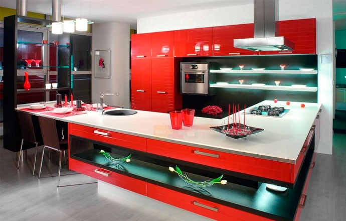
In loft-style rooms, an achromatic range of shades is used in combination with solutions that are non-standard for classic rooms. This includes brickwork that adorns only part of the wall, or metal pipes that show through rust. In such kitchens, red is used to highlight individual items, rather than as the main color. In particular, it can be 1-2 shelves, household appliances or other.

Provence
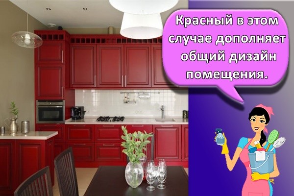
Provence style involves the active use of olive or other light shades of green. These colors go well with pastel tones. In this case, red complements the overall design of the room. Excessive use of such a shade in a Provence style kitchen is prohibited.
Mediterranean
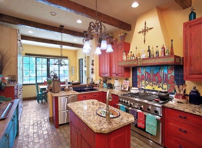
The Mediterranean-style rooms combine light colors, including various shades of blue. In kitchens with this design, a set and other furniture made of wood are often installed. For coloring the latter, you can apply "warm" shades of red (closer to the brown palette).
Rustic
The rustic style combines an abundance of wood products and walls, finished with stone (brick) or painted with paint in one of the shades of brown. Red is rare in a kitchen with this design.

Shabby chic
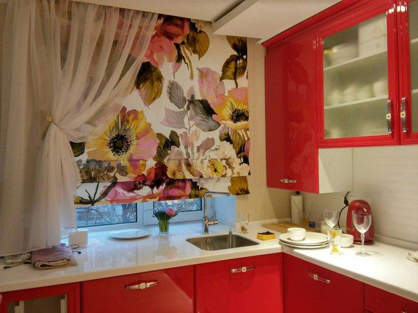
Shabby chic is a non-standard style of interior decoration, in which there are elements of decoration and furniture with a certain touch of negligence and wear. But at the same time, the basis of the interior is made up of classic items. Shabby chic style involves the use of vintage or artificially aged furniture. Red in a kitchen with this design is used as one of the elements of the overall design. This color does not play a dominant role.
The combination of white in the interior of the kitchen
The choice of colors for companions must be approached carefully.
They start from the following factors:
⇔ room illumination, large or small windows;
⇔ sunny or shaded side;
⇔ what mood the color palette should create.

Photo by
on
Combination of white with black and gray.
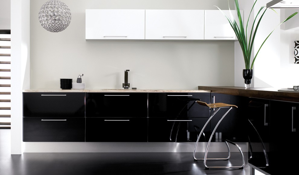
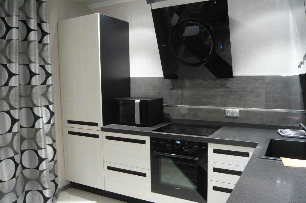
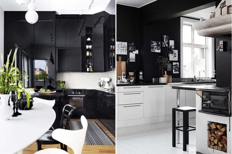
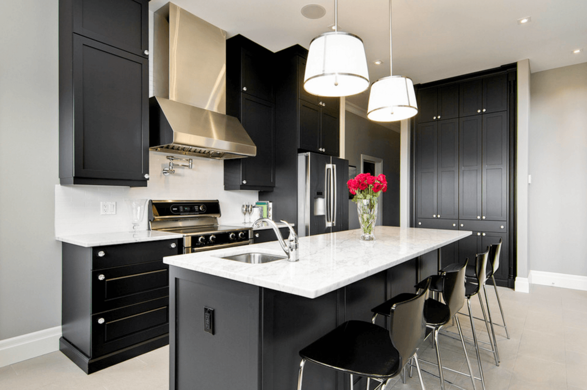
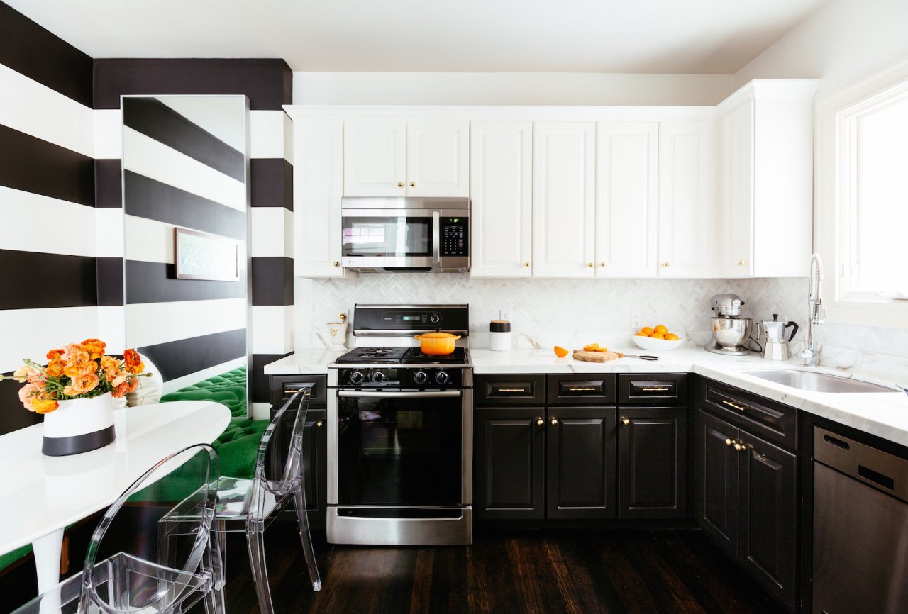
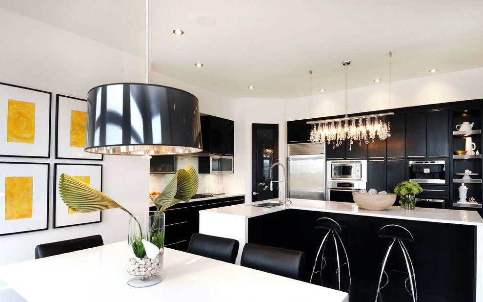
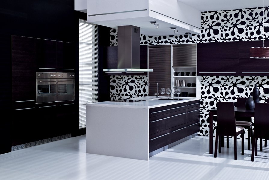
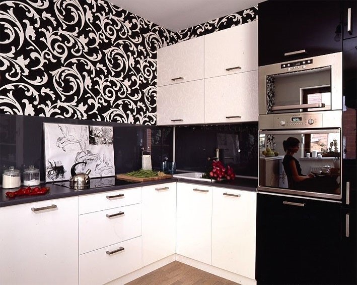
Note the kitchen in black and white.
The atmosphere of peace, tranquility, calm atmosphere will be created by the harmony of white and pastel colors. Cold shades are added to the room on the sunny side: green, blue, brown, purple. Shades of green will add a sense of freshness to the interior, blue - the smack of the sea breeze, heavenly depth. Beige and brown will bring a mood of peace, stability. Purple - notes of romance, violet tenderness.

The combination of white and blue in the interior.

Credit: @
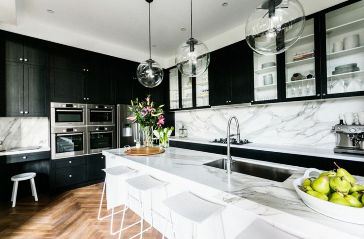
White and gray kitchen with marble top.
Contrasting combinations with rich tones; red, orange, burgundy, green, blue and others will make the interior more expressive, expressive.The combination of white and black is the unity of two opposites. Requires skillful interpretation. Introduces elements of shocking, challenge, but looks elegant.

Photo of a white kitchen in the interior combined with red and gray.
A "cold" room, with windows to the west, north, needs to be warmed with warm tones of the orange-yellow spectrum.

"Warming" bright orange wall.
The color combination is used in the elements of the facade of furniture, decoration, decors. In contrast, they build the zoning of the room, highlighting the working and dining areas of the kitchen.
Features of choice and finishes
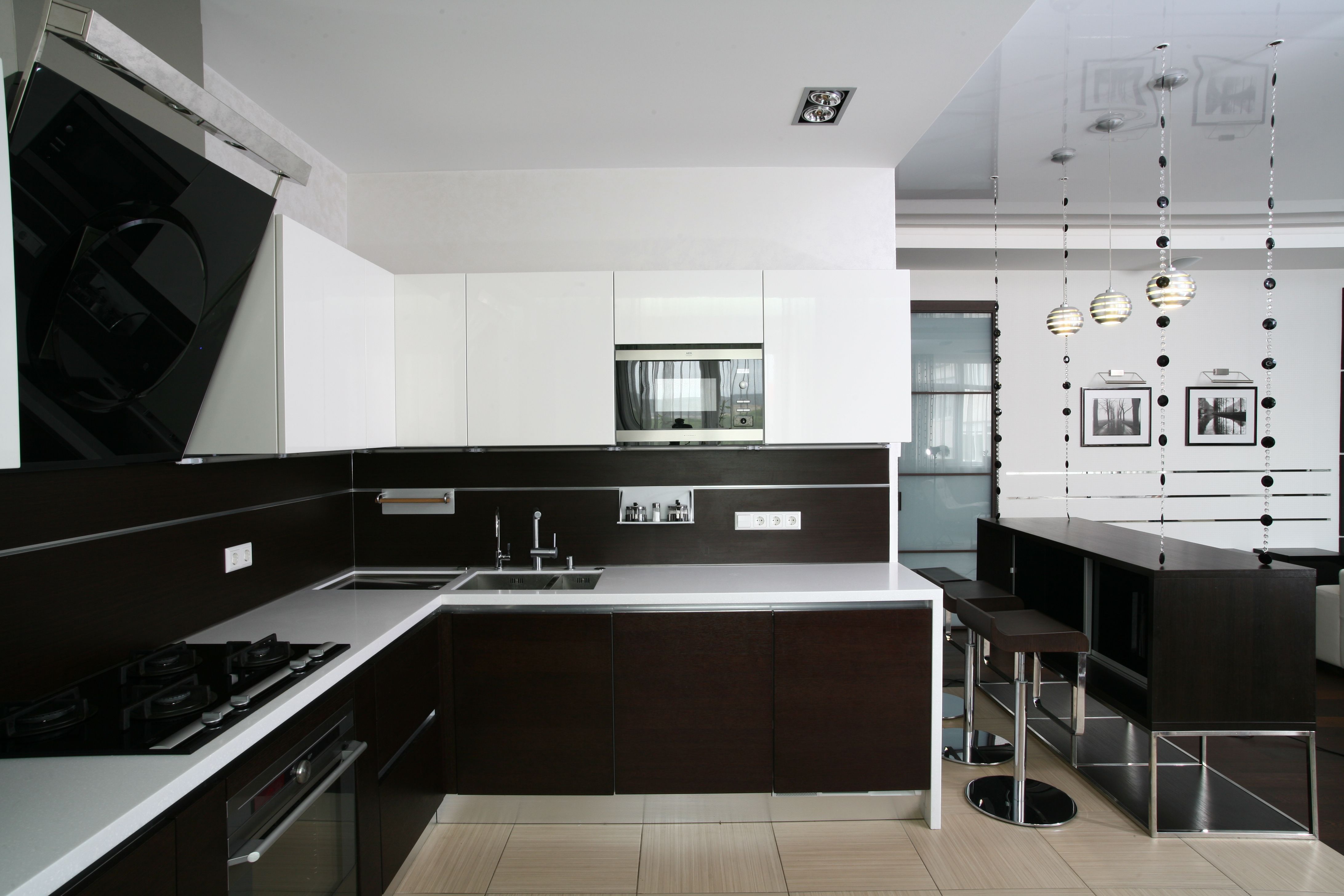
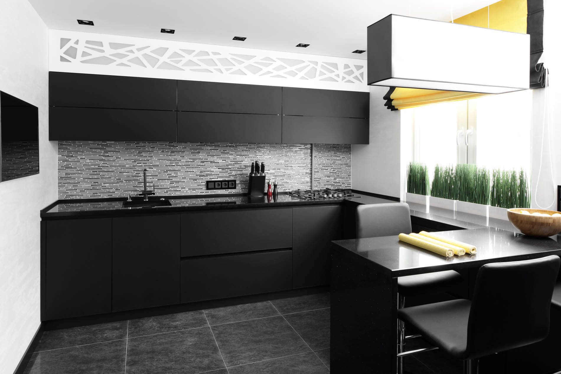
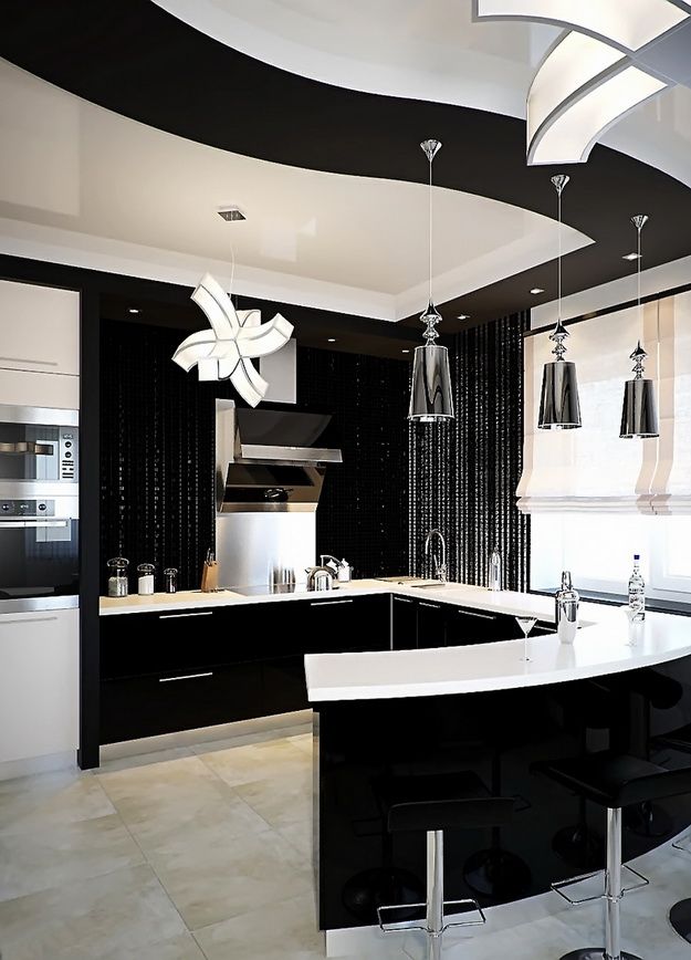
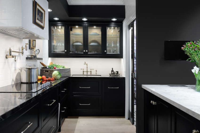
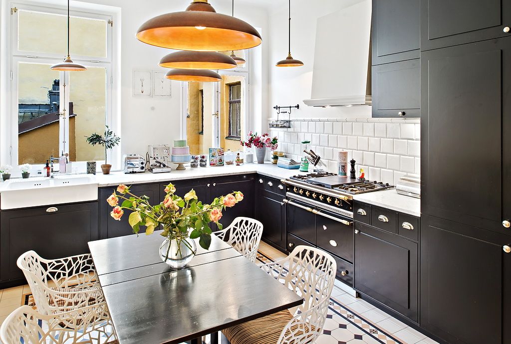
A black and white kitchen set should be in harmony with all interior elements.
Walls
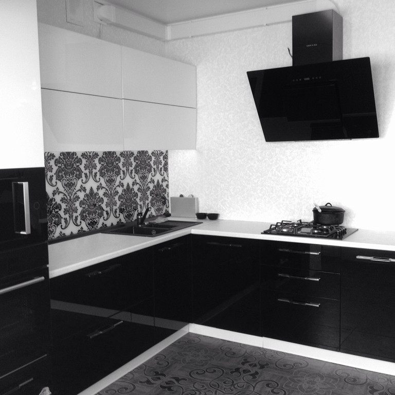
Wall decoration options depend on the size of the room, in proportion to the ratio between colors. In a small kitchen, the walls should be white or have a small dark print. In larger kitchens, it is permissible to make 3 white and 1 black wall or wall with photo wallpaper in the style of black and white photography.
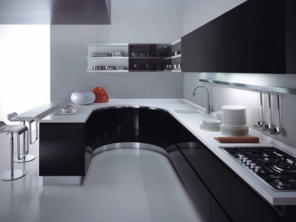
A wall with an imitation of an old photograph should be free of furniture, as it is an important element of the decor. A bright spot of color will enliven the wall composition.
Floor
Floor color can be:
- black, provided that the ceiling is white;
- in a black and white check, if there is a repetition of a geometric pattern in the furniture;
- white, with a dark pattern;
- with alternating stripes;
- white.
Floor covering material for black and white design - tiles, linoleum.
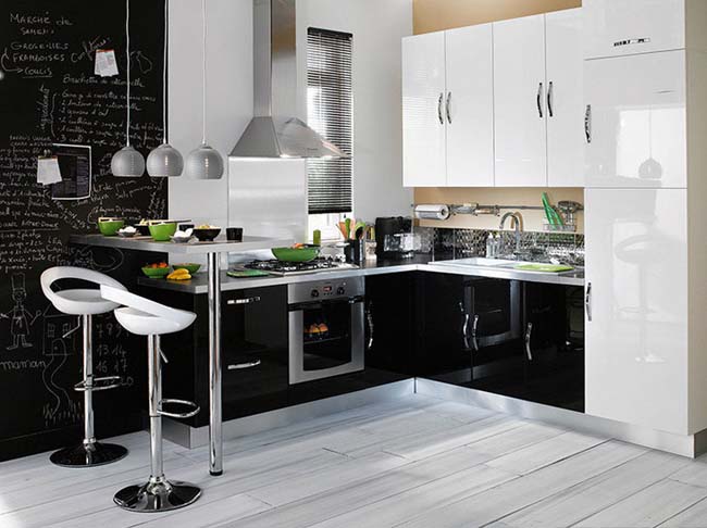
Ceiling
Black mirrored ceiling possible in large, high kitchen
In combination with LED lighting, such a ceiling resembles a starry sky and serves as an additional, eye-catching decorative element.
White ceiling is the main option for small to medium sized kitchens. With a wall height of more than 3.5 meters, the ceiling will look good, divided into 2 zones (1/3 - black, 2/3 - white), with LEDs on the glossy dark side.

Apron
Apron options in black and white composition:
- black, separating white cabinets and white countertops;
- black, merging into a monolith with a table top;
- combined, with a predominance of black pattern;
- combined, with a predominance of white pattern;
- white, between black cabinets and a black countertop;
- white, with a white top;
- on a black background bright accents of red, dark green.
The apron can have a non-uniform color, for example: part black, part black and white and vice versa (white, white and black). A single-colored surface can be behind the stove, near the sink, with a print along the worktop.

Table top
There are only 2 color options for the countertop: black or white. In this case, the facades do not have to be of a contrasting shade.
Curtains
Curtains on the window should either enhance the severity of the design, or soften. Pure white curtains or curtains with small dark ornaments accentuate the cold clarity of the design. As a contrast to both colors, red curtains can be hung on the windows. An alternative to white is a silvery, milky shade. These curtains will add more comfort to the kitchen environment.
Furniture
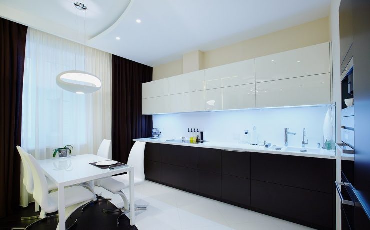
Facades of cabinets and pedestals can be:
- either white or black;
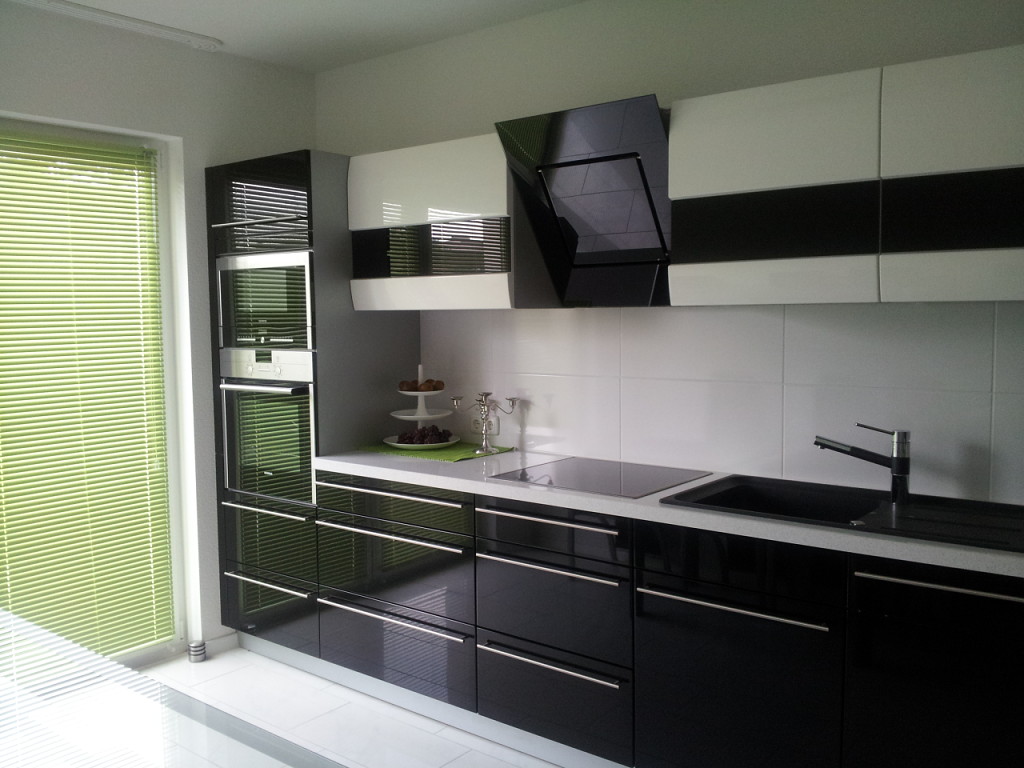
- in the upper part - white, in the lower part - black;
- combined (black case - white door, white case - black door).
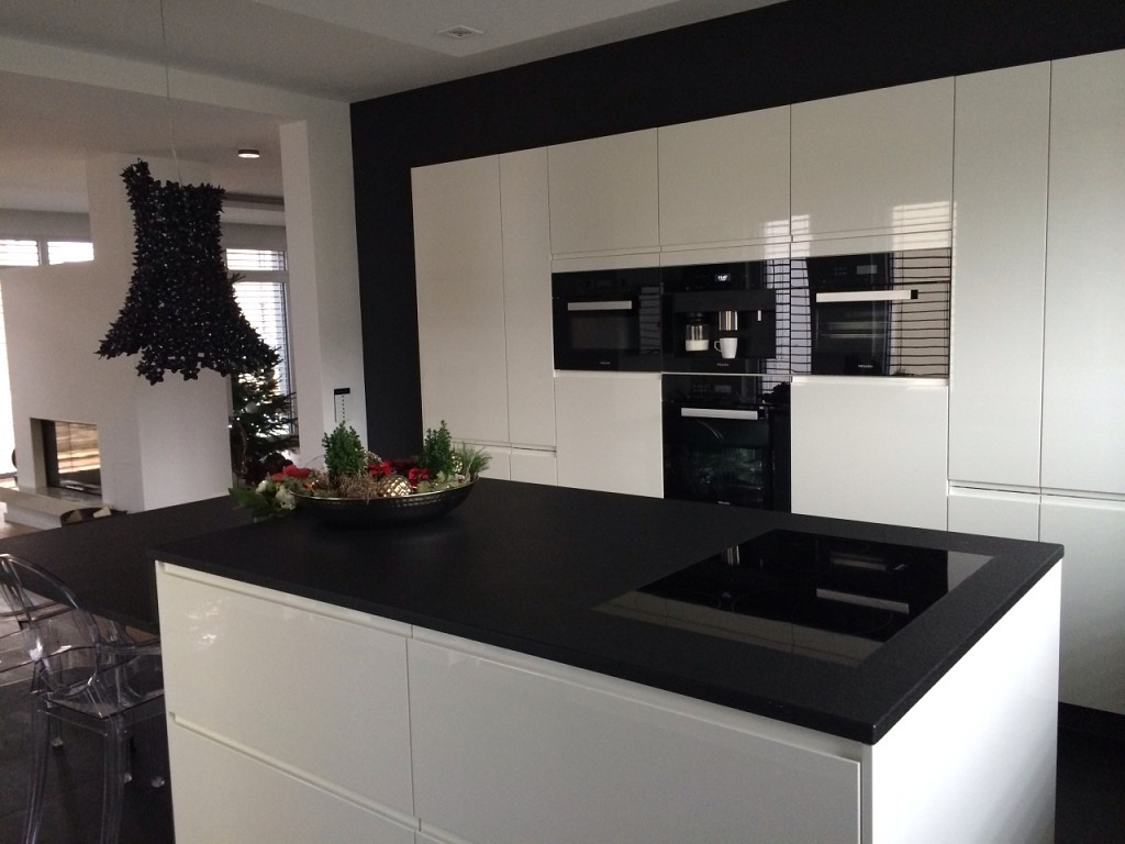
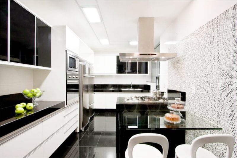
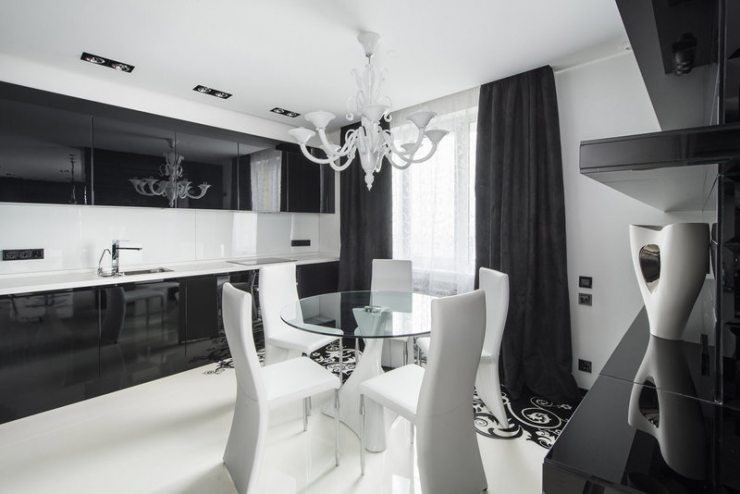
The island model has a black table (both the table top and the body) will look harmoniously with the snow-white headset, if the wall / apron matches in tone. Chairs belong to the decor elements and should correspond to the furniture element for eating: black or black and white for a black countertop, white for a white one.
Using bright accents
If the double combination of colors gets bored, then it can be diluted with bright colors, but only in moderation. Experts advise against using more than three basic shades in the interior. An additional color acts as an accompanying one. It is designed to balance or revive the composition.
Popular companion colors for the black and white palette:
- Red. For creative and daring natures, such a color trio would be ideal. Red is commonly found in crockery, accessories, corner open shelves, chairs, curtain patterns and wallpaper. The extraordinary interior looks active, dynamic and a bit mysterious.
- Blue. This combination is not trivial, since it is rarely used in kitchen design. Blue also belongs to the cold range. To prevent the room from becoming "frosty", experts recommend choosing bright and saturated shades of the gamut with the addition of green.
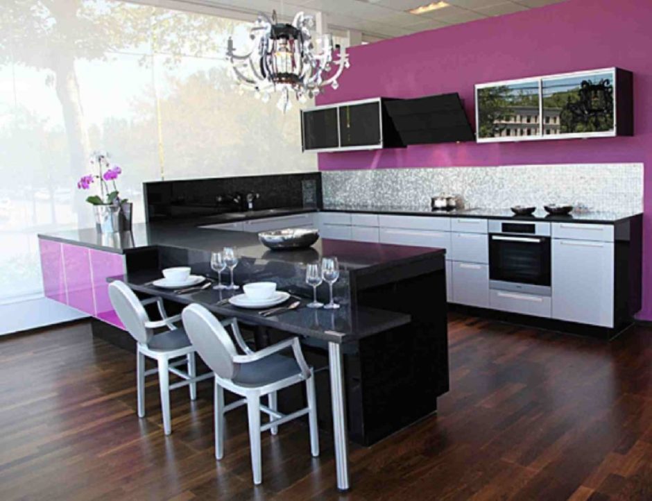
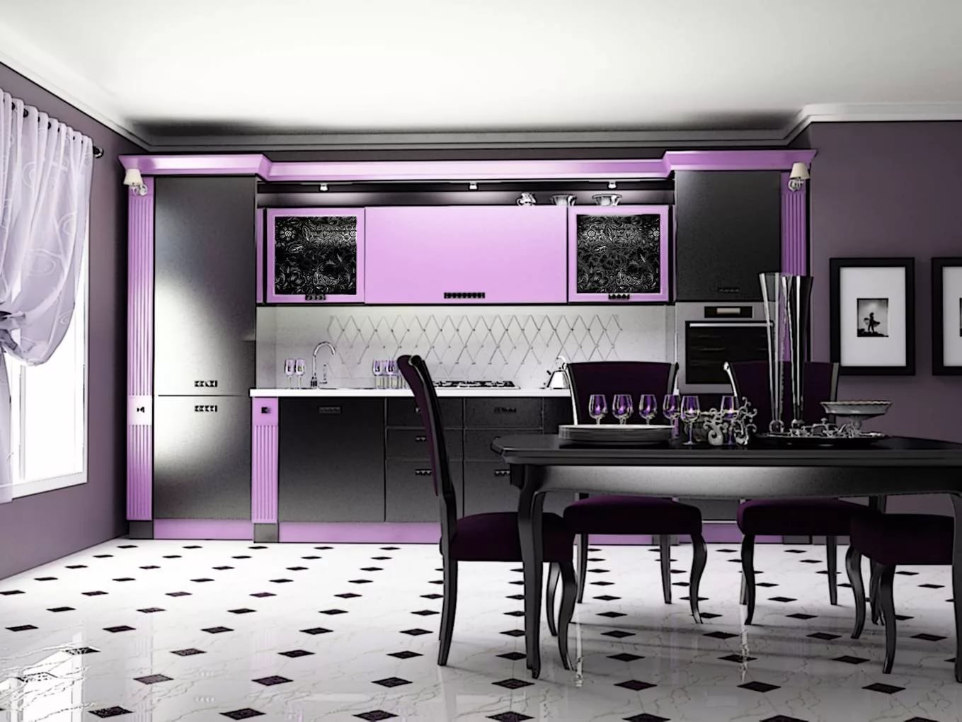
- Purple. With such a combination of colors, it will turn out to embody a fashionable and glamorous style. Violet is able to balance the strict lines and shapes created by the combination of white and black. A rich shade can be present in the apron pattern, glass inserts of facades or a small pattern of finishing materials.
- Green. Bold color makes it easy to spice up a monochrome design. In shades of green, you can pick up dishes and other kitchen tools. Bright vases and pots with fresh flowers, as well as catchy countertops and chairs will transform a laconic kitchen beyond recognition.
- Yellow. You can add positive notes to the cold design with yellow accents. Stripes, geometric patterns and ornaments in sunny colors are used on facades, aprons and curtains. Decorative details and accessories in yellow tones will look harmonious.
- Orange. A warm and cozy interior is created with the addition of orange colors. In recent years, orange tones have been very popular in the design of kitchens. They tune in to positive thinking and increase appetite.
Black and white kitchen with bright accents looks catchy and extravagant. Spectacular color combinations are welcome in styles such as pop art or art deco.
For those who prefer neutrality, professionals suggest adding beige, gray or coffee as a third color.
Kitchen style with a green set
Green is represented by a wide palette of tones that will be appropriate in a particular style.
- A set in a classic style made of expensive woods will emphasize the simplicity and luxury of the kitchen with the help of a monochromatic design of deep colors and matte surfaces.
- For the Scandinavian style, natural and clean tones of a warm palette are suitable.
- Country style involves a combination of pale and rich tones with wood and stone.
- The English and Provence style will be recognizable through the décor and olive kitchen furniture with the characteristic finishes of the cabinets and dining group.
- A modern kitchen can combine several colors, such as a white top and a green bottom with a black backsplash.
The photo shows a rustic kitchen design, where wooden facades of white and green colors are harmoniously combined, the apron of the working area brought novelty to the interior.
Style features
The orange kitchen cabinet doors are simple in design. Smooth flat surfaces are best suited to modern high-tech and minimalist styles.
High tech
Citrus, floral shades will invigorate the cool shiny high-tech style. The bright table top and seats highlight the table and chairs with chrome legs. Orange blinds will add a contrasting accent and comfort to the overall restrained atmosphere.
Minimalism
Orange color will dilute the severity of geometric furniture and replace the decor. The orange sheen of the cabinets without fittings is combined with the red leather upholstery of the chairs, wood and metal surfaces.
Classic
Paneled cabinet doors with curly handles look psychedelic in orange color. Darker woody tones are not surprising. A compromise is to add a high-tech element to the classics. The glossy façade at the top is combined with the matte surface below, diluting the pomp of leather chairs, a heavy oak table and a wrought iron chandelier with swirls.
Influence of white
How does it work in design:
- freshens up a small kitchen;
- furniture looks elegant;
- favorably distinguishes the colored decor of the apron;
- lighting becomes brighter;
- cheap finishing materials look noble.
> Versatile white matches warm and cold shades, chrome, gilding, wood, marble. In a white version, a country-style kitchen and a loft look harmoniously. The base color can be found in the palette of any materials - wallpaper, tiles, plastic and wood panels. It is easier and faster to pick up than shades of red or lilac.
White is the color of peace and purity. It pacifies with an active lifestyle. But it can cause a feeling of emptiness during the measured course of everyday life. The white palette includes 40 shades. So that the kitchen does not look sterile white, the designers combine several tones and place color accents using apron trim, decorative dishes, bright appliances, furniture, lamps.
Decorating a kitchen in white is an opportunity to experiment with different textures and textures. The combination of stone, plaster, textiles, porcelain and glass will create a stunning play of light and shadow, and the interior will turn out to be voluminous and not boring at all.
Tip 5. Decide on the texture
It is very important to choose the right texture - dark tones look completely different in glossy and matte finishes.


For classic interiors, it is better to give preference to matte surfaces. They look noble and restrained, and any shade seems more graceful. However, keep in mind that in a small kitchen it is better to refuse matte dark tones. They will visually make the room even smaller, so this solution requires a thoughtful approach.
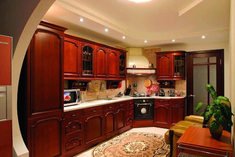 Matte dark kitchens look very noble
As for the gloss, it is, oddly enough, much easier to work with it. Of course, surfaces with a characteristic shine will not suit classic interiors - they are more suitable for modern kitchens.
However, any shade in gloss looks cleaner and richer, so such kitchens turn out to be very beautiful.
 Glossy details in dark colors look very modern
Advantages and disadvantages of interiors in black and white
The advantage of this range is the ability to add other colors when decorating the interior. To dilute the black and white duo, different shades are suitable - gray-beige, green, blue, red. This is due to the neutrality of the primary colors, so embedding them in other palettes occurs without any problems. You can easily change bright accents in the room: the interior will look completely different. It is enough to stick new posters, lay another rug or blanket, and the room will sparkle with fresh colors.
A black and white room looks stylish regardless of the type of materials used. Of course, natural wood, forging, white marble will add luxury to the interior, but even the usual black laminate flooring in combination with wallpaper in white tones and dark decor will make the room memorable and attractive.
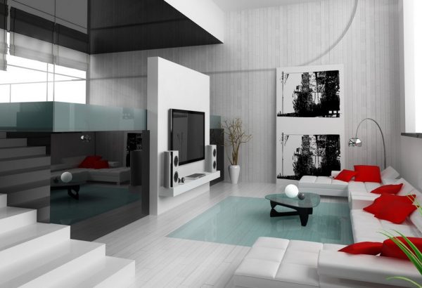
An interior in neutral colors is suitable for a huge number of style trends: minimalism, classic, hi-tech, loft and others. It is really possible to decorate any room in a similar color scheme: living room, kitchen, bathroom.
Of the minuses, one can name the difficulty with independent decoration of rooms and the strong visibility of all mistakes: they will literally be striking. Low quality lighting will also reduce the aesthetics of the room: it is better to immediately plan multi-level lighting with sconces, floor lamps, good main light.
Interior styles that match orange
Hi-tech - this style is ideally combined with orange. It is perfect for active and modern people who are not afraid of experiments and prefer innovations to boring traditions.
In a high-tech kitchen, you can install a laconic kitchen set with orange glossy facades and glass inserts.The walls in this interior can be white or light gray, it is worth equipping the floor in the same color.


All household appliances should be state-of-the-art, preferably from one manufacturer. The best color for her is metallic silver or black. A large orange refrigerator will look very interesting in such an interior.
Do not forget about spot lighting around the entire perimeter of the kitchen. The apron can be made of glossy tiles or mosaics. It is recommended to use synthetic stone for arranging work surfaces.

It is better to use porcelain stoneware as a floor covering. A black self-leveling floor will look good. Suspended ceiling in white can also be glossy.
Advice! If a rich orange seems too bright and defiant, you can replace it with softer shades - apricot, salmon, pale orange. Snow-white decor details - tablecloth, curtains, porcelain - will also help to dilute the brightness of this saturated color.


Minimalism - this style will also make friends with all shades of orange. The main thing is to make sure that there is not too much of this bright color in the room.
The kitchen in monochrome neutral colors will be decorated with orange elements: a tall refrigerator, lower or upper facades of a headset, blinds, a chandelier. Surfaces can be either glossy or matte. The room should not be overloaded with unnecessary parts and accessories.

The use of textiles should be completely refrained from. It is better to hide all dishes and kitchen utensils and not put them on display. You can put one tall orange vase in the corner of the kitchen.
Classic is a style that is difficult to combine with orange. However, if you still really want to do this, you should replace the bright shade with a calmer peach tone. It can be used in textiles - upholstery of chairs, curtains, tablecloths. Elegant dishes of peach color will become a decoration of such a kitchen.
In general, the interior must comply with the classical standard, that is, it is necessary to give preference to smooth lines, natural materials, exquisite decor. The use of gilding, mirror surfaces and natural stone (can be replaced with an artificial one) is encouraged.
Advice! The more modern the style of the interior, the brighter and more saturated shades of orange can be used in it - pumpkin, carrot, orange, and also the color of cinnabar. For traditional interiors, strict shades of orange are more suitable - mustard, ocher, amber, honey, brick, terracotta, chestnut, rusty.


Features of choice and finishes
Thinking over the nuances of the interior, it is important to choose the right individual elements. To create a pleasant environment, you will need to achieve a combination of all pieces of furniture with a basic finish.
Kitchen furniture
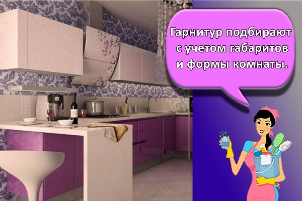
The set is selected taking into account the size and shape of the room. For an oblong room, a linear kit is suitable, and for rectangular ones - a U-shaped or angular one. Adhering to minimalism, it is worth putting compact furniture with spacious drawers and compartments for built-in appliances. If a dining area is highlighted in the room, then its elements should correspond to the tone of the furniture or be contrasting.
The original design solution for dividing the space into separate zones presupposes a certain play of colors. Light-colored walls and bright furnishings intertwine with soft furnishings in the dining area
This interior option looks impressive and attracts attention.
Curtains
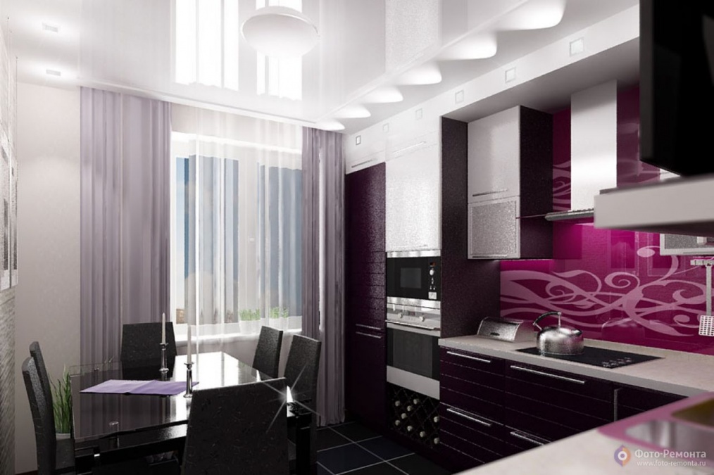
If the room is small, then instead of curtains on the windows it is better to hang blinds, Roman or roll structures. In a spacious room, transparent tulle and blackout curtains made in purple shades will look laconic.
Wallpaper
By correctly choosing the color of the wallpaper, it will be possible to create a certain visual effect. One bright wall, combined with light-colored ones, expands the space.You can also stick white wallpaper and decorate it with colored inserts. Using richer tones helps to narrow the space and make it more cozy.

Ceiling
Ceiling decoration is essential in shaping the overall visual space in the room.
The stretch ceiling, made in purple tones, looks stylish and attracts attention. If the surface of the canvas is glossy, then it will reflect light, enhancing the accent in the overall design.
The use of a purple stretch ceiling is relevant for different stylistic directions, including the following:
- high tech;
- modern;
- futurism;
- minimalism.

Examples of ready-made design solutions
How to decorate a white kitchen:
- a rectangular glossy milky set, a shiny laminate floor and an apron finished with a photo print with a cityscape;
- white wooden classic furniture, tiled glossy apron with scarlet flowers, round dining table in light wood, curtains to match the floral pattern;
- pearl wallpaper, white matte set with transparent green glass inserts on the doors and interior lighting, black countertop and apron, ceiling and pistachio-colored checkered curtains;
- creamy finish on the floor and ceiling, glossy ivory set, photo apron with large red and white tulips, warm shade of lighting - the kitchen looks monochromatic cream, and the apron stands out with an accent;
- white floral tiles on the walls, matte snow wood set with black fittings, brown countertop and furniture.
The advantage of a white kitchen is that for renovation, it is enough to change the color of curtains, lamps, towels, buy new dishes or headsets. The room will look like it has been renovated. The main thing is to initially finish the walls, floor and ceiling with high quality. And then dirt, deformation and water are not terrible in the kitchen, despite the white color.
Share link:
Interior styles
Guided by the above rules, you can move on to the next stage of light renovation in the kitchen - the choice of design style.
Bright kitchen in classic style
The classic kitchen in light colors is monumental and luxurious. This set is usually made of solid wood and painted in noble colors of ivory, mocha or crème brulee. Gold-plated fittings, Greek-style ornaments and edging complete the picture, and stone countertops in cream or contrasting dark tones harmoniously complete the image of a light kitchen classic.
Real photo of a classic kitchen in light colors.
Photo of a kitchen in light colors in a classic style.
Read more ... Black and white kitchen and interior design tips from designers.
Bright kitchen in a modern style
Modern kitchen spaces, usually small in size, combine simplicity and functionality. Simple geometric shapes, glossy surfaces and metal inserts make the room comfortable and do not weigh it down. To make the design of a bright kitchen not look boring, add wood inserts - floor, countertop, ceiling beams, etc.
The modern snow-white interior is versatile.
Bright kitchen in Scandinavian style
Scandinavian kitchens are usually filled with light and air due to the snow-white design interspersed with icy blue, blue and gray colors. Patterned surfaces are rarely used here - most colors are monochrome. An exception may be a floor covering or a patchwork apron. The general "frost" of such a room is balanced by a couple of bright color accents, for example, yellow textiles or red dishes.
Credit: @
The Scandinavian interior is cold but practical.
Light kitchen in Provence style
This style is a striking representative of the "retro-guard". His credo is a pastel color palette with a touch of French charm.The light kitchen "a la Provence" is performed in milky, olive or mint tones. Antique furniture, open cabinets and display jars of spices are integral parts of this antique French interior. Country coziness and charm in their quintessence.
Credit: @
Romance of French Provence.
Credit: @
Contrasting design of Provencal cuisine.
Bright kitchen in loft style
A kitchen space with echoes of industrialization - bare brick walls, uncovered communications and rough ceiling beams - the basis of the loft style. This design is suitable only for spacious rooms with significant ceiling heights. Windows are not shaded - blinds can serve as an alternative. Such a light-colored kitchen in the interior is decorated with simple Scandinavian furniture or shabby solid wood in the country style.
Loft style kitchen space.
Credit: @
Industrial and cozy loft style.
Modern style
A minimum of unnecessary details, everything is simple and functional. Designing a kitchen design in light colors in the Art Nouveau style implies rectangular lines in furniture, built-in appliances and spot lighting, which, along with the main function, simulates the space and can even change its color.
Photo of a light floor in a modern kitchen.
It is useful to learn about the design of a white bedroom, its advantages and disadvantages in the interior.
Credit: @
Light interior in the Art Nouveau style.
Light kitchen in the style of "minimalism"
A stylistic solution that meets the needs of all age groups and is always popular. The principle of the absence of unnecessary details is here elevated to an absolute. The surfaces are smooth, often glossy, the furniture is durable, functional, the geometry of the lines is ingenuous. Light is very important - it is he who creates the atmosphere in the ascetic kitchen space.
The room is in a minimalist style.
Kitchen-dining room in a minimalist style.
