Advice
Some useful points to help you find the best color combination in the interior of the living room:
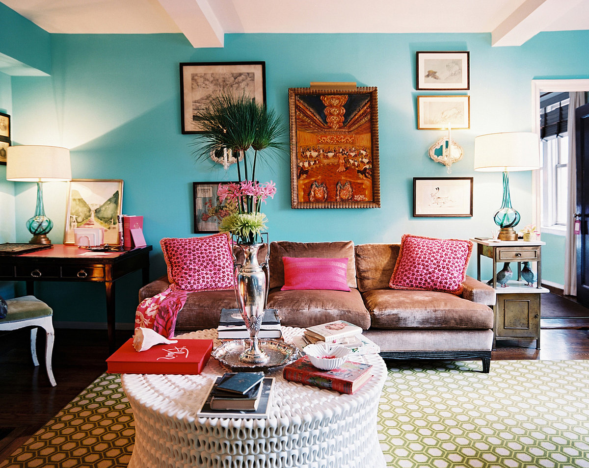
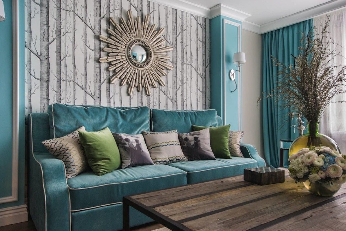
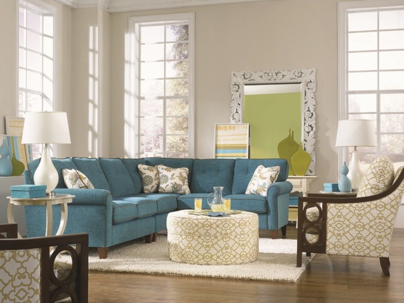
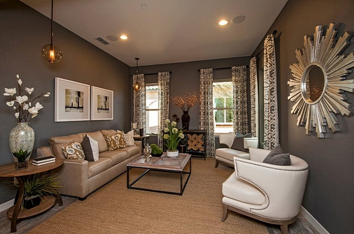
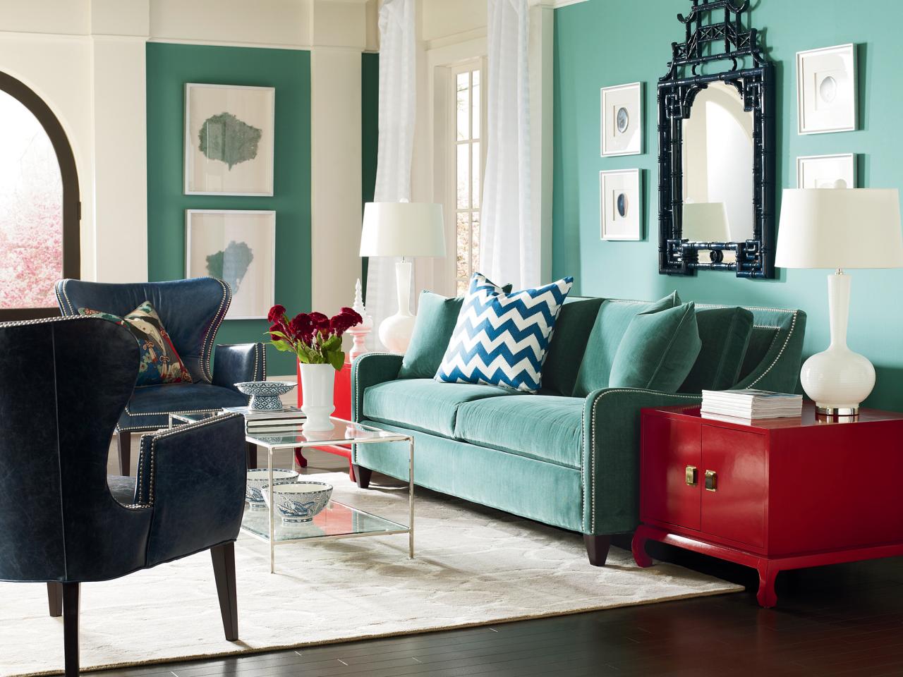
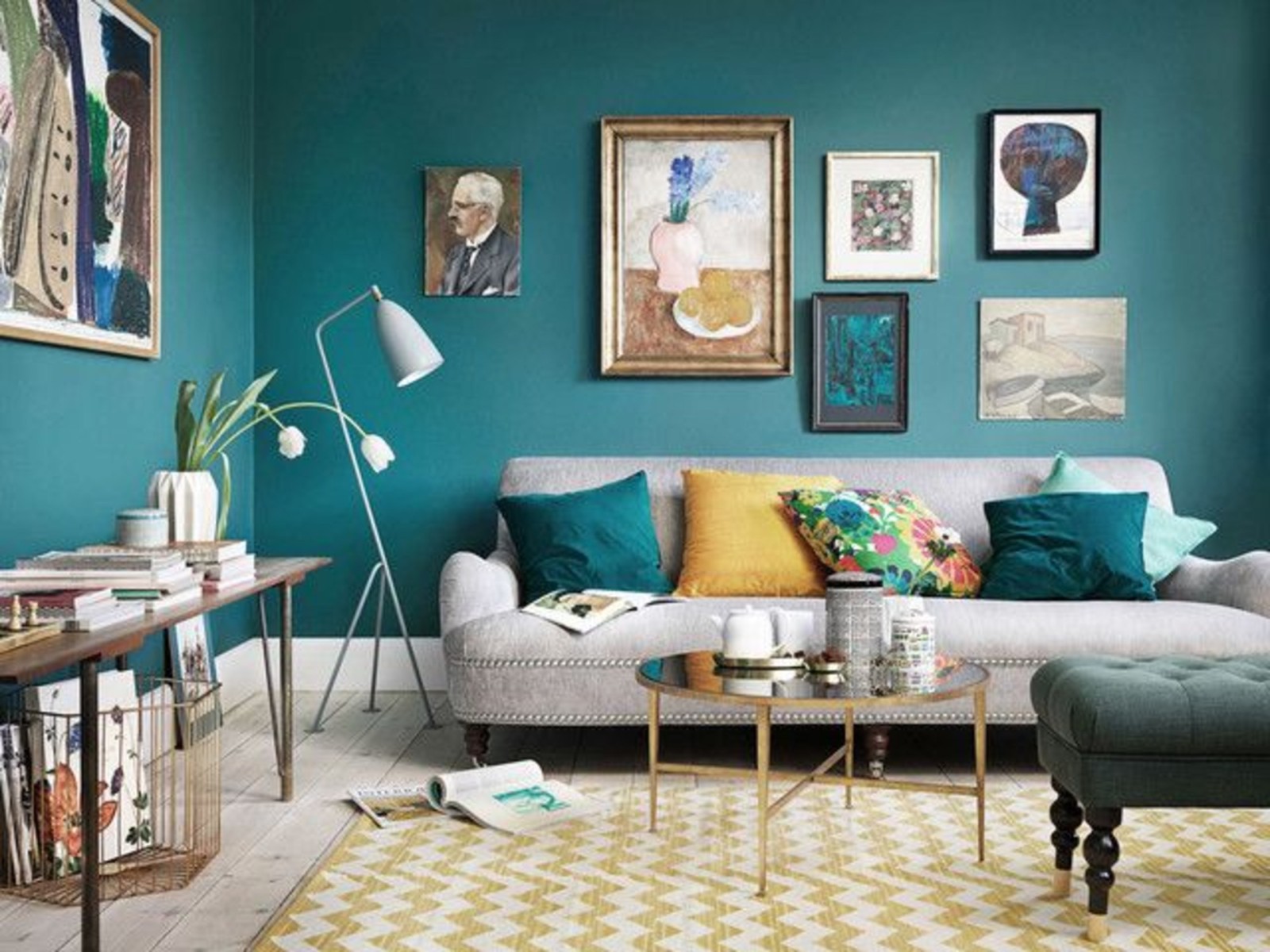
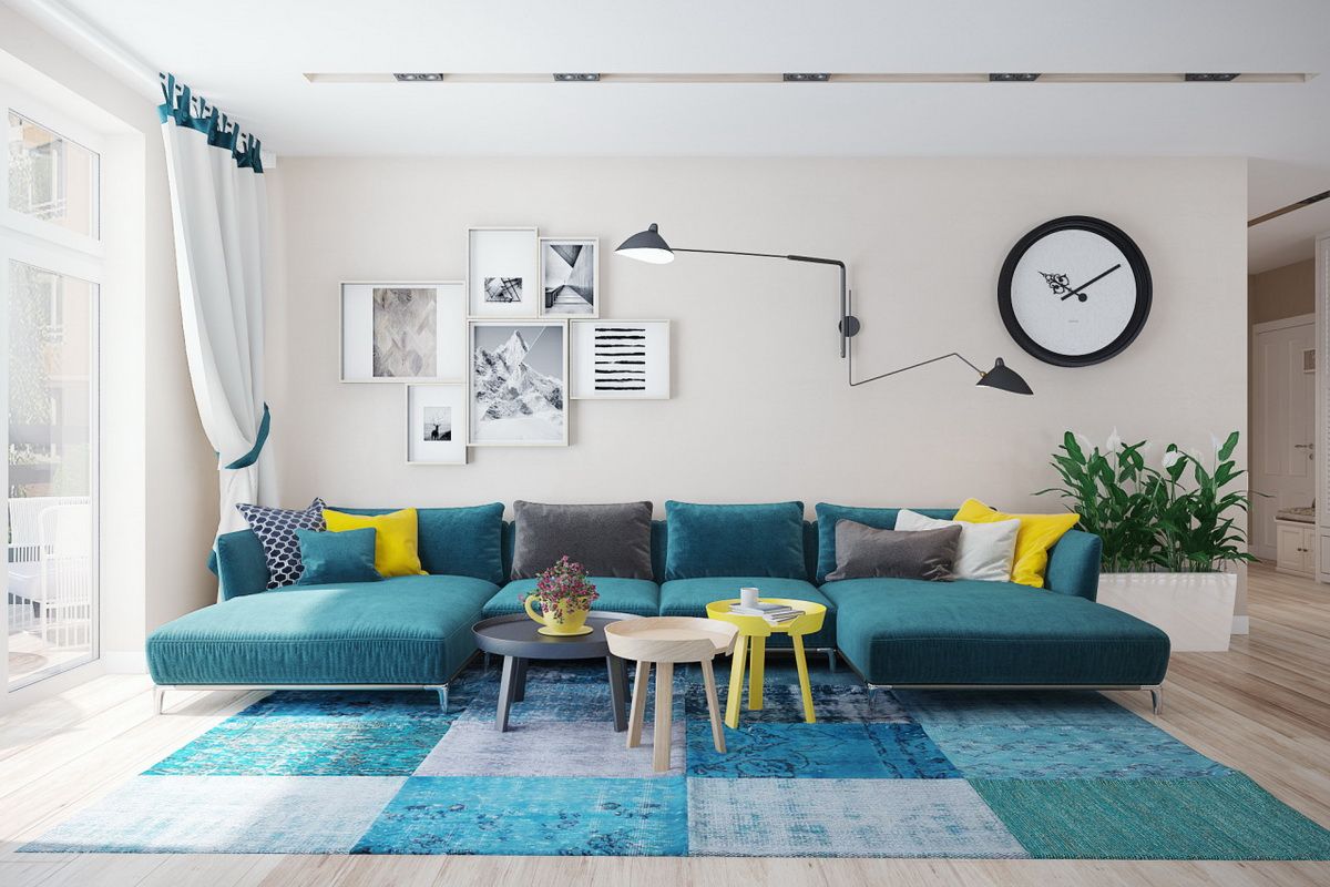
- Don't be afraid to apply bright colors. Let's say you've furnished your living room in a classic design using brown, a noble beige shade and a touch of green. And everything is beautiful and dignified, but something is missing, there is a feeling of a little boring space. So liven up this color selection by adding unexpected orange or pink spots. Turquoise, warm yellow and other bright contrasting shades may be suitable. Decorative pillows, wall panels, sofa upholstery and other decorative items can be made in such an accent color. And you will see how the walls and furniture in the living room will play, the interior will become warmer and more interesting.
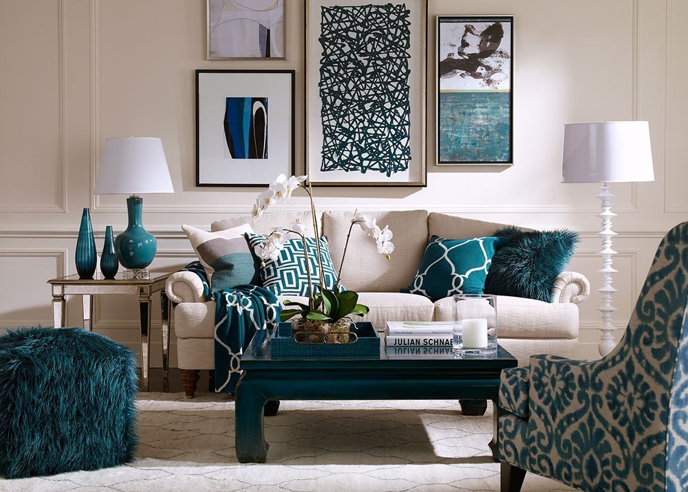
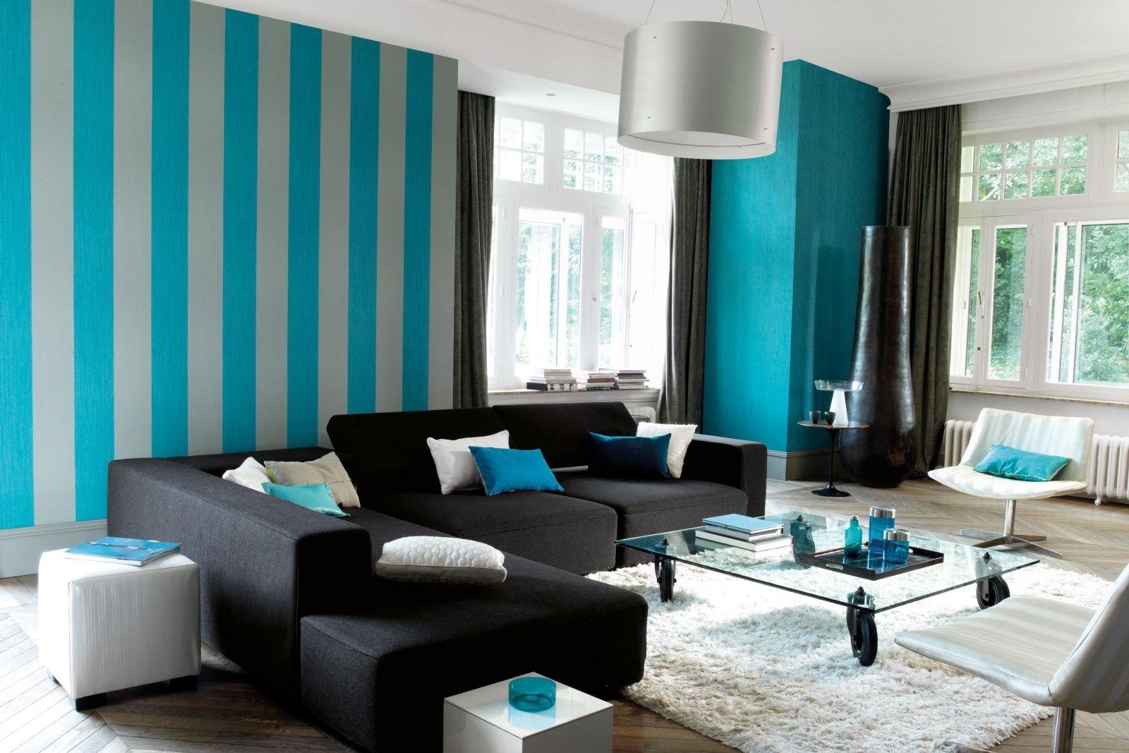
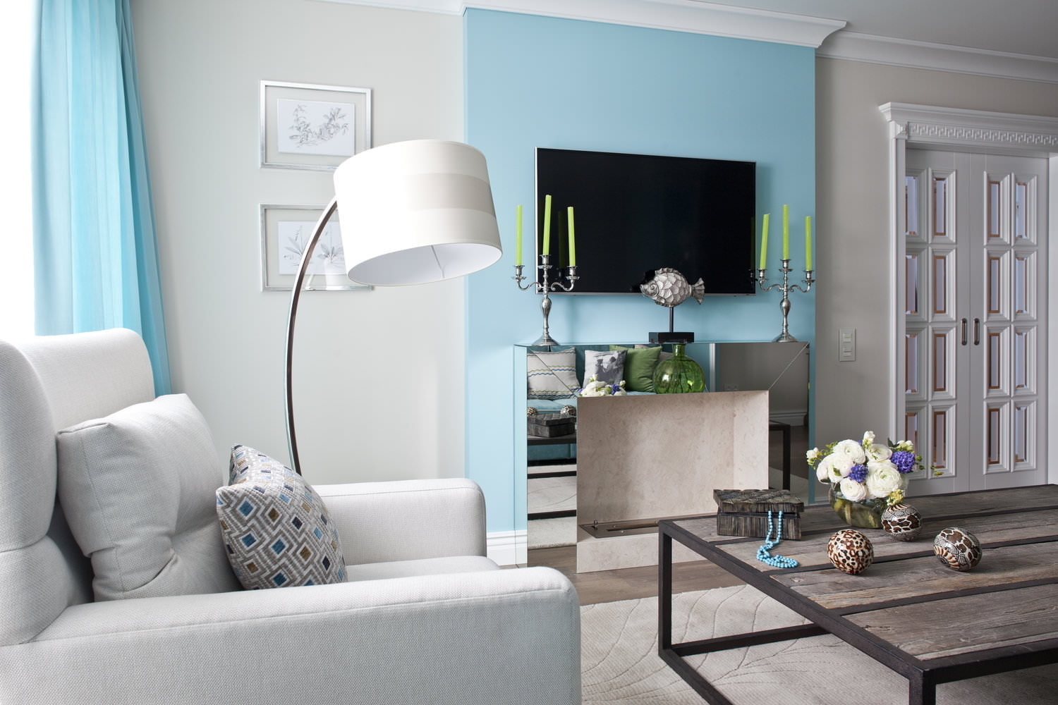
- Deep blue color goes well with berry tones. Why not try decorating the walls and furniture of the living room in a blue and burgundy version with an accent, for example, in a dark green version. Only colors should be muted, warm, natural shades, not neon or acidic. A living room in a similar design takes on a luxurious look: the color of the walls, the upholstery of the sofa, the shade of the curtains - everything will look harmonious. At the same time, such a selection will delight with its color thoughtfulness and decorativeness.
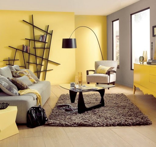
- If the living room is designed in a strict black and white design, then you can decorate its walls with bright colors of red or yellow shades or add a little green. You will see how much the interior will change after that, the living room will immediately acquire a lively, warm look.
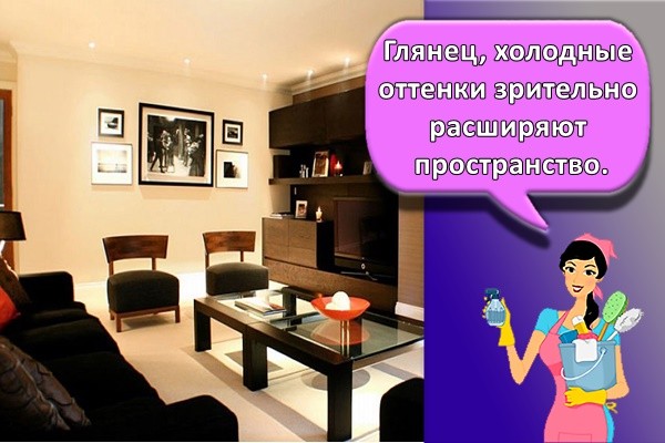
- It is better to choose warm and soft colors for decorating walls, curtains and upholstery of a sofa, rather than cold ones. A living room decorated in a warm color always looks more cozy and comfortable. Beige and orange are always visually more comfortable than lilac or cool blue.
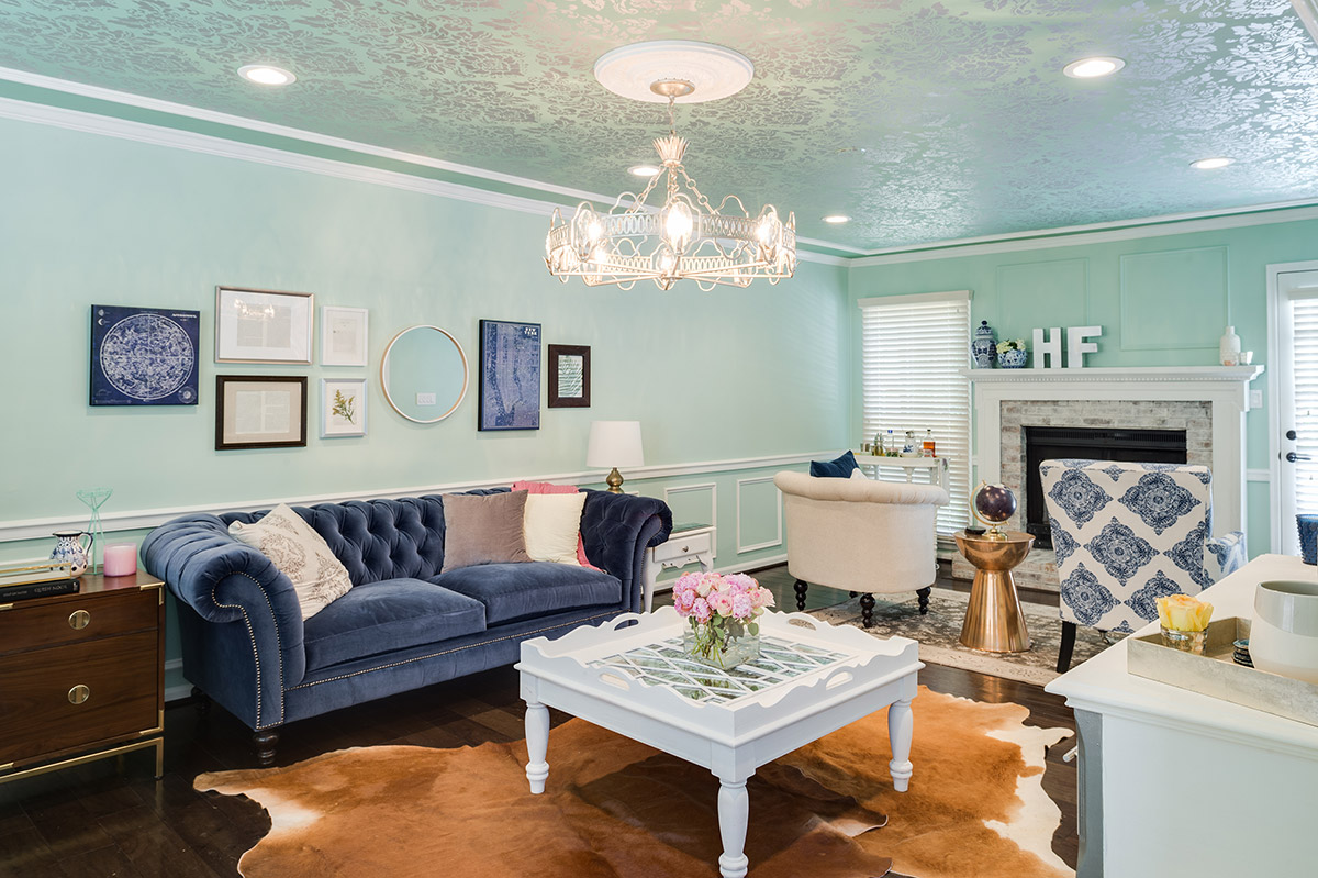
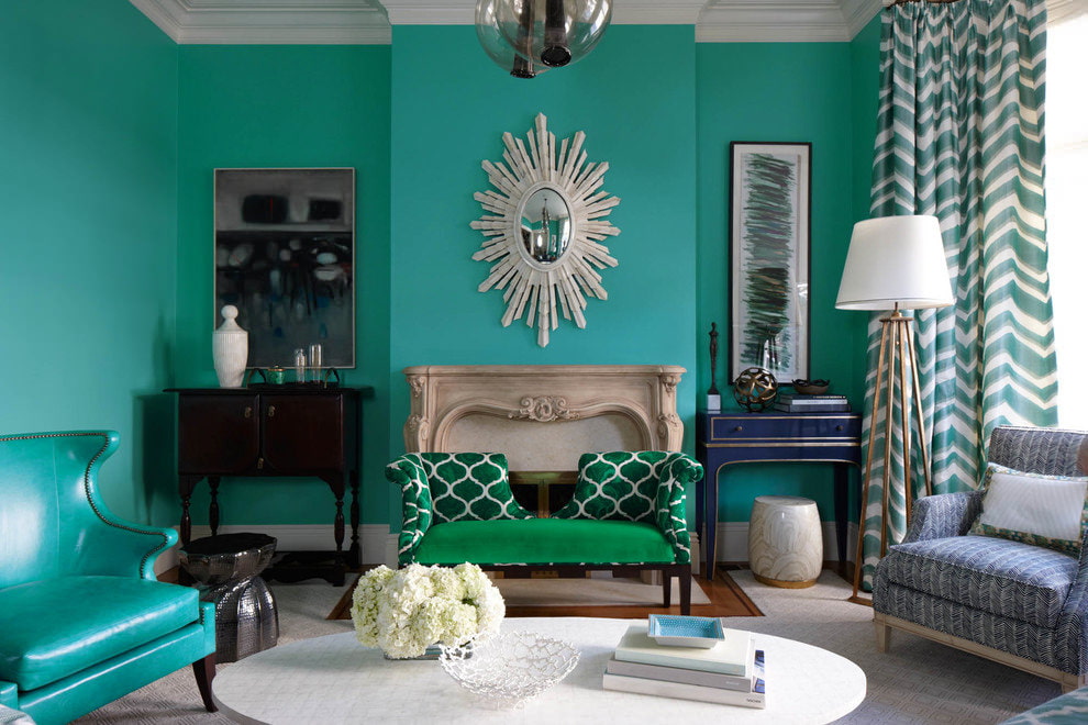
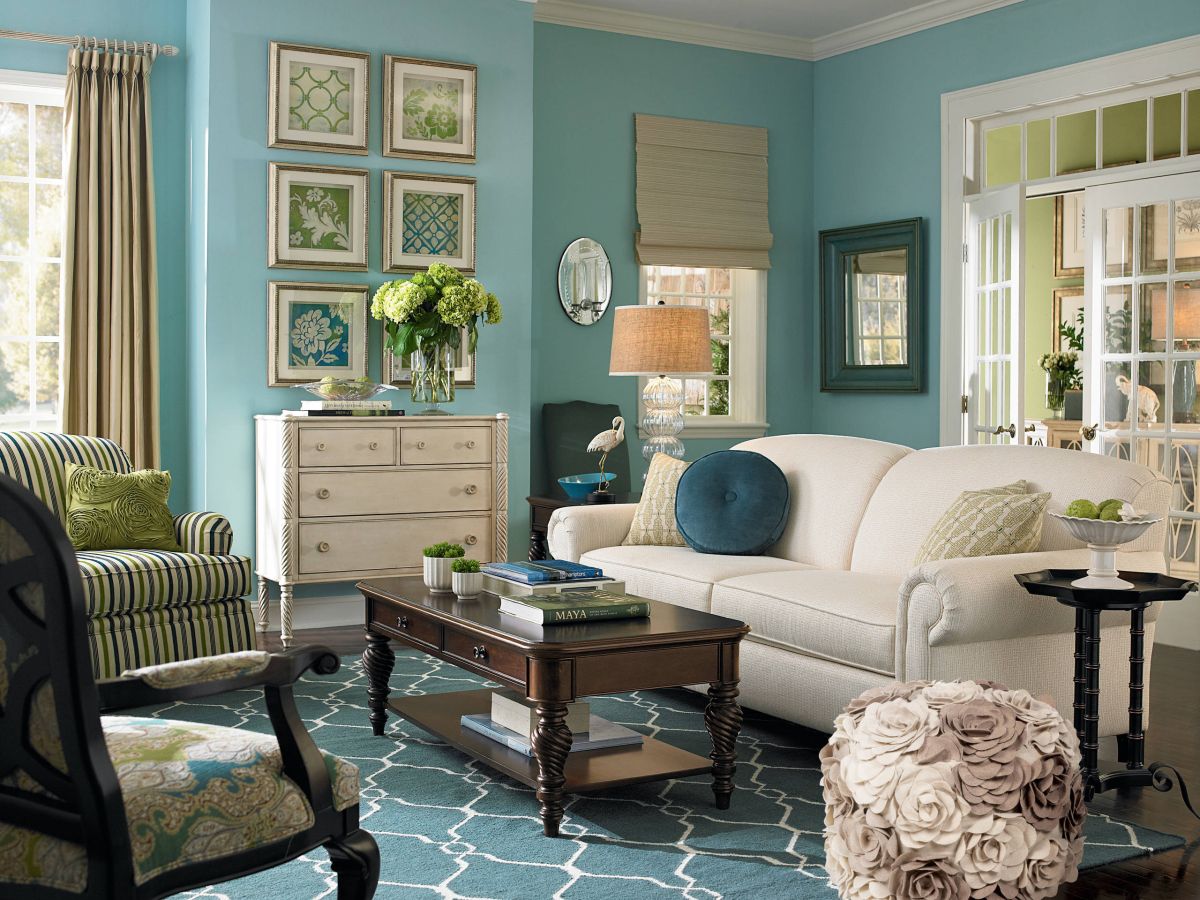
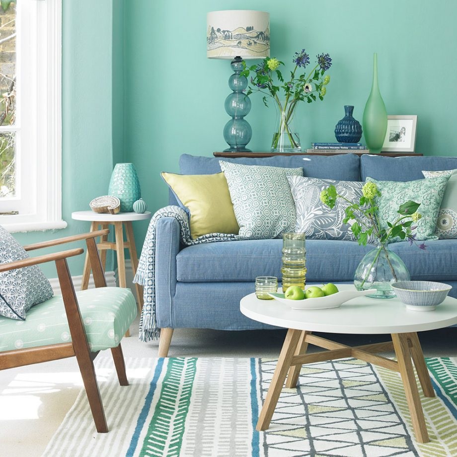
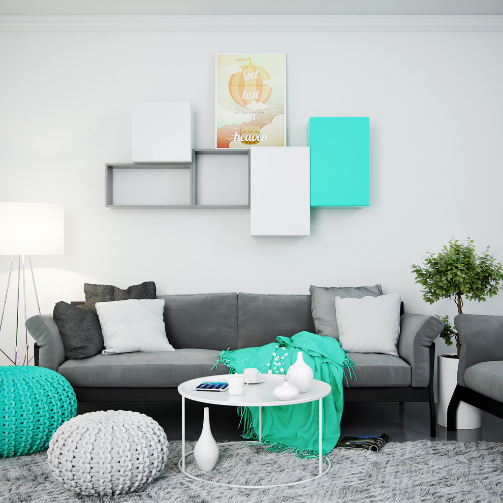
- You can try this rather bold option: keep the whole living room in light mint-sand shades. And add a dark beige, turquoise shade or add bright green as a contrasting tone. Such a living room will be a real source of pride for the owners and an ideal place for relaxation and meeting with friends.
- Do not use too many details in a contrasting color - one large or two or three small ones will be enough to set off the main decoration of the room. For example, in a grayish-beige living room, one bright red large sofa or several small pillows and a picture on the wall in a contrasting color will look great.
- The more natural the basic color scheme of the floor and walls, the more daring experiments with the contrasting shade of curtains and sofa you can afford.
Whichever color combination you choose, do not forget to adhere to the rule of proportionality of contrasting and primary colors - and, without a doubt, even an independent living room design will look great.

Style features
The coloristic solution of the interior depends on the style. If you want to achieve a futuristic effect, preference is given to a gray-turquoise range. Beige and turquoise are chosen when they want comfort.
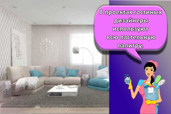
Scandinavian
In living room projects, designers use the entire pastel palette. Cool shades match the Scandinavian style exactly. By adding gray, white, gray-blue details, a harmonious color composition is obtained.
Mediterranean
The feeling of warmth in the cold turquoise is brought by natural shades of natural materials, well-designed lighting, lovingly selected paintings, and objects of decorative and applied art.

High tech
Glossy, bright surfaces alternate with the rough texture of concrete and bricks.Ocher, brick red shades bring dynamics to the interior of a modern living room.
Provence
Comfortable sofas in the recreation area with covers made of natural fabric in sand, beige shades. Natural wood or materials imitating it, in the decoration of the ceiling, floor, countertops. The turquoise range is presented in almost transparent, delicate shades. They are used as the main background (walls) or as an addition: textiles, small decorative elements.

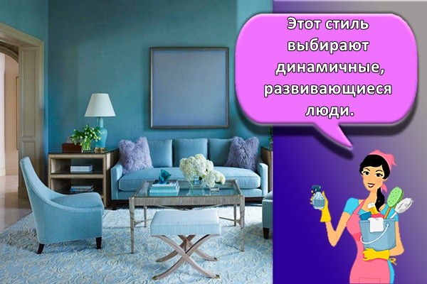
Minimalism
This style is chosen by dynamic, developing people. They are comfortable in the living room, not overloaded with details, non-functional furniture. Deep gray and tiffany are good companions.
Country
Option for a country house, dacha, less often for a city apartment. The basis of the interior is natural materials: stone, wood, natural fabrics. Their warm shades soften the cold palette. For a country-style living room, muted shades of turquoise are chosen. They bring a sense of time, peace.

Classic
A warm light accent in the dining area is created using pendant lamps that simulate burning candles. The technique is used in different styles: neoclassic, shabby chic, contemporary.
American modern
Eclectic democracy and unobtrusiveness - this is how you can characterize the American style. Over the past 100 years, American Art Nouveau has undergone a transformation. At first, elements of art deco prevailed in it, then country, now a newfangled high-tech.
The uniqueness of this style is in its versatility, it allows for variegated furnishings. The main emphasis is on the rational use of space. In the decoration of the living room, high-quality, but not expensive materials of pastel shades of turquoise are used. Bright color accents: ceiling beams, platbands, niches, moldings, decorative trifles.
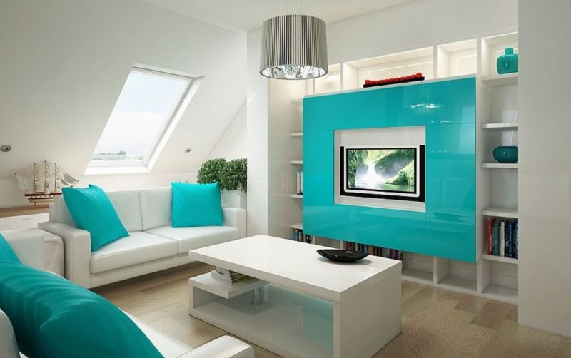
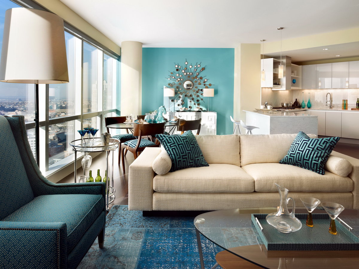
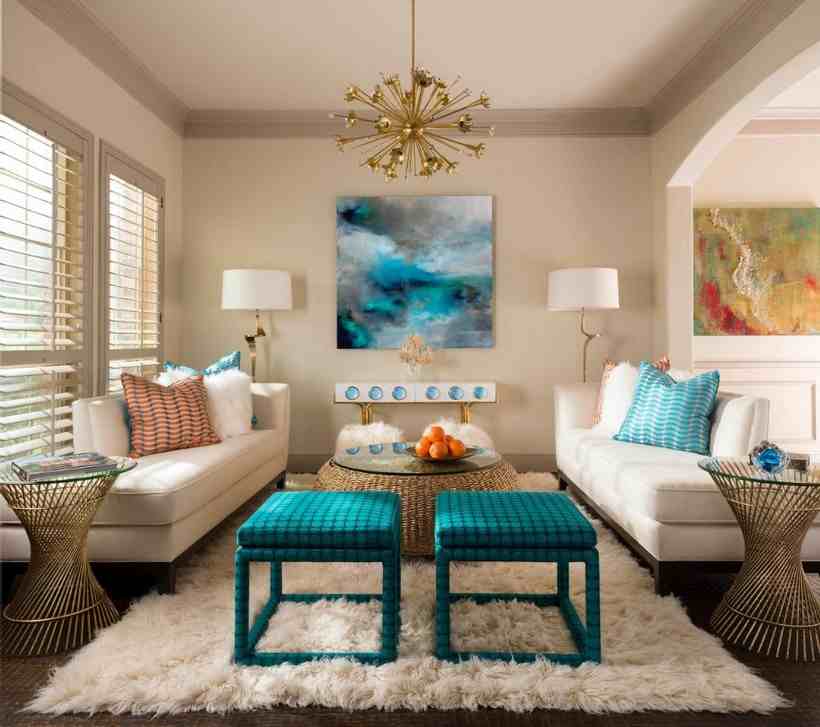
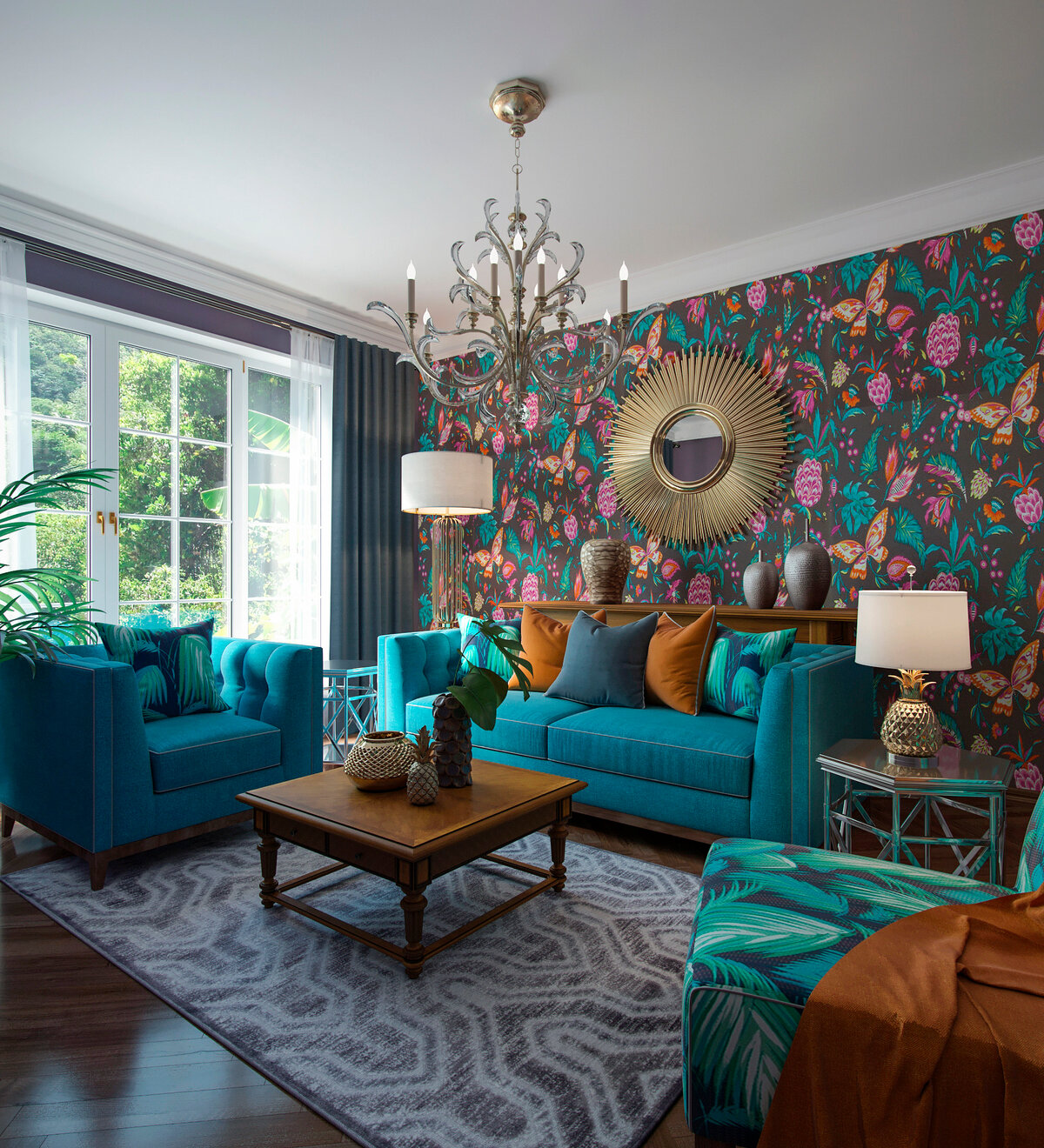
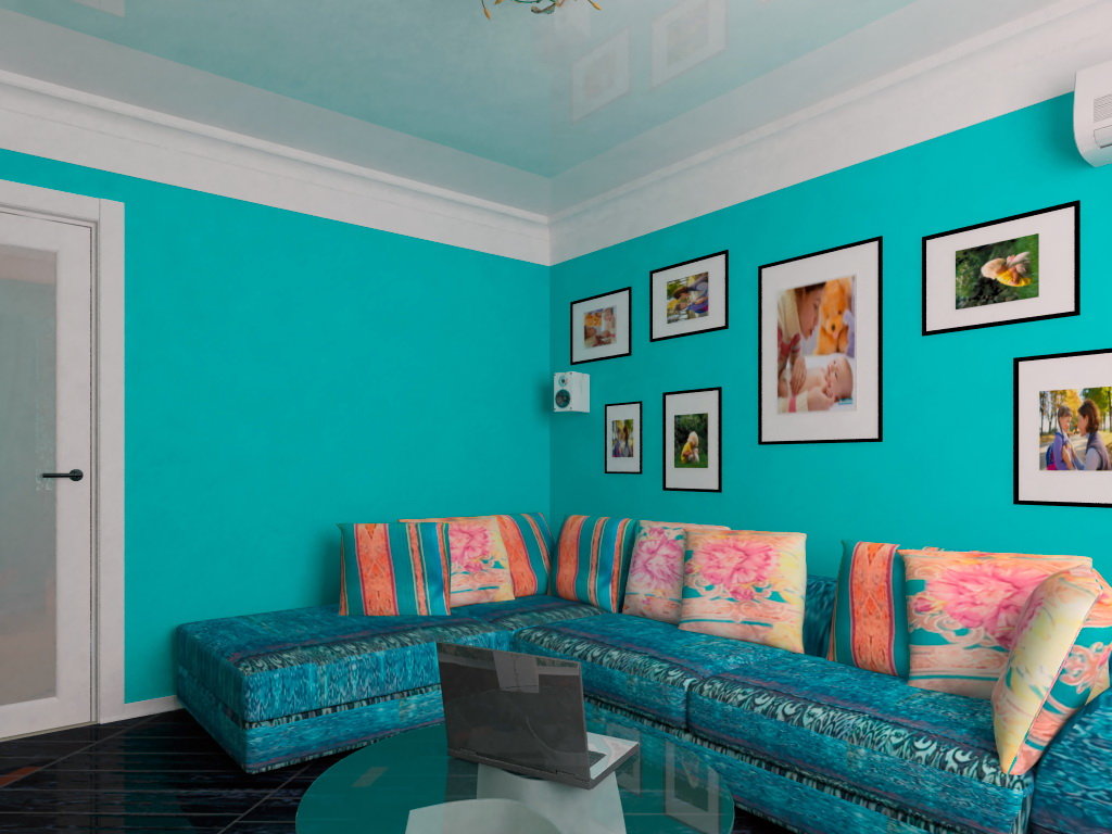
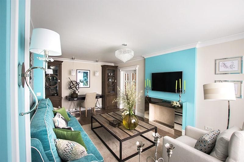
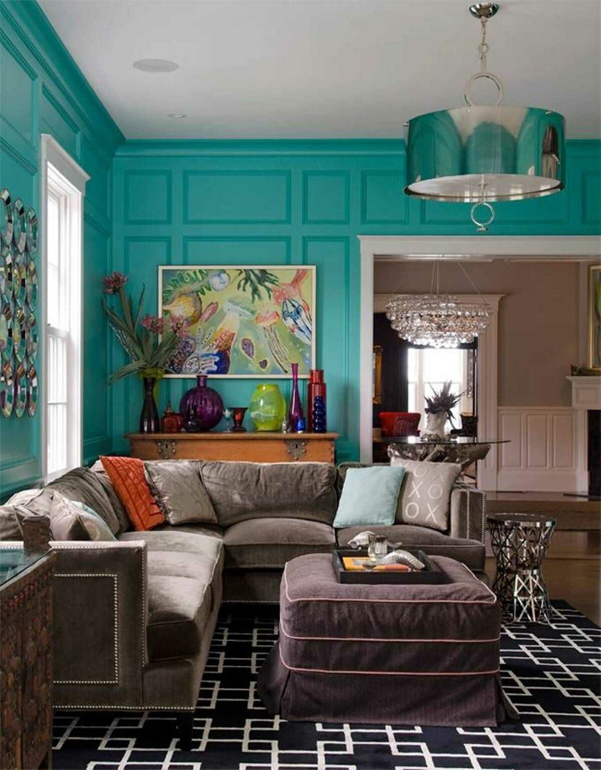
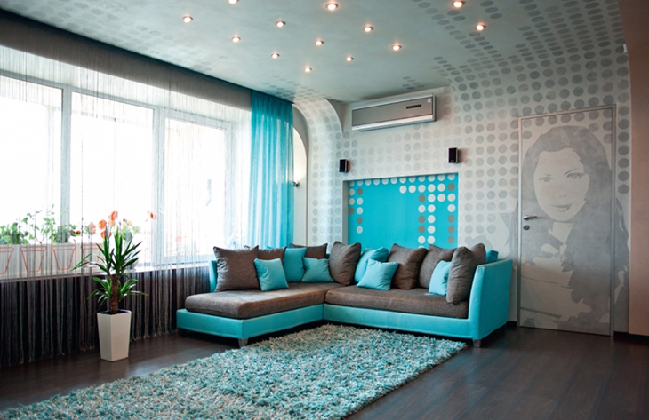
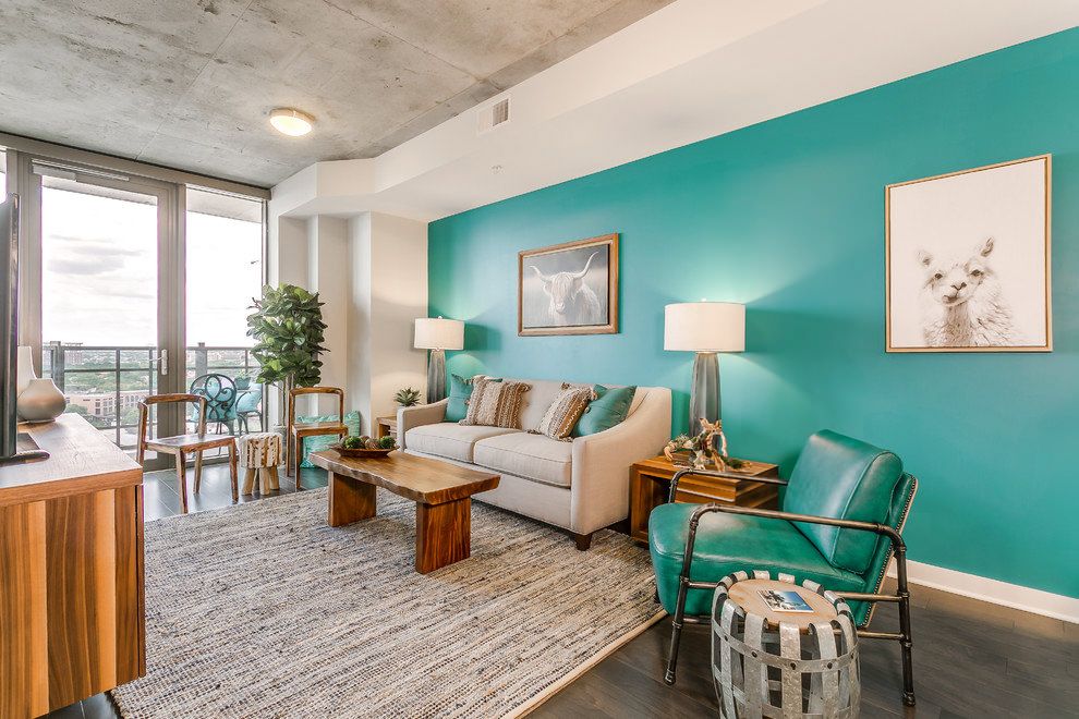
Turquoise color in the interior of the living room: original ideas for decorating a room
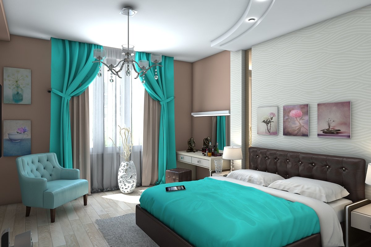
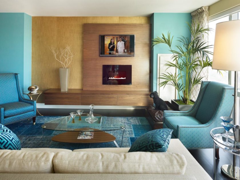
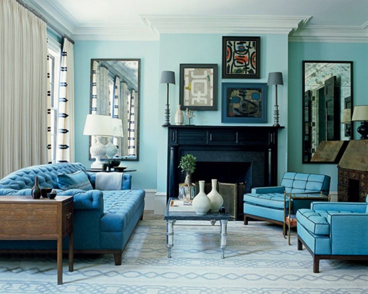
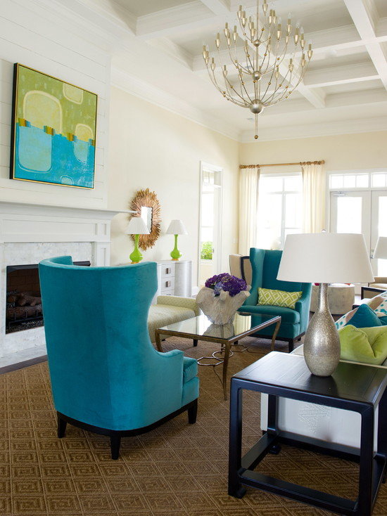
Turquoise is a color that has manifested itself over the years in the furnishings of apartments and houses, most often in the form of elusive additions such as decorative pillows, or in more elegant compositions in the form of curtains, carpets or upholstered furniture. However, with the rise of fashion for stylish furniture, turquoise has returned to living rooms in a gorgeous design that many years ago was considered a sign of kitsch or characteristic only of rural interiors. Today, it emphasizes the character of fashionable minimalism in the form of white lacquered furniture.
A turquoise room looks best with glossy white lacquered furnishings that add glamor and modernity to the entire setting, and when paired with warm orange or black.
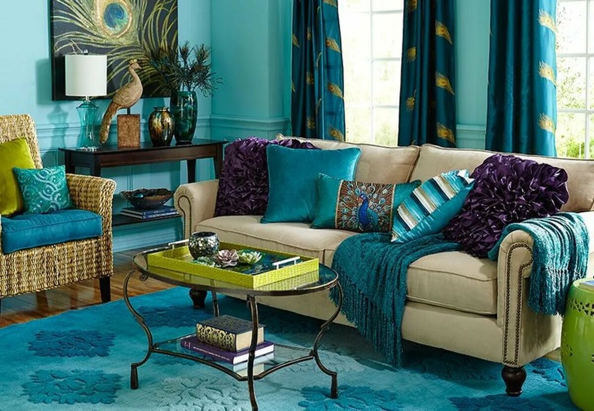
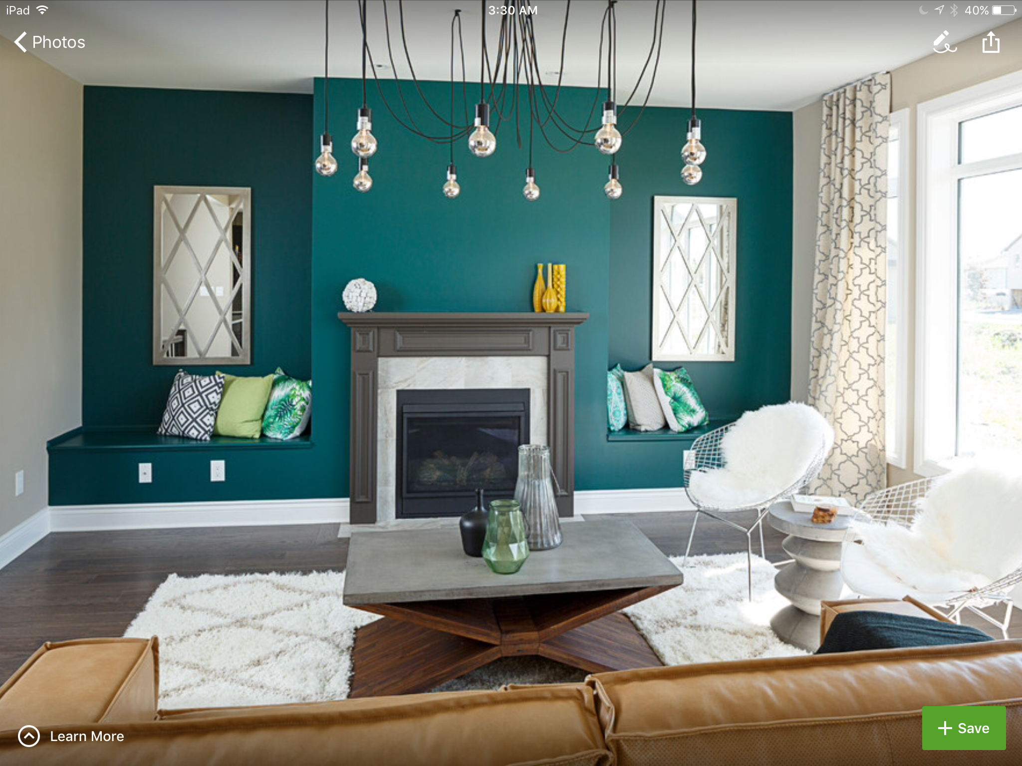
You can highlight one of the walls with turquoise wallpaper with trendy geometric patterns or colorful circles. In this case, it is better to choose furniture, i.e. TV stand, bench, shelves, chest of drawers, table and chair from natural wood. Turquoise upholstered furniture looks best with a subtle white or gray pattern.
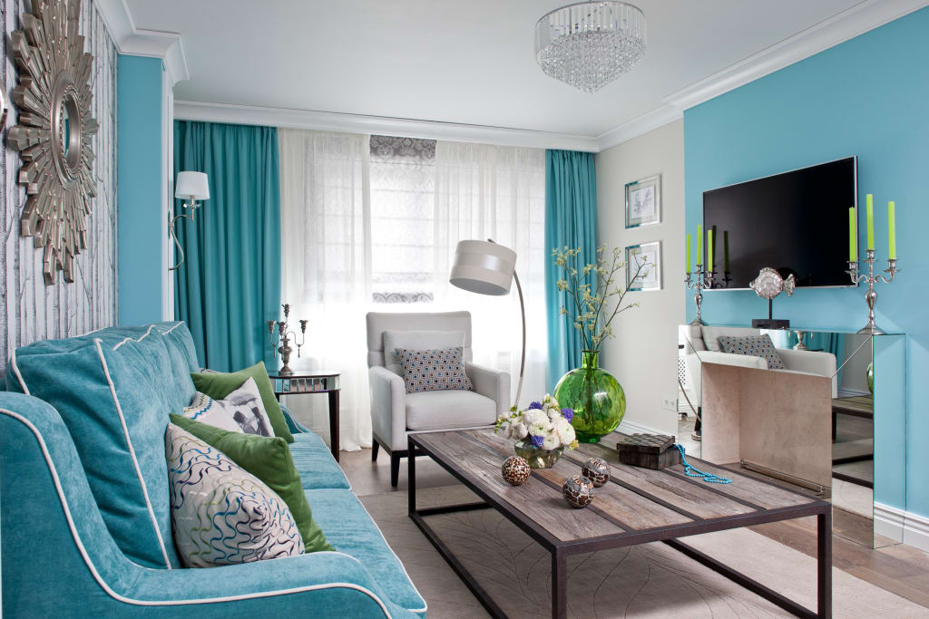
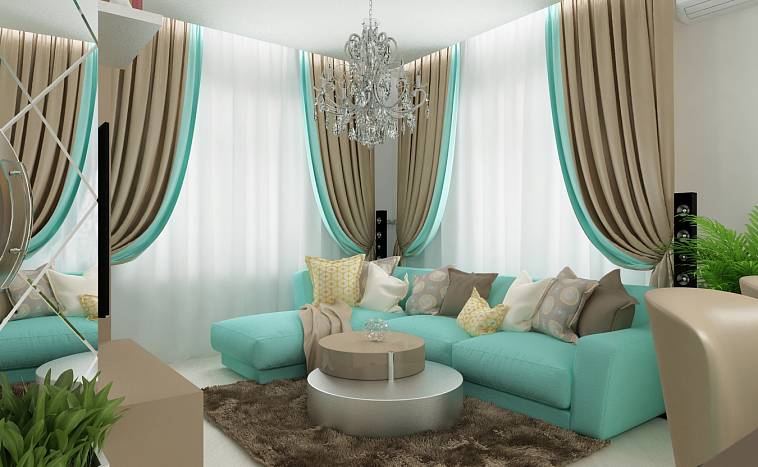
For a modern cool effect, you can use turquoise, smooth fabrics in a variety of shades, from very light and delicate fabrics on the largest surface of the sofa, to durable and dark ones like chairs or curtains. The living room looks good with turquoise walls and white furniture, and light blinds are used to emphasize the modern character of the interior.
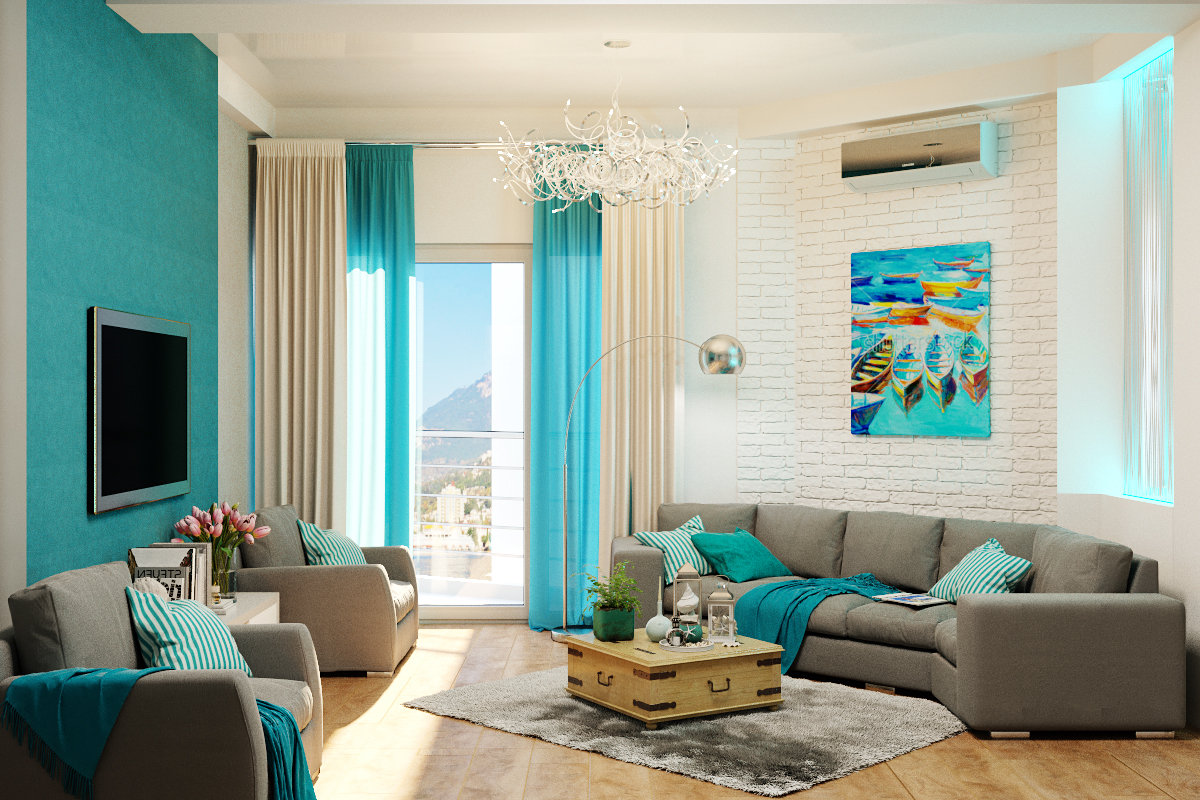
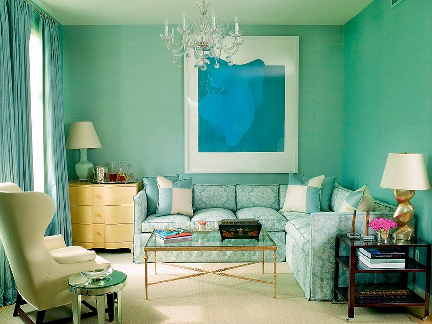
Another suggestion for creating a turquoise interior is to paint one or two walls in a chosen shade of this color, and the next ones - white or very light gray. In such an interior, both white and gray furniture will look great. To illuminate an entire space, care must be taken to provide adequate lighting, so a chandelier and lamp with real or much cheaper artificial crystals that reflect and diffuse light beautifully would be a great idea.When using turquoise as a base, you should not be afraid of additions in a glamorous performance, since they will not change the modern character of the composition, but only give it a little luxury.
Successful combinations with other colors
Designers use brown tones so that they do not create a gloomy mood. Compositions with other shades are needed so that color unity is felt in the living room.
With green
The tones of wood and foliage look organically together. In a brown living room, the color of a swamp, moss, pistachios is appropriate. Emerald and malachite shades are used in classic interiors. Green tones give the room more freshness. You can put indoor plants on shelves and windowsills in the living room. They use textiles in greenish tones: pillows, blankets.
With blue
Intense brown colors in the room are successfully combined with sky blue. It is best if the walls are painted in turquoise, ultramarine or azure. Then the flooring and furniture choose bark colors. The beige walls are in harmony with the pure blue plastic on the furniture.

With yellow
Brown shades are close to yellow, golden tones. Saturated tones of yellow are used in the selection of textiles and accessories. In the chocolate parlor, golden silk curtains hang from the windows. You can experiment with the ceiling by painting it in the colors of the sun. Then there will be more space.
With gray
The combination of gray and brown is perfect for Scandinavian style. The background for the living room is created in white. Upholstered furniture made from natural wood can have shaggy blankets made of gray wool or fluffy pillows. The coldness of gray is lost in the warmth of brown, giving the room a cozy feel.

Coffee with milk
The coffee color is chosen as the predominant color in the design of the living room. It is in harmony with the sandy tones of textiles and the richness of brown in natural wood furniture.
The interior turns out to be luxurious if you use the decoration in chocolate colorand the furniture is light coffee. Appropriate textiles and lamps are selected for it. It is best to make the wall plain behind the back of the sofa by choosing either a dark or light shade of wallpaper or panels. The pattern on the textiles should match the color of the walls.
Variety of shades
The most popular beige shades that are suitable for home styling include:
- lactic. Ideal for rooms located on the north side. Allows you to create an elegant room for receiving guests and leisure activities.
- gray beige. Neutral color, which is recommended for combined rooms (for example, for a studio with a dining room). Great for zoning space, it can be easily combined with any colors.

- beige brown. A darkened color scheme that is more suitable for rooms decorated in a classic or royal style. Allows you to create a calm and measured atmosphere.
- caramel. Warm pastel colors are ideal for extra comfort. Emphasizes a calm, homely atmosphere.
- cinnamon. Warm, darkened color scheme, which is best used for rooms located on the south side. With insufficient lighting, it will create a depressing environment.

Surface finishing
If finishing work is being carried out, it is important to consider what colors are used and how they will be in harmony with certain textures and materials.
- the easiest option is to use plain wallpaper or paint, but if we talk about convenience, the first option will be more advantageous;
- to hide a defect on the wall, you can use a preliminary putty, and then apply paint with a pattern or ornament;
- with the help of wallpaper, complex decors will look great and be combined with individual zoning or with photo wallpaper, depending on the design technique used;
- dark colors hide the spatial area;
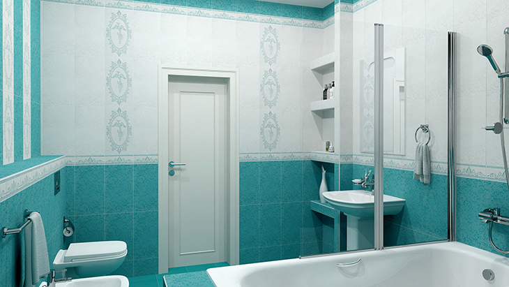
- in the bathroom in the color of turquoise, tiles are selected, it will look both with light and white shades;
- if you paint the ceiling white or use the installation of stretch ceilings, the surfaces will be harmoniously combined;
- making the ceiling multi-level, any shade of turquoise is involved;
- make original floors in different colors modern and relevant;
- if it is a dormitory, carpet is taken for the floor, which can be chosen in tone for any direction.

The use of color in different interior styles
Interior design involving beige is difficult to spoil. Moderate tones will fit perfectly into any design style. Cool shades are suitable for walls and ceilings. Light textiles, window, doorways can be distinguished. A bright accent is appropriate with small blotches (wallpaper patterns, figurines, etc.). Beige is a safe bet for the following basic styles:
- Classical. Soft shades look great against a backdrop of understated sophistication. Visually expand the space, make the lighting more expressive. A combination of different textures, a combination of beige with gilding, silver is allowed;
- Country. The style most close to nature is based on convenience and comfort. The decoration is done in light colors. To emphasize naturalness, they use decor with rough shapes, untreated surfaces, careless plaster;
- Minimalism. The beige decor will look great in rooms of any size. Better to use cool shades. Their diversity is not encouraged. The emphasis can be placed on textures, decorative elements;

- Eclecticism. You can combine completely inharmonious details. Beige will be more appropriate than ever. Bright accents, catchy textures will look great against the background of all its shades;
- Naturalism. A combination of only natural shades (pistachio, blue, brown, yellow) is allowed. In beige, they imitate natural surfaces. Only natural materials are welcome;
- Provence. Warm, neutral shades will do. Beige is the traditional color for this style. It is in perfect harmony with natural stone, natural wood. One of the best backgrounds for variegated colors.

Terracotta in the interior
The shade of brick can be used in any room, without exception. It is allowed to make it the main or additional: at will, depending on the rest of the tones used, on the dimensions of the room and the degree of color saturation. If the room is voluminous, facing the sunny side, terracotta can be made basic: they can be used to decorate walls and floors. In small rooms, it is better to take the lightest tones of terracotta or use dark shades, but in the form of accents.
Hallway
In this room, terracotta tiles will welcome guests and households with a friendly, warm atmosphere, and will contribute to calmness. It is quite discreet, non-staining, looks very stylish. In the large corridor you can use terracotta wallpaper, but only under the condition of good artificial lighting, because there are no windows. White furniture looks especially impressive against the background of such a finish.
In a small hallway, it is better to strive for a visual expansion of the walls, so they should have light shades. At the same time, furniture can be terracotta, black, brown: it will only emphasize the pleasant freshness of vertical surfaces.
Living room
Terracotta tiles will come in very handy for the living room, it will give the atmosphere of tranquility and cheerfulness. Usually, the walls are decorated in light brick colors, while the floor, furniture, curtains are made darker. Another good option for decorating the hall is the walls in light pastel colors, and the sofa and armchairs are terracotta or add this color to the flooring and accessories.
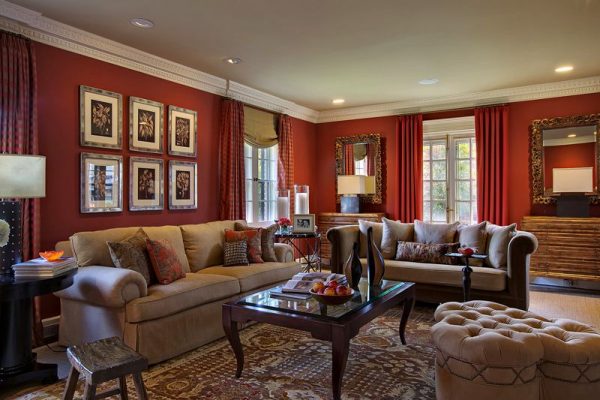
In sunny, southern rooms, the terracotta tone can be diluted with cool shades of turquoise, blue, green.Additional tones in textiles will look good: curtains, pillows, rugs, blankets. For cold rooms, it is good to combine light terracotta with red and white tones, beige shades. Wooden furniture, dark wooden floors, natural carpets and soft textiles look great against the background of brick walls, which is especially suitable for the country style.
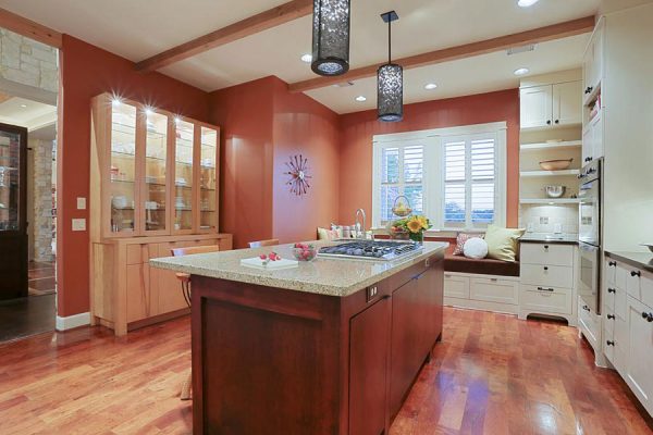
Kitchen, dining room
In the kitchen, terracotta tiles will successfully fit into the interior, remind you of spices, earthenware, and provide an excellent appetite. It has a positive effect on vision, therefore, it can be present in the decoration in significant volumes. Most often, terracotta in the kitchen is decorated with a set or floor, coupled with a ceramic backsplash.
You can also enter the color of bricks in textiles, accessories against the background of light furniture, especially if the room is small. Potholders, cups, watches, vases, wall plates will help to strengthen the style orientation and make the room spectacular.
Bedroom
It is better to make a sleeping room light, airy in appearance, therefore, as the main terracotta, it is used only in the form of pastel colors. But furnishings can be bright, but they should not be used in large quantities. Terracotta looks great in:
- furniture upholstery;
- pillows;
- bedspreads;
- curtains;
- sconce;
- frames of paintings;
- ceramic accessories.
The terracotta in the bedroom interior goes well with gray, blue colors. Terracotta walls and white furniture are the perfect match for a casual and effortless combination.

Children's room
For a nursery, it is recommended to use only natural materials in wall decoration: for example, paper, non-woven, fabric wallpaper. It is better to use juicy, cheerful tones, so terracotta is usually used to decorate only one wall or area, or use color in the decor. Yellow, orange, green, light green, blue look good with a brick tone - all these shades will suit the child's taste. Teenage rooms are often decorated loft style and a brick wall is used as an accent.
Bathroom
Usually the bathroom is finished in terracotta color by those who prefer conservatism in everything, including the interior. Preference should be given to matte surfaces that look more stylish, but with a combination of orange, beige and terracotta, it is quite possible to use a glossy finish. In spacious rooms, it is permissible to use darker colors, in small rooms - only light, pale ones. The limited introduction of terracotta in textiles and accessories will be appropriate. Green, pink, red accents will complement the decor.
Cabinet
For the office, the terracotta color will suit perfectly: it will give this austere room a more homely look, will help to tune in to a calm but fruitful work. It is better to use accessories of this range in the office (floor vases, panels, figurines, paintings, lamps) or furniture: armchairs, sofas.
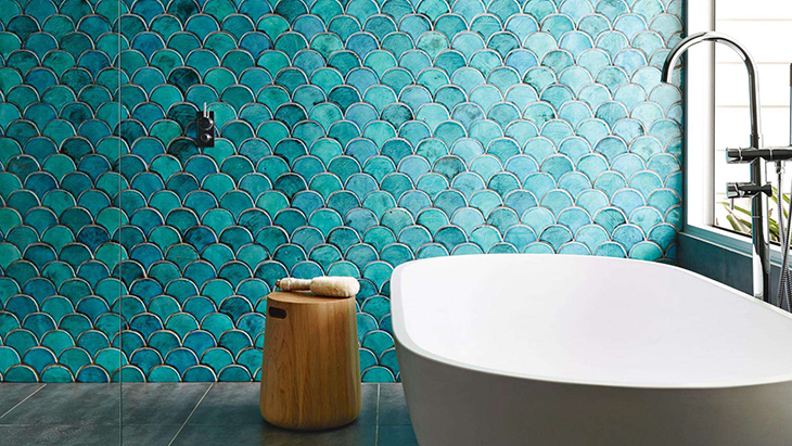
The use of turquoise in different interiors
There is a huge number of stylistic interiors where turquoise is used not only as a universal, but a very attractive color.
Classic
If the design of the room is classic, there must be elements of turquoise, in this case, for example, the living room will resemble an old-style palace. In addition to the background, turquoise is used in photo wallpaper, furniture and curtains; as an addition, a gold or silver shade is suitable.

Most often, the shade of the sea wave is presented here, it is used as an accent, for example, in the form of curtains or paintings.
Ethnic
One of the most popular interiors of our time. Ethnic style is present in various pieces of furniture, pillows, bedspreads. Turquoise usually predominates in this case in textiles. The colors are combined very well with the yellow shades.

Art stylistics
This design mixes a wide variety of shades that can be difficult to perceive at first, but later seem completely normal. It is permissible to use black, brown blotches here, where the main background is turquoise.
Country style
Allows you to combine many shades of nature, in addition to blue and green, gray and brown tones are present here
It is very important that the color shades do not contradict each other. Country style is combined with peas, with floristry, with cellular patterns, if animal drawings are shown
Loft style
It uses traditional colors from the brutal category, which include brick, gray, chocolate and steel. These colors are diluted with catchy or modest tones of turquoise. Frescoes, cupboards, chairs, textiles are used as certain accents.
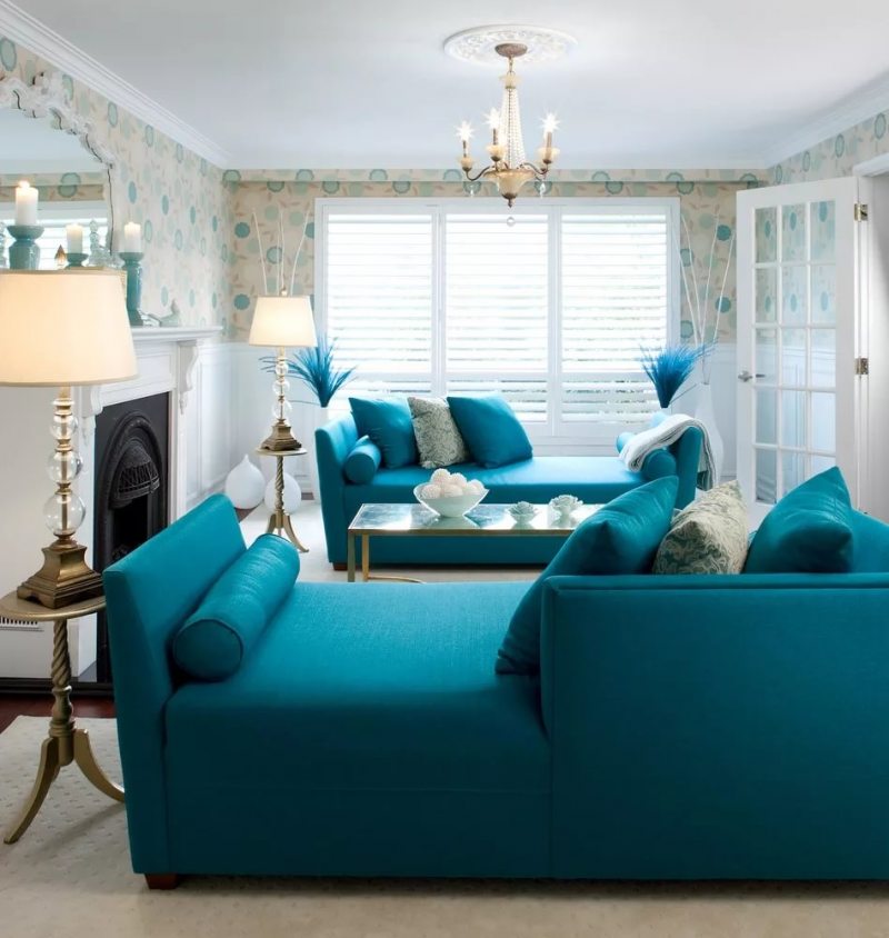
Marine interior
This is the most common option in which houses have been decorated since ancient times. It is ideal for city apartments and private cottages. The main colors used are blue, white, brown and turquoise. There are a variety of tones in shades of blue. White can be not only pure, but also cream or milky.
Style features
There are no style restrictions for shades of beige. Their variety and versatility does not limit the designer's imagination. In the right hands, the living room turns into a work of art. Well-chosen accents set the right rhythm; primary and secondary colors complement each other perfectly.
Classic
Beginning designers like to experiment with classics. In the decoration of walls, floors, ceilings, the choice of furniture, combinations of white, beige, brown are played. They do not use pure colors, but their derivatives:
- olive brown;
- Ivory;
- milky white;
- cappuccino;
- coffee with milk.

Playing with shades, they create a non-boring interior. A smooth transition from a dark floor to lighter walls and an almost white ceiling visually fills the room with air, making it voluminous.
High tech
A progressive style for dynamic, modern people. Gloss, cold shades visually expand the space. Cozy details in the form of multi-colored decorative pillows, bright non-functional accessories are absent
Attention is focused on furniture, lamps of unusual shape
High-tech style walls are light, painted or paneled, stretch ceilings. The geometry of the room is emphasized by LED strip, spot and pendant lamps. With the help of a lighting system, the living room is divided into functional areas.
Provence
This style gravitates towards natural shades, motives, therefore, the entire beige range is suitable for a living room designed in the Provence style. It is used in the decoration of walls, floors, ceilings, accessories, furniture upholstery, textiles. Light furniture visually enlarges the area of a small living room. Correctly decorated windows create the atmosphere of a French countryside. Use only natural, lightweight textiles, plain or with floral motifs.
Wicker chairs and baskets are used as functional decorative elements. Together with original lamps, chandeliers, paintings, they bring a feeling of comfort. Delicate floral motifs are present in the decor of sofa cushions and wallpaper.
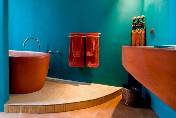
Accessories in a turquoise bathroom
Accessories
should not be selected in a single color, if they are bright, but several elements of similar shades should be selected. This will add warmth to the interior and achieve layering in the play of light.

Credit: @
Beige shades of lamps, curtains and glass surfaces add a touch of sophistication.
The bathroom can be brightened by using turquoise accessories. However, when choosing rugs and towels, as well as decor items, restraint should be observed, since the abundance of variegated elements can destroy such a carefully selected composition.

Light colors in the wall decoration are complemented by a turquoise rug and mirror.
Among the walls of neutral shades, decorative elements in shades of turquoise look good and fresh. Choose bathroom accessories with turquoise walls in contrasting colors; this combination will add dynamism to the interior.

Forged elements in the decor.
By applying the principles of color matching, you can achieve a great combination in the design of the bathroom in turquoise tones. Choosing this palette allows you to add freshness and chic to the design. In addition, this solution allows you to achieve the desired results in the design with the use of minimal finishing materials. In total, the design of a turquoise bathroom turns out to be a practical and stylish solution.