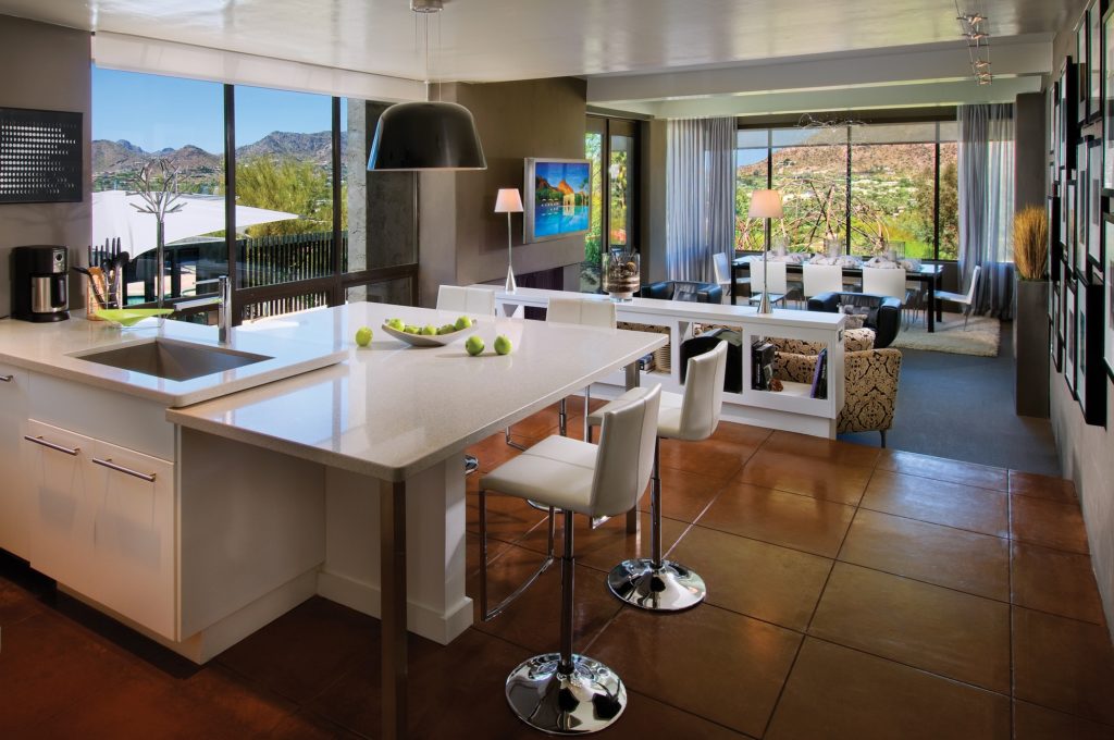
Interior stylistic solution
Classic style
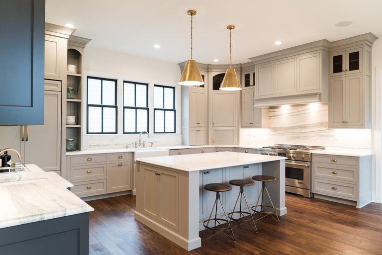
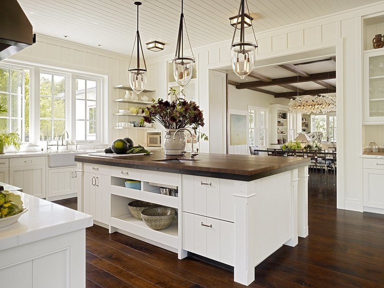
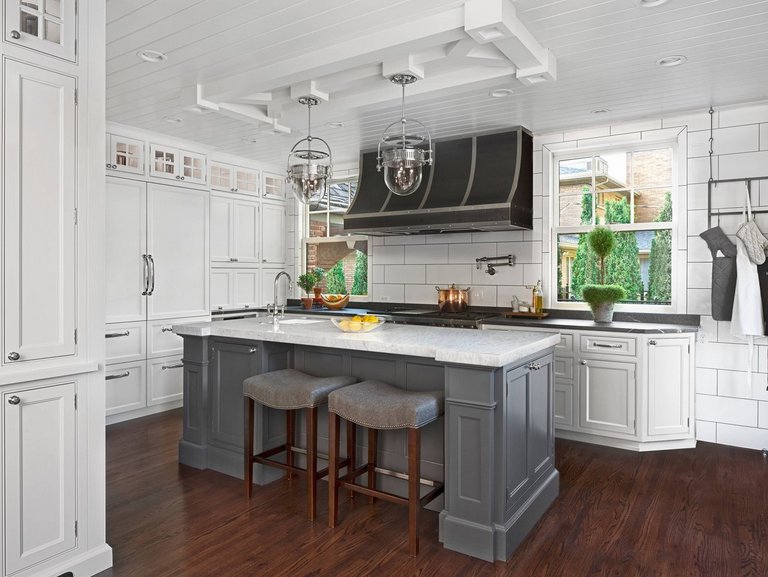
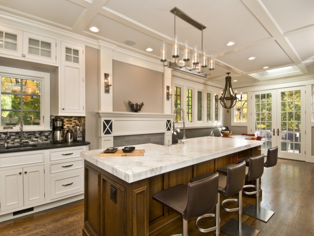
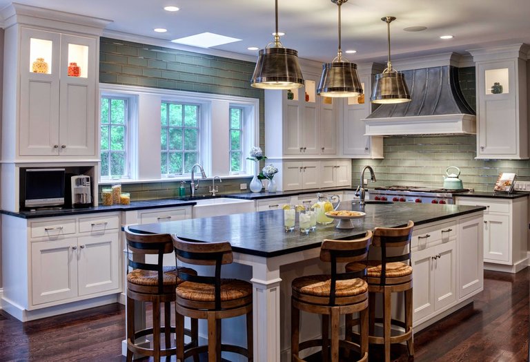
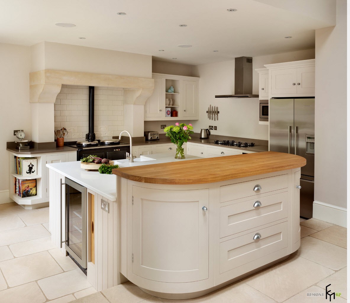
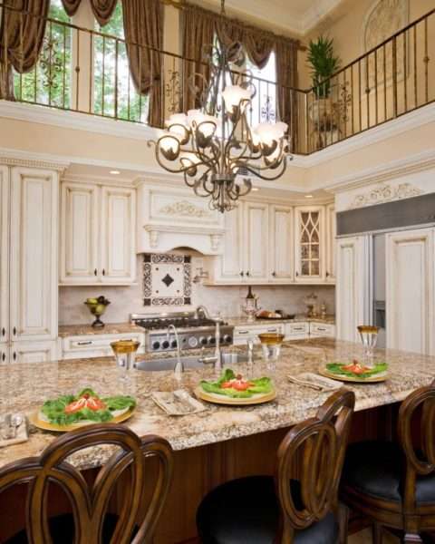
The traditional island table is made of natural materials: solid wood for cabinets, natural stone for the countertop. The facades of such pedestals are abundantly decorated with carvings, open shelves are made in the form of arches and are framed with ornate balusters. Intricate stained-glass windows are provided in the doors. The personal hood for the curbstone is made in a fireplace style. A crystal chandelier over the island with candle-shaped lamps will decorate the room and create a soft stream of light. Lamps with elements of artistic forging look exquisite. If the curbstone plays the role of a dining table, then there may be several of the same type of devices. It is better to use practical materials as flooring: porcelain stoneware or tiles.

Modern style
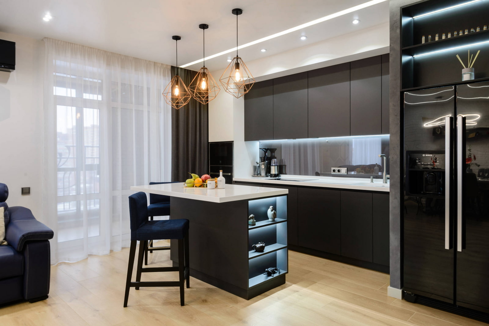
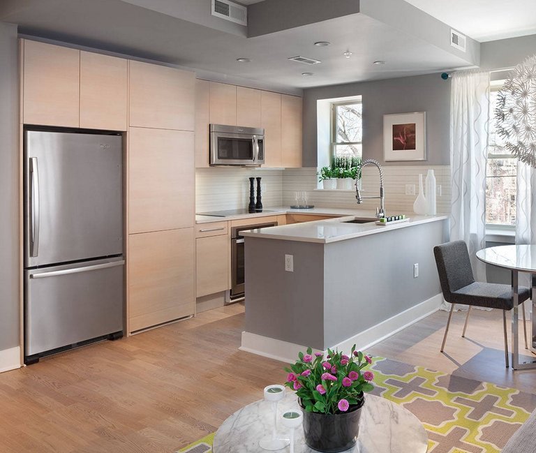
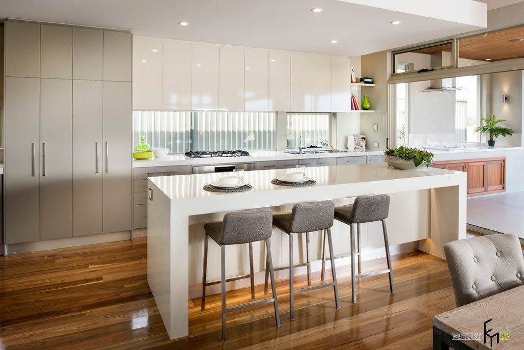
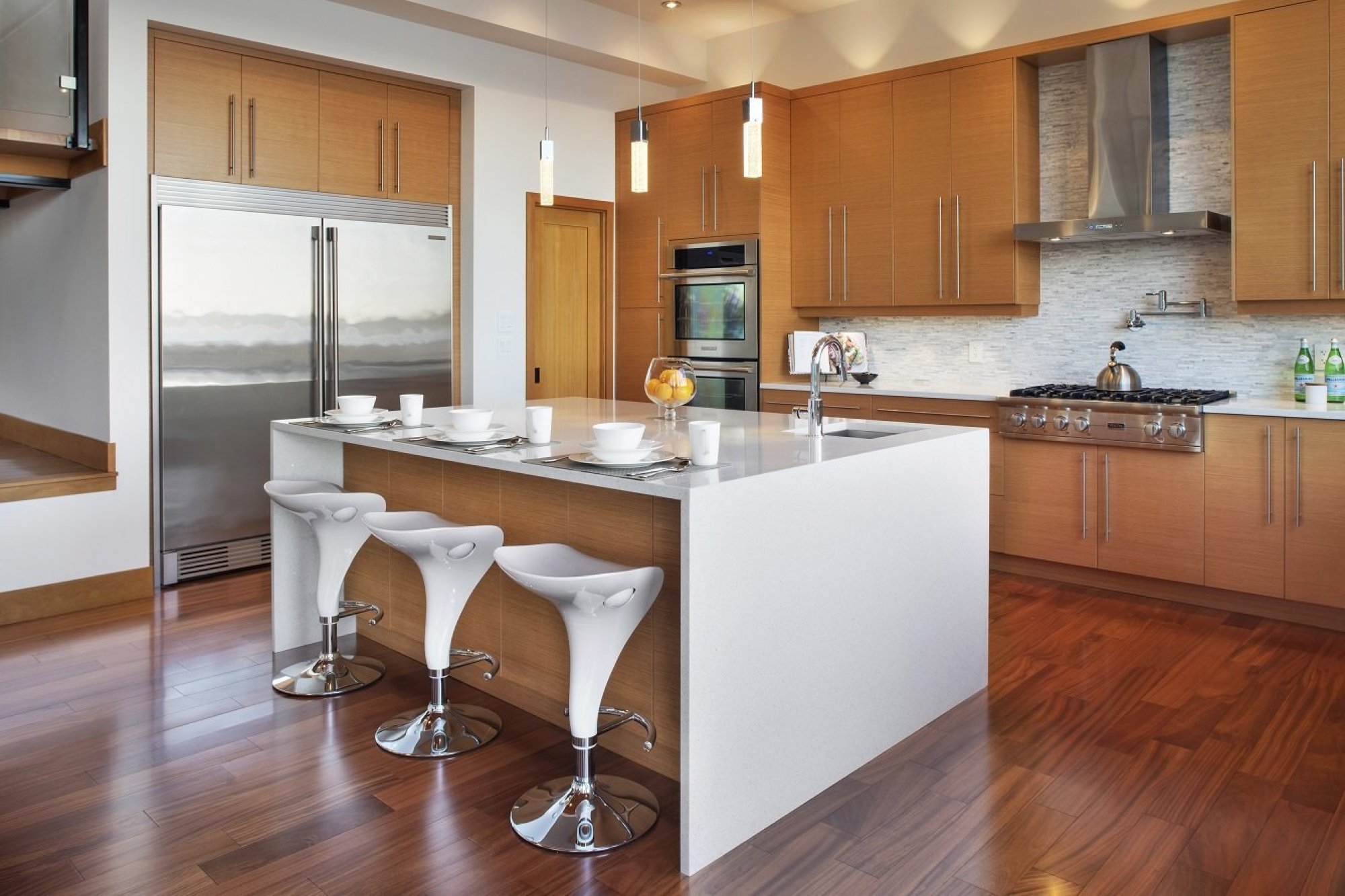
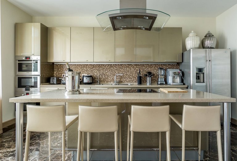
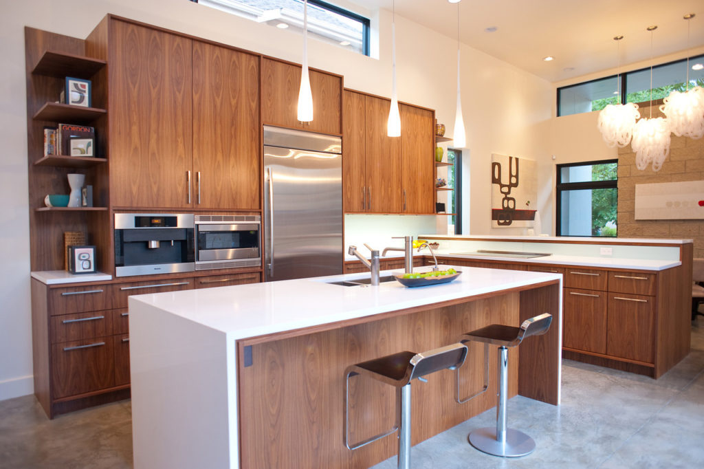
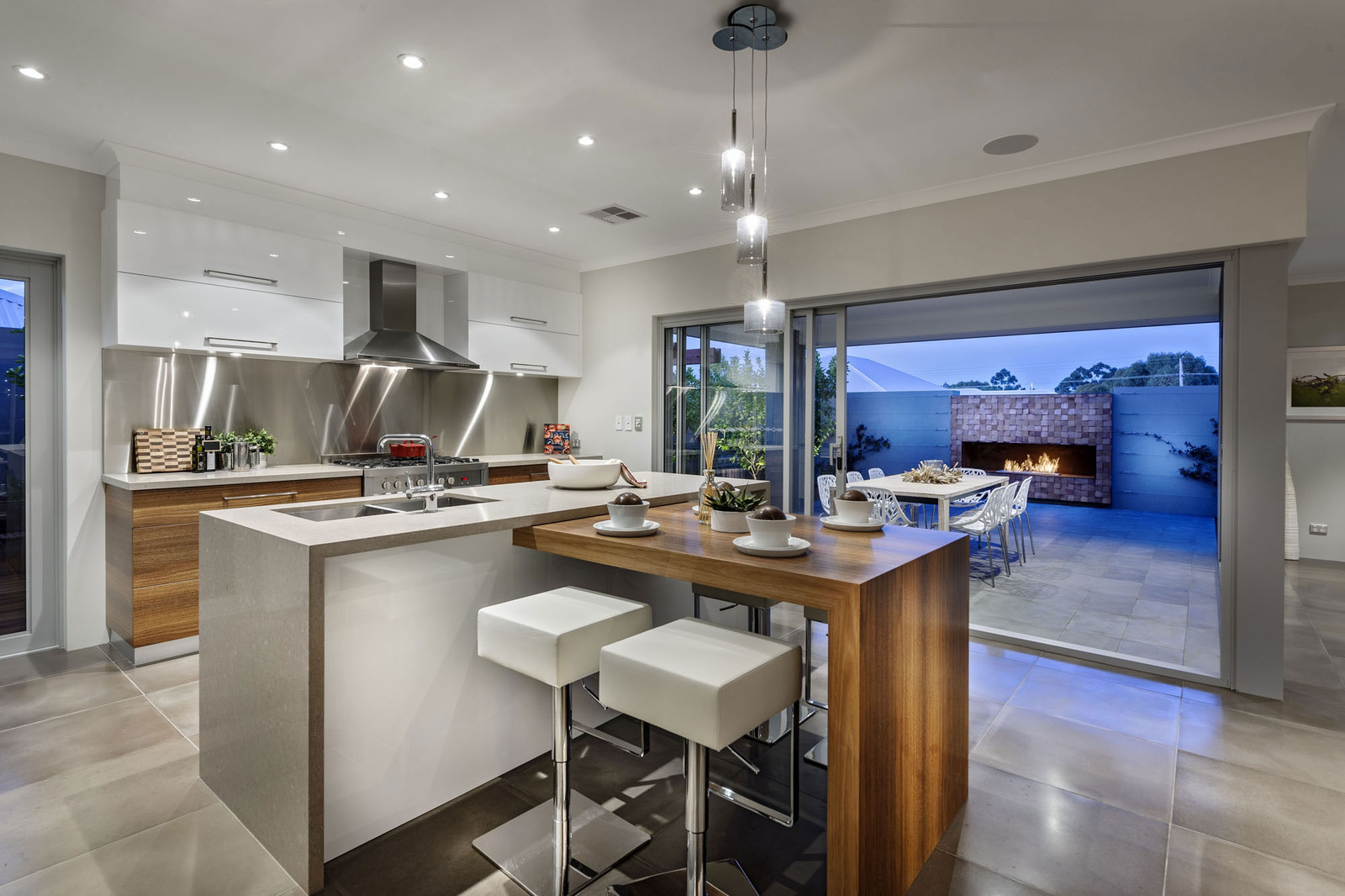
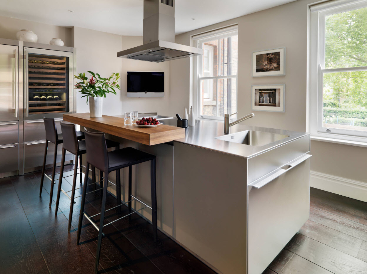
This design reflects the lifestyle of the current generation of people. Saving time for cooking results in a rational workspace with multifunctional appliances. The style is characterized by an abundance of plastic smooth glossy surfaces, many metal chrome elements, as well as translucent glass inserts
Particular attention in the interior is paid to the functionality of the modules, therefore the island cabinet is most often equipped with built-in kitchen appliances

Provence
The cozy and simple design is characterized by light, artificially aged furniture, mostly made of wood. An elegant sideboard to match the color of the headset will be decorated with romantic ceramic figurines and earthenware. Wicker baskets made of wicker can be placed on the open lower shelves of the island. Textile elements are preferably decorated in light colors. It would be appropriate to choose dishes, tablecloths and curtains made in a small floral pattern. The style requires bright lighting, so additional lighting fixtures must be placed above the curbstone. A fabric lampshade with weightless lace or a forged lamp with a worn metal effect will decorate the interior and add a rustic flavor.

Country
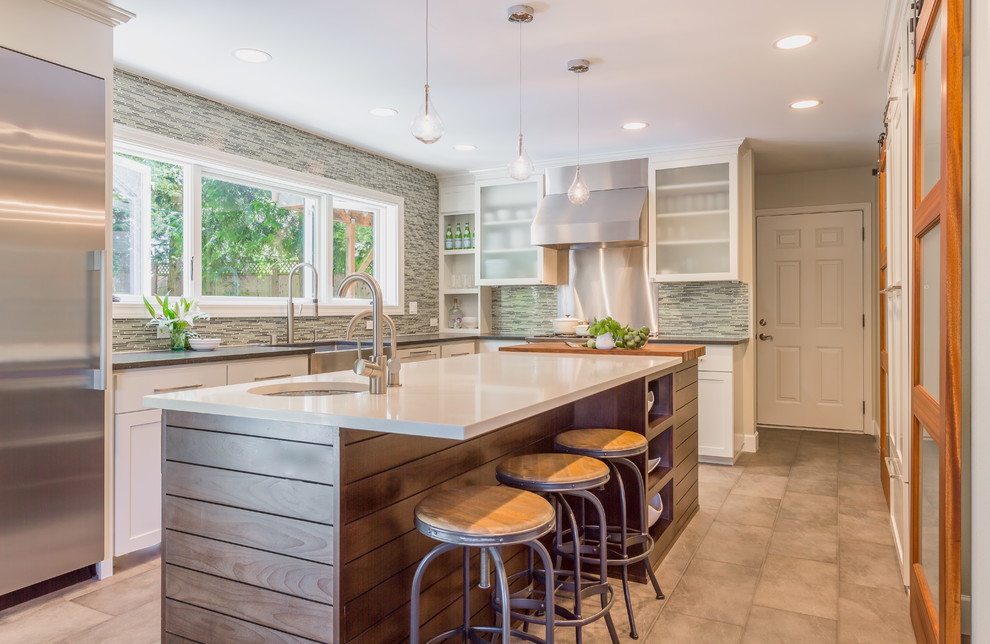
A massive table-island made of aged wood successfully fits into the rustic style. Open shelves can be made with wicker baskets or covered with light checkered curtains. The curbstone may contain rough drawers with forged handles, and it would be appropriate to lay out an uncomplicated pattern of small tiles on the countertop.

Loft
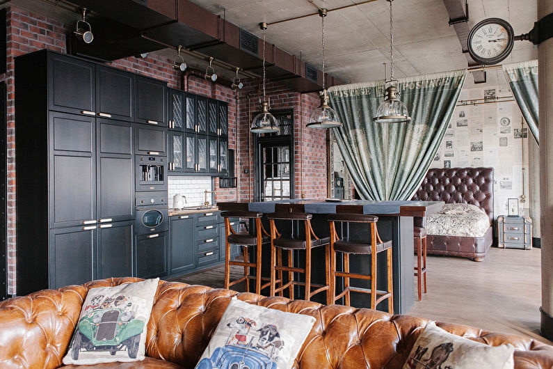
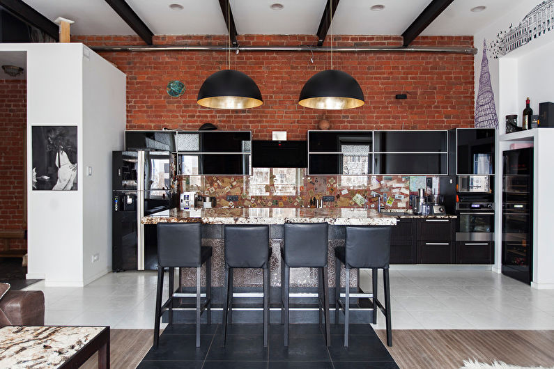
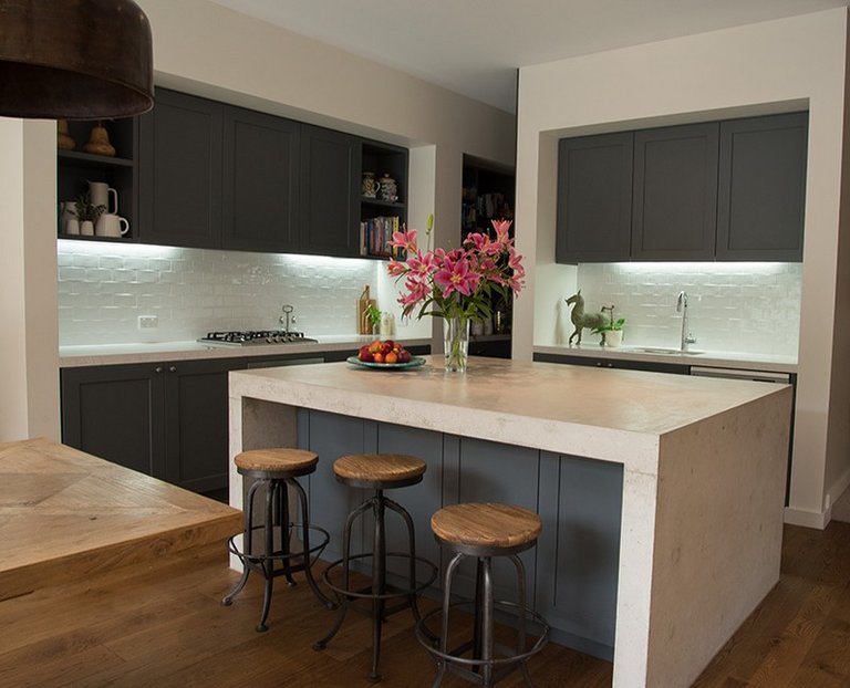
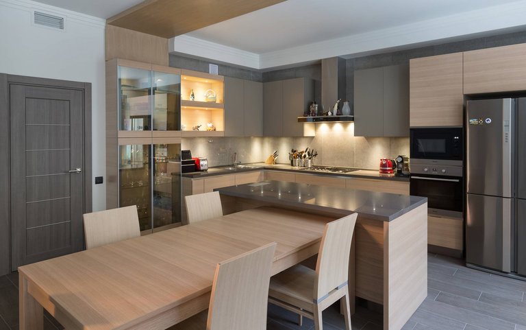
The seeming simplicity of the industrial style borders on the high functionality of current technologies. A spacious room without partitions often serves as a kitchen, dining room and living room at the same time. To delimit space, it would be appropriate to use an island, which may look like a roughly made table. The legs are pillars lined with bricks or metal pipes welded to the lid. The table top can be made of solid planks, rough stone or steel. For lighting, it would be appropriate to use spotlights or factory lamps without shades.

Space required
If you are considering an island for the kitchen as a design option, then it is worth considering a number of nuances.
Kitchen dimensions
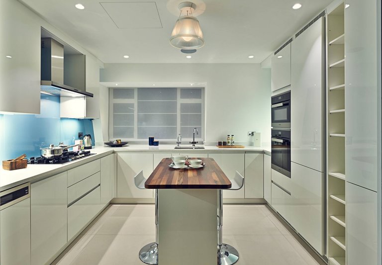
The use of such an original piece of furniture as an island is convenient if the kitchen area is at least 16, and better - 20-25 square meters. However, in a small kitchen, it is quite possible to equip a kitchen with an island, if it is compact and extremely practical, which is well demonstrated by the following photos.
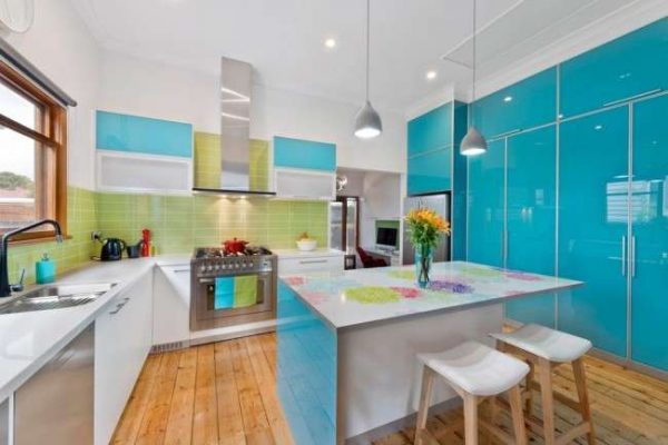 Light and bright shades of kitchen with an island make the room more airy.
Island dimensions
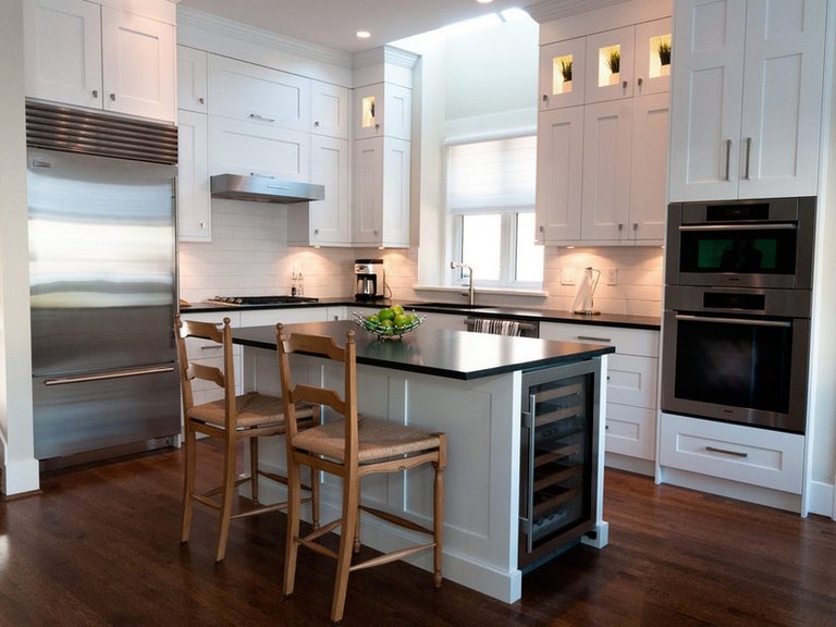
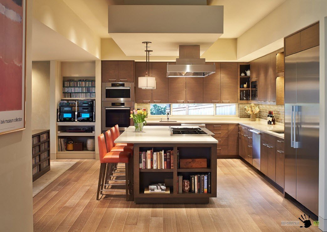
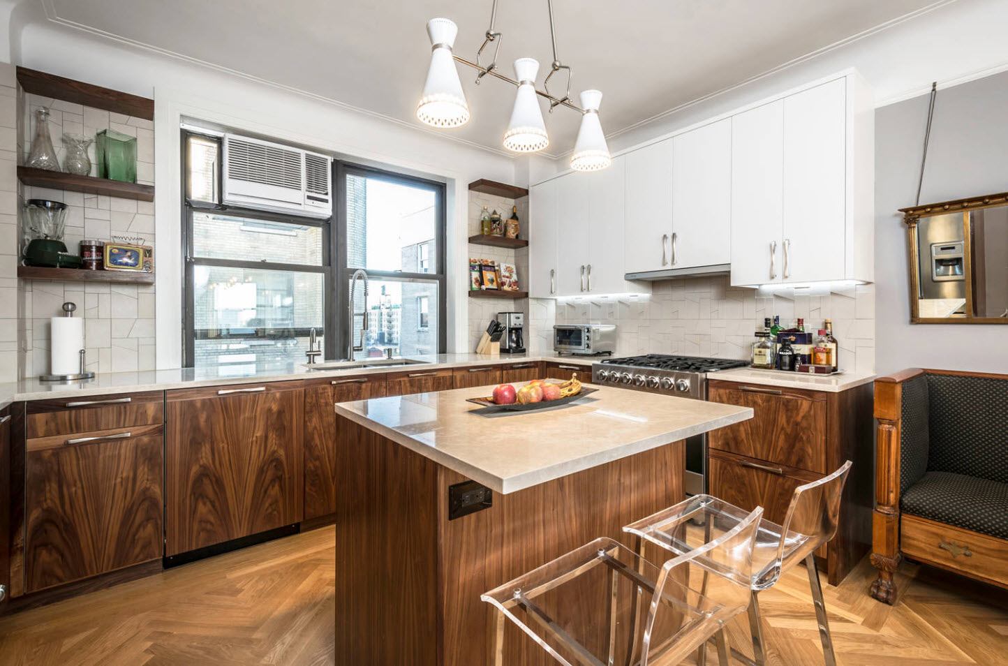
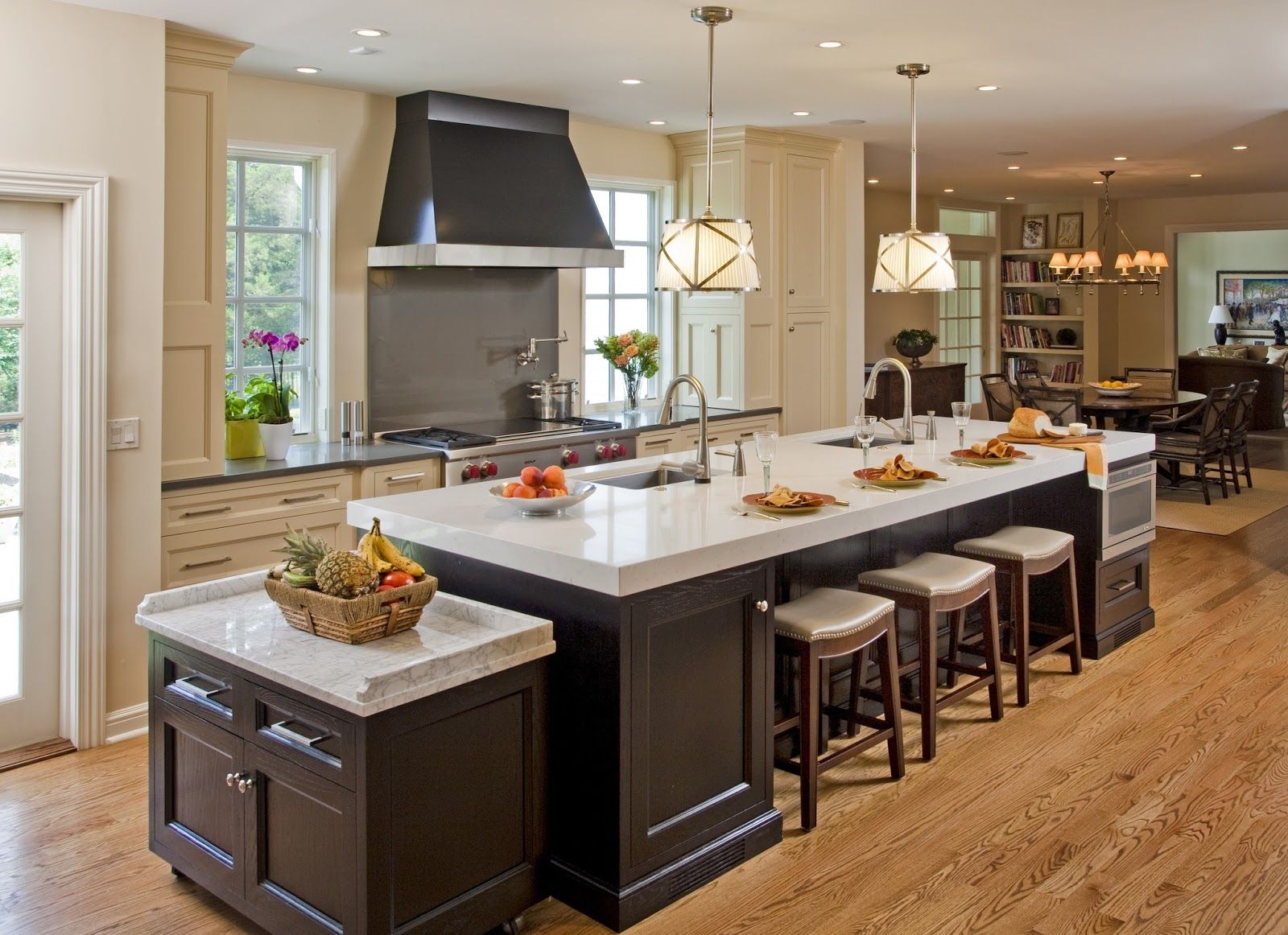
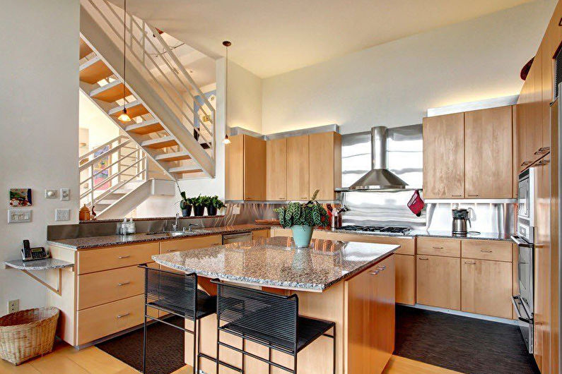
The dimensions of the kitchen island are selected individually, depending on the size of the room, as well as the needs of the family.For a small room, it is better to use a compact island, and for a spacious one - a more voluminous one, with a length of more than two meters. The optimal size of the island in the kitchen is 180 by 90 cm, with a recommended height of 85 to 90 cm - this is confirmed by the following photo.
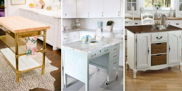 Examples of island tables for kitchens
The distance separating the island from the kitchen unit or wall should be at least 120 cm, which provides not only comfortable movement around the kitchen, but also convenient use of the storage system elements.
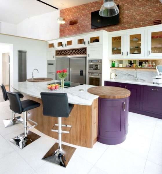 Multifunctional island area in the kitchen
Features of kitchen with an island
An island is a special furniture module that is located in the central part of the kitchen space, separate from the rest of the set. It can be a place for food preparation or a reception area. This layout option has its advantages as well as disadvantages.
pros
First, let's list the positive aspects of this solution:
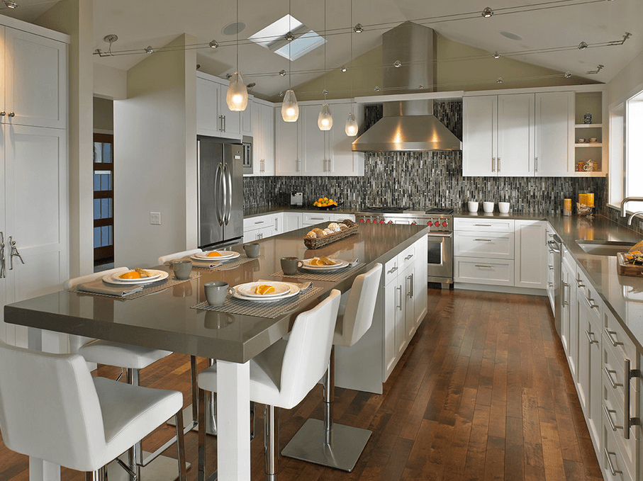
- Thanks to the use of the island in the kitchen, everything you need is at hand, there are many work surfaces, which can be seen in the following photos;
- The island perfectly divides the kitchen-living room or studio apartment into zones;
- It is convenient to have a snack or a cup of your favorite drink at the island table;
- Allows you to simultaneously cook and chat with guests or other family members.
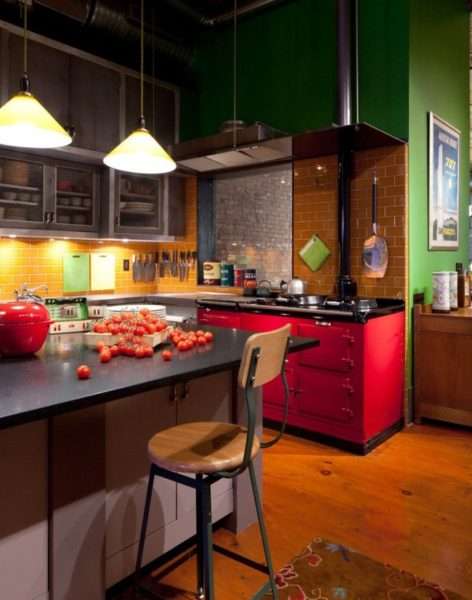 The island's lower cabinets are great additional storage space for kitchen utensils.
Minuses
The negative aspects of such a layout include:
- The installed island will take up a few extra square meters of space, which is not possible for any kitchen;
- In apartment buildings, there may be problems with the communications necessary to install a sink or stove, and sometimes they will be impossible;
- An island table cannot replace a full-fledged dining table, and everyday use of bar stools is not very convenient.
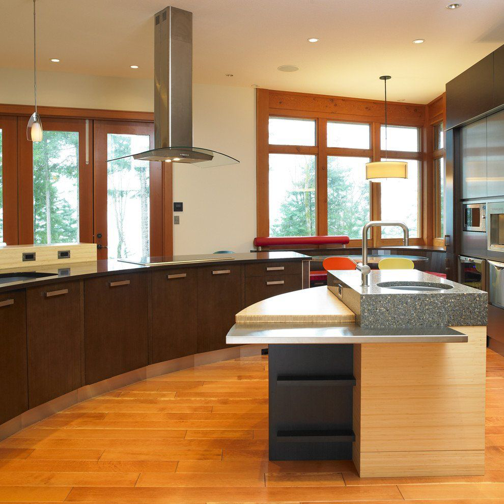
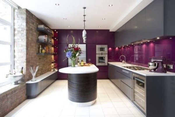 The island table can be of any shape
Kitchen with an island in a typical city apartment
The island can be installed in rooms of at least nine square meters. Since it takes up quite a lot of space, the kitchen of a standard apartment will require redevelopment - its transformation into a kitchen-living room, the design of which can be supplemented with an option with an island.
The use of the island in the kitchen would be appropriate for a studio apartment, which is perfectly demonstrated by the following photo.
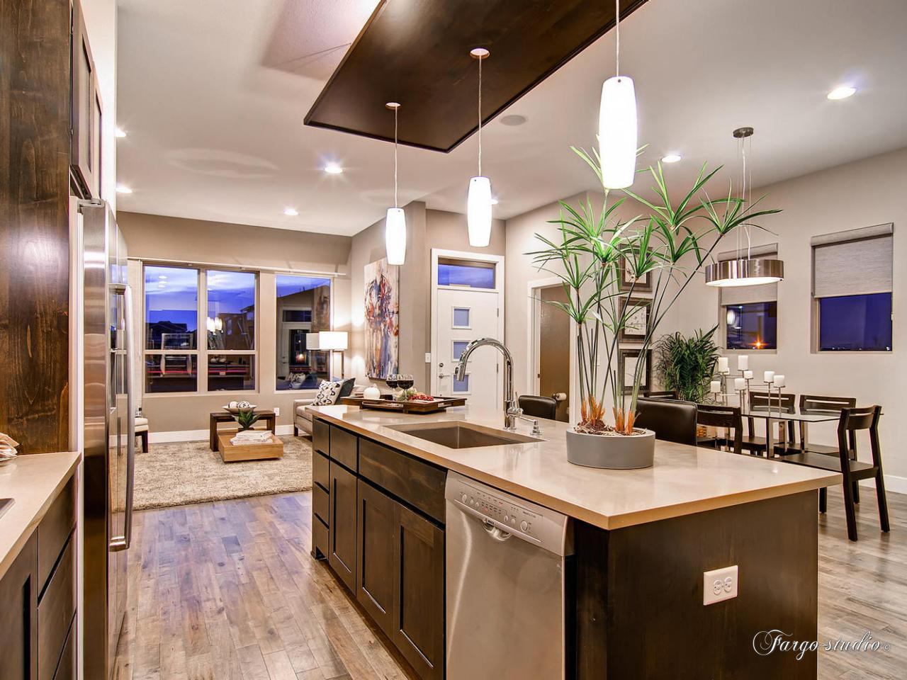
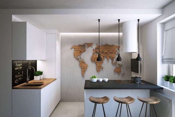 Kitchen-living room interior with island in studio apartment
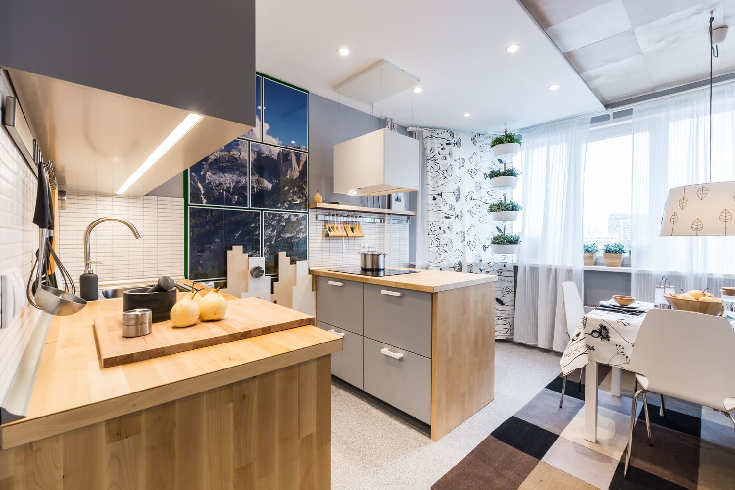
In a small room, a competent layout will allow you to correctly use the space of the kitchen-island, making every centimeter of it as functional as possible, which is clearly visible in the photo.
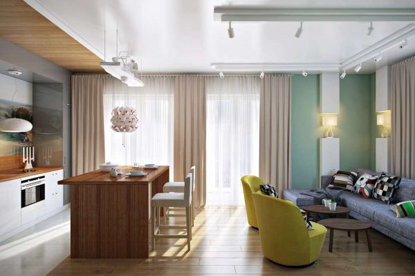 Functional placement of the kitchen table-island in the kitchen-living room
Island table in a private house
The ideal place to place an island table is in a private home, where the kitchen is usually large. A cottage or a country house provides truly unlimited possibilities for the embodiment of the original kitchen design with an island.
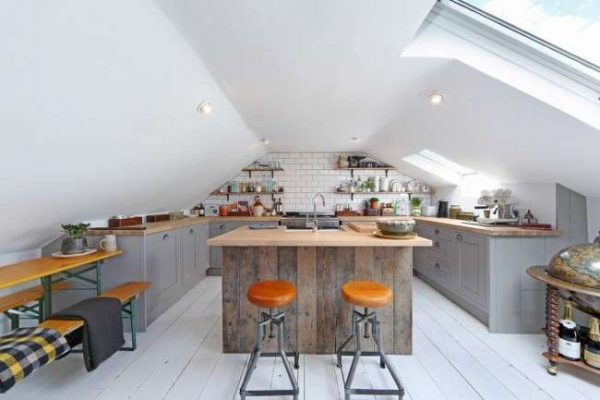 Kitchen with an island in the attic of a private house
Choice of sizes
Competent placement of furniture sets means taking into account and the ratio of the area of the kitchen and the island element. Ergonomics and comfort in the room depend on the distance from the island's hull to:
- refrigerator;
- cooking stove;
- walls;
- windows;
- other elements of the furniture set.
The optimal kitchen area for placing an additional table is from 25 square meters. The spacious room allows you to choose any model of the island. For kitchens measuring 15-20 square meters, tables with an area of 3-6 square meters are suitable. Installation of the island is convenient for zoning combined rooms.

Rules for planning a kitchen with an island
If it was decided to build a sink and a dishwasher in a separate cabinet, then it is necessary to plan the supply of hot and cold water, as well as think over how you can drain the waste water.Any equipment built into the cabinet requires electricity supply
It is equally important to provide adequate lighting over a separate work surface. All necessary communications are laid under the floor, the level of which becomes higher than the previous one
To make it convenient to use the island curbstone, certain standards must be observed:
- The optimal shape of the product will be the repetition of the outlines of the kitchen: if the room is square, then the cabinet is also installed in an absolutely correct shape; the longest part of the rectangular island should be parallel to the same side of the elongated room.
- The standard height of the module is considered to be 85-90 cm, the minimum comfortable length of the working table top is 1.2 m, the width of the cabinet can vary from 0.6 m to 1.5 m, depending on the area of the room.
Two approaches to kitchen design: classic and modern
If you have little experience in creating creative designs, then it is better to stick to the classic interior. This style is mainly performed in warm colors combined with blue, white and gold.
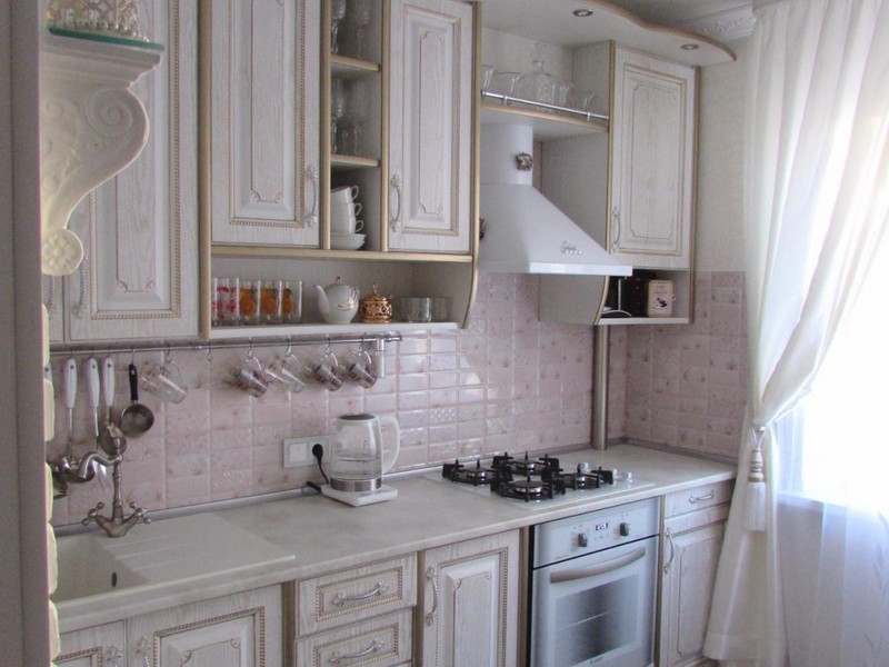
Classics never get old and are always considered a sign of sophisticated taste.
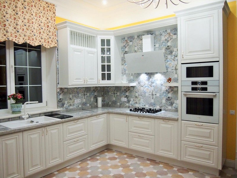
Corner set in classic style
Glossy white furniture will fill the room with light, while bright curtains, light wood countertops, decor and paintings on the walls will dilute the monochrome. You just need to remember that excessive luxury and pomp in details in a small room will look ridiculous. Observe the golden mean.
In a small kitchen, Provence style looks attractive. It is rich in light natural shades - beige, mint, blue and lavender. There are many wooden elements in it. Floral curtains, houseplants, knitted rugs and napkins from a city apartment will transport owners to the countryside.
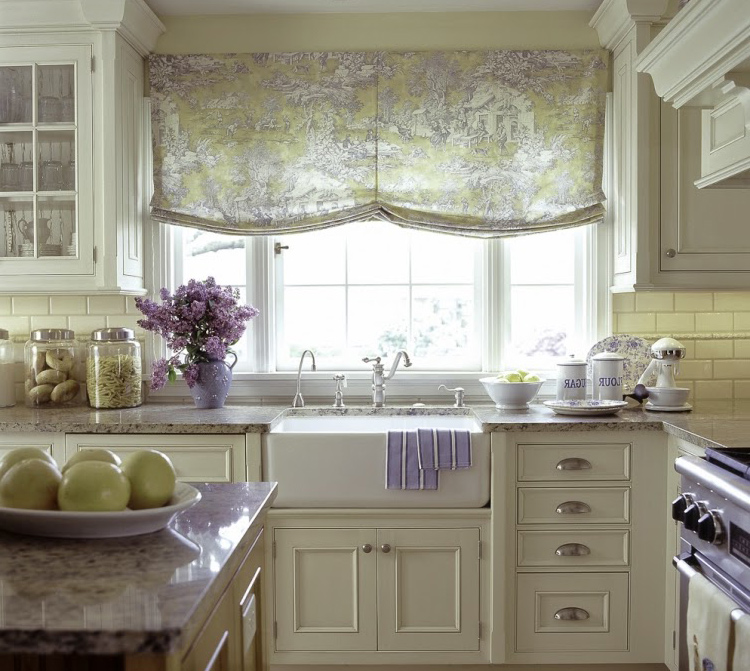
Provence style kitchen interior is designed in calm pastel colors

Fresh flowers, various handmade textiles and a variety of vintage decorations are suitable as bright accents.
For those who appreciate the severity of lines, laconicism, the absence of excessive decoration, stylish household appliances in the interior, modern trends are suitable:
- high tech;
- modern;
- minimalism.
They are all united by a restrained color palette, a strict form of furniture, a large presence of glass, metal and the presence of mirrors.
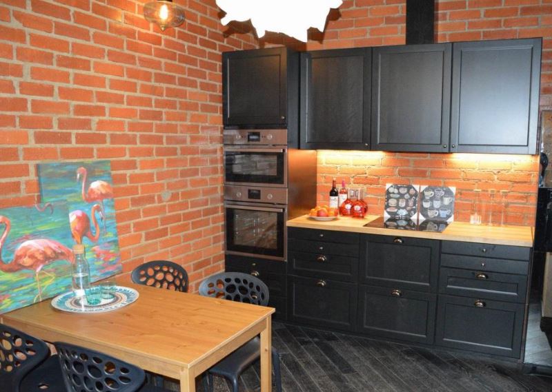
Modern kitchen with loft elements

High-tech kitchen looks modern and stylish
The number of kitchen finishes 3 by 3 meters can make your head spin. Before deciding on the final option, you should look at the photos, study what finishing materials are on sale, prices. You can even model a 3D project and see if you like the result. Only by thinking carefully about everything, you will get a modern and comfortable kitchen from your dreams.
We arrange furniture and appliances.
We pass directly to the design stage. You should start from the bottom row of cabinets, in which we immediately place a sink, stove and refrigerator.
If necessary, we additionally mark on the plan the positions for the washing machine and dishwasher.

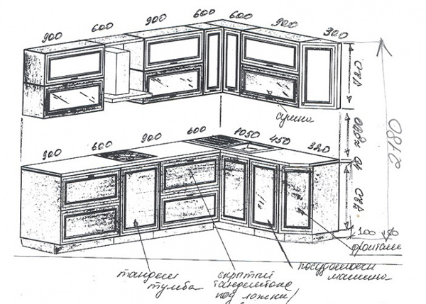
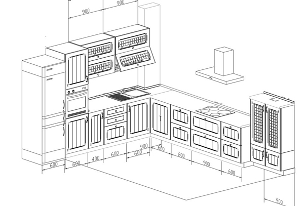
There are some restrictions in terms of the placement of these elements, and it is advisable to observe these restrictions:
- It is advisable to place a sink, a dishwasher in close proximity to communications.
- In the case of a corner kitchen, do not try to place the sink in the very corner - this is not always convenient. But using the corner of the kitchen for a stationary water purifier, a microwave oven and a warehouse of kitchen electric assistants is a more rational option.
- The stove / hob / oven depends on the gas pipe, outlet, kitchen hood. Naturally, no one has canceled the gas hose and the electric extension cord, but the overall usability of the kitchen and the aesthetic appearance will lose from this.
- The sink, stove and kitchen work area are usually in the same line.At the same time, it is desirable that the working area serves as a neutral strip between the sink and the stove. This location has been proven over the years and is very convenient.
- The refrigerator is protected against heat, but it is best not to use it. In addition to placing the refrigerator in a convenient place, contact with the battery, stove and sunlight should be avoided if possible.
- Electricity. Calculate in advance the required number and location of sockets for electrical appliances. It is not necessary to be tied to the existing wiring, but it is better to plan ahead and re-equip the outlets so that they have constant and easy access to them.
Having dealt with the lower tier, you can move on to the upper row of cabinets.
It should be noted right away that the width of the upper tier should not be greater than the lower one, otherwise the ergonomics of the kitchen may be impaired and injury cannot be ruled out.
Traditionally, the depth of the upper row is 30 cm, of the lower one - 60 cm. The hood is an important element here.
The chimney version of the hood implies a separate unit instead of a cabinet, but a built-in hood will allow you to leave the top line of cabinets unbreakable, with one condition that the cabinet above the hood will be one step less than the others.
If sliding cabinets become more convenient in the bottom row, then the doors of the upper furniture row, as a rule, open horizontally or vertically using special lifters (cabinets 35 cm high).
Selection of the color palette in decoration and furniture
After installing the kitchen unit and appliances for 9 sq. meters of free space remains a little. Therefore, at the stage of developing a kitchen design, all the details should be taken into account - the shape and size of the furniture, the number of household appliances, lighting, the color of the walls and facades, decorative and textile decorations.
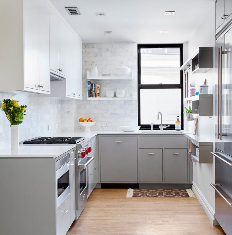
The color scheme can radically transform the interior of the kitchen
From how correctly everything will be arranged, your kitchen will become comfortable and beautiful. In confined spaces, every centimeter must be used to its advantage. It is necessary to accommodate all the appliances in the cooking area, pots and pans, you need everything you need to be at hand and not fall on your head.
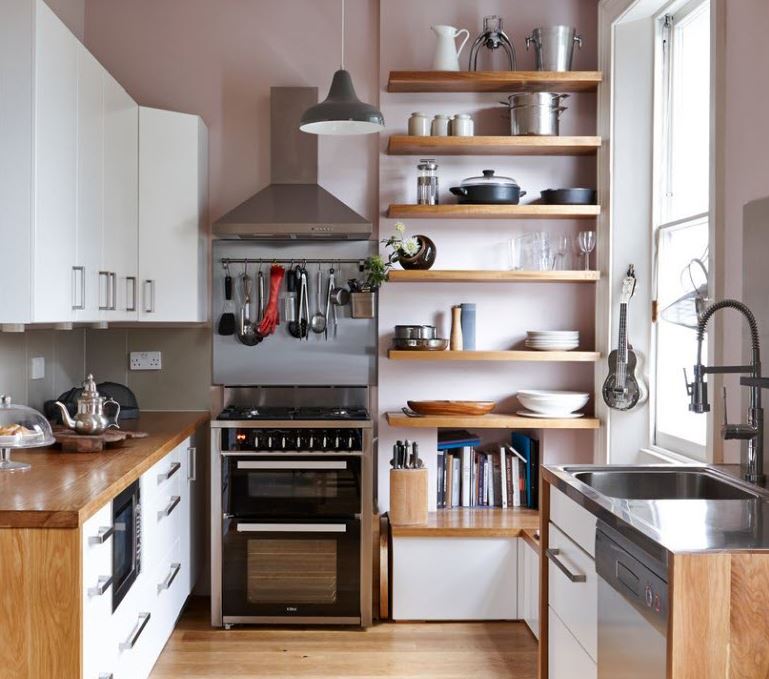
Furniture should be compact and functional at the same time
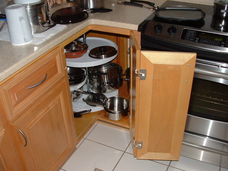
The inner corner can be very comfortable and functional
Large objects built into the headsets and covered with facades - a refrigerator, an oven or a stove - create a single style composition.
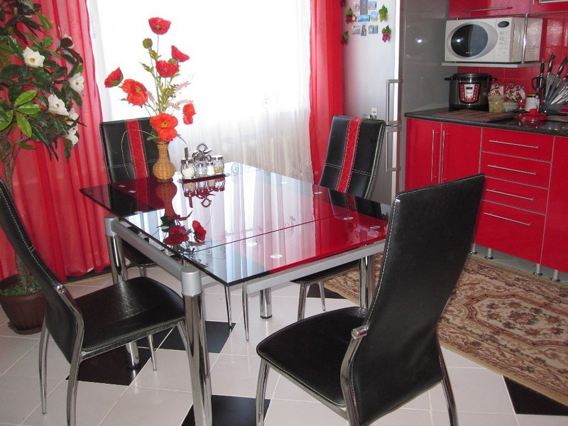
Transparent furniture looks less bulky, so it makes sense to take a closer look at dining tables with glass top
This will save space and it will be possible to increase the area of the working surface. Relevant for a family where they cook a lot.

Cabinets to the ceiling will help you to organize the storage of kitchen utensils as efficiently as possible
Mini bar counter for a small kitchen
Small kitchen design with a bar counter assumes a combination of functionality, practicality and aesthetics
On a few square meters, it is very important to use every free centimeter, so when choosing a model, you should give preference to the most ergonomic one. Consider the main layout options
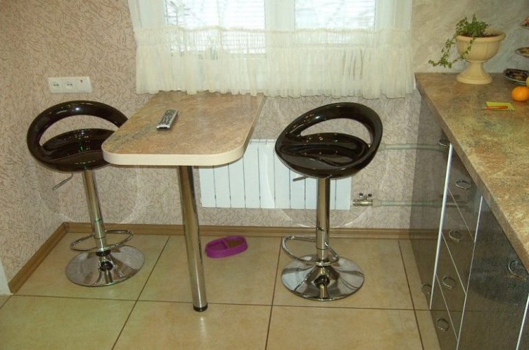
- The bar counter by the window is perfect for kitchen corner sets, forming with them a layout in the form of the letter P. It can be a continuation of the window sill, be located along or with a turn. For the convenience of sitting, it is desirable that there are no lockers below, since you will have to sit sideways. Also consider the material of the countertop, especially if there is a radiator underneath. It must be resistant to temperature extremes and withstand humidity. Such kitchens with a bar will appeal to everyone who likes to sip morning coffee while admiring the view from the window.
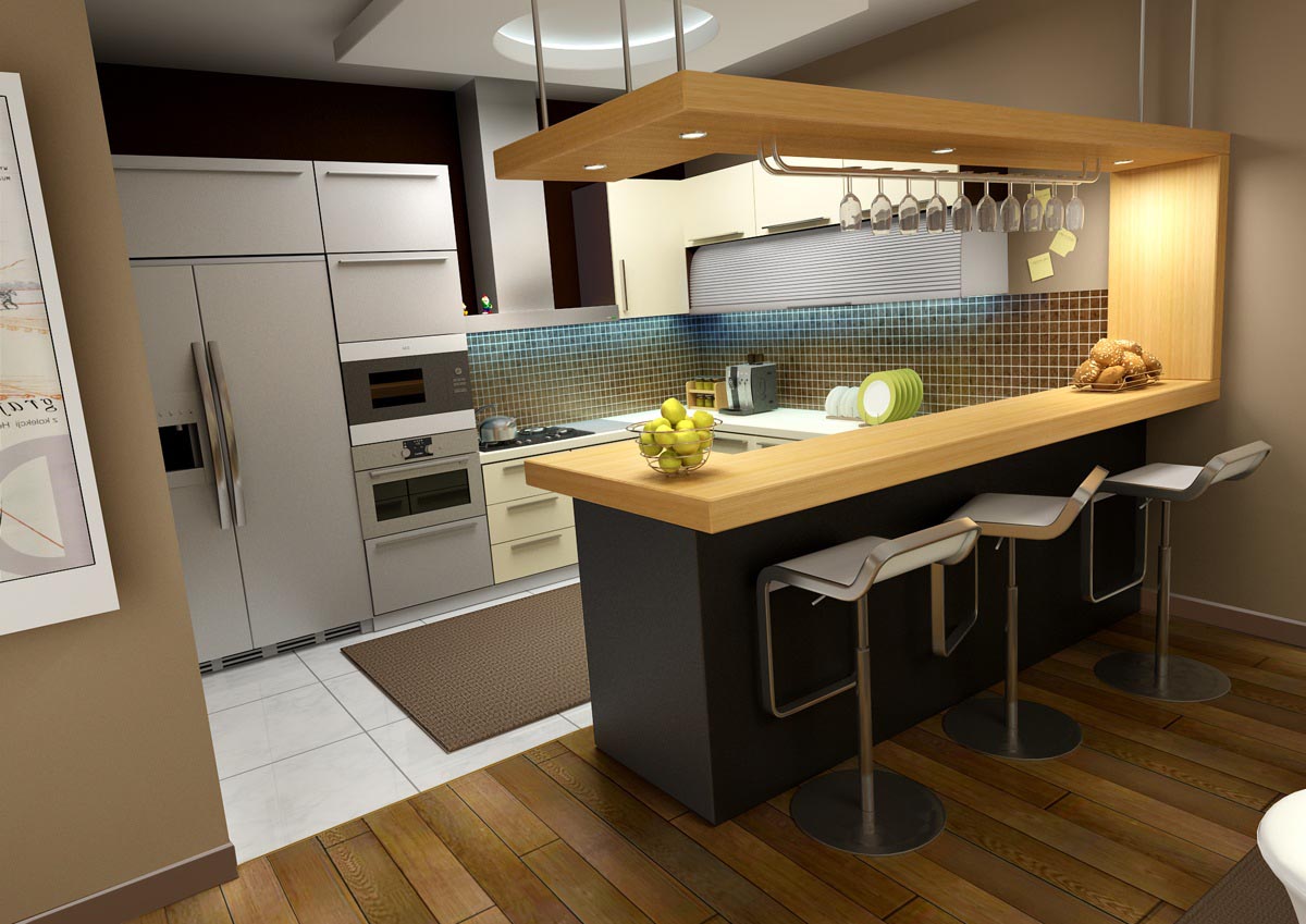
- Very often, the design is a continuation of the headset, being at the same height with it and forming a single whole.If the kitchen is small, then the bar counter will replace the dining table and become an additional work surface. In order not to clutter up the room, it is advisable to refrain from bar accessories in the form of fruit bowls, hanging systems for wine glasses and cups. You can limit yourself to stylish lighting in the top panel or ceiling. The contrast of colors between the bar counter and the headset will look original. For example, the countertop might be white, and the counter top might be black or dark brown.
- For narrow and elongated kitchens, a bar counter attached to the wall with metal brackets is suitable. The tabletop can be positioned at any height and made to any length and width. In the interior of a small kitchen, the photo design of which can be viewed on the website, such an invention will become a real find. It is noteworthy that such a mini-bar counter can be folded and folded close to the wall without taking up space.
- Modern furniture manufacturers offer a unique version of the kitchen with a bar counter built into the headset. If necessary, the structure extends, providing a place for a quick snack and tea drinking. For convenience, the stand is usually equipped with casters. Its only drawback is its relatively high cost.
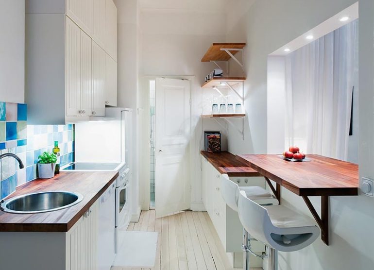
A window sill as a bar counter is a popular solution for a small kitchen
"In two lines" - when the width of the kitchen allows
The next type of layout is "in two lines". This is already somewhat more convenient, because you can create a "working triangle", and there is twice as much useful space in such a kitchen. The layout of the kitchen with a refrigerator in this case wins, because it is often located on the side opposite to the sink and the tile.
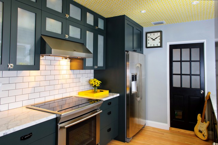
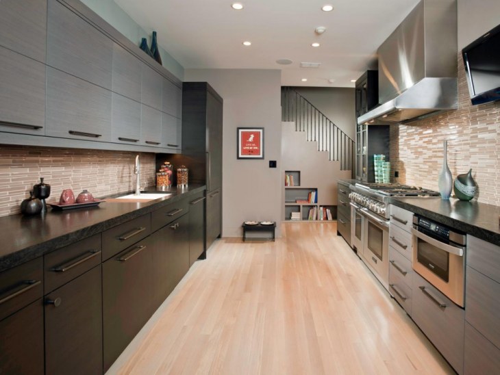
It is often done either at the third wall by the window, where you can organize a comfortable space, or placed in the middle of the kitchen, slightly away from the working triangle. But this is only if the space allows. Otherwise, the zone can be taken out to the next room - living room or dining room.

Color and texture solutions
When creating the design of the kitchen-island, the choice of the general color scheme, concerning both the kitchen as a whole and separately the island zone, plays an important role.
Palette
The kitchen island, which is an integral part of the interior, should be in harmony with the rest of the furniture, decoration, and the general decor of the room. But there are no strict rules - modern ideas allow you to design a kitchen with an island both in a single color and style, and to make the island an accent element of space, which can be seen in the photo below.

Materials (edit)
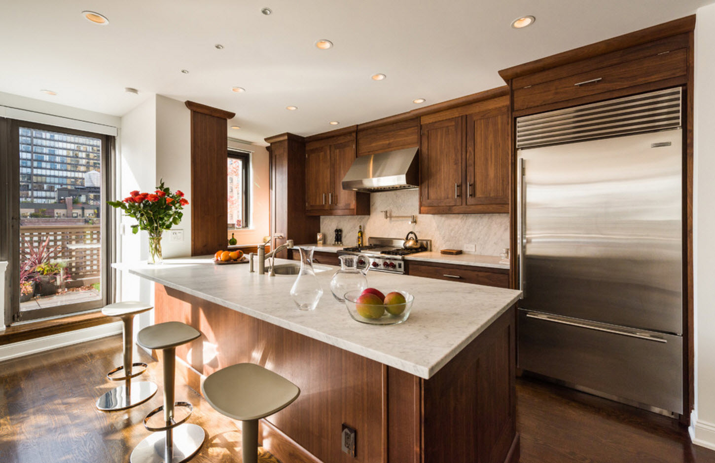
As for the materials from which the island table is made for the kitchen, when choosing large island kitchens, it is best to give preference to natural textures - wood, stone. The marble surface will look refined and monumental. If a sink will be placed on the island, the choice of moisture-resistant materials will be the right decision.
Types of kitchen layouts
There are currently 4 popular layouts:
- Linear kitchen.
- L-shaped
kitchen. - U-shaped
kitchen. - Island cuisine.
Consider in what situations it is necessary to apply them, and
also identify the pros and cons.
Linear kitchen
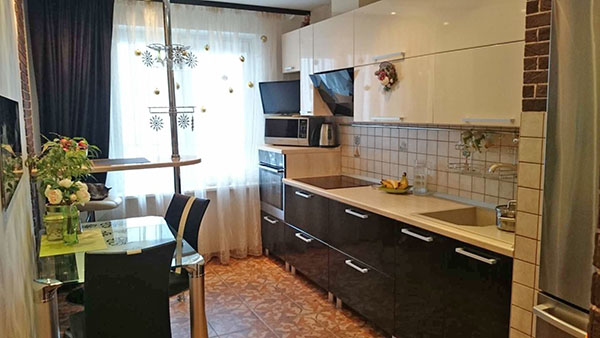
The location principle is simple - the headset is installed along
one wall so that the refrigerator and stove are on both sides of the sink. Suitable
the length of the working surface is from 2 to 3 m.If you exceed, then the room is narrower
cannot be called ergonomic. The option fits well into rooms of 5-6 m2, for narrow
kitchens and studio apartments.
Of the minuses - the workspace will be limited, which is not
will allow you to install a lot of additional equipment.
L-shaped kitchen
The kitchen set is placed in the shape of the letter "G". This option is ergonomic. Allows you to organize a work area in the form of a triangle from a stove, refrigerator and sink.Movement according to this scheme is considered very convenient for the hostess.
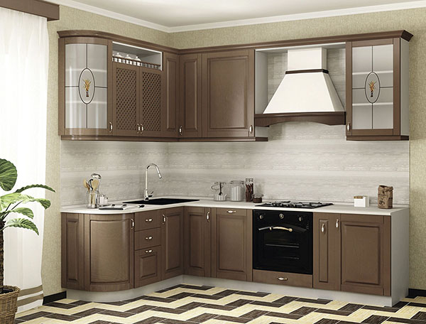
The method is considered universal, but most suitable for
medium-sized square kitchen layouts. Of the advantages, they also note the ability to divide the space into
2 parts - work and lunch. If
will allow free space, it will be possible to install a sofa.
It should be noted that modern kitchens are more spacious. The hosts have a lot of space to accommodate equipment.
U-shaped kitchen
The method of planning kitchen furniture is to place
headset along three walls, which allows you to maximize the use of
territory and place household appliances. The triangle element is installed at two
corners. Suitable for medium to large kitchens.

Disadvantages: not suitable for small and too large
kitchens, since there will be a problem with the arrangement of the dining area.
Island cuisine
Suitable only for owners of large kitchens with an area of 16 m2 or more. The island variant of the kitchen layout consists in choosing any of the above methods and additionally installing the "island" in the middle of the room. This work area, which is compiled at the request of the owner - a set, a dishwasher, sinks.
On this topic:
BACK
FORWARD
1 out of 6
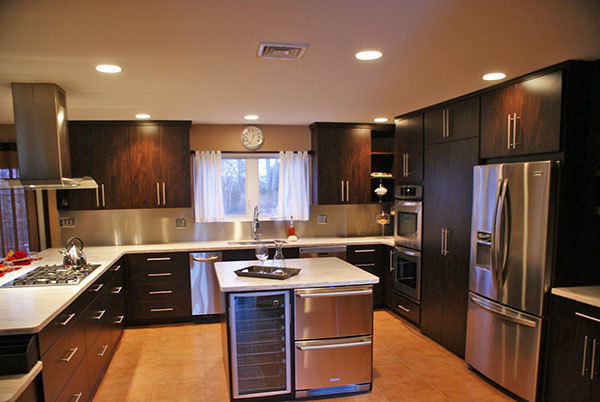
The advantage lies in the fact that the working area acquires
maximum efficiency, in large rooms a sense of a single
space.
The downside is obvious - for arranging small rooms
island kitchen is not suitable.
How to make a kitchen 3 by 3 meters more spacious

Color and lighting are two main tools for visually expanding a kitchen space.

In fact, you can increase free space by using furniture that combines several functions.
Competent approach to the color of the room
When choosing a color palette for the kitchen, personal preference is the first thing that drives us. We choose the color that is close to us, does not cause discomfort. But you should not base your choice on this only. One should also take into account the emotional mark that the surrounding colors leave in our soul, at the subconscious level. Find a compromise between interesting, unusual design chips and your own feelings, without forgetting about common sense. Let's say that you like bright or dark shades - red, fuchsia, black or dark brown and you want to decorate the kitchen set and walls in these colors. The design of the kitchen is 9 sq. meters, the entire interior should not be maintained only in these shades.

Bright colors and contrasting combinations can be, you just need to know when to stop using colorful shades
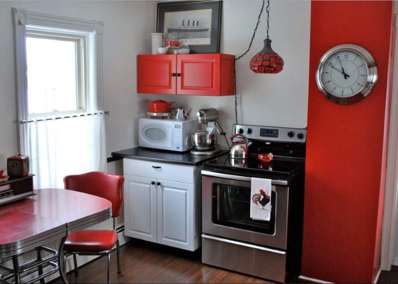
An original interior can be created using the classic combination of red, white and black.
Dark tones absorb light and make the room smaller, while too bright tones quickly tire and prevent the eyes from relaxing. For a small room, it would be more correct to choose a neutral and light palette, and let decor items, textiles or an accent wall be bright. This approach is interesting and does not diminish the space.
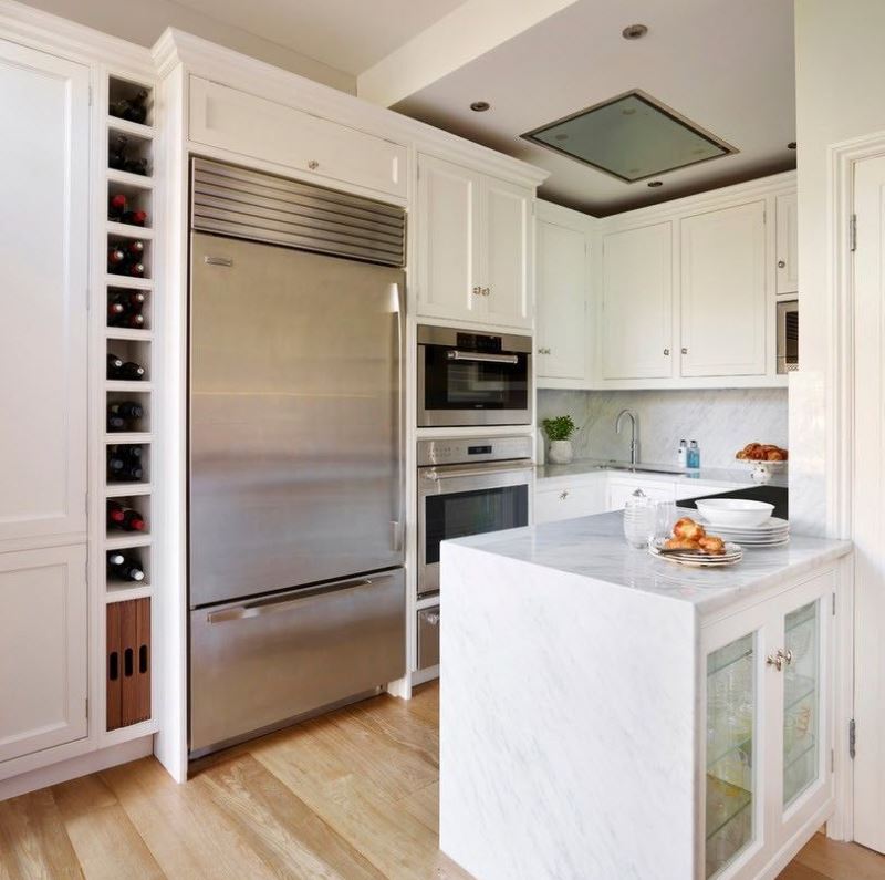
For the decoration of small rooms, light shades are suitable like no others. White set will visually increase the space, while furniture located from floor to ceiling will not look bulky
Combination of different types of lighting
Plays an important role in the decoration of the premises. The lack of light sources forces the eyes to strain, and its abundance tires the eyes. The most important areas are highlighted with the help of light. Hanging, for example, a volumetric lamp over the dining area, you thereby make it stand out. Light has the ability to create an illusion.
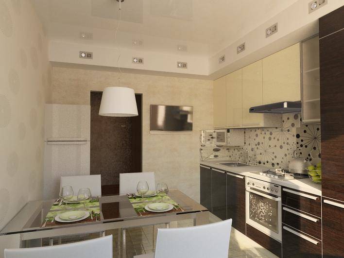
Lighting is the most reliable assistant. The more natural and artificial light sources, the more spacious the kitchen appears.
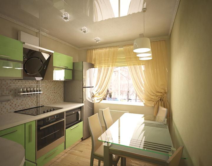
You can highlight the dining area with pendant lights, and emphasize the workplace with built-in lighting.
Light can increase or decrease visual space. In an apartment with low ceilings, using light directed to the ceiling or wall, you can create the impression that the room is taller and wider. There will be a feeling of additional volume. There should be several types of light sources. Place the common source in the center of the kitchen, and supplement the work or dining area with spotlights. The amount of reflected light also matters in kitchen design. This is the light that bounces off surfaces and furniture. The lighter the interior, the more light is reflected.
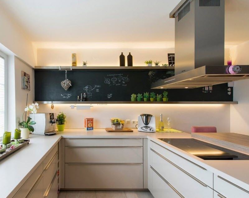
LED strip running along the top of the cabinets will add volume and depth to the kitchen
The use of mirror surfaces, a wall with photo wallpaper, light textiles on windows or blinds will help expand the boundaries.
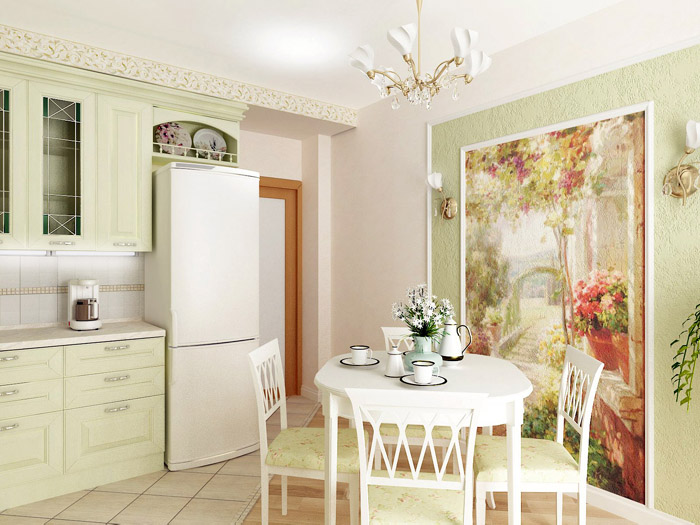
Now it has become fashionable to highlight the dining area with beautiful photo wallpapers.
Interior stylistic solution
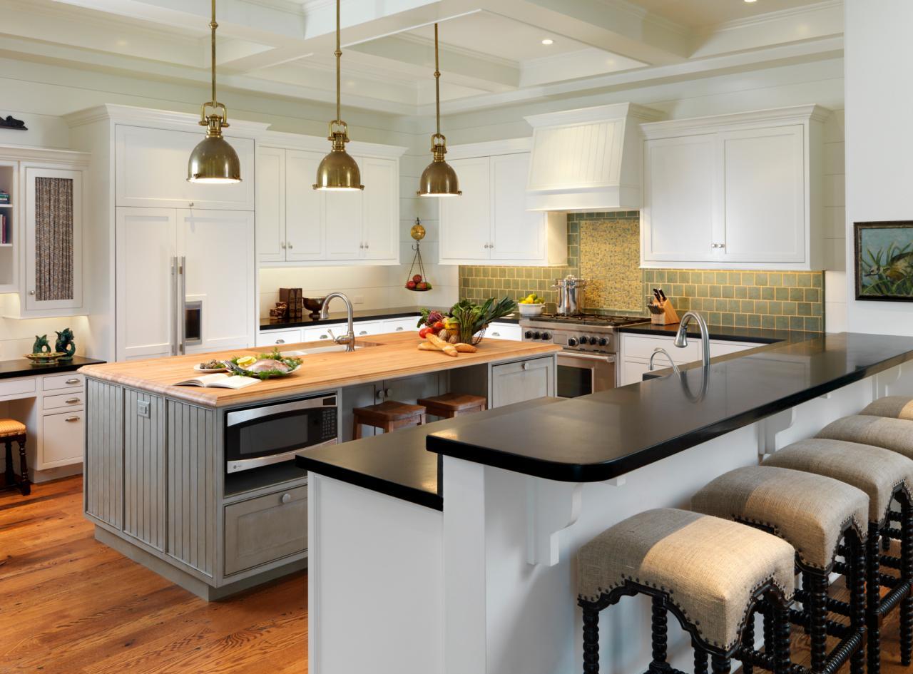
In most cases, they try to match the island to the headset and the design of the kitchen as a whole.
Repetitive colors, materials and décor look thoughtful and appropriate, which is especially important for small spaces. If the cooking area is spacious, this piece of furniture can be accentuated by a brighter color or original texture
One way or another, the island cabinet, as one of the most noticeable details in the interior of the kitchen, must correspond to the chosen design direction.
Classic style kitchen with island
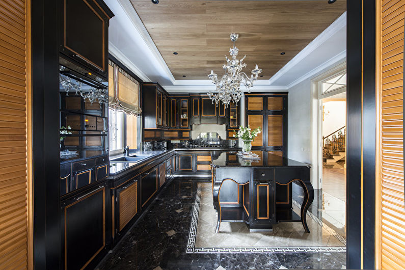
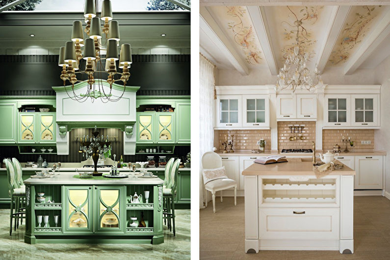
Successful examples of classic style island kitchens can be found in the collections of Italian furniture showrooms. As a rule, these are exquisite combinations of polished wood of expensive species and light ivory enamel with decorative gilding, panels, columns, carved baroque decorations. Black and white, black and gray, olive, pinkish versions with silver fittings are also possible.
The island's countertop in classic style can be wooden or marble, with a noble glossy pattern. The curbstone is suitable exclusively for stationary, large and stable, rectangular shape with symmetrically rounded corners. Above it, you can hang either an extractor hood (for the hob) or a beautiful crystal chandelier.
Kitchen with an island in a modern style
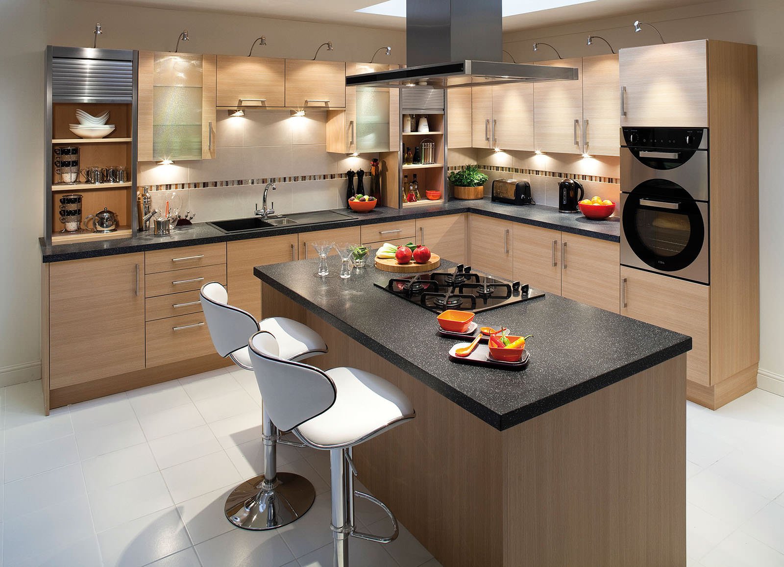
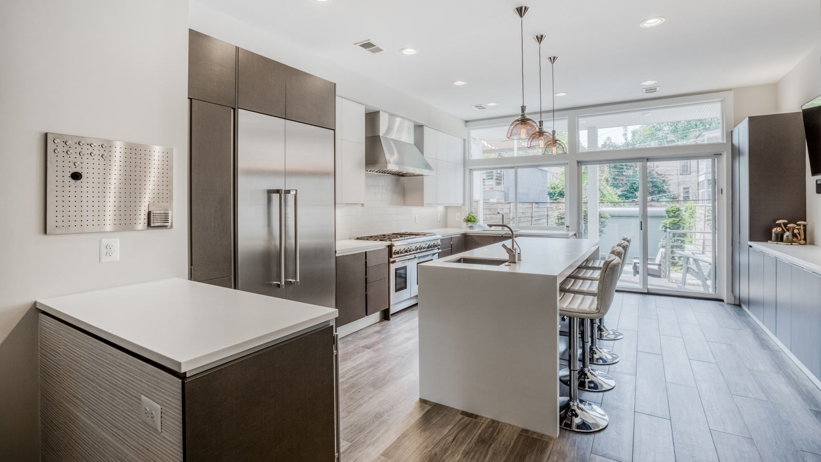
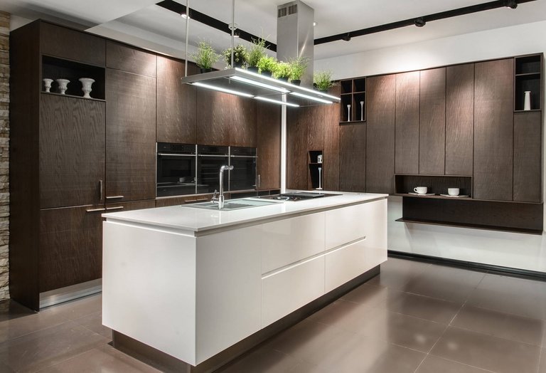
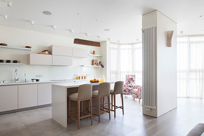
The distinctive features of the 21st century kitchen are laconicism, functionality and high technology designed to speed up the cooking process as much as possible. The island in such an interior is an integral part of the headset, almost completely repeating its design.
Smooth monochromatic table top is made of durable composite material - artificial stone, tempered tinted glass, stainless steel. An induction cooker, a sink can be mounted in it, and the cabinet body is taken away for household appliances or spacious storage systems.
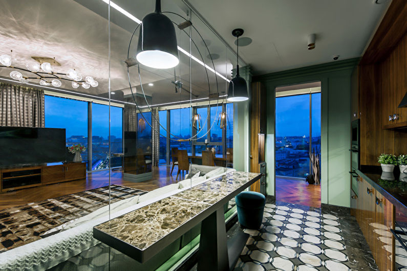
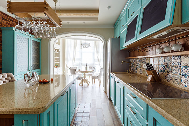
Provence style kitchen with an island
In a Provence style kitchen, the island looks the best possible. Traditionally, it is a simple wooden structure painted in pastel colors. The palette is dominated by milky white, mint, turquoise, gray, blue, lavender. The body is without unnecessary frills and decor, but its functionality is provided by a large number of cabinets, drawers, shelves, wicker baskets.
Since the southeast of France is a wine-growing region, the local kitchen island often has diagonal honeycomb shelves for storing bottles of wine in a horizontal position. The Provence style countertop material is light stone, marble or its artificial counterparts in a white or grayish shade, but it should not be too glossy.

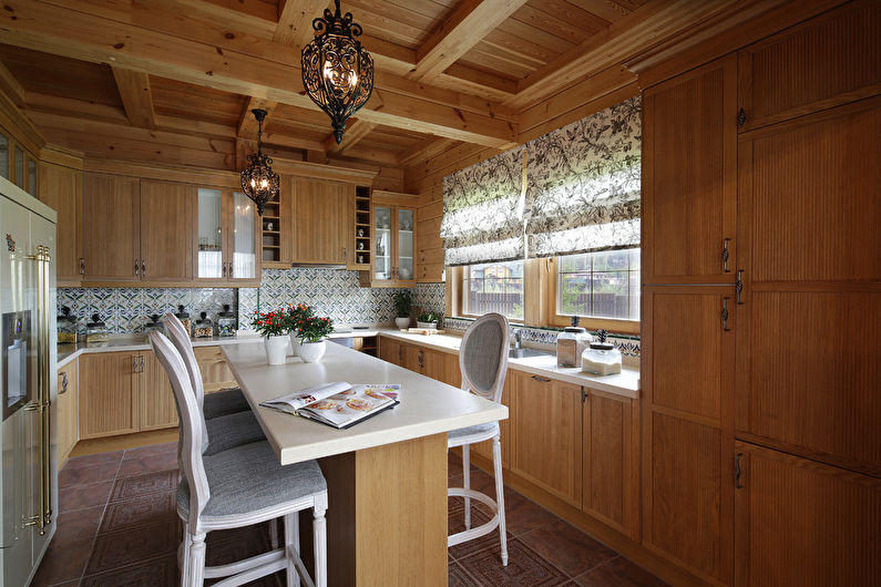
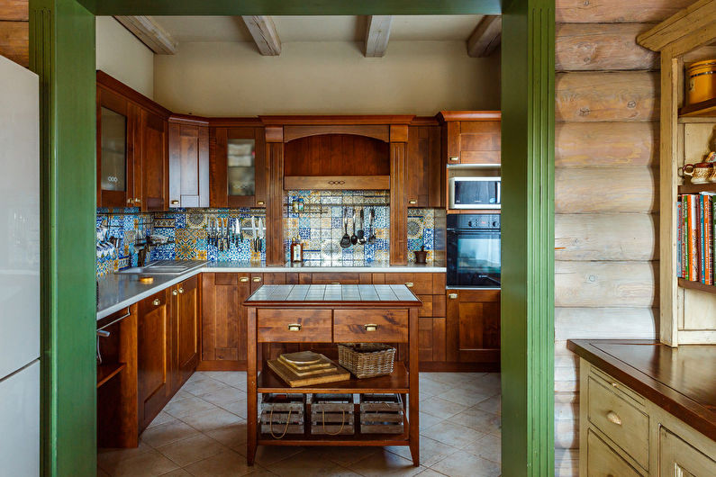
Country style kitchen with island
The rustic style is primarily about natural materials and natural tones. A stable, somewhat rough cabinet made of solid wood, with large facades of cabinets and drawers for storing dishes, will fit well into such an environment.Ideally, the material should be without any coating, except perhaps a protective layer of varnish or beeswax. New furniture items can be artificially aged to give them a medieval look.
Forged fittings should be used, because it is she who serves as the main decoration and the most important stylistic device in the country interior. As for the countertop, it can be of the same wood, unpolished stone, or tiled with matte ceramic tiles (porcelain stoneware) in terracotta shades.
Loft style kitchen with island
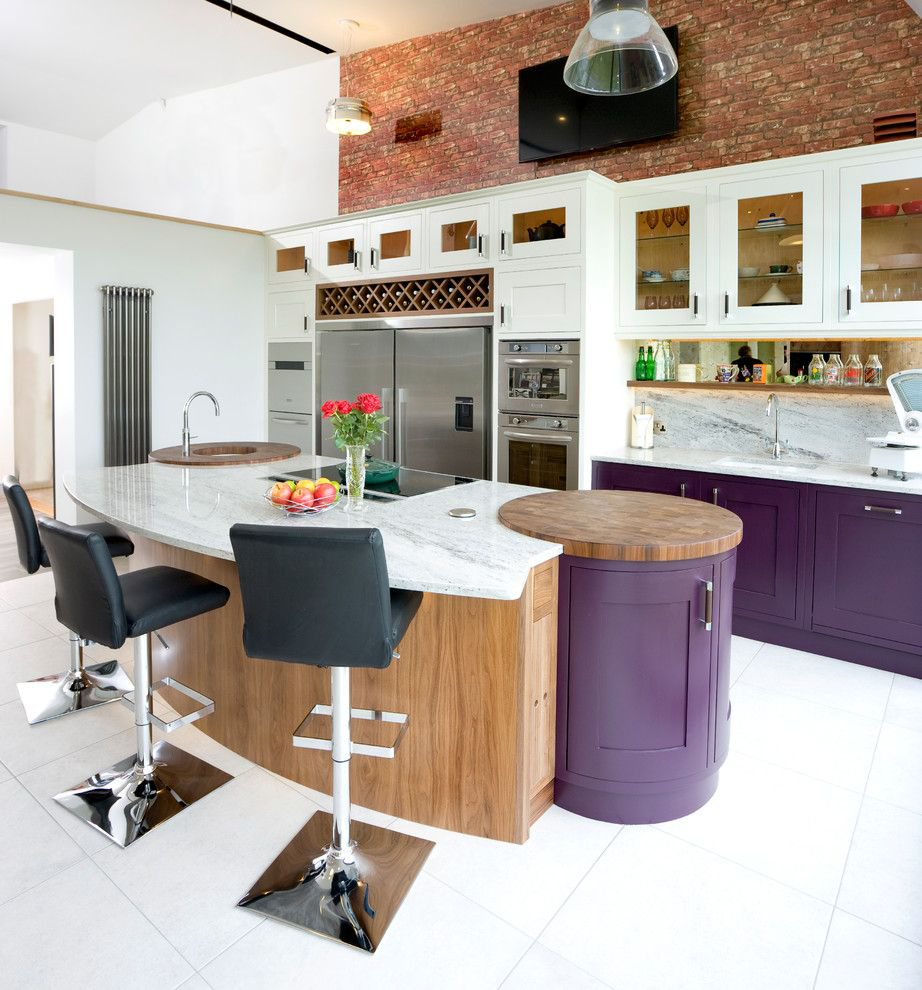
The deliberate simplicity of an industrial interior does not tolerate pretentiousness in details. In an open kitchen in this style, the island, in addition to its usual functions, often plays the role of the only partition between the cooking area and the living space of the loft.
Compared with other design directions, here a separate table looks the most unassuming way. Instead of a pedestal, a rough plank, steel or stone countertop can even be placed on brickwork or welded legs made of old metal pipes. Above such an improvised island there are open communications with spotlights or "factory" lamps in black sockets.
