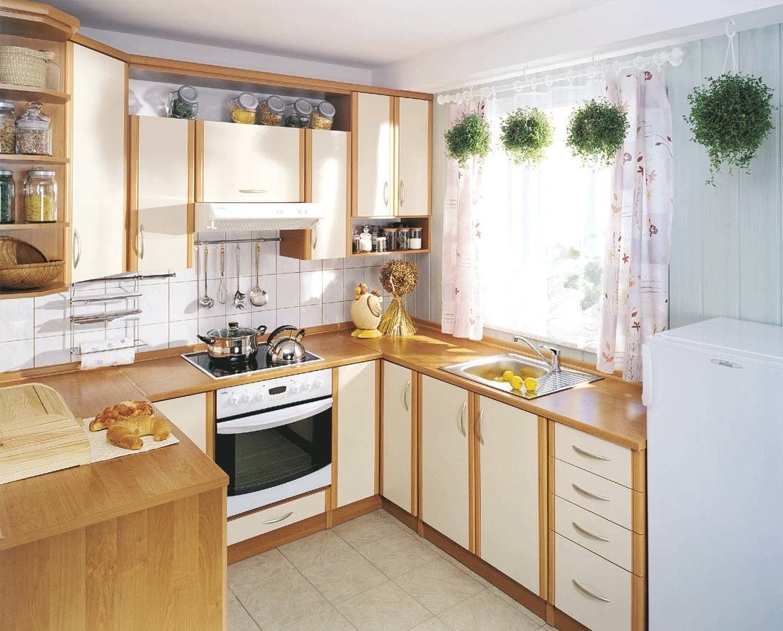
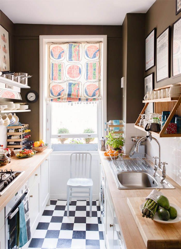
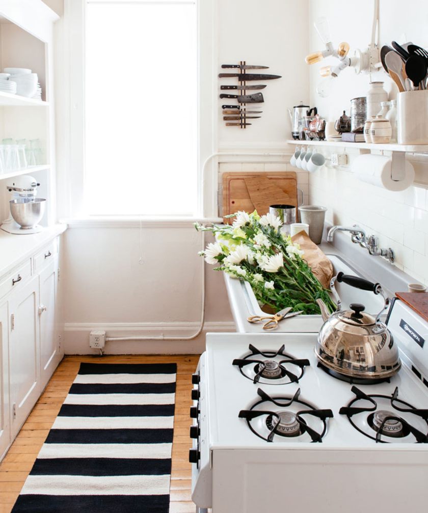
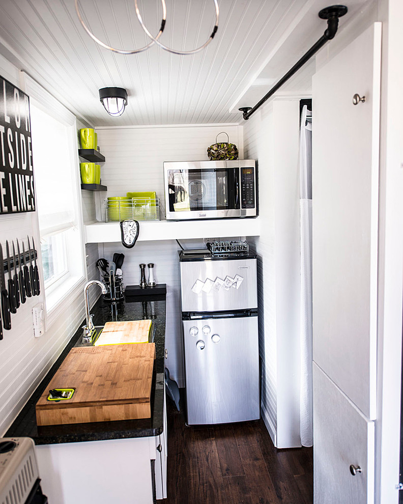
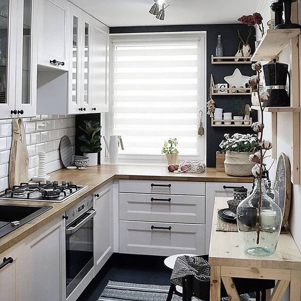
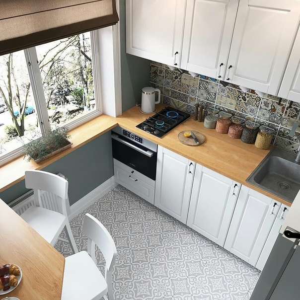
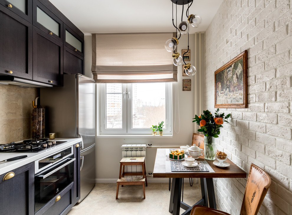
Organization of the interior of a small kitchen
For some people living in modern residential buildings, all that remains is to look at a photo of a kitchen design in an apartment built during the Soviet Union. After all, They are very small in size. However, most people continue to live in such apartments and use such small kitchens on a regular basis.
You can, of course, increase the area, for which there are two ways:
- Moving the partition between the kitchen and the adjacent room. To do this, you need to make a complete redevelopment of the apartment.
- Visual enlargement of the kitchen. This method can be done anywhere. For this, some of the techniques of design art are applied.
The color scheme, lighting, furniture and appliances are changing. In a kitchen with a small square, it is recommended to hang mirrors or glass surfaces. A glass table, transparent doors or a ceiling made of mirrors will visually increase the space.
The interior of the kitchen, stylishly and beautifully decorated, as well as taking into account the square meters of the room, will create coziness, comfort and great mood.
Below we suggest watching a video in which you can see interesting tricks, as well as perfectly designed kitchen designs by experienced designers.
Popular styles for kitchen decoration
The most common kitchen styles are three. More details about them below.
Country
It belongs to the most popular. The use of this style is based on environmentally friendly and natural materials for furnishing premises. These are simple, wooden furniture, fittings for which are made of materials such as brass or bronze.
Corner kitchens
Country style kitchens include a variety of wicker baskets, carvings, wooden utensils and fabric floor rugs. Surely, almost everyone has come across a design in this style live, or have seen kitchen designs in apartments in the photo.
The floors are also made of wood or natural stone. On the windows, simple curtains made of chintz fabric are used, on which beautiful patterns of flowers, striped or checkered colors are used. There are various figurines, ikebana from wildflowers, pillows (from different fabric scraps) or panels. In addition, painted boards and other decorative elements are hung in such kitchens.
Classic
In this style, wood is used for interior decoration. His difference from others is in nobility, restraint and grace.
To organize a classic style, you will need to pick up fairly solid accessories. For example, it can be vases, and porcelain, and paintings or whole sculptures. Yaroslavl kitchens (furniture) are selected with wooden carvings, dishes made of gilding or with silver dusting. Kitchen fittings are made of copper or porcelain. A cozy and calm atmosphere will be created by natural materials and beautiful curtains on the windows.
Design techniques for the implementation of lighting in a small kitchen-living room
The role of lighting in a small room, especially in the kitchen, is quite large. If it is possible to place a window in both zones, use it. If not, then place the kitchen in such a way that the light from the living room enters this area as well.
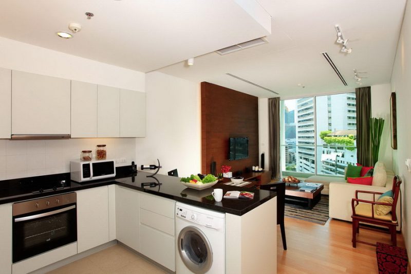
In rooms with a larger square footage, you can take advantage of additional zoning options by adding new functional areas to the room.
When organizing lighting, remember that you can use it to zone the space. For the kitchen triangle, that is, the working area, point recessed lighting would be the best option.Ceiling lamps of an interesting design can be placed above the dining table or bar counter. Since the room is small, then it is better to refuse the chandelier in the living room. Use the already known version of the recessed luminaires.
Fundamental rules
Isn't it true, looking at the photo of the kitchen layout, you can see beautiful and worse options, spacious, cramped, cozy and absolutely tasteless?

So, in order for your kitchen to meet all the requirements, you should use the basic rules when planning:
Working triangle rule. The sink, stove and refrigerator should be located at a corner for more convenience. This is the most convenient way to prepare food.

The sink should be located no further than 2.5 m from the riser. Otherwise, the water pressure will be poorly supplied, a pump will be required. On one side of the sink, there should be either a washing machine or a dishwasher.
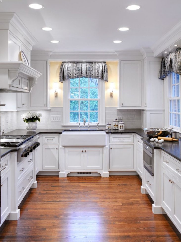
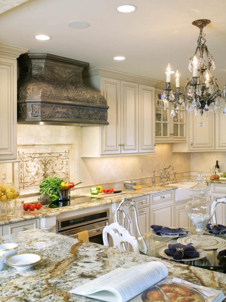


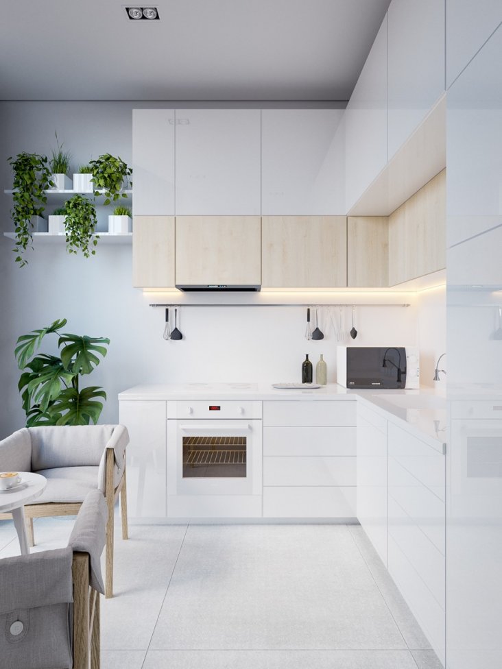
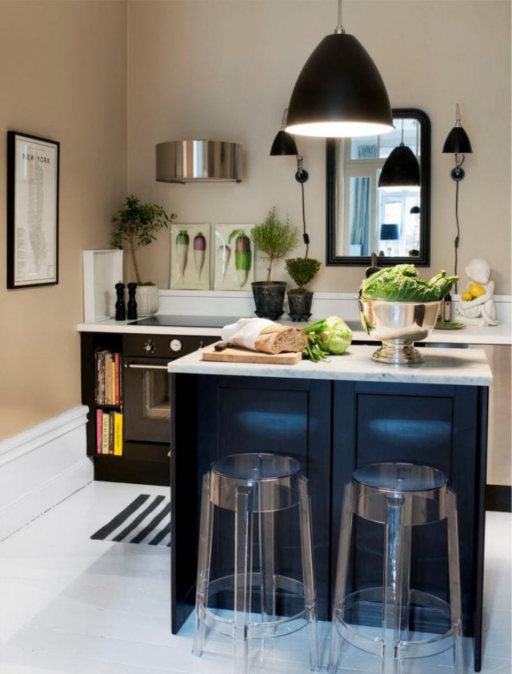


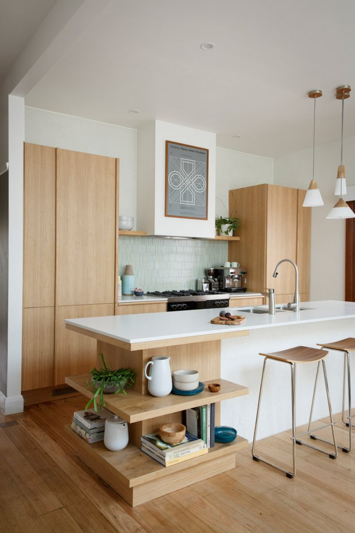
The stove is positioned 40 - 180 cm from the sink, as close as possible to the ventilation opening. It is not safe to place the slab closer than 40 cm from the window.
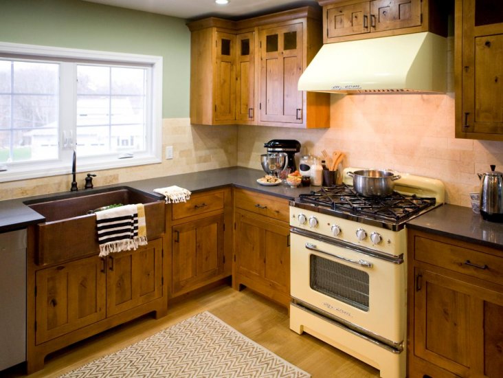
A standard passage for the convenience of households must be maintained at least 120 cm. In small rooms -1m.
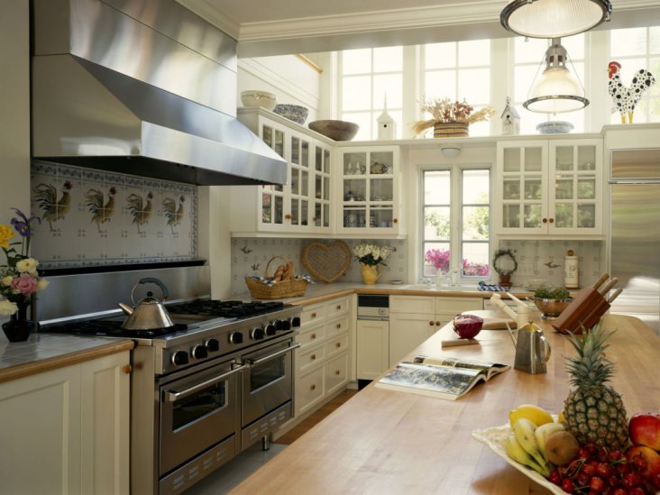
If the question is about where to put the refrigerator: to the stove or sink, there is only one answer: definitely to the sink.
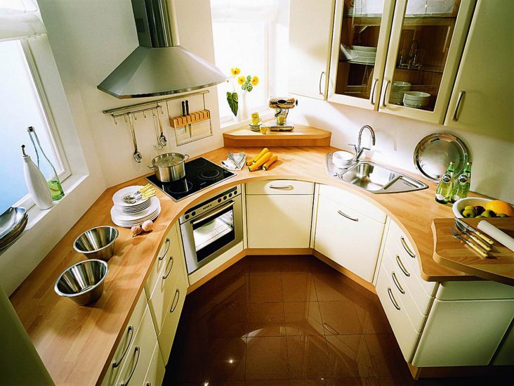
Kitchen niches are always valuable and can be adapted to store things and kitchen utensils.
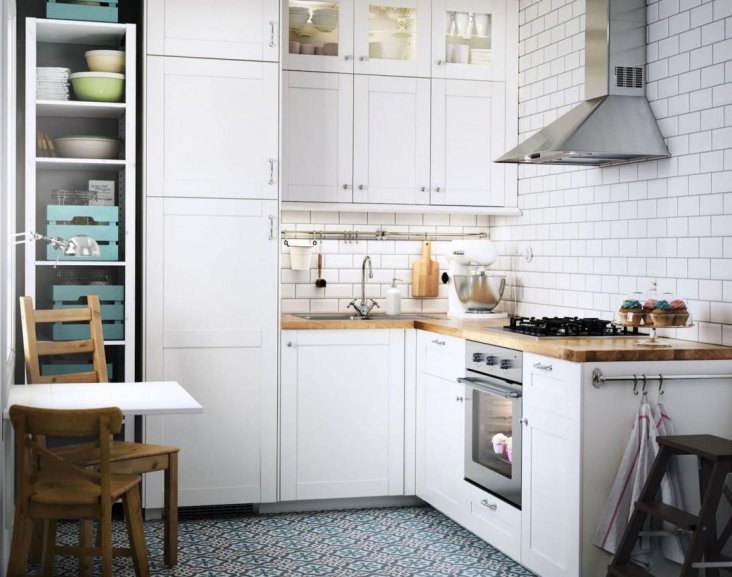

Real numbers. The width of the seat is 60 cm. There should be a distance of 80 cm for a chair between the dining table and the wall or furniture.
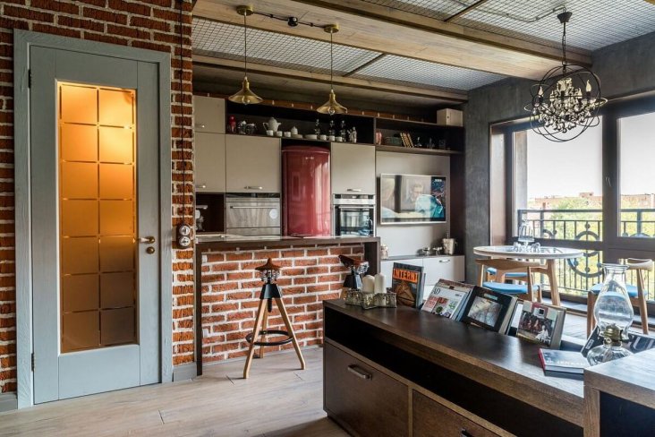
Zoning
Even the smallest room can be multifunctional with proper space distribution. The kitchen is a place where all family members should be comfortable. There, food is prepared and taken, family tea parties, meetings with friends are held.
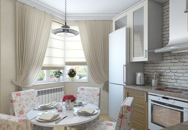
Think over everything to the smallest detail - from the choice of finishes to furniture and small accessories.
Therefore, when thinking over the design of a rectangular kitchen, it is important to take the required amount square meters per each of the zones. The rectangular shape in such cases plays a positive role, the whole area is easily broken

Finishing plays a vital role in the design of a rectangular kitchen.
Zoning methods
- The use of different finishing materials
- Light zoning
- Color zoning
- Installation of movable screens
- Bar counter separation
- Special arrangement of furniture.
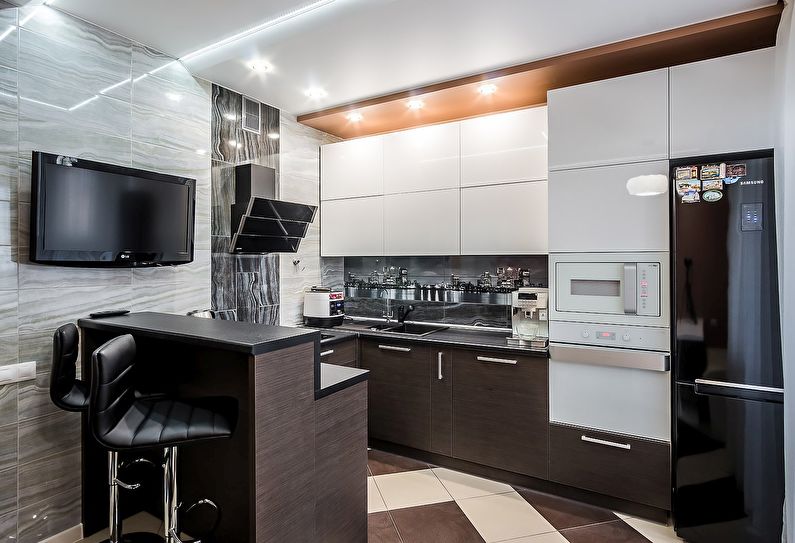
In addition to planning, you should take care of the style of the interior.
In an elongated kitchen, there should not be a lot of furniture, especially bulky ones, it "makes the overall perception of the room heavier".

It is best to make the walls monochromatic, preferring light shades.
The kitchen interior seems complete and more comfortable if it involves a full dining area. Oval, round and square table shapes are relevant. If the room is small, it can be replaced with a bar counter.

The best option for a rectangular room would be custom-made furniture.
If the owner wants to keep the shape of a rectangle in the room, you can install a classic headset with smooth, rounded contours, come up with an extraordinary decor.

Cabinet doors can be decorated with intricate wood carvings, transparent glass, mirrors.
Interior design of a small kitchen
A small kitchen requires good design. Functionality is what matters here. A good way to enhance the interior of a small cooking room is to connect it to the living room. Kitchen design should start with planning. In a small kitchen, you should choose furniture that has several functions. The peninsula will perfectly cope with the arrangement of the room. It has been proven to be an excellent solution for small areas. Allows you to make the most of the surface of a small room while taking up little space, so you can conveniently prepare food and eat it together.In turn, the space under the peninsula will be useful for storing kitchen knick-knacks and mounting an outlet.

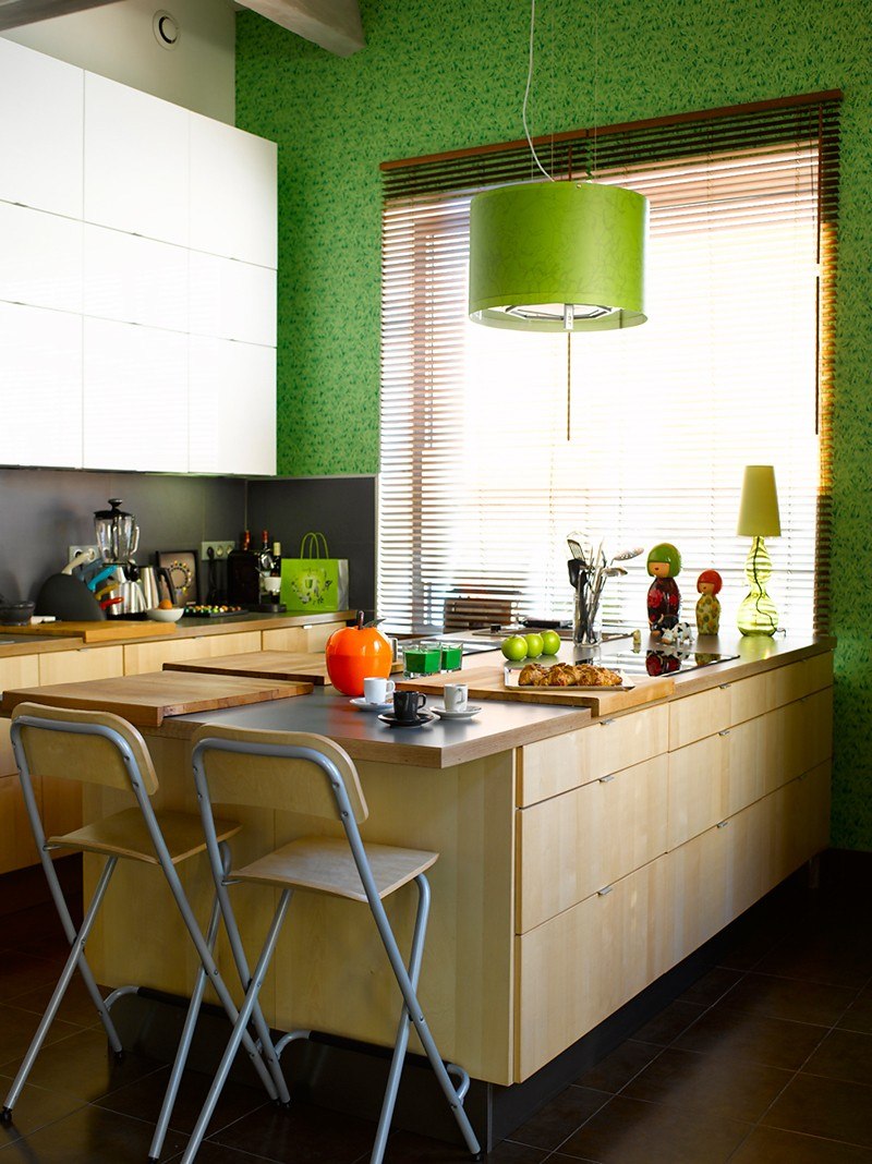
Kitchen layouts
Depending on the square meters of the kitchen space, a suitable layout option is selected individually for each interior. A photo of the kitchen in the apartment will allow you to clearly see exactly how the interior will look. Among the layouts, the main ones can be distinguished:
- Linear layout suitable for large areas. In this variation, the kitchen set and appliances are placed along the wall. Such an organization looks quite nice, but it is not particularly practical, since during the cooking process you will need to "run constantly".
- U-shaped, perfectly fitting into the rectangular kitchen. Everything can be placed here quite conveniently.
- L-shaped - a great option for small kitchens, divided into two zones. A sink is placed in the corner, on both sides of which there is furniture. Everything looks beautiful and, moreover, functional.
- Ostrovnaya - not desirable for kitchens with small dimensions, since here the furniture is arranged linearly.
Below are the options for planning the design of the kitchen in the apartment:

Questions and Answers
What color to choose for the design of a small kitchen?
As mentioned in the article, the best color for a small kitchen is white. After all, it has the property of reflecting and multiplying light, visually pushing the walls apart, a set with white facades does not seem cumbersome. However, it is not at all necessary to make the interior totally white. You can combine white with any other color (for example, white set + colored wallpaper on the walls), choose a two-tone kitchen or add colors through decor (curtains, dishes, etc.). Also, in the interior of a small kitchen, all light and pastel shades, for example, pale yellow or light blue, will be appropriate.


Also, for a better understanding of what color to choose for the interior of a small kitchen, we recommend reading this basic guide.
How to make a design project for a small kitchen yourself?
An online planner will help you correctly plan the design of a small kitchen yourself, for example, on our website, on the Ikea website (if you want to buy a headset there) or on other Internet resources.
We also recommend that you study the following basic articles:
- How to develop a kitchen layout and design
- How to choose the design of a kitchen set and its configuration
- How to plan the design of a small kitchen in Khrushchev
- Furniture for a small kitchen - the secrets of designers in one article
- Design and renovation of a small kitchen in Khrushchev - 13 proven solutions
- Planning and renovating a small kitchen
- Kitchen design 8 sq. m in seven steps
- 10 tips for arranging a 9 sq. meters
- Kitchen design 10 sq. m
We decide on the layout of the kitchen area
To develop the interior in the kitchen-dining room should be based on the definition of the layout. Possible options are shown in the table.
Many people find it much more convenient to install a dining group in the kitchen, so as not to carry food from room to room.
| Layout | Description |
| Linear | It consists in placing the headset along the wall. This saves usable space. Can be conveniently put table and chairs, even in an average-sized room. The storage and placement system for kitchen utensils can be arranged up to the ceiling. This allows you to accommodate more items using the entire space. |
| In the shape of the letter G | The headset is installed in the corner. The layout is suitable for medium-sized kitchens. Thanks to the useful use of the corner, space is freed up for the dining group. The L-shaped option eliminates the need for zoning the space with improvised means. The layout itself divides the room into segments. |
Selection of furniture and kitchen units
When choosing furniture for a kitchen with a low ceiling, we advise you to follow a few rules:
- furniture should not clutter up the room;
- instead of large cabinets from floor to ceiling, you should choose light hanging cabinets;
- the dining table and chairs should also not be bulky: a glass table is an excellent option;
- in furniture, you can use elements that tend upward: stools with long legs, cabinet facades made of lining, vertically positioned handles.
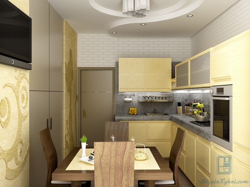 The main thing to remember when choosing furniture is not to buy massive sofa corners and tall cabinets.
Fixtures and lighting
If you want to increase the space - add light. If you have a large bright window in your kitchen, you're in luck. The perfect solution for low ceilings is a wall-to-wall window. When it is impossible to make a large window, enlarge it visually.
Air curtains in light colors, possibly with a vertical pattern, will help with this. The curtains should be on the floor: so long that 10-15 cm remains on the floor. The cornice should be placed on the ceiling. The blinds must be vertical.
 Curtains for low ceilings with pleats have the same effect as wallpaper with stripes
It is better to give preference to spotlights. The ceiling will appear higher if you set the backlight pointing up. Small chandeliers are appropriate above the dining table, and large ones should not be purchased.
 The main thing when choosing light sources is to organize bright and uniform illumination of the entire room, this will visually raise the low ceiling in the kitchen
The interior of a small kitchen in Khrushchev: a way to increase the usable area
A small kitchen will not seem cramped if you choose light fronts. According to the principle of kitchen design, a small area should be illuminated. For furniture, choose smooth, light-colored countertops that reflect light. Remember that the final look of a small kitchen is determined by the utensils and accessories, as well as well-planned lighting. Shelves arranged in several rows (they do not need to be deep) are well suited for lighting (for example, with fluorescent lamps). This solution is extremely effective in creating the illusion of depth in a small kitchen. When arranging a small room, it is worth experimenting with wall paintings, since they are a very fashionable solution today. Scale objects or plants, as well as photographs representing perspective views, will optically enlarge even the most limited interior and give the impression of three-dimensionality in the kitchenette.
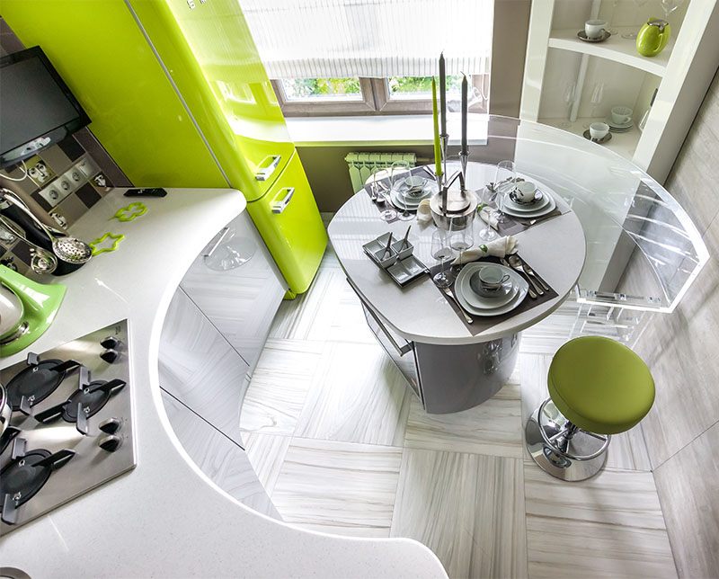

Bright colors in decoration
French decorators are convinced that kitchen furniture should be pleasing to the eye, bringing cheerfulness to the gray interior of a small kitchen. It is on the headset that the main tint load is assigned. There are a lot of color solutions for the furnishings. Any rich tone looks impressive in combination with white. The most refined are its combinations with green, blue, orange, purple, pink and yellow.
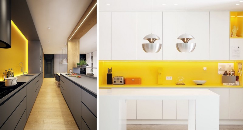
In general, any gamut is permissible for kitchen furniture - you just need not to overdo it with the number of shades. The optimal amount is 3-4.

Bright kitchen furniture with glossy facades looks amazingly stylish. With proper care, it will retain its presentable appearance for a long time.

The design of a small kitchen in 2020 involves the use of pastel colors in the decoration - they visually make the room larger.
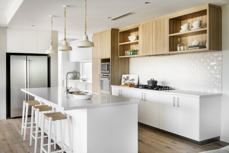
Light yellow, azure, beige, cream, pale olive colors are considered especially successful. If you plan to focus on furniture, the entire finish should be kept in a discreet, preferably monochrome palette.




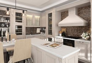
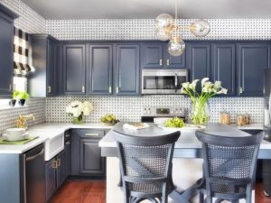
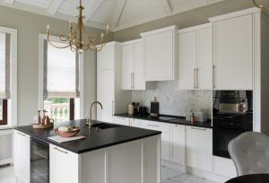
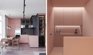

Kitchen-dining room combined with living room
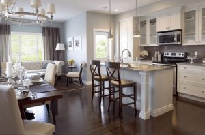
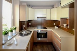
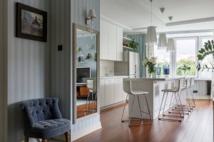
Redevelopment is very costly. This concerns the financial side and the time that needs to be spent before the result is ready. It is recommended that you understand the advantages and disadvantages of connecting the kitchen and living room in advance so that there is no disappointment.
In very spacious rooms with a large window or a walk-through structure, you can find a parallel layout of a furniture set and a dining area in the kitchen-dining room.
pros
- A significant increase in space, there is more space.
- It is possible to implement ideas and plans that were previously unavailable due to the limited area.
- There are more windows. This contributes to an increase in natural light, visual expansion of the space.
- Guests will be in the same room with you, you can make snacks without leaving them alone. This also applies to situations with children. They will not be left unattended while you cook.
- It is easy and convenient to communicate with guests, family members.
With the corner arrangement of the furniture set, there is enough space to install a small dining table.
The combination of two rooms into one large one also carries some disadvantages.
- During the cooking process, odors will begin to spread around the entire perimeter, touching the living room. To avoid this, you will have to buy a high-quality special hood, which entails additional expenses.
- In addition to smells, there will be more extraneous sounds coming from household appliances. The problem can be resolved by purchasing low noise models.
- The room needs to be cleaned more often due to the spread of dirt from the work area.
The listed disadvantages can be eliminated, but this will require additional financial investments.
This option is worth considering if the kitchen is really tiny and expansion is necessary.
A soft corner in the kitchen-dining room - a comfortable dining area
The soft corner allows you to embody a comfortable and convenient place for eating. The preferred location is the bay window. This will allow you to use all the space that is in the room. The corner will be located near the window, which will allow you to observe the beautiful landscapes. The place will be bright and full of natural light. Often the soft zone becomes an extension of the headset. The variant is suitable for narrow and long rooms. Allows you to get a harmonious ensemble.
Arranging a seating area in the kitchen is a great opportunity to organize a dining area with comfort.
If the kitchen is distinguished by the presence of complex geometry, it is worth using all the meters as much as possible. An asymmetrical bay window will become a dining area where a seating area is placed. Finishing in white tones, a light set will help to hide the unevenness of the room. For a bay window in the shape of a square or rectangle, choose an oval table or a round one. This will help smooth out some corners.
If the dining room has a large space, choose a spacious, soft corner, where many people can comfortably sit.
Ideal miniature kitchen style
Having started the last, but no less important issue of designing a small-sized kitchen, it is important to understand: the simpler the style, the more harmonious it will look in a compact area. And above all, it is high-tech, minimalism, modern, traditional styles.
In high-tech design, one color prevails over the other, contrasts are clearly distinguished. Glass, metal, precise proportions, straight lines - this is how you can briefly describe high-tech.


Perhaps the most popular for a small kitchen is the Art Nouveau style. Thanks to its functionality, convenience, wide color variation of design, many will like it. Built-in appliances, comfortable spot light, no unnecessary items - all this is combined in a modern kitchen.


If we talk about minimalism, then the term itself speaks for itself: the absence of decorative elements, a minimum of color, clear boundaries and good lighting gives a feeling of boundless space, unique lightness and weightlessness. 
 Traditionists will love the classic design. However, not all variations of the classics are suitable for decorating a small kitchen.In this case, give preference to light colors without unnecessary patterns and intrusive finishes.
 Of course, the noble sophistication of the interior will be emphasized by natural wooden furniture. It is desirable that it be monochromatic, without pretentious shapes and lines.

 Do not be afraid of original solutions, boldly implement interesting ideas, but do not forget about what was said above. Or maybe the next collection of photos will inspire you to create that one and only look in the decoration of a small kitchen?

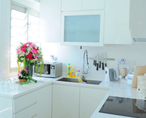
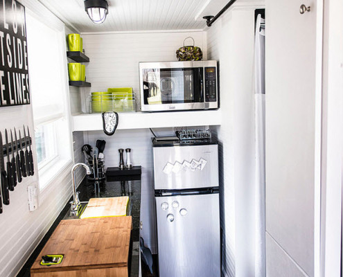
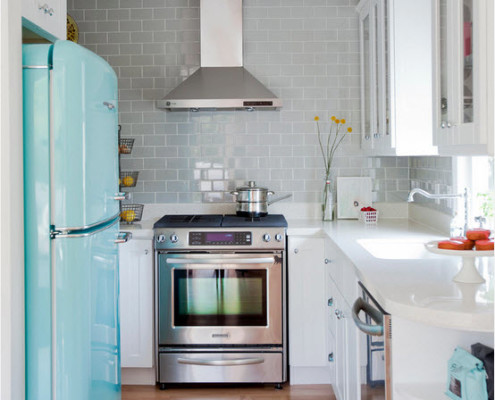


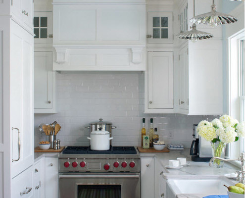


Interior decoration
A rationally designed interior of a narrow kitchen will add coziness, harmony to the room, and what is most important in our case - volume. Consider options for how to arrange certain areas of the room

Floor
For a kitchen decorated in light shades, a light wood floor is ideal. You should not choose a smooth floor with a reflective effect, otherwise it will affect the interior of the whole room in the same way as a mirrored ceiling.

Matte floor will not focus on disadvantageous features of the room. The design of the floor in the form of horizontal stripes will help to visually expand the room.

Walls
Light shades of the walls will help to visually expand the room. In this case, wallpaper or paint can be used as a wall covering. Light wallpaper with a pattern in the form of horizontal stripes will also make the room more voluminous.

In addition to the classic wall coverings, wall murals are suitable.

Ceiling
A high ceiling can help organize your kitchen. For example, placing a mezzanine will help save some of the space. The cabinet can be used to store little-used kitchen utensils or spices.

The main rule is that the mezzanine should look neat and modern. She may have open areas in which beautiful jars and bottles should be placed, pleasing to the eye.

Table top
The countertop is the most important part of a kitchen set, since it is it that serves as a container for all the necessary items for cooking, and serves as the main surface for this process.

It is best to choose a kitchen surface that is multifunctional, with a pull-out cutting board and many sections to keep your kitchen utensils tidy. It is better to place a wall cabinet above the countertop.

It is best to choose a narrow countertop that does not take up much of the space.

Finishing options
The kitchen is a room with high humidity, a source of heating, and increased requirements for sanitation. The specifics of the conditions require their own types of finishes.
Floor
The following requirements are imposed on the flooring in the kitchen:
- be water and moisture resistant;
- do not slip;
- do not get electrified;
- transfer treatment with disinfectants;
- easy to wash;
- withstand mechanical damage (falling heavy objects);
- thermal stress (from the oven).
Floor coverings used in the kitchen:
- Linoleum. The certified material meets all the requirements, is presented in a wide range at an affordable price. Disadvantages: dents from furniture with prolonged exposure, wears out over time, tears from sharp objects.
- Ceramic tile. Resistant to water, temperature, chemicals. The building material is convenient for creating floor compositions. It is not recommended to use sanded tiles. Disadvantages: amenable to mechanical stress, cold floor.
- Wooden: parquet, board, wooden tiles. Eco-friendly, warm floor. Minus: flammable. Parquet requires special care. The paint on the boards will peel off over time.
- Chipboard: laminate. Imitates parquet, easy to install and repair. Disadvantage: low chemical and moisture resistance.
- Bulk. Outperforms all coatings in terms of wear resistance, ease of maintenance and design possibilities.
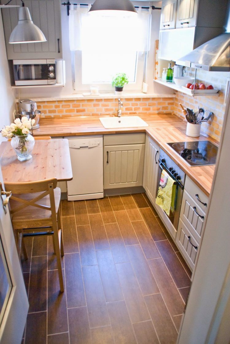
A durable and reliable coating must be consistent with the design idea.
Walls
The kitchen has 2 zones: a work and a dining area.The decoration of the walls where food is prepared is made taking into account the increased evaporation and temperature, splashing water, oil. Walls should be easy to clean without losing their appearance. You can decorate the place where food is taken with more delicate materials.
Satisfy the conditions of the working area:
- ceramic tile;
- washing wallpaper;
- waterproof paints;
- glass apron.
The dining area of the kitchen will be additionally decorated with decorative plaster, MDF panels.

Roman curtains
Cloth / PVC / bamboo straw canopy covers the entire kitchen window up to the windowsill. The lifting mechanism (manual, electric) folds the curtain in uniform folds, opening the window opening not completely (25 centimeters to the cornice). The device uses a rope, horizontal slats threaded into the pockets every 30 centimeters, and a lower weighting agent.

Roll
The light-shielding sheet can be mounted on brackets on the wall, on the window sash. In the first case, the curtain covers the window sill, in the second it remains free. They produce roller blinds made of polyester of various textures, with cotton, linen. Cloths have antistatic, antibacterial protection. For the kitchen, curtains are used that have an additional water-repellent impregnation.
Panel
Several vertically positioned narrow canvases made of cotton and linen close and open, moving along the upper and lower guides: on the cornice and the window sill. The side tracks are niches, for them the panels are wound (manually, using an electric drive).

Blinds
The light-protective device can be horizontal or vertical according to the regulation method. Represents a set of lamellas (plates) connected by a guide rope / line. The lamellas can be rotated 90 degrees around the axis, moved up or sideways. Plates are produced from plastic, wood, aluminum.
Cafe curtains
Traditional window curtains have changed in the way of fastening, shape, materials. Especially suitable for rustic kitchens. What kind of curtain to hang depends on the hostess's imagination. It is easy to sew it with your own hands or purchase a ready-made one.

Cork
The cork cover is distinguished by its special tenderness and warmth. This is a wonderful natural material that will become a real friend for little kids and allergy sufferers.
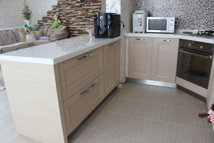

The only drawback will be not a very good attitude to moisture and the cost of the coating.

An unambiguous answer to the question "Which floor in the kitchen is better?" does not exist. It all depends on the personal preferences of the owners. Someone is delighted with tiles, someone is more interested in linoleum, and someone loves a delicate laminate.

Often, the kitchen floor is combined from several materials to meet all the requirements of this complex room. The working area is decorated with unpretentious tiles or linoleum, the dining area is made of laminate, cork or wood.

Photos of the kitchen floor will help you choose the most pleasant coating.

Additional tips for convenience
In order for the furniture to be placed perfectly, not a single centimeter of useful footage was lost, you need to make it to order according to individual measurements. In order not to overload the space, instead of several classic cabinets, you can hang open shelves. Hinged doors "help" to save free space. Do not forget about modern transforming furniture.
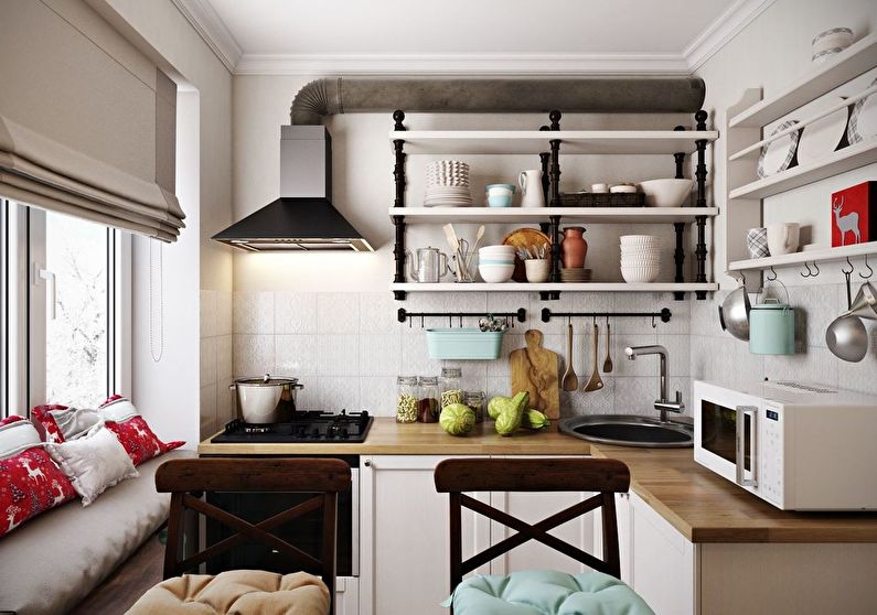
Such arrangement will make the room more multifunctional.
To get as much natural light as possible into the room, do not hang heavy, blackout curtains.
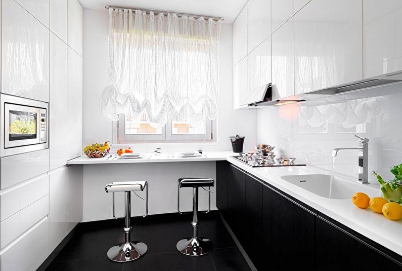
Light curtains will suffice.
Whatever style of decoration of a rectangular kitchen is chosen, subject to certain rules, diligence, violent imagination, the mistress's dream will turn out. The main thing is to take into account all your wishes in time, so that you do not redo anything later.

The main thing is that you initially want to spend as much time as possible in this room.
I'm not a cook, why do I need a kitchen?
Yes, we can agree that not all people love to cook, and for some this room will not be so popular and often used.But this is only at first glance. After all, even if you spend most of the day at work and even prefer to dine in public places, there are still days when you want to invite your friends, relatives, treat them with something like that, even if not a super complicated dish, but a delicious cocktail.

Whatever one may say, it is difficult to do without a kitchen, even if half of the shelves on it will be empty at first. Let them be better, and you will always have time to find a use for them. And there are times when a beautifully designed kitchen inspires people to improve their culinary skills! Do not steal from yourself the opportunity to learn something new.




Ready-made color solutions
The psychological state of people depends on the color scheme of the interior. The kitchen is the most visited and dangerous place in the apartment.
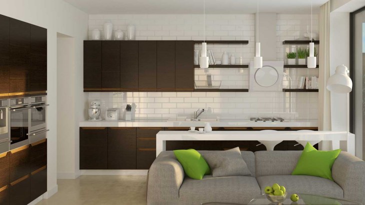
White
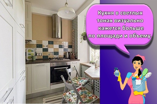
A kitchen in light colors visually seems to be larger in area and volume. White is associated with purity, light. The snow-white tone in the interior of the room is replaced with a milky one in order to avoid the feeling of cold and loneliness. All shades are combined with white, which makes the design of the kitchen more interesting.
Gray
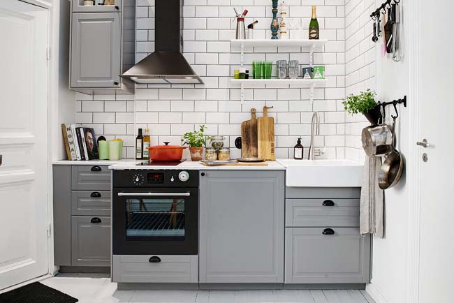
A color whose perception has a calming effect. It is suitable for a minimalist, high-tech kitchen. But, so that being in the room does not cause despondency, the interior is enlivened with bright turquoise, lavender spots, white stripes are added.
Beige
The warm shade is often used to paint walls in interiors of all styles. The peculiarity of the color is the creation of a peaceful, optimistic mood. Combines with other brown tones: coral, peach. Carmine and cherry accessories enliven the kitchen design.

Yellow
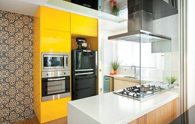
Muted shades of yellow help to concentrate, increase efficiency, which is important for fulfilling the duties of a cook. Overuse of bright colors leads to irritability and rapid fatigue
In the interior of the kitchen, cream, lemon, sand tones are used in combination with white, olive colors. The golden, amber color of accessories (vases, lamps) will attract the eye and raise the tone.
Green
Green color in the kitchen is used for painting walls and as a decor for surfaces. Pistachio, light green, olive - the dominant tone in the interior. Malachite, emerald, herbal - countertops, cabinet doors and cabinets.

What to avoid when setting up a kitchen
When decorating a kitchen with a low ceiling, in no case should you make the following mistakes:
- paint the ceiling black or another dark color, you should also not choose a darker shade for it than for the walls;
- glue wallpaper with a horizontal pattern, place horizontal tiles or lining;
- make a suspended ceiling without well-thought-out lighting;
- clutter the ceiling with decorative slats, large cornices, stucco moldings, large chandeliers.
We really hope that following our advice, you will be able to turn even the most unsightly kitchen with a low ceiling into a bright, cozy room. A well-thought-out interior will guarantee comfort and good mood for your loved ones and guests.
 Elegant kitchen in a classic style with a low ceiling

Fresh Mediterranean style
This design option in the kitchen connected to the dining room assumes the maximum use of ceramic elements. Tiles are used as floor and wall finishes. She participates in the decor of the room. In the latter case, plates and amphorae are used. The listed items must be painted with a floral motif.
The utensils used in the kitchen should be ceramic, matching the design with decorative elements.
Furniture must be durable. Wooden items are a great solution. The sideboard should have open shelves where you can place various kitchen utensils and decorations.
The headset of impressive size will allow the general interior to look rich.
It is recommended to complement the general decor with mirrors and other details with forged elements. Linen or cotton fabric is suitable as textiles for such a design. The presence of drawings, patterns is required. “Mediterranean” suggests a P-shaped room layout.
All items and furniture are placed along three walls. This will avoid through traffic.
The combination of the kitchen and the dining room allows you to get a spacious room where you can spend time simultaneously preparing meals, communicating with guests, relatives
It is important to take into account the nuances and reduce the negative aspects of such a merger. Then you get a beautiful, harmonious and practical interior.


